
Turn on suggestions
Auto-suggest helps you quickly narrow down your search results by suggesting possible matches as you type.
Showing results for
Turn on suggestions
Auto-suggest helps you quickly narrow down your search results by suggesting possible matches as you type.
Showing results for
Community Tip - Visit the PTCooler (the community lounge) to get to know your fellow community members and check out some of Dale's Friday Humor posts! X
- Community
- Creo+ and Creo Parametric
- 3D Part & Assembly Design
- Creo 2 Default color scheme.
Options
- Subscribe to RSS Feed
- Mark Topic as New
- Mark Topic as Read
- Float this Topic for Current User
- Bookmark
- Subscribe
- Mute
- Printer Friendly Page
Creo 2 Default color scheme.
Sep 12, 2012
04:17 PM
- Mark as New
- Bookmark
- Subscribe
- Mute
- Subscribe to RSS Feed
- Permalink
- Notify Moderator
Sep 12, 2012
04:17 PM
Creo 2 Default color scheme.
With the Creo suite of apps the default color scheme uses a white background. We are curious to see how many users keep this color scheme or change is to black or maybe even the old Wildfire scheme.
What are the reasons you keep/change this?
Andy Hermanson
Engineering Design Applications
tel 605.275.1040 x51114 mobile 605.310.8168
website www.daktronics.com
What are the reasons you keep/change this?
Andy Hermanson
Engineering Design Applications
tel 605.275.1040 x51114 mobile 605.310.8168
website www.daktronics.com
Labels:
- Labels:
-
Surfacing
26 REPLIES 26
Sep 12, 2012
04:34 PM
- Mark as New
- Bookmark
- Subscribe
- Mute
- Subscribe to RSS Feed
- Permalink
- Notify Moderator
Sep 12, 2012
04:34 PM
Absolutely hate the white background.
We all use the old blue blended, much easier on the eyes.
Who the heck uses the white background? That is terrible!
On Wed, Sep 12, 2012 at 3:17 PM, Andy Hermanson <
andy.hermanson@daktronics.com> wrote:
> With the Creo suite of apps the default color scheme uses a white
> background. We are curious to see how many users keep this color scheme or
> change is to black or maybe even the old Wildfire scheme.****
>
> ** **
>
> What are the reasons you keep/change this?****
>
> ** **
>
> Andy Hermanson*
> *Engineering Design Applications****
>
> ****
>
> tel 605.275.1040 x51114 mobile 605.310.8168
> website www.daktronics.com ****
>
> ** **
>
> ****
>
> [image: Description: Daktronics_Sig_Logo]****
>
> ** **
>
Sep 12, 2012
05:21 PM
- Mark as New
- Bookmark
- Subscribe
- Mute
- Subscribe to RSS Feed
- Permalink
- Notify Moderator
Sep 12, 2012
05:21 PM
I love the white background, in fact I changed my WF5 scheme to use it
as well. It's much easier on the eyes to me. It may be because we also
use Solidworks here as well and it uses a white background by default as
well. I never really liked the blended blue, although the blended gray
is OK.
The very old, pre-WF was the most useful, but it's pretty glaring to me
now. Everything since makes things too similar like the light brown vs.
dark brown for the sides of a datum plane. Creo is the first one that I
haven't felt that way about in a long time.
Doug Schaefer
Sep 12, 2012
05:21 PM
- Mark as New
- Bookmark
- Subscribe
- Mute
- Subscribe to RSS Feed
- Permalink
- Notify Moderator
Sep 12, 2012
05:21 PM
White backgrounds tend to make on the fly screen shot much more readable when being passed between a group of designers
Sep 12, 2012
05:40 PM
- Mark as New
- Bookmark
- Subscribe
- Mute
- Subscribe to RSS Feed
- Permalink
- Notify Moderator
Sep 12, 2012
05:40 PM
We changed our background to black... It is really nice on the eyes!
And you don't see a big difference between modeling and drawing which has always had a black background.
Michael Ohlrich, Design Engineer
Benchmade Knife Company
mohlrich@benchmade.com<">mailto:mohlrich@benchmade.com>
(503) 655-6004 x122
[cid:image002.jpg@01CD90F4.82F5F6F0]
www.benchmade.com<">http://www.benchmade.com>
CONFIDENTIALITY NOTICE: This e-mail communication and any attachments may contain confidential and privileged information for the use of the designated recipients. If you are not the intended recipient, (or authorized to receive for the recipient) you are hereby notified that you have received this communication in error and that any review, disclosure, dissemination, distribution or copying of it or its contents is prohibited. If you have received this communication in error, please destroy all copies of this communication and any attachments and contact the sender by reply e-mail or telephone (503) 655-6004).
Sep 12, 2012
05:42 PM
- Mark as New
- Bookmark
- Subscribe
- Mute
- Subscribe to RSS Feed
- Permalink
- Notify Moderator
Sep 12, 2012
05:42 PM
I use a blended black background. This dates back when the defaults to many software screens were black. I agree on the white being good for screen shots and color printing! I do have a mapkey to toggle the background to white for times like those.
~Doug
~Doug
Sep 12, 2012
06:52 PM
- Mark as New
- Bookmark
- Subscribe
- Mute
- Subscribe to RSS Feed
- Permalink
- Notify Moderator
Sep 12, 2012
06:52 PM
I have the background black.
I also change the color scheme of the Datum Planes, Text, everything....back to the WF3 color scheme
I also change the color scheme of the Datum Planes, Text, everything....back to the WF3 color scheme
Sep 12, 2012
07:05 PM
- Mark as New
- Bookmark
- Subscribe
- Mute
- Subscribe to RSS Feed
- Permalink
- Notify Moderator
Sep 12, 2012
07:05 PM
I use aclassic dark blue gradient and yellow with white part edges in the drawing. Wish I could change the menus to match.
Sep 12, 2012
07:21 PM
- Mark as New
- Bookmark
- Subscribe
- Mute
- Subscribe to RSS Feed
- Permalink
- Notify Moderator
Sep 12, 2012
07:21 PM
Hi Folks,
My 10c (we dropped the smaller coins)
Still on WF5
I start with the pre WF colour scheme with the graduated blue background.
I do this as I find the bright colour backgrounds (any of the newer ones)
to be too hard on my old eyes. The darker background eases eyestrain for
me and like Joel I prefer the old colours for datum planes and curves etc
as I find that the newer colours used on the brighter screens are harder
to distinguish apart. I could use black but I find I get better depth
perception with the graduated blue. I anticipate doing very similar in
Creo 2.0 when I test next week.
I do note though that some younger users prefer the lighter coloured new
screens. Each of our users can choose what suits them.
I also have mapkeys for swapping colour schemes. One to go to full white
background for screen capture as mentioned another for one of the earlier
Grey WF backgrounds and one to restore me to the pre WF scheme with the
graduated Blue.
As a maybe interesting aside I note many comments on how eReaders are much
easier for prolonged reading than Tablets. The Tablets look lovely with a
white screen but try reading for a few hours and see how you go. I am
guessing the advantage for an eReader is due to the passive nature of its
screens with no back-lighting.
Antonius mentions the menus and I know in WF5 I can use a config
setting *ui_theme
standard* which allows me to set the menu surround and fonts etc to
whatever Windows uses and I have that set to XP Classic (yes I am a
dinosaur). maybe this is useful to others especially if it works in Creo.
Regards,
*Brent Drysdale*
*Senior Design Engineer*
Tait Communications
Sep 12, 2012
07:44 PM
- Mark as New
- Bookmark
- Subscribe
- Mute
- Subscribe to RSS Feed
- Permalink
- Notify Moderator
Sep 12, 2012
07:44 PM
OK, So here is my humble and probably worthless opinion since everyone will just do what they want.
I have always been resistant to changing the colors. When I first started with Pro/E, I hated the bright blue. I was use to black... I got use to it. When the other color changes happened over the years, I hated them too but again, I got use to them.
Now Creo is out. I must admit that I am not as young as I use to be and to be honest, some of the color schemes are really hard for me to see. Try editing a feature and the purple feature color and blue dimensions are almost impossible for me to see. When in sheet metal the new default part color and the white background make it impossible to see the part unless you have the shading with edges turned on (which I do and love). Here is a capture of a flat sheet metal wall without shade with edges. White on white is hard to see.
[cid:image003.jpg@01CD9105.F229C4A0]
Some of my part colors are now in conflict with the highlighting colors. I always avoided red and now I think green, orange, purple and a few others will need to be avoided.
Highlighting is also interesting. You get a surface type display until you actually pick on something. Then you get the green edge display (hence my desire to avoid green on the part model)
So, I have only been working on Creo2 for a few weeks. I am trying my best to leave the color scheme alone and see if I adapt. It has worked for me in the past so I am hoping that it will serve me well again. So far, the blended background have been my favorite. I must admit that after a few weeks I have adapted to most of this. I still struggle with dimensions during edits and part creation. Sometimes the edge highlighting is hard for me to see but for the most part, I don't really seem to have a preference.
I am just glad that there are options and we can adopt what we think is best!
Ronald B. Grabau
HP PDE-IT
Roseville, CA
916-785-3298
-<">mailto:->
Sep 13, 2012
08:30 AM
- Mark as New
- Bookmark
- Subscribe
- Mute
- Subscribe to RSS Feed
- Permalink
- Notify Moderator
Sep 13, 2012
08:30 AM
Using CREO1, I find the white background too harsh and hard on the eyes
and use a uniform dark slate blue background. I don't use the gradient
blue grey background at it has too little color saturation difference to
the entity colors and saturation. I think it was Computervision that
did a study in the early 80's that claimed a dark background tinted
slightly red or blue was the easiest on the eyes. Stark black
backgrounds were not optimum.
I use a mix of new and older Pro-e colors, with surfaces and edges the
current purple-yellow respectively.(the older purple-pink scheme was
idiotic)
I am trying to use the current brown-grey plane scheme, this is slightly
better than the older scheme, but not a visible as the original
red-yellow. I try to have important feature differences have high
saturation (or brightness) values to stand out not just in color.
Not to start a flame war, but so many things about the interface seem to
have been given little thought in regards to being easily recognizable.
The use of pastel colors with little difference in saturation make the
color schemes less than optimum. What was so wrong with the
pre-wildfire (rev-19) colors anyway?
Christopher F. Gosnell
FPD Company
124 Hidden Valley Road
McMurray, PA 15317
Sep 13, 2012
01:33 PM
- Mark as New
- Bookmark
- Subscribe
- Mute
- Subscribe to RSS Feed
- Permalink
- Notify Moderator
Sep 13, 2012
01:33 PM
I found this little switch in the color file (not a config.pro option!):
COLOR_SCHEME 0
USE_PRE_WILDFIRE_ENTITY_COLOR YES
SYSTEM_DIMMED_MENU_COLOR ...
In my case, this system color file is named: classic_syscol.scl
This is the config.pro option that calls it up: system_colors_file C:\<path>\classic_syscol.scl
CS couldn't tell me a lot about this option but it does give me the old yellow text on dark blue with brown/yellow datums.
Sep 13, 2012
06:27 PM
- Mark as New
- Bookmark
- Subscribe
- Mute
- Subscribe to RSS Feed
- Permalink
- Notify Moderator
Sep 13, 2012
06:27 PM
The default background on Creo Parametric is an off white. This color is less stressful on the eyes because darker colors have a larger contrast between the graphics screen and the Ribbon UI. This is also noticable when switching from Creo Parametric to your email client and Microsoft Office apps.
Dark backgrounds force your eyes to work harder because it's darker than the surrounding colors or the colors of other apps you use daily.
This is probably why email clients and/or MS Office applications don't use dark backgrounds.
Some of my veteran users did not like it and wanted to change but I challenged them to try it for 1 to 2 weeks. When I asked them if they are ready for me to show them how to change the background to a dark color, they all said they got used to the off white and don't want to change.
Everyone's eyes are different but I simply think darker backgrounds force your eyes to work harder unless you are working in complete darkness.
If you do change the background to a custom color and do not choose the default darker scheme, be careful with the colors on your curves, datums, etc. Sometimes you will find that the color combination does not work for everything and you must continue to tweak them all individually until you have a complete custom scheme you like.
One last thing. I like the way the default color (off white) makes the model tree look like it's floating. The graphics window looks like it melts into the model tree. If you change to a darker color, there is a separation from the Graphics screen and model tree that creates a hard edge which I don't like. This is another reason why I like the default color.
"Too many people walk around like Clark Kent, because they don't realize they can Fly like Superman"
Sep 17, 2012
06:47 AM
- Mark as New
- Bookmark
- Subscribe
- Mute
- Subscribe to RSS Feed
- Permalink
- Notify Moderator
Sep 17, 2012
06:47 AM
I would love to using an off-white background.
But I need to be able to change the model dimensions/notes/etc from yellow to something dark, blue/black.
But I need to be able to change the model dimensions/notes/etc from yellow to something dark, blue/black.
Sep 17, 2012
09:03 AM
- Mark as New
- Bookmark
- Subscribe
- Mute
- Subscribe to RSS Feed
- Permalink
- Notify Moderator
Sep 17, 2012
09:03 AM
Mathew,
You can change only the colors of the things you want. Finding the right combination to work with your background color is the trick.
I do wish you the background you choose would also change the model tree background to match it. This would obviously be difficult with blended backgrounds but it would be a nice option for solid colors.
It would also be nice if PTC offered more default scheme's out of the box which have all the colors working together with the different colored backgrounds options. This would give the end user more choices to quickly change things rather than spending all the time it takes to tweak all the colors in the entire setup to work nice together.
In Reply to Mathew Palazola:
I would love to using an off-white background.
But I need to be able to change the model dimensions/notes/etc from yellow to something dark, blue/black.
Sep 17, 2012
09:11 AM
- Mark as New
- Bookmark
- Subscribe
- Mute
- Subscribe to RSS Feed
- Permalink
- Notify Moderator
Sep 17, 2012
09:11 AM
Indeed... I only need to know how to change the color of the model dimensions from yellow to something dark.
Sep 17, 2012
01:20 PM
- Mark as New
- Bookmark
- Subscribe
- Mute
- Subscribe to RSS Feed
- Permalink
- Notify Moderator
Sep 17, 2012
01:20 PM
Here is the Creo 2.0 syscol.scl file. There may be extra entries which should be removed:
COLOR_SCHEME 0
USE_PRE_WILDFIRE_ENTITY_COLOR NO
SYSTEM_BACKGROUND_COLOR 98.431373 98.431373 98.823529
SYSTEM_DIMMED_MENU_COLOR 49.019608 49.019608 50.196078
SYSTEM_LETTER_COLOR 0.000000 0.000000 94.117647
SYSTEM_HIGHLIGHT_COLOR 60.000000 0.000000 0.000000
SYSTEM_EDGE_HIGH_COLOR 100.000000 0.000000 0.000000
SYSTEM_GEOMETRY_COLOR 13.333333 13.333333 14.901961
SYSTEM_HIDDEN_COLOR 76.078431 76.078431 80.000000
SYSTEM_SHEETMETAL_COLOR 0.000000 60.000000 35.294118
SYSTEM_CURVES_COLOR 0.000000 0.000000 94.117647
SYSTEM_VOLUME_COLOR 60.000000 20.000000 80.000000
SYSTEM_SECTION_COLOR 0.000000 60.000000 80.000000
SYSTEM_PRESEL_HIGHLIGHT_COLOR 56.470588 94.117647 0.000000
SYSTEM_SELECTED_COLOR 20.000000 80.000000 30.196078
SYSTEM_SECONDARY_SELECTED_COLOR 18.039216 89.803922 89.803922
SYSTEM_PREVIEW_GEOM_COLOR 100.000000 58.431373 0.000000
SYSTEM_SECONDARY_PREVIEW_COLOR 80.000000 40.000000 60.000000
SYSTEM_DATUM_COLOR 60.000000 40.000000 20.000000
SYSTEM_QUILT_COLOR 94.117647 75.294118 0.000000
SYSTEM_SHADED_EDGE_COLOR 13.333333 13.333333 14.901961
BLENDED_BACKGROUND no
SYSTEM_TOP_BLENDING_COLOR 98.431373 98.431373 98.823529
SYSTEM_BOTTOM_BLENDING_COLOR 93.333333 94.117647 94.509804
Also try config.pro ... system_letter_color 0.000000 0.000000 94.117647 (blue)
Sep 17, 2012
01:25 PM
- Mark as New
- Bookmark
- Subscribe
- Mute
- Subscribe to RSS Feed
- Permalink
- Notify Moderator
Sep 17, 2012
01:25 PM
These are all the default config.pro Creo 2.0 color definitions:
system_background_color 98.431373 98.431373 98.823529
system_curves_color 0.000000 0.000000 94.117647
system_dimmed_menu_color 49.019608 49.019608 50.196078
system_edge_high_color 100.000000 0.000000 0.000000
system_geometry_color 13.333333 13.333333 14.901961
system_hidden_color 76.078431 76.078431 80.000000
system_highlight_color 60.000000 0.000000 0.000000
system_letter_color 0.000000 0.000000 94.117647
system_section_color 0.000000 60.000000 80.000000
system_sheetmetal_color 0.000000 60.000000 35.294118
system_volume_color 60.000000 20.000000 80.000000
Mar 04, 2017
04:56 AM
- Mark as New
- Bookmark
- Subscribe
- Mute
- Subscribe to RSS Feed
- Permalink
- Notify Moderator
Mar 04, 2017
04:56 AM
Hi all,
I need one requirement to take the pictures.
When i have selected the required datums (Planes, axes, csys), The datums are displayed in green color only. But i want to change the highlighted datum color as a red color. It will helpful to take the pictures for me.
Pls suggest how to change the highlighted datums color in creo-2
Thanks in advance.
Mar 06, 2017
09:31 AM
- Mark as New
- Bookmark
- Subscribe
- Mute
- Subscribe to RSS Feed
- Permalink
- Notify Moderator
Mar 06, 2017
09:31 AM
FILE - OPTIONS - system colors.
change the "selected" option to your preferred color.

Sep 17, 2012
06:46 PM
- Mark as New
- Bookmark
- Subscribe
- Mute
- Subscribe to RSS Feed
- Permalink
- Notify Moderator
Sep 17, 2012
06:46 PM
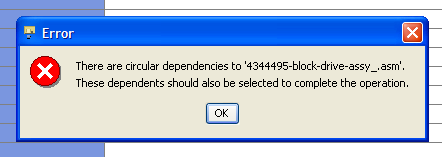
Hi all,
Does anyone happen to know how to find the circular dependencies when encountering this error while performing a duplicate objects? I remember seeing it in the past but forgot how to get around it.
Thanks,
Stefan
[cid:image001.png@01CD94EB.A8493D90]
Does anyone happen to know how to find the circular dependencies when encountering this error while performing a duplicate objects? I remember seeing it in the past but forgot how to get around it.
Thanks,
Stefan
[cid:image001.png@01CD94EB.A8493D90]
Sep 18, 2012
09:21 AM
- Mark as New
- Bookmark
- Subscribe
- Mute
- Subscribe to RSS Feed
- Permalink
- Notify Moderator
Sep 18, 2012
09:21 AM
Sweet, colors to 6 decimal places. Now who has the 80 bit color space to resolve these? I wonder how much of my life is being wasted by shaders dithering between 98.431372 & 98.431374?
In Reply to Antonius Dirriwachter:
These are all the default config.pro Creo 2.0 color definitions:
system_background_color 98.431373 98.431373 98.823529
system_curves_color 0.000000 0.000000 94.117647
system_dimmed_menu_color 49.019608 49.019608 50.196078
system_edge_high_color 100.000000 0.000000 0.000000
system_geometry_color 13.333333 13.333333 14.901961
system_hidden_color 76.078431 76.078431 80.000000
system_highlight_color 60.000000 0.000000 0.000000
system_letter_color 0.000000 0.000000 94.117647
system_section_color 0.000000 60.000000 80.000000
system_sheetmetal_color 0.000000 60.000000 35.294118
system_volume_color 60.000000 20.000000 80.000000
PTC quality philosophy: We've upped our quality standards. Up yours.
Sep 18, 2012
09:29 AM
- Mark as New
- Bookmark
- Subscribe
- Mute
- Subscribe to RSS Feed
- Permalink
- Notify Moderator
Sep 18, 2012
09:29 AM
Typical PTC...
This kind of sheer stupidity comes from them buying Computervision in the middle 90's and giving all those Computervision block-heads jobs.
This kind of sheer stupidity comes from them buying Computervision in the middle 90's and giving all those Computervision block-heads jobs.
Sep 18, 2012
09:52 AM
- Mark as New
- Bookmark
- Subscribe
- Mute
- Subscribe to RSS Feed
- Permalink
- Notify Moderator
Sep 18, 2012
09:52 AM
Now, now. PTC existed and had colors long before the purchase of CV.
Besides there are days STILL where I would rather be back in the
drafting mode of CADDS4X than CREO1/2...
Maybe, just maybe, the numbers are a floating point decimal conversion
of what was originally a binary representation of a simple 8 bit color
value like 1-127. Welcome to the genius of Pro-E (?)
Christopher F. Gosnell
FPD Company
124 Hidden Valley Road
McMurray, PA 15317
Sep 18, 2012
10:42 AM
- Mark as New
- Bookmark
- Subscribe
- Mute
- Subscribe to RSS Feed
- Permalink
- Notify Moderator
Sep 18, 2012
10:42 AM
Computervision's system did the job in its' day far better than many systems, although it sure was not perfect in lots of ways.
What they were really bad at was changing and improving the software to adapt to industry requirements, and they just did not listen to customers. PTC came along with a good, improved CAD system and ate their lunch. One great thing CV did was offered a package that could model a part and then generate decent NC files and good drawings of virtually anything, pretty well. PTC has never done this as a package, the NC was an expensive add-on that never worked well and still doesn't, and Mastercam and others have eaten that lunch now. The ease of making good drawings in PTC software has varied widely with different revs. PTC has never been good at listening to the customer about software functionality, either, just like CV weren't. They do seem better at it in the last few years though.
Jeff Dayman (CV user 1982-1993, PTC user 1993-now)
Sep 18, 2012
04:25 PM
- Mark as New
- Bookmark
- Subscribe
- Mute
- Subscribe to RSS Feed
- Permalink
- Notify Moderator
Sep 18, 2012
04:25 PM
Just one division by 100 and one multiplication by bit plane depth for
each colour at startup, i don't think much of your life is being wasted
(unless you have a reaaally slow PC) 😉
The plus side is this notation is bit plane depth independent, so you
can use your color preferences on one workstation, and it will show the
same colours on another. And I imagine this was probably an issue back
when Pro/E was mainly run on all the different Unix flavours as well as
ancient versions of Windows (NT 3.51 or maybe even older?) and 255 bits
colour depth was not a given.
I don't see much of a problem with it, except perhaps the readability
of it.
And if it ain't borken, please don't ask PTC to fix it!
Just my €0,02
Best regards,
Patrick Asselman
Sep 18, 2012
04:30 PM
- Mark as New
- Bookmark
- Subscribe
- Mute
- Subscribe to RSS Feed
- Permalink
- Notify Moderator
Sep 18, 2012
04:30 PM
Didn't Pro/E create some log file in the working directory that shows
the circle of references?
Named *.crc if i'm not mistaken...
Best regards,
Patrick Asselman
the circle of references?
Named *.crc if i'm not mistaken...
Best regards,
Patrick Asselman
