Turn on suggestions
Auto-suggest helps you quickly narrow down your search results by suggesting possible matches as you type.
Showing results for
Turn on suggestions
Auto-suggest helps you quickly narrow down your search results by suggesting possible matches as you type.
Showing results for
- Community
- Creo+ and Creo Parametric
- 3D Part & Assembly Design
- Modelcheck in Creo 5 feedback
Options
- Subscribe to RSS Feed
- Mark Topic as New
- Mark Topic as Read
- Float this Topic for Current User
- Bookmark
- Subscribe
- Mute
- Printer Friendly Page
Modelcheck in Creo 5 feedback
Oct 10, 2018
04:57 PM
- Mark as New
- Bookmark
- Subscribe
- Mute
- Subscribe to RSS Feed
- Permalink
- Notify Moderator
Oct 10, 2018
04:57 PM
Modelcheck in Creo 5 feedback
I've been using Modelcheck in Creo 5 for a few months now, as I configure our setup from Creo 4 and prepare for training and migration. I would like to provide feedback:
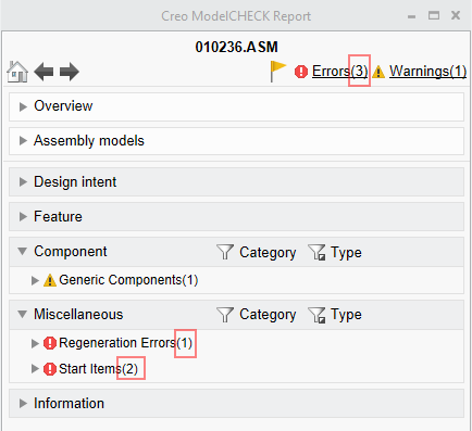
- The number on top, next to the Errors and Warnings, would seem to be a cumulative value of all of the numbers of errors and warnings within the subsections, due to the same way they are identified. For instance, in the below picture, if a user was expanding a random section, he would assume there is nothing in Design Intent and Feature as there are already three errors listed and 1 warning:
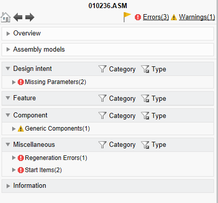
Rather, if we expand all sections, we see more errors:
Although I understand that the number on top is the check# and the number next to the checks are the quantity #, it is confusing since they are identified the same way - I'm not sure users care whether errors or warnings are identified as Design Intent, Feature, Component or Misc. Whatever the organization has identified as important will be an error and whatever they identified as not critical, will be a warning. I'm not sure how these categories help.
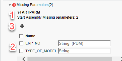
- When trying to fix an issue, it appears that the flow is also confusing. In a given check, the description is at the top(step 1), the field to specify the fix is at the button (step 2), and the button to fix it is in the middle (step 3). It would be equivalent to an online form where the submit button is at the top of the page instead of after the entry fields. Also, I'm not sure if the icons are 100% obvious to the action of the buttons.
This was probably done for a user who may not realize there is a way to fix an issue if the button is not visible from the beginning. I think a different way of showing the data will help with this. - In Creo 4, the default results for a Modelcheck regenerate showed the ALL tab which listed all errors and warnings. Here, not all categories are expanded from the beginning. This introduces a high risk of users missing the checks when they are trying to rush and get out a part by adding extra work for an improved tool. Users aren't a big fan of a tool which finds their mistakes to begin with. Having extra work to hunt for them is not going to go over well. Furthermore, now they can say they didn't see the checks when the report came up since it was buried. I can't even use a mapkey to show all checks since the commands are not mapkey sensitive. It goes without saying that the Overview and Information section should NOT be expanded by default. At this time, I am not sure if there is enough benefit to migrate to Creo 5 if this last issue does not get addressed before then.
@Mahesh_Sharma and @lwestbrook
Labels:
- Labels:
-
General
32 REPLIES 32
Jul 03, 2020
03:43 AM
- Mark as New
- Bookmark
- Subscribe
- Mute
- Subscribe to RSS Feed
- Permalink
- Notify Moderator
Jul 03, 2020
03:43 AM
@lwestbrook We have several people testing the new ModelCheck GUI and they seem to like it a lot better. Even more when I turned on the MC_REPORT_SHOW_ALL_TAB config_init.mc setting. 😀
Maybe this new idea will help! New ModelCheck GUI - Display All Errors/Warnings Automatically
Jul 04, 2020
09:44 AM
- Mark as New
- Bookmark
- Subscribe
- Mute
- Subscribe to RSS Feed
- Permalink
- Notify Moderator
Jul 04, 2020
09:44 AM
Thank you very much for your clear answer.
We use new ModelCheck GUI in creo 4 since March without problems.
Jul 06, 2020
02:22 PM
- Mark as New
- Bookmark
- Subscribe
- Mute
- Subscribe to RSS Feed
- Permalink
- Notify Moderator
Jul 06, 2020
02:22 PM
Glad to hear the positive feedback for the new report UI!
- « Previous
-
- 1
- 2
- Next »


