Connected Statistics
- Mark as New
- Bookmark
- Subscribe
- Mute
- Subscribe to RSS Feed
- Permalink
- Notify Moderator
Connected Statistics
What are your thoughts on the initial dashboard designs? Are there additional KPIs you would like to see?
- Labels:
-
Performance Advisor
- Tags:
- group discussion
- Mark as New
- Bookmark
- Subscribe
- Mute
- Subscribe to RSS Feed
- Permalink
- Notify Moderator
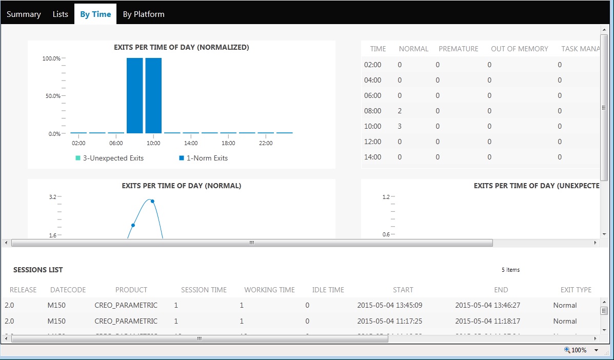
One thing that i would like to see is a settings menu to adjust the scales to something a bit more reader friendly. What i mean by this is that things are displayed in 24hr time format, decimals of an hour, things like that. I would like to be able to localize to the correct time zone to more quickly determine when exits occur for troubleshooting if there may have been say a Windchill connection issue at the some time. Thats just an example but would be really helpful.
Thanks,
Andy
- Mark as New
- Bookmark
- Subscribe
- Mute
- Subscribe to RSS Feed
- Permalink
- Notify Moderator
I'm sorry if I missed some of this in the initial demo.
We are very interested in geographic granularity, separating from Country, State and City.
Thanks,
Josh
- Mark as New
- Bookmark
- Subscribe
- Mute
- Subscribe to RSS Feed
- Permalink
- Notify Moderator
One of the things I don't like is I can't change the size of the tables on the individual page. It is difficult to see the table when the size of the table is very short. In this case the bottom SESSIONS LIST table.

- Mark as New
- Bookmark
- Subscribe
- Mute
- Subscribe to RSS Feed
- Permalink
- Notify Moderator
Dan,
I discovered a strange thing.
I added some gadgets and then I moved it in another position.
After refreshing data (hitting F5 on my browser) gadgets are returned to their original position.
- Mark as New
- Bookmark
- Subscribe
- Mute
- Subscribe to RSS Feed
- Permalink
- Notify Moderator
If you want to see your suggestions implemented create a product idea.
Re: Performance Advisor for PTC Creo - Dashboard Environment


