Community Tip - Did you get an answer that solved your problem? Please mark it as an Accepted Solution so others with the same problem can find the answer easily. X
- Subscribe to RSS Feed
- Mark Topic as New
- Mark Topic as Read
- Float this Topic for Current User
- Bookmark
- Subscribe
- Mute
- Printer Friendly Page
Format a Solve Block
- Mark as New
- Bookmark
- Subscribe
- Mute
- Subscribe to RSS Feed
- Permalink
- Notify Moderator
Format a Solve Block
The examples using Solve Blocks show a plain box with Guess Values, Constraints, and the appropriate Solver inside, but the box is otherwise "undecorated". When I lay down a Solve Block, it has labels on the side for "Guess Values", "Constraints", and "Solver". If I remove unneeded space inside the Block, the labels on the side "ride up" so they overlay each other and look just plain ugly.
How do you suppress these labels so that the Solve Block looks like the blocks in the Help Files, i.e. just a box with no labels? I looked and couldn't find it in the Ribbon (I may just have missed it), and right-clicking or left-clicking the Block didn't seem to work (unless I failed to find the Magic Spot).
- Labels:
-
Other
- Tags:
- solve_blocks
- Mark as New
- Bookmark
- Subscribe
- Mute
- Subscribe to RSS Feed
- Permalink
- Notify Moderator
I have also complained about this, but currently there is nothing you can do. Hopefully the issue will be addressed in Prime 3.0.
- Mark as New
- Bookmark
- Subscribe
- Mute
- Subscribe to RSS Feed
- Permalink
- Notify Moderator
Just to add my two pence worth, I dislike the new solve block layout compared to M15. I didn't see any valid reason to change.
Mike
- Mark as New
- Bookmark
- Subscribe
- Mute
- Subscribe to RSS Feed
- Permalink
- Notify Moderator
I'm not using Prime yet but I have looked at it and I too don't like the look of the solve block. One of the key advantages of Mathcad over all of the competition is that the code can look just like a math or engineering textbook. The Prime solve block is a step away from that concept in my opinion. If PTC is not careful, this advantage of "math that looks like math and not code" will be lost.
- Mark as New
- Bookmark
- Subscribe
- Mute
- Subscribe to RSS Feed
- Permalink
- Notify Moderator
If it's a simple solve block I often put everything on one line. It's more compact, and neater. It's also not possible with Prime solve blocks ![]()
- Mark as New
- Bookmark
- Subscribe
- Mute
- Subscribe to RSS Feed
- Permalink
- Notify Moderator
Fully agree again.
Mike
- Mark as New
- Bookmark
- Subscribe
- Mute
- Subscribe to RSS Feed
- Permalink
- Notify Moderator
I'm not using Prime yet but I have looked at it and I too don't like the look of the solve block. One of the key advantages of Mathcad over all of the competition is that the code can look just like a math or engineering textbook. The Prime solve block is a step away from that concept in my opinion. If PTC is not careful, this advantage of "math that looks like math and not code" will be lost.
I am 100% with you on this.I really like the way Mathcad use to handle solve block, as I could make them look elegant and profession, but personally do not like the new feature at all.
Mike
- Mark as New
- Bookmark
- Subscribe
- Mute
- Subscribe to RSS Feed
- Permalink
- Notify Moderator
We added the new solve block rectangle, to make it easier to recognize what is in the solve block and what is out. Previous solve blocks can be a confusing feature, since the pieces of it can be interspersed with other regions.
Would you prefer that we offered an option in the future, to be more flexible?
Mona
- Mark as New
- Bookmark
- Subscribe
- Mute
- Subscribe to RSS Feed
- Permalink
- Notify Moderator
Mona Zeftel wrote:
We added the new solve block rectangle, to make it easier to recognize what is in the solve block and what is out. Previous solve blocks can be a confusing feature, since the pieces of it can be interspersed with other regions.
I do agree that they can look confusing if the users does not make it clear were the SB starts and finishes within the worksheet. I always stipulate in my calcs the start of the solve block to save this confusion.
Would you prefer that we offered an option in the future, to be more flexible?
Yes, great idea. Maybe choose between the new or standard solve block. Or have the option to hide the rectangular box.
Mike
Mike
- Mark as New
- Bookmark
- Subscribe
- Mute
- Subscribe to RSS Feed
- Permalink
- Notify Moderator
Previous solve blocks can be a confusing feature, since the pieces of it can be interspersed with other regions.
Back in version 11 assignments were not allowed in solve blocks. At some point that was changed (I'm not quite sure which version) so that they now are allowed. That was a very bad idea. In version 11 the only regions other than equalities and inequalities that could be in a solve block were text (necessary for comments), pictures (sometimes useful for comments), and evaluations. So there was room or confusion, but it was limited. Allowing assignments hugely increased the possibility of confusion. Not only does it mean that people can put most of a worksheet inside a solve block, so the "Given" gets lost somewhere near the top, but, much worse, many people seem to think the assignments in a solve block actually affect the solver! Of course, they don't.
The rectangle in Prime does show the extent of the solve block, but it just trades off one problem for another. Now we can't format a solve block on a single line, and have to live with the ugly text on the left. And, assignments are still allowed in the solve block, and still have no effect on the solver! Assignments in a solve block should be forbidden! Also let us turn off the border, and shrink the solve block to a height of one line (currently not possible, even if everything is on one line). If the border is turned off then we need a "Given" to show where the solve block starts.
- Mark as New
- Bookmark
- Subscribe
- Mute
- Subscribe to RSS Feed
- Permalink
- Notify Moderator
An alternative approach, again a long-standing feature request (see http://communities.ptc.com/message/159782#159782), is to allow users to mark off a rectangular area of a worksheet as a effectively a subworksheet. This would allow all of Mathcad's formatting to be applied to a solve block whilst providing a means of encapsulating it.
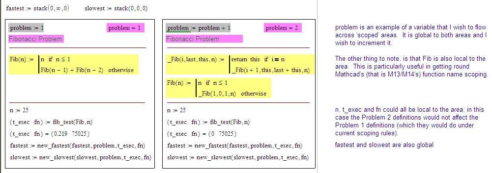
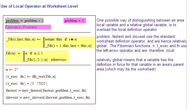
Attached is a worksheet that outlines one of the concepts I'd played with, including overloading of the local definition operator to act as worksheet-level definition operator in a Rectangular Area. I know that I posted it originally in the Collab, but I can't any other mention of the subject.
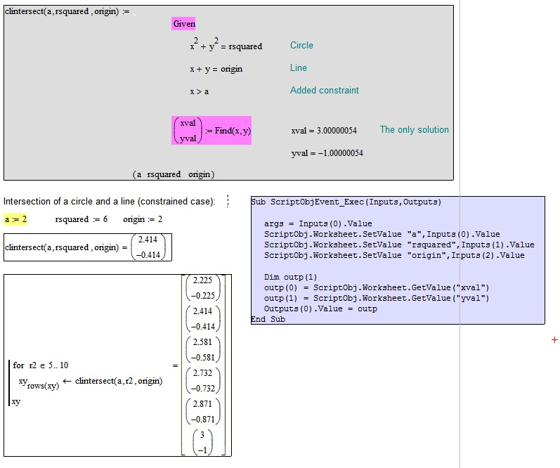
I do have a vague recollection of suggesting that such areas / subsheets ought to be able to return a value and have parameters passed to them (like a component). This could provide a means of getting round another long-standing gripe/request, ie looping round a worksheet outside of a program ... eg, write a worksheet that handles the single case, then pop it into another worksheet as a functionalized subworksheet and call it as you would any other function (I'd suggest increasing the maximum allowed number of input and arguments ... this should be less of an issue than interfacing to a scripting language in a non-Mathcad component).
Stuart
- Mark as New
- Bookmark
- Subscribe
- Mute
- Subscribe to RSS Feed
- Permalink
- Notify Moderator
I have also suggested this at a TC meeting at PTC, including the idea of inputs and outputs. The idea was reasonably well received by the Prime team (they didn't laugh hysterically at me, and then frog march me out of the building) so I have some hope that we will actually get something like this at some point.
- Mark as New
- Bookmark
- Subscribe
- Mute
- Subscribe to RSS Feed
- Permalink
- Notify Moderator
One advantage of the Prime Solve blocks is that one can have solve blocks side by side, which is sometimes helpful. The really bad thing about them is the patronising labels that cannot be removed. Labels are often a good idea, but the user should be able to choose where they go and how they should look.
I also strongly support Richard's comment that
"...Allowing assignments" within solve blocks "hugely increased the possibility of confusion. Not only does it mean that people can put most of a worksheet inside a solve block, so the "Given" gets lost somewhere near the top, but, much worse, many people seem to think the assignments in a solve block actually affect the solver! Of course, they don't."
Alan
- Mark as New
- Bookmark
- Subscribe
- Mute
- Subscribe to RSS Feed
- Permalink
- Notify Moderator
AlanStevens wrote:
One advantage of the Prime Solve blocks is that one can have solve blocks side by side, which is sometimes helpful. The really bad thing about them is the patronising labels that cannot be removed. Labels are often a good idea, but the user should be able to choose where they go and how they should look.
My proposal would also allow the arrangement of solve blocks side-by-side and get rid of the need for the labels ...OTOH, it might be a nice idea to have Mathcad automatically (as a Preference) create the labels when a user types given?


- Mark as New
- Bookmark
- Subscribe
- Mute
- Subscribe to RSS Feed
- Permalink
- Notify Moderator
See http://communities.ptc.com/message/185232#185232 for an example of a Solve block using an embedded Mathcad component as a function.
Stuart

- Mark as New
- Bookmark
- Subscribe
- Mute
- Subscribe to RSS Feed
- Permalink
- Notify Moderator
Move the solve block over your left margin border. This aligns the left edge of the solve block to the left margin leaving the descriptors in the unprinted margin space.


