
Turn on suggestions
Auto-suggest helps you quickly narrow down your search results by suggesting possible matches as you type.
Showing results for
Turn on suggestions
Auto-suggest helps you quickly narrow down your search results by suggesting possible matches as you type.
Showing results for
Community Tip - Learn all about the Community Ranking System, a fun gamification element of the PTC Community. X
- Community
- PLM
- Windchill Discussions
- Windchill Desktop Integration - New Office Toolbar...
Options
- Subscribe to RSS Feed
- Mark Topic as New
- Mark Topic as Read
- Float this Topic for Current User
- Bookmark
- Subscribe
- Mute
- Printer Friendly Page
Windchill Desktop Integration - New Office Toolbar Coming in 10.2_M020
Feb 06, 2014
08:54 AM
- Mark as New
- Bookmark
- Subscribe
- Mute
- Subscribe to RSS Feed
- Permalink
- Notify Moderator
Feb 06, 2014
08:54 AM
Windchill Desktop Integration - New Office Toolbar Coming in 10.2_M020
Hi,
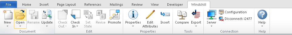
PTC has been busy working on an update to the Windchill Desktop Integration ribbon interface in Microsoft Office. The current ribbon implementation has been in place for a long time and looks like this. It uses standard ribbon buttons with text labels. These text labels are a bit large and verbose, making the overall layout of the ribbon very wide as shown by the collapsed Local File Actions panel.
 |
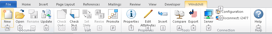
The objective of the redesign was to make the ribbon easier to use, by presenting the most commonly used actions with large icons in a compact manner that will reduce, if not eliminate the need to collapse the action panels. We accomplished this by implementing the Microsoft ribbon Split button which allows us to put the most commonly used actions directly on the ribbon and the secondary actions below in a drop down menu.
The new ribbon UI in Microsoft Office looks like this.
Hopefully you'll find this new layout much easier to use and folks will have much fewer questions regarding the use of the various actions in the Microsoft Office Windchill ribbon.
Labels:
- Labels:
-
Other
2 REPLIES 2
Feb 06, 2014
09:08 AM
- Mark as New
- Bookmark
- Subscribe
- Mute
- Subscribe to RSS Feed
- Permalink
- Notify Moderator
Feb 06, 2014
09:08 AM
The new ribbon interface will continue to support keyboard navigation via the Alt key for the primary and secondary actions.
.
Feb 06, 2014
10:43 AM
- Mark as New
- Bookmark
- Subscribe
- Mute
- Subscribe to RSS Feed
- Permalink
- Notify Moderator
Feb 06, 2014
10:43 AM
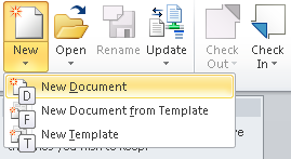
It's interesting how bypassed tech continues to hang on. A floppy disk is the symbol for Save or Rename. A pencil with an eraser for changing attributes, and a file folder as a symbol for open. PowerPoint uses the tripod stand screen, an item rarely used anymore, as the presentation start icon.
I think any icon that requires text to tell what it's for is a failure, though most times they fail because there is no good way to deal with complex concepts in pictures. Some say a picture is worth a thousand words, but they don't mention that those words are different for every person viewing the picture.
I'll bet if the words were removed from the icons, almost no one could figure out what they are for, but if the icons were removed, the interface could be used just as easily.

