Community Tip - Need to share some code when posting a question or reply? Make sure to use the "Insert code sample" menu option. Learn more! X
- Subscribe to RSS Feed
- Mark Topic as New
- Mark Topic as Read
- Float this Topic for Current User
- Bookmark
- Subscribe
- Mute
- Printer Friendly Page
Plotting a family of curves
- Mark as New
- Bookmark
- Subscribe
- Mute
- Subscribe to RSS Feed
- Permalink
- Notify Moderator
Plotting a family of curves
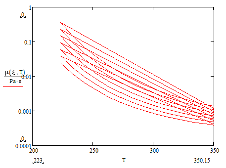
I am trying to plot the curves of the properties of monoethylene glycol solutions in water, working from the parametric equations given in M. Conde Engineering "Properties of Working Fluids - Brines" (http://www.mrc-eng.com/Downloads/Brine%20Properties.pdf). Ultimately, I want to show the curves cut off properly at the freezing point line, as in the Conde document, and also to be able to show index lines for a specific temperature and glycol concentration. But I am struggling to get even the curves to plot correctly. If I set up the equations using range variables for glycol concentration and temperature I get the right sort of graph but with 'flyback' lines between each curve. Here's an example, for the dynamic viscosity; the various curves are for 0%, 10%..60% glycol in water.

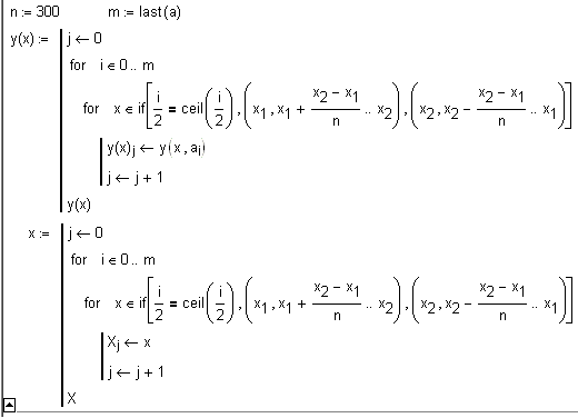
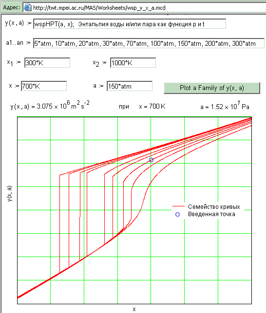
I have found the various discussions here on plotting families of curves and waterfall curves. I am trying to follow the method illustrated by Valery Ochkov in his example sheet 2D_Plot_y_x_a.xmcdz, but I am not getting it to work for me. I am getting error messages like 'These array dimensions do not match' and 'All evaluations resulted in either an error or a complex result'.
I am using Mathcad 15 (M005), but I am not very experienced in using Mathcad for matrix manipulation; I am not sure I am even reading the example sheet correctly. Can anyone help?
Gerard
Solved! Go to Solution.
- Labels:
-
Other
Accepted Solutions
- Mark as New
- Bookmark
- Subscribe
- Mute
- Subscribe to RSS Feed
- Permalink
- Notify Moderator
You are trying too hard ![]()
If you plot a vector on the x-axis and a matrix on the y-axis, where the matrix and vector have the same number of rows, then you get a line for each column of the matrix. You don't need any program to do this, but I did put in a helper function that makes it easier to fill a vector using a range.
- Mark as New
- Bookmark
- Subscribe
- Mute
- Subscribe to RSS Feed
- Permalink
- Notify Moderator
Thanks for this solution too; quite different from Valery Ochkov's. His appears to draw the curves forewards and backwards as a continuous line but yours draws a series of separate curves - very neat!
- Mark as New
- Bookmark
- Subscribe
- Mute
- Subscribe to RSS Feed
- Permalink
- Notify Moderator
try "draw" for curve type rather than "line"
- Mark as New
- Bookmark
- Subscribe
- Mute
- Subscribe to RSS Feed
- Permalink
- Notify Moderator
I'd seen your similar comment to other threads before, but had not previously understood it. This time I found where the curve type can be changed. I must say the Mathcad User Guide is not very forthcoming about the curve types; I had not seen them - maybe I hadn't had the need - previously.
- Mark as New
- Bookmark
- Subscribe
- Mute
- Subscribe to RSS Feed
- Permalink
- Notify Moderator
- Mark as New
- Bookmark
- Subscribe
- Mute
- Subscribe to RSS Feed
- Permalink
- Notify Moderator
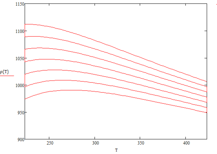
Thanks for the program and for correcting my graph.
There's one thing I am not sure I understand; that is why the format of ϱ(T) as I entered it is different from your graph. If I write ϱ(T) on the axis placeholder, it doesn't work, but if I copy it from the program, it does work. Presumably there is a format error, that as I write it, it appears as a function but as copied it has another format. What should that format be?
- Mark as New
- Bookmark
- Subscribe
- Mute
- Subscribe to RSS Feed
- Permalink
- Notify Moderator
Valery is playing games with variable names. Type
r,
Ctrl g,
Ctrl Shft k,
(T)
Ctrl Shft k
That gives you a variable name, whereas
r,
Ctrl g,
(T)
gives you a function definition with T as the argument.
- Mark as New
- Bookmark
- Subscribe
- Mute
- Subscribe to RSS Feed
- Permalink
- Notify Moderator
So that's what he did, and how he did it. Thank you.
Thanks to everybody who contributed. I've learned (sometimes re-learned) a lot!
- Mark as New
- Bookmark
- Subscribe
- Mute
- Subscribe to RSS Feed
- Permalink
- Notify Moderator
Thanks Ricardo an sorry Gerard.
I have the description of this method
But have no time to translate it into English.
See please pictures from this chapter of the book.


- Mark as New
- Bookmark
- Subscribe
- Mute
- Subscribe to RSS Feed
- Permalink
- Notify Moderator
Sorry? For what? You have been a great help. I should be thanking you more.
I started with your solution simply because I am reading your new book "Thermal Engineering Studies with Excel, Mathcad and Internet". After all the help I have received in this thread I now reckon I could make any of the suggested solutions work for what I wanted to do (I am now successfully hiding/not displaying the parts of each curve for temperatures below the freezing point of the mixture, and am working on the boiling point cut-off). I marked Richard's suggestion as the Correct Answer simply because it was easier for me to follow as I was re-learning how to graph data from matrices; now that I have grasped it, I see your solution works equally well.
I really should make more frequent use of Mathcad so I don't have to ask these beginners questions from time to time. But nowdays I seldom have the opportunity to get my hands dirty in the engineering maths; it's almost all the management side now, and providing guidance and information to the younger engineers when they get stuck.
Many thanks,
Gerard
- Mark as New
- Bookmark
- Subscribe
- Mute
- Subscribe to RSS Feed
- Permalink
- Notify Moderator
Thank you for the link to the book chapter. Google Translate (https://translate.google.com/translate?hl=en&sl=ru&tl=en&u=http%3A%2F%2Ftwt.mpei.ac.ru%2FTTHB%2F5%2F3%2Findex.html) does a good enough translation for understanding.
Actually, with all the help I got from you and others I now have the worksheet working. I just have to tidy it up for good presentation; at the moment it contains a number of redundant sections and check results.


