cancel
Showing results for 
Search instead for 
Did you mean: 
cancel
Showing results for 
Search instead for 
Did you mean: 

Community Tip - You can Bookmark boards, posts or articles that you'd like to access again easily! X

Printing PDF vs. TIFF

ptc-4857215
1-Newbie

Printing PDF vs. TIFF

Hello,

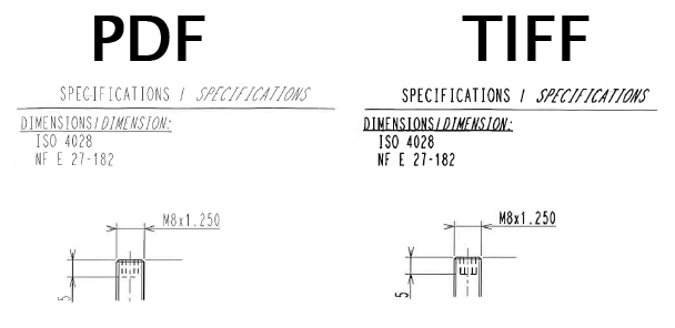
My company is just starting to investigate creating our prints in PDF format rather than TIFF. In doing so, i've come across something i cannot explain. When i create a TIFF and a PDF using the same pen table file, the resulting print is not identical. As you can see below the dimensions and text in the TIFF file are much darker than the PDF file. Can anyone explain this phenomenon?

PDF+vs.+TIFF.jpg

Below is the text from the pen table file we are using.

pen 4 thickness 0.08 cm;

pen 1 thickness 0.025 cm;

pen 3 pattern 0.2 , 0.1 , cm;thickness 0.025 cm


This thread is inactive and closed by the PTC Community Management Team. If you would like to provide a reply and re-open this thread, please notify the moderator and reference the thread. You may also use "Start a topic" button to ask a new question. Please be sure to include what version of the PTC product you are using so another community member knowledgeable about your version may be able to assist.
8 REPLIES 8

Are you printing the PDF at 1:1?

PDF has some intelligence about line weights and this is what the printing code sends to the file. I have noticed even on the screen that once you size the print to 125% in Acrobat reader, things finally look good.

I have resorted to giving my fonts line weight (.012) and stroke all fonts to avoid some other issues with TTF's.

Feel free to pose this question to the customer service group. Just create a support case and see what PTC has to say about this. it certainly isn't the 1st time we discussed this.

TIFF is a bitmap, and has a minimum width line based on the DPI you allowed when the file was created.

Given a PDF, Adobe Reader or Acrobat will attempt to produce the actual width of the line subject to the minimum width based on the DPI of the printer or display.

So, if the TIFF is created at 100 DPI the smallest line is .010 wide, regardless of the pen table setting. If the pen table is set to .001 the result will still be .010.

On the PDF a .001 width being sent to a 300 dpi printer will result in a line that is .00333 wide. If it is sent to a 600 dpi printer it will be .001666 wide.

To make them look the same, the DPI at which they are created needs to match.

The reason zooming up in Reader looks better is that the width of the lines needs to be noticeably larger than the size of the pixels to avoid aliasing. By default, Reader trys anti-aliasing for very fine lines, unless the line weights option is used. (In ReaderX it is Preferences/Page Display/Enhance thin lines)

For a decent comparison, import the PDF into GIMP or Adobe Photoshop and change the DPI to which the image is coverted. You'll see the effect of pixel size vs minimum line width.

I understand what you are saying, and i turns out my DPIs were different but making them the same didn't change anything. I am saving the TIFF/PDF at 400 DPI which would give me a minimum line thickness on the TIFF of 0.00635 cm. The lowest line thickness value in my pen table is .025 cm which is well above the minimum.

OK - Can you save a Postscript file generated based on the same pen table? (I'm hoping that you looked very closely to be sure of using the same pen table for PDF and TIFF.)

The Postscript file should have the same information that is fed into creating the PDF.

A Postscript file is a text file and anything that can edit text can open it. What you are looking for is a line with a "slw" or "setlinewidth" command preceded by a number. That number is the width in inches that is applied to draw the graphics that follow it, until another "slw" or "setlinewidth**" command comes along. You can see if the expected widths are being used. You should find ".0984 slw" (0.025cm) in the file.

Just to be sure, see that a line that reads "72 72 scale" is near the top of the file. This scales the image from 72nds of an inch to inch units. I think you get the drift.

Also, the DPI setting for PDFs only affects shaded images; it should affect nothing else.

(Grasping at a straw) Finally, the outputs must be generated to the same size. Making the sizes different will make the line widths appear different.

**setlinewidth is the Postscript command. slw is defined by PTC to be the same to save space in the file.

One more thing occurs to me - If you are using TTFs, the line widths should be driven by the font definition unless you use the 'stroke fonts' option.

That's a great explanation, David. I always use 600DPI and my dimensions and leaders toggle between two thicknesses thorugh out the drawings. I will have to see if this gets better with a lower DPI setting.

If only... PTC had just taken the time to embed the font definitions into the Postscript output, life would be somewhat easier. Acrobat could convert the files into searchable PDFs and Photoshop or other utility could generate accurate, controlled bitmaps with resolution managed at the conversion.

Check the Wikipedia page for TIFF. It's a nearly bottomless bucket of graphics format pain. Basically, TIFF describes the container, not necessarily the contents. For example of weird JPEG is a TIFF compression method. At least with Postscript you can read the file (though you may have to decompress sections of it) and see what will happen. JPEG, GIF, PNG are much narrower standards.

David Schenken wrote:

TIFF is a bitmap, and has a minimum width line based on the DPI you allowed when the file was created.

Given a PDF, Adobe Reader or Acrobat will attempt to produce the actual width of the line subject to the minimum width based on the DPI of the printer or display.

So, if the TIFF is created at 100 DPI the smallest line is .010 wide, regardless of the pen table setting. If the pen table is set to .001 the result will still be .010.

On the PDF a .001 width being sent to a 300 dpi printer will result in a line that is .00333 wide. If it is sent to a 600 dpi printer it will be .001666 wide.

To make them look the same, the DPI at which they are created needs to match.

The reason zooming up in Reader looks better is that the width of the lines needs to be noticeably larger than the size of the pixels to avoid aliasing. By default, Reader trys anti-aliasing for very fine lines, unless the line weights option is used. (In ReaderX it is Preferences/Page Display/Enhance thin lines)

For a decent comparison, import the PDF into GIMP or Adobe Photoshop and change the DPI to which the image is coverted. You'll see the effect of pixel size vs minimum line width.

Wow! That solves my issues completely. Who would have known.

Printouts from PDF are the same regardless of setting (it appears) but screen viewing is seriously improved when disabling the Enhance thin lines option.

As for the TIFF vs PDF... In Creo 2.0 - They are very close to the same. The big difference is that shaded images don't plot with TIFF, and TIFF does plot some lines as gray rather than black where PDF plots thin black lines on tangent edges and fonted sketch lines. I set the System colors to black an d white; output to TIFF printer file (not export "POP" screen image)

tiffvspdf.PNG

PDF-Left TIFF-Right

See why I love this forum

Top Tags