
Turn on suggestions
Auto-suggest helps you quickly narrow down your search results by suggesting possible matches as you type.
Showing results for
Please log in to access translation
Turn on suggestions
Auto-suggest helps you quickly narrow down your search results by suggesting possible matches as you type.
Showing results for
Community Tip - Learn all about PTC Community Badges. Engage with PTC and see how many you can earn! X
- Community
- Creo (Previous to May 2018)
- Creo Modeling Questions
- Concepts - Lighting Strategies
Translate the entire conversation x
Please log in to access translation
Options
- Subscribe to RSS Feed
- Mark Topic as New
- Mark Topic as Read
- Float this Topic for Current User
- Bookmark
- Subscribe
- Mute
- Printer Friendly Page
Concepts - Lighting Strategies
Sep 23, 2011
01:18 PM
- Mark as New
- Bookmark
- Subscribe
- Mute
- Subscribe to RSS Feed
- Permalink
- Notify Moderator
Please log in to access translation
Sep 23, 2011
01:18 PM
Concepts - Lighting Strategies
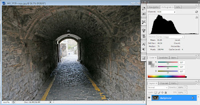
To kick things off, I'm pulling a link from the archives to help you with rendering. I'm seeing some great stuff being rendered however the thing that stands out the most is the flatness in the renderings. By flatness, I refer to the even tone across the image which if you were to open the image in Photoshop and looked at the histogram you'd end up seeing a traditional bell curve:
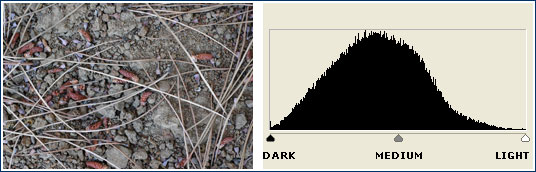
This leads to a very flat, even toned image. What you want, is pizazz or in simple terms contrast. Some artists lean towards the crunchy side where you pull the distribution more to the dark side:
While you can approach this in post, it is not nearly as good as rendering with good lighting in mind. So to kick things off, here's a refresher on the old staple 3-point lighting:
0 REPLIES 0
