Community Tip - When posting, your subject should be specific and summarize your question. Here are some additional tips on asking a great question. X
- Community
- Creo+ and Creo Parametric
- 3D Part & Assembly Design
- In sketch is it possible to get windows text fonts...
- Subscribe to RSS Feed
- Mark Topic as New
- Mark Topic as Read
- Float this Topic for Current User
- Bookmark
- Subscribe
- Mute
- Printer Friendly Page
In sketch is it possible to get windows text fonts as single thickness?
- Mark as New
- Bookmark
- Subscribe
- Mute
- Subscribe to RSS Feed
- Permalink
- Notify Moderator
In sketch is it possible to get windows text fonts as single thickness?
We put engraving in our dies.
Unfortunately we have to match our engraving characters with metal hand stamp characters because over the die life the CNC'd characters lose their crispness.
Knowing the type of character used by the hand stamp I am wondering if it would be possible to use this text in our dies. The only problem is that the windows fonts are double line walled and we need this to just be single walled (or no volume).
Creo's default text CNC's much better than our curve created match of the Gothic hand stamps. The problem is that they don't match the hand stamps.
Could anyone point us in a direction that would allow us to place text created stamp characters that match the hand stamps?
Solved! Go to Solution.
Accepted Solutions
- Mark as New
- Bookmark
- Subscribe
- Mute
- Subscribe to RSS Feed
- Permalink
- Notify Moderator
Paul,
I do not think that usage of Creo font leads you into troubles. You can test existing fonts to get some experience.
The trouble from your point of view is fact that Creo font are composed from straight lines (you cannot define arcs and splines to get smooth character outlines).
Example of Creo font source file:
Creo2_LOADPOINT\Creo 2.0\Common Files\M070\text\usascii\ascii.src
Information concerning Creo fonts:
See attached PDF file, start on page 119.
If you want to create your own font you have to take a paper with square grid and sketch your characters using straight lines. Then you have to described pen movement using m and d commands. There is no software editor available (I mean free of charge software).
At the end you have to translate source file, put it into appropriate directory and also create ndx file.
Translate command entered in Command prompt window (Windows 64-bit):
setenv COMPILE_FONT_PMT 36
compile_font.exe myfont.src myfont.fnt
Conclusion: Creation of Creo font is VERY complicated and time consuming.
Martin Hanak
Martin Hanák
- Mark as New
- Bookmark
- Subscribe
- Mute
- Subscribe to RSS Feed
- Permalink
- Notify Moderator
Paul,
please can you attach some picture of your hand stamp. Also can you explain the term "windows fonts are double line walled" ?
Martin Hanak
Martin Hanák
- Mark as New
- Bookmark
- Subscribe
- Mute
- Subscribe to RSS Feed
- Permalink
- Notify Moderator
Martin,
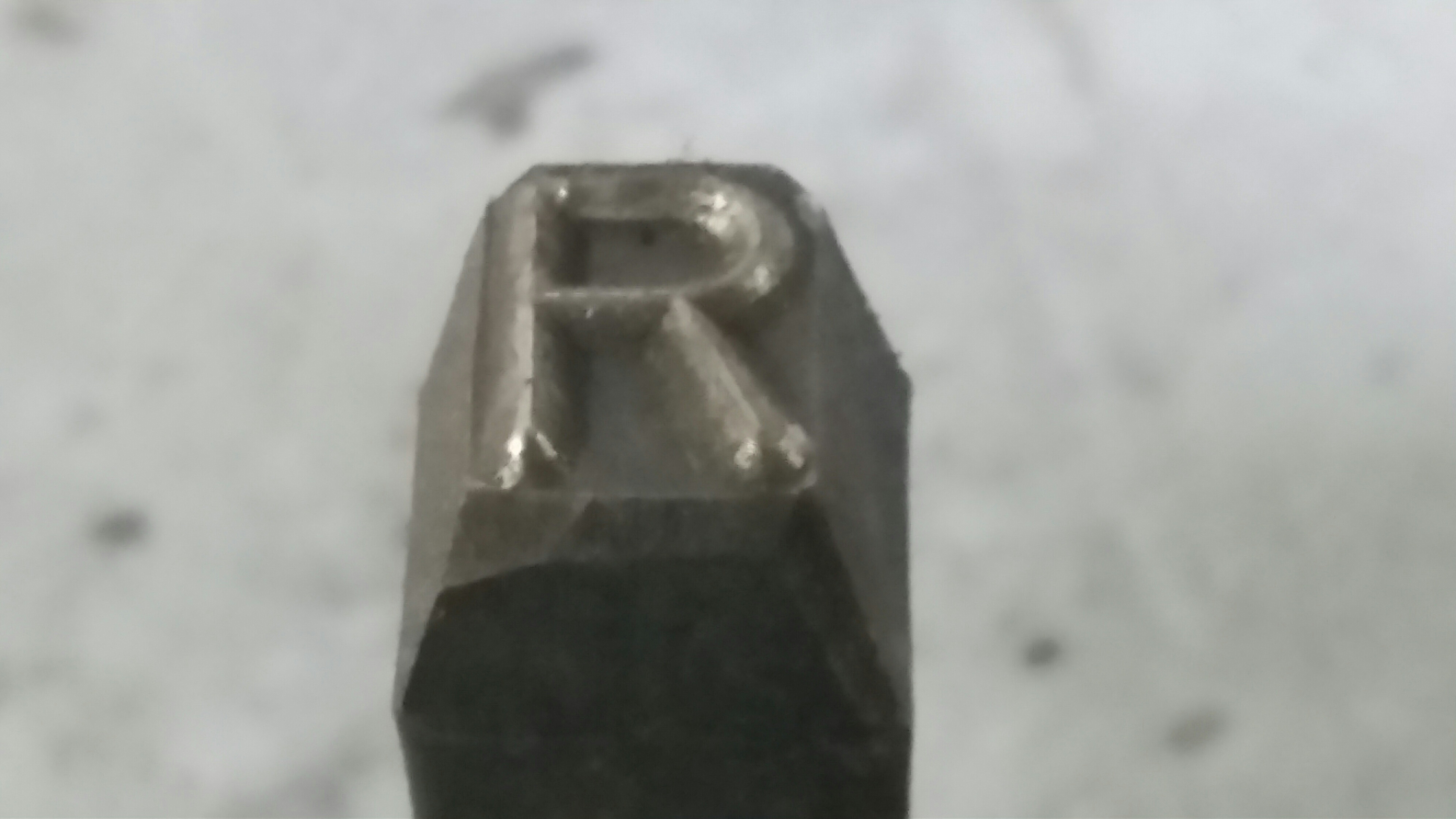
Here is what the hand stamp looks like.

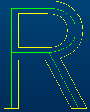
Here is what the supposed correct true font looks like in Creo.
The hand stamp comes to a sharp edge and is angled back from this single edge.
The true font equivalent has thickness all around the letter. This will not machine correctly.
Creo does have fonts that don't have the thickness as shown below.
This is what I need, but I need the true type font to match the hand stamp font we have.
- Mark as New
- Bookmark
- Subscribe
- Mute
- Subscribe to RSS Feed
- Permalink
- Notify Moderator
Hi Paul,
since most Windows fonts are true type fonts (.ttf) they are typically outline and fill (and varying thicknesses).
What you are looking for is a 'stroke font'.
You can find some stroke fonts inside Creo as well, like the ISOFONT...
- Mark as New
- Bookmark
- Subscribe
- Mute
- Subscribe to RSS Feed
- Permalink
- Notify Moderator
Constantin,
I'm doing a Google search to see whether there might be a match to the "stroke font" to what we are looking for.
- Mark as New
- Bookmark
- Subscribe
- Mute
- Subscribe to RSS Feed
- Permalink
- Notify Moderator
LeRoy is a good line type font in Pro/E for machining purposes.
- Mark as New
- Bookmark
- Subscribe
- Mute
- Subscribe to RSS Feed
- Permalink
- Notify Moderator
LeRoy doesn't match our hand stamp characters but I'll keep it in mind for applications where we don't need to match the hand stamps.
- Mark as New
- Bookmark
- Subscribe
- Mute
- Subscribe to RSS Feed
- Permalink
- Notify Moderator
Paul,
I think you have the following choices:
1.]
sketch TTF character "centerline" (green curve) derived from TTF character (yellow curve)

2,]
sketch R letter from scratch using Sketcher entities - lines, arcs, splines
3.]
create your own TTF font using BirdFont (http://http://birdfont.org/)
Martin Hanak
Martin Hanák
- Mark as New
- Bookmark
- Subscribe
- Mute
- Subscribe to RSS Feed
- Permalink
- Notify Moderator
Martin,
I have the text characters already made using lines, arcs and splines.
I would like to be able to type out text instead of placing these small individual sketches into a sketch.
I would also like to see the advantage of more efficient machining of this type of character.
The birdfont option does look interesting but in the youtube examples that I watched the fonts all had thickness. I'm not sure whether this can handle no thickness characters.
- Mark as New
- Bookmark
- Subscribe
- Mute
- Subscribe to RSS Feed
- Permalink
- Notify Moderator
i think you would have to use modelling tools to get that.
sweep,extrude,boundary blend etc.
- Mark as New
- Bookmark
- Subscribe
- Mute
- Subscribe to RSS Feed
- Permalink
- Notify Moderator
Paul,
you are right. TTF character cannot containg single line. Therefore Birdfont software is dead end ![]() .
.
ProE font is also dead end, because it can contain straight segments, only ... and also font editor is not available.
So you can continue using current procedure.
Martin Hanak
Martin Hanák
- Mark as New
- Bookmark
- Subscribe
- Mute
- Subscribe to RSS Feed
- Permalink
- Notify Moderator
Martin,
Our current procedure is not too bad. We have our stamp characters placed in the Sketch Palette so they are easy to bring up.
I was just hoping that there was a way of typing out what needs stamped and perhaps a corresponding cleaner machine path.
Even if this font needed generated from scratch it would have benefits in the long run.
- Mark as New
- Bookmark
- Subscribe
- Mute
- Subscribe to RSS Feed
- Permalink
- Notify Moderator
It's possible to create your own fonts for PTC; they included a font compiler for a long time. This is how the single stroke FONT is created. The font definition for FONT used to be included and users would modify the source for it to add serifs to distinguish 1, l and I from each other.
- Mark as New
- Bookmark
- Subscribe
- Mute
- Subscribe to RSS Feed
- Permalink
- Notify Moderator
David,
I did a little search on compiling your own fonts and couldn't really find any how to instructions.
I read how someone ended up with some troublesome results. I couldn't understand what was being described.
Would I be correct in saying that developing my own single stroke font to be used in sketches for stamping characters would be more trouble than it would be worth?
- Mark as New
- Bookmark
- Subscribe
- Mute
- Subscribe to RSS Feed
- Permalink
- Notify Moderator
Paul,
I do not think that usage of Creo font leads you into troubles. You can test existing fonts to get some experience.
The trouble from your point of view is fact that Creo font are composed from straight lines (you cannot define arcs and splines to get smooth character outlines).
Example of Creo font source file:
Creo2_LOADPOINT\Creo 2.0\Common Files\M070\text\usascii\ascii.src
Information concerning Creo fonts:
See attached PDF file, start on page 119.
If you want to create your own font you have to take a paper with square grid and sketch your characters using straight lines. Then you have to described pen movement using m and d commands. There is no software editor available (I mean free of charge software).
At the end you have to translate source file, put it into appropriate directory and also create ndx file.
Translate command entered in Command prompt window (Windows 64-bit):
setenv COMPILE_FONT_PMT 36
compile_font.exe myfont.src myfont.fnt
Conclusion: Creation of Creo font is VERY complicated and time consuming.
Martin Hanak
Martin Hanák
- Mark as New
- Bookmark
- Subscribe
- Mute
- Subscribe to RSS Feed
- Permalink
- Notify Moderator
Martin,
Thank you for your answer. When we get the opportunity it will be good to try this.
It is unfortunate that there isn't pre-existing fonts that could be used, but perhaps when we put the time and effort into this it will be time that is rewarded.
Thank you for the how to information.
- Mark as New
- Bookmark
- Subscribe
- Mute
- Subscribe to RSS Feed
- Permalink
- Notify Moderator
I'm looking through the font creation documentation.
In order to maintain proper character size it would be very helpful if 1) You could directly bring in already created IGES characters or 2) Have the already created character as a back drop for building your own character (such as that which Bird Font allows).
Is this possible or do the characters you develop have to be completely eye balled?
- Mark as New
- Bookmark
- Subscribe
- Mute
- Subscribe to RSS Feed
- Permalink
- Notify Moderator
Paul,
functionality 1) and 2) is not available. You use paper and Notepad ![]() .
.
Martin Hanak
Martin Hanák
- Mark as New
- Bookmark
- Subscribe
- Mute
- Subscribe to RSS Feed
- Permalink
- Notify Moderator
MartinHanak 撰写:
Paul,
I do not think that usage of Creo font leads you into troubles. You can test existing fonts to get some experience.
The trouble from your point of view is fact that Creo font are composed from straight lines (you cannot define arcs and splines to get smooth character outlines).
Example of Creo font source file:
Creo2_LOADPOINT\Creo 2.0\Common Files\M070\text\usascii\ascii.src
Information concerning Creo fonts:
See attached PDF file, start on page 119.If you want to create your own font you have to take a paper with square grid and sketch your characters using straight lines. Then you have to described pen movement using m and d commands. There is no software editor available (I mean free of charge software).
At the end you have to translate source file, put it into appropriate directory and also create ndx file.
Translate command entered in Command prompt window (Windows 64-bit):
setenv COMPILE_FONT_PMT 36
compile_font.exe myfont.src myfont.fnt
Conclusion: Creation of Creo font is VERY complicated and time consuming.
Martin Hanak
MartinHanak:
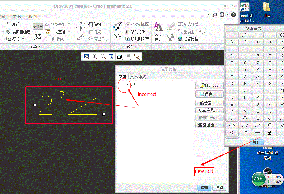
After i add a new symbol in the special.src and compiled it ,but it display incorrectly in the creo,as follows ,can you fix it ?
- Mark as New
- Bookmark
- Subscribe
- Mute
- Subscribe to RSS Feed
- Permalink
- Notify Moderator
Hi,
I think it is not possible to display your special character correctly inside the dialog box.
MH
Martin Hanák
- Mark as New
- Bookmark
- Subscribe
- Mute
- Subscribe to RSS Feed
- Permalink
- Notify Moderator
Why? i want to add the superscript ,there is another way?
- Mark as New
- Bookmark
- Subscribe
- Mute
- Subscribe to RSS Feed
- Permalink
- Notify Moderator
why the ptc's symbol can display correctly.whether i make mistakes in the special.src?
- Mark as New
- Bookmark
- Subscribe
- Mute
- Subscribe to RSS Feed
- Permalink
- Notify Moderator
Hi,
please do not ask me such questions ![]() . Ask PTC Support.
. Ask PTC Support.
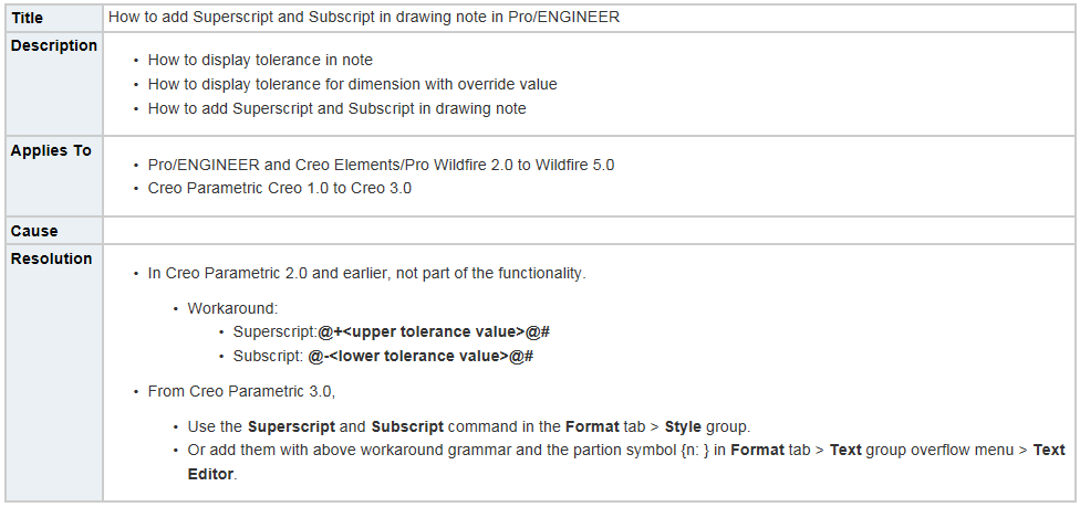
FYI: According to https://support.ptc.com/appserver/cs/view/solution.jsp?n=CS38901 superscript functionality is implemented in Creo Parametric 3.0.
MH
Martin Hanák
- Mark as New
- Bookmark
- Subscribe
- Mute
- Subscribe to RSS Feed
- Permalink
- Notify Moderator
thank you ,but i haven't the access to ptc esupport,can you give me a snapshot picture.
- Mark as New
- Bookmark
- Subscribe
- Mute
- Subscribe to RSS Feed
- Permalink
- Notify Moderator

Martin Hanák
- Mark as New
- Bookmark
- Subscribe
- Mute
- Subscribe to RSS Feed
- Permalink
- Notify Moderator
Thank you very much![]()


