- Community
- IoT & Connectivity
- IoT & Connectivity Tips
- A New & Improved Visual SDK for Web Components in ...
- Subscribe to RSS Feed
- Mark as New
- Mark as Read
- Bookmark
- Subscribe
- Printer Friendly Page
- Notify Moderator
A New & Improved Visual SDK for Web Components in ThingWorx 9.0 – Check It Out!
Hello, IIoT Developers!
Today, I’m going to provide you an overview of a new SDK we’re offering for developers to build custom web content. It’s called our Visual SDK. We released 9.0 in June, so it’s time to start getting excited! In case you missed it, check out these other 9.0 posts on active-active clustering, Composer and Mashup Builder, and the 9.0 release overall.
In 8.4, we introduced a new visualization architecture and set of web components based on Polymer. We’ve continually updated and added new widgets and features with this architecture each release, including new Chart Components in 9.0. This SDK was previously available mostly as a style guidance, informing designers and developers what elements and behaviors were available in the new PTC web component-based widgets. You could use this SDK to style in CSS custom elements of the web components in a mashup-based application. You weren’t, in 8.4, really able to use this SDK yet to actually create your own Polymer web components and have them be as robust in the Mashup Builder in ThingWorx.
In 9.0, this SDK has been expanded so you not only have style and behavioral descriptions of PTC components, but you also have tutorials and utilities that let you create your own components and import them into the Mashup Builder. The possibilities are endless here for custom content, so let’s look at what’s inside.
The SDK guide has a quick outline of some pre-requisites you should know about as you enter custom web development with ThingWorx. Things like knowledge of Polymer 3, downloading common tools like NPM and Gulp CLI, Aurelia, etc. Much of this info is also included in markdown documents within the SDK files, but the SDK web content makes it easier to follow and search.
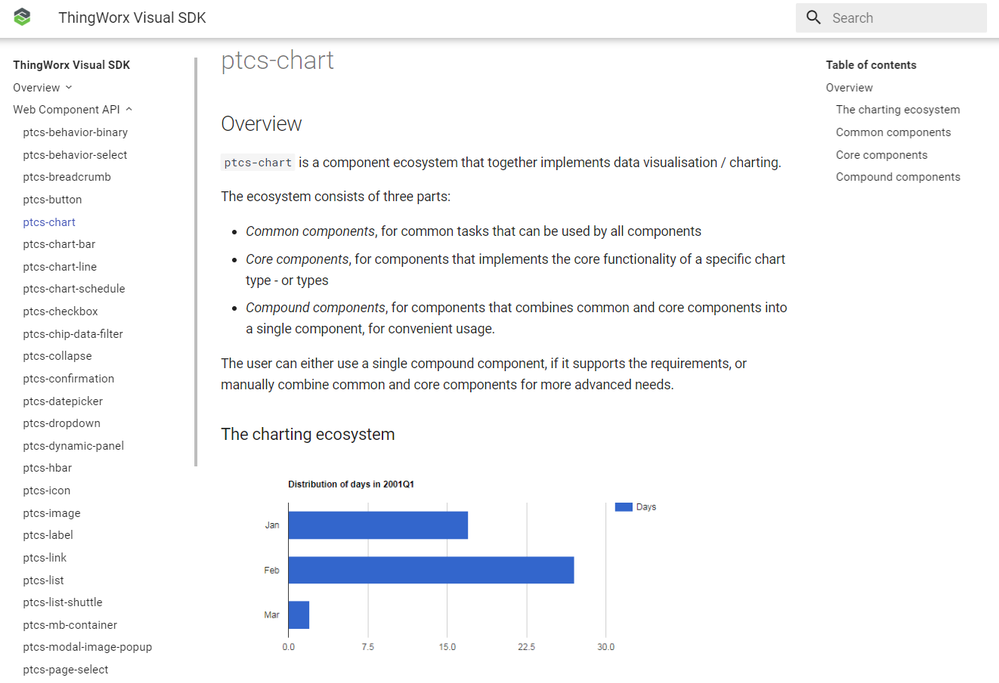
From there, the guide walks you through more setup of your SDK directories, NPM install of PTC components, and basics around dependencies, styling, and demo pages. Each PTC-developed web component is also available in the SDK pages as well with more information on what they offer and their basic designs. This is useful if you would like to reference the PTC components as imports into your own web component. This technique is very useful for re-use and upgrade safety when developing custom components on top of ThingWorx.
The SDK also includes a getting started tutorial and a sample Polymer component and a widget called simple-el , which are helpful as you want to reference during development and familiarizing yourself with concepts. The component is functional and offers a theme dropdown so you can see how the theming engine and events work.
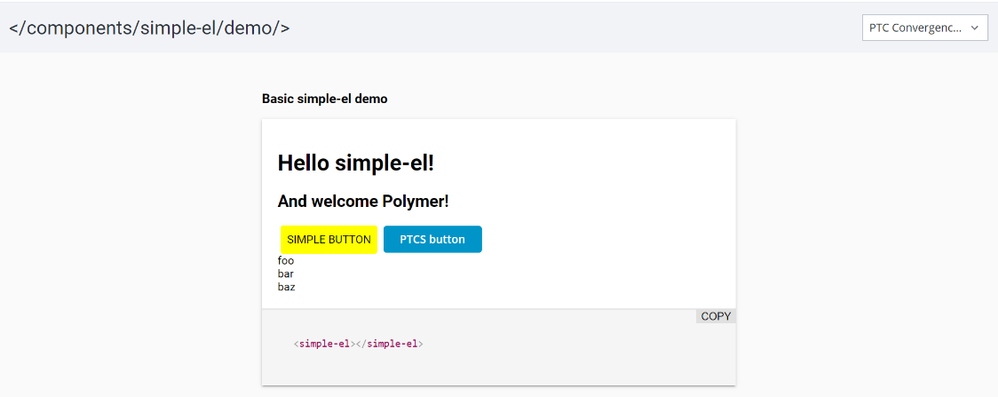

Once you have run the utility, you just import the artifact into a ThingWorx platform and it will be available for your application developers to use in their mashups as a widget. Again, how it appears in the design experience, what properties are exposed, how it responds to platform binding and theming events are all customizable in the SDK.
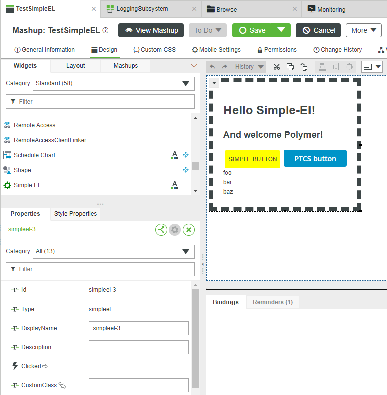
Once you get the hang of things with the sample code and understand the ins and outs, you can then use those same patterns to develop your own content! These are the same techniques that the PTC R&D team uses when they make each of the new widgets that you see in our product, like the 9.0 charts! Uber cool stuff!
Like what you see? Have a question? Drop us a line in the comments!
Stay connected!
Kaya
- Mark as Read
- Mark as New
- Bookmark
- Permalink
- Notify Moderator
Looking at https://polymer-library.polymer-project.org/3.0/docs/quick-tour Google claims "The Polymer library is in maintenance mode. For new development, we recommend Lit."
It would seem somewhat shortsighted to invest in developing based on a library that is at end of life. Can someone please advise what the direction would be to follow here?
Is PTC converting this functionality to Lit?
- Mark as Read
- Mark as New
- Bookmark
- Permalink
- Notify Moderator
Hi Duan,
We are aware of this and are currently evaluating Lit and Stencile as future options. While new feature development on Polymer is not happening with Google, the technology itself should still run in browsers and should be serviceable for the short to medium term future.
Stay posted for updates on this in future with ThingWorx as we craft our strategy.
Thanks.
Chris

