- Community
- IoT & Connectivity
- IoT & Connectivity Tips
- Analyzing External and ThingWorx Mashup Service Ex...
- Subscribe to RSS Feed
- Mark as New
- Mark as Read
- Bookmark
- Subscribe
- Printer Friendly Page
- Notify Moderator
Analyzing External and ThingWorx Mashup Service Execution Using Tomcat Access Logs
Background
Getting a performance benchmark of your running application is an important thing to do when deploying and scaling up an application in production. This not only helps focus in on performance issues quickly, but also allows for safely planning for scaling up and resource sizing based on real concrete data.
I recently created a tool and made a post about capturing and analysing ThingWorx utilisation statistics to do such an analysis, as well as identifying potential performance bottlenecks.
Although they are rich and precise, utilisation statistics fall short in a number of areas however - specifically being able to count and time specific service executions, as well as identifying and sorting based on the host executing the service.
Tomcat Access Log Analysis
As ThingWorx is a Tomcat web application, Tomcat logs details of the requests being made to the application server and ThingWorx REST API. The default settings include the host (IP address), date/timestamp, and request URI; which can be decoded to reveal relevant details like the calling entities and service executions.
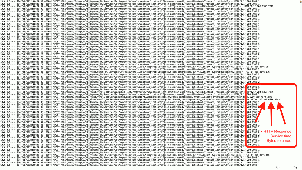
Adding 3 key additional variables (%s %B %D) to the server.xml access log value also gives us the HTTP response code, service execution time, and bytes returned from Tomcat. This is super useful as we can now determine exact time of service executions, and run statistics on their execution totals and execution time.
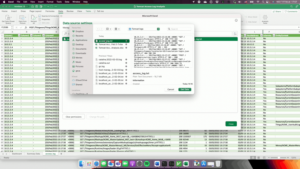
Once you have an access log file looking like the one above, you can attempt to load it into the access_log sheet in the analysis Excel workbook that I created. You do this by click on the access_log table, then selecting "Data > Get Data > Data Source Settings". You'll then be prompted with the following or similar pop-up allowing you to navigate to your access_log file to select and then load.
It should be noted that you'll have to Refresh the table after selecting the new access_log.txt file so that it is read in and populates the table. You can do this by right-clicking on the table and saying Refresh, or using the Data > Refresh button.
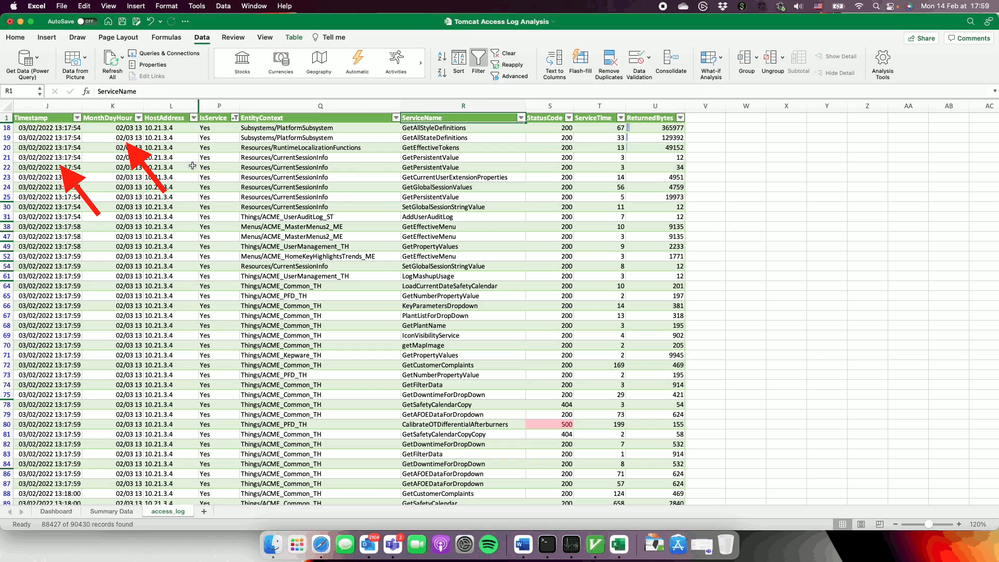
This workbook relies on a number of formulas to slice and dice the timestamp, and during my attempts at importing I had significant issues with this due to some of the ways that Excel does things automatically without any manual options. You really need to make sure that the timestamps are imported and converted correctly, or something in the workbook will likely not work as intended. One thing that I had to do was to add 1 second to round up 00:00:00 for the first entries as this was being imported as a date without the time part, and then the next lines imported as a date/time.
Depending on how many lines your file is, you'll likely also have to "Fill Down" the formulas on the right side of the sheet which may be empty in the table after importing your new data set. I had the best results by selecting the cells in question on the last row, then going down to the bottom corner, pushing and holding Shift, clicking on the last cell bottom right, and then selecting Home > Fill > Down to pull the formulas down from the top.
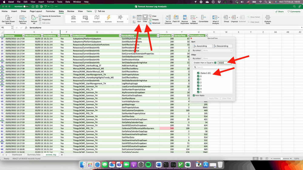
Once the data is loaded, you'll be able to start poking around. The filters and sorting by the named columns is really helpful as you can start out by doing things like removing a particular host, sorting by longest execution times, selecting execution times greater than 4 seconds, or only showing activity aimed at a particular entity or service.
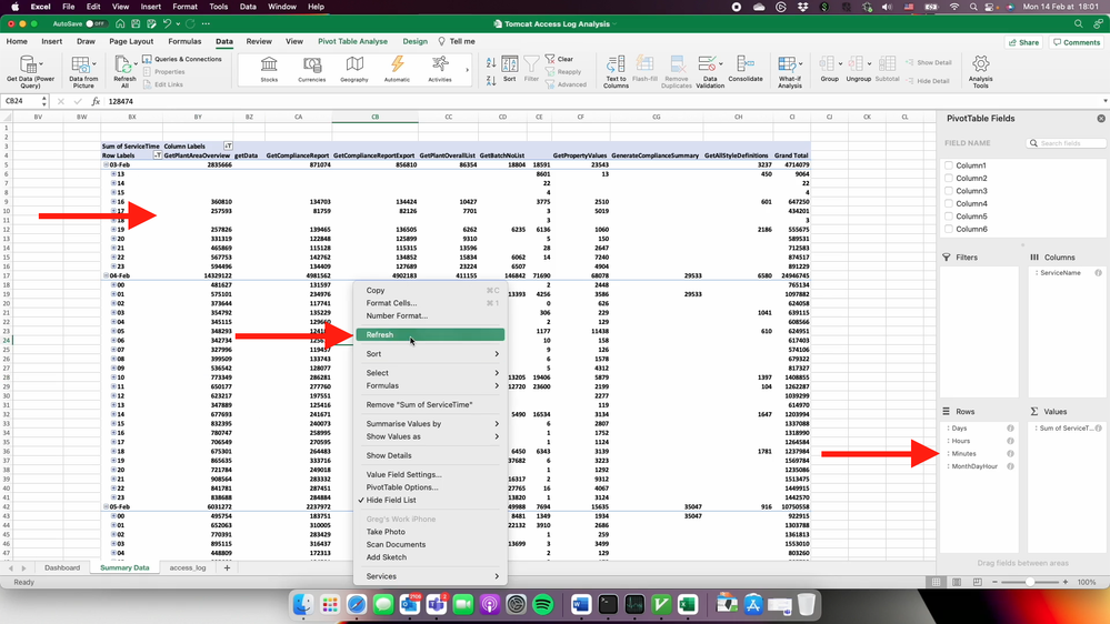
You really need to make sure that the imported data worked fine and looks perfect, as the next steps will totally break if not. With the data loaded, you can now go to the Summary Data table and right-click on one of the tables and select Refresh. This is reload the data in into the pivot table and re-run their calculations.
Once the refresh is complete, you should see the table summary like shown here; there are Day, Hour, and Minute expand/collapse buttons. You should also see the Day, Hour, Month fields showing in the Field Definitions on the right. This is the part that is painful -- if the dates are in the wrong format and Excel is unable to auto-detect everything in the same way, then you will not get these automatically created fields.
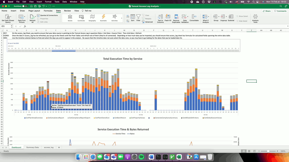
With the data reloaded, and Pivot Tables re-built, you should be able to go over to the Dashboard sheet to start looking at and analysing the graphs. This one is showing the Top 10 services organised into hourly buckets with cumulated service execution times.
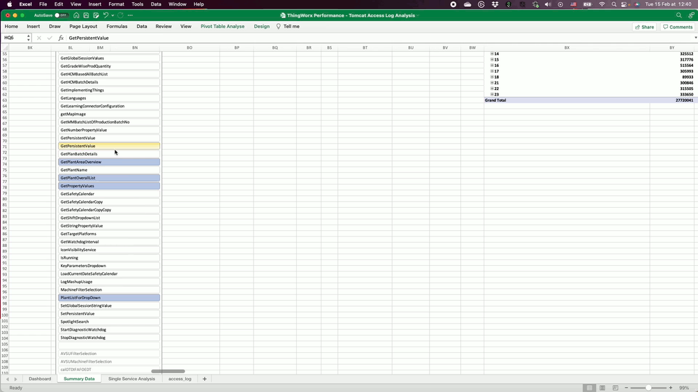
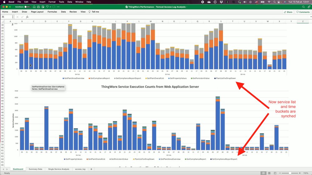
I'm not going to go into all of the workbooks features, but you can also individually select a set of key services that you want to have a look at together across both the execution count and execution time dimensions.
Next you can see the coordinated view of both total service execution time over number or service executions. This is helpful for looking for patterns where a service may be executing longer but being triggered the same amount of times, compared to both being executed and taking more time. I've created a YouTube video (see bottom) which goes through using all of the features as well as providing other pointers to using it.
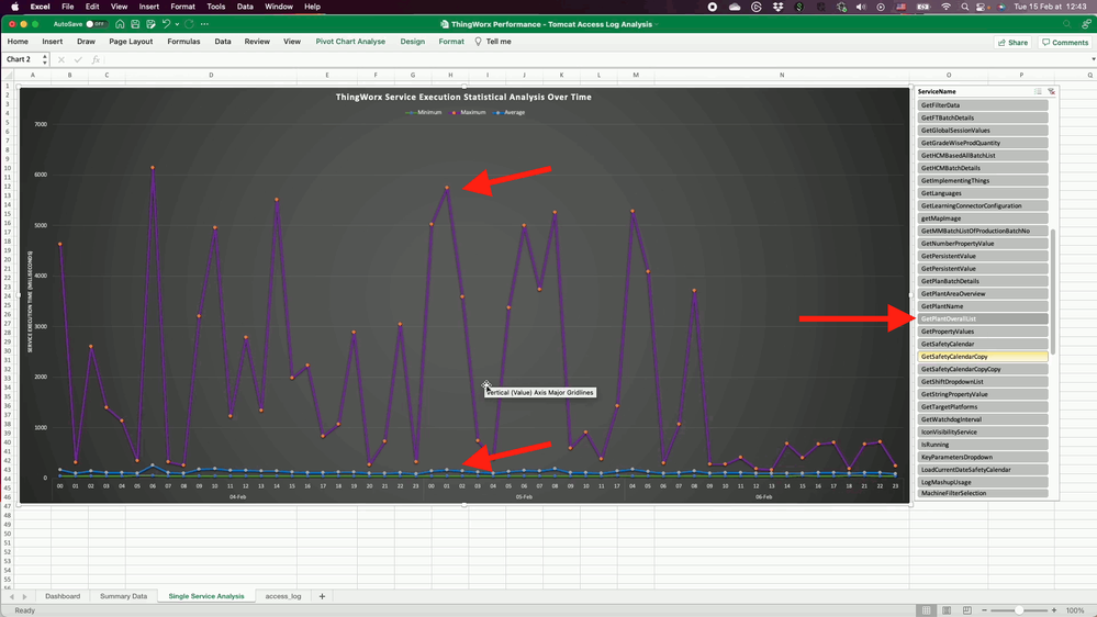
Getting into a finer level of detail, this "bonus" sheet provides a Pivot Table and Pivot Chart which allows for exploring minimum, maximum and average execution time for a specific service. Comparing this with the utilisation subsystem metrics taken during the same period now provide much deeper insight as we can pinpoint there the peaks were, how long they lasted, and where the slow executions were in relation to other services being executed at that time (example: identifying many queries/data processing occurring simultaneously).
Without further ado, you can download and play with my ThingWorx Tomcat Access Log Analysis Excel Workbook, and check out the recorded demonstration and explanation for more details on loading and analysis use.
[YouTube] ThingWorx Tomcat Access Logs - Service Performance Analysis
- Mark as Read
- Mark as New
- Bookmark
- Permalink
- Notify Moderator
Great Post, thank you Greg !

