Build an Engine Analytical Model Part 2
- October 25, 2022
- 0 replies
- 660 views
Step 4: Simulated Model
Models are primarily used by Analytics Manager (which will be discussed in the next guide), but they can still be used to estimate the accuracy of predictions.
When Models are calculated, they inherently withhold a certain amount of data (~20%). The prediction model is then run against the withheld data. This provides a form of "accuracy measure".
The withheld-data is selected randomly, so you'll actually get a slightly different model and accuracy measure each time that you create a Model versus the same dataset.
- On the left, click Analytics Builder > Models.
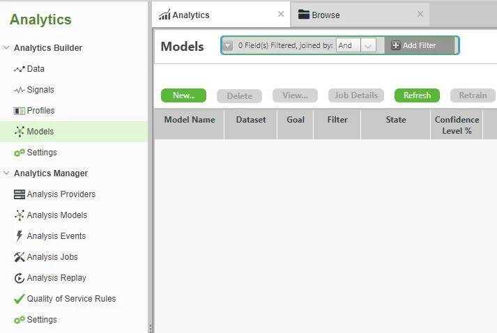
- Click New….
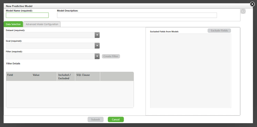
- In the Model Name field, enter simulated_model.
- In the Dataset field, select simulated_dataset.
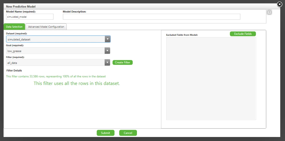
Click Submit.
- After ~60 seconds, the Model Status will change to COMPLETED.
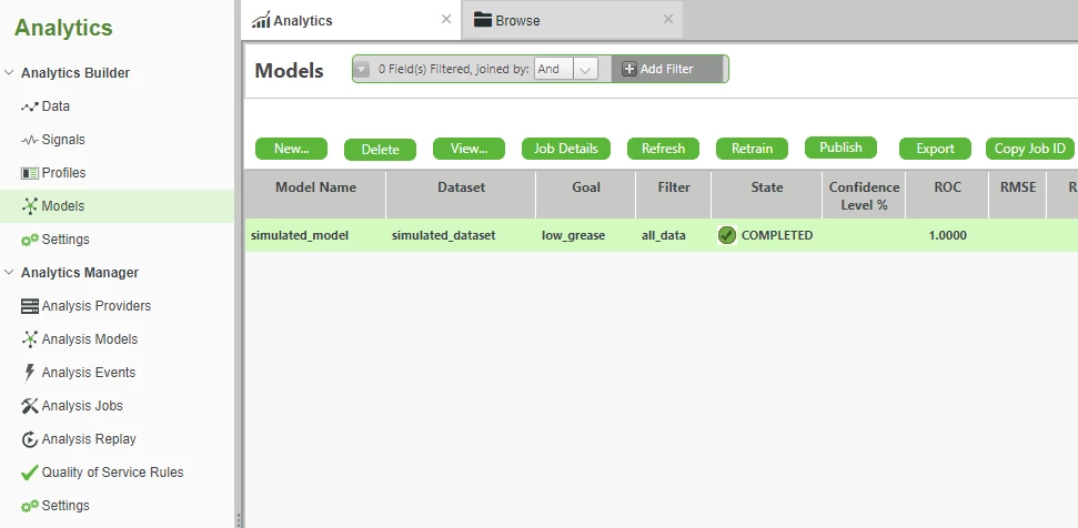
- Select the model that was created in the previous step, i.e. simulated_model.
- Click View… to open the Model Information page.
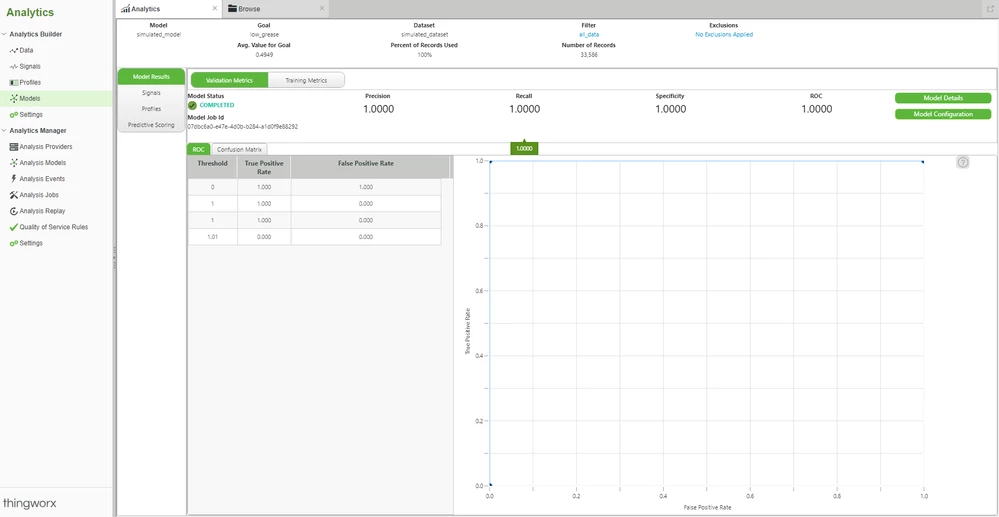
As with Signals and Profiles, our Model is once again "too good". In fact, it's perfect.
The expected "Precision" is 1.0, i.e. 100%. The True vs False Positive rate shown in the graph goes straight up to the top immediately.
While you want a graph that is "high and left", you're very unlikely to ever see real-world scenarios such as shown here.
Still, you've been able to progress the process of using Foundation (and now Analytics) to build an analytical model of MotorCo's prototype engine.
What needs to happen now is to receive real world data from your R&D engineers.
Step 5: Upload Real World Data
In your process of using the EMS Engine Simulator, the idea has always been to get a headstart on the engine developers.
At some point, they would wire sensors into the EMS and start providing real world data.
In our scenario, that has now happened. Real world data is being fed from the EMS to Foundation,
Foundation is collecting that data in an Info Table Property, and you've even exported the data as a .csv. file.
This new dataset is over periods of both good and bad grease conditions. The engineers monitoring the process can flip a sensor switch connected to the EMS to log the current grease situation as either good or bad at the same time that the vibration sensors are taking readings.
We will now load this real world dataset into Analytics in the same manner that we did earlier with the simulated dataset.
- Download the attachedanalytics_vibration.zip file to your computer.
- Unzip the analytics_vibration.zip file to access the vibration_data_and_header.csv and vibration_metadata.json files.
- On the left, click Analytics Builder > Data.
- Under Datasets, click New....
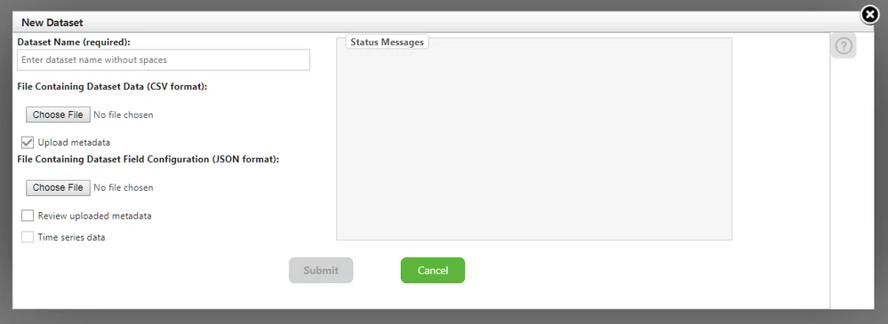
- In the Dataset Name field, enter vibration_dataset.
- In the File Containing Dataset Data section, search for and select vibration_data_and_header.csv.
- In the File Containing Dataset Field Configuration section, search for and select vibration_metadata.json.
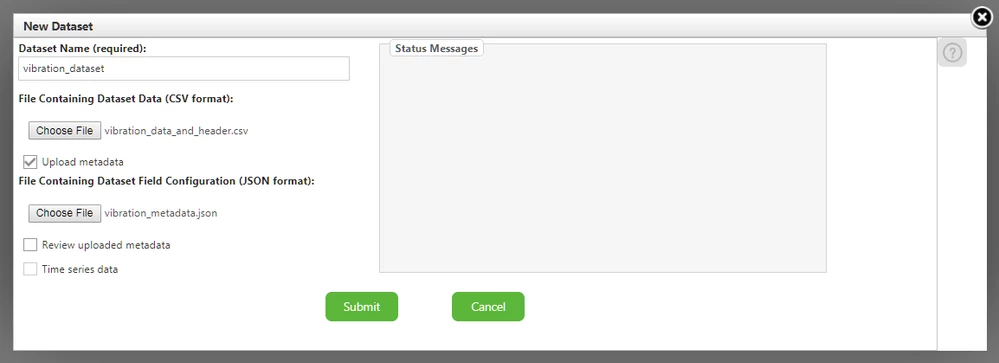
- Click Submit.

Step 6: Real World Signals and Profiles
Now that the real-world vibration data has been uploaded, we’ll re-run Signals and Profiles just as we did before.
Hopefully, we’ll start seeing some patterns.
On the left, click Analytics Builder > Signals.
At the top, click New….
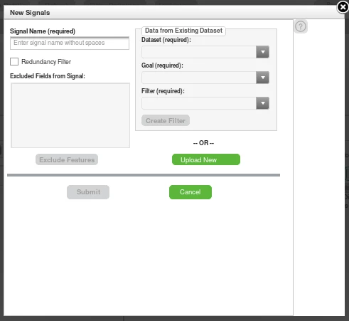
In the Signal Name field, enter vibration_signal.
In the Dataset field, select vibration_dataset.
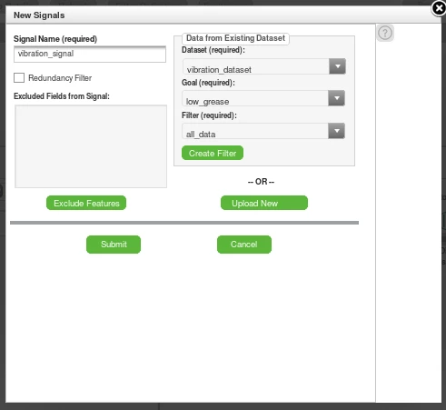
Click Submit.
- Wait ~30 seconds for Signal State to change to COMPLETED
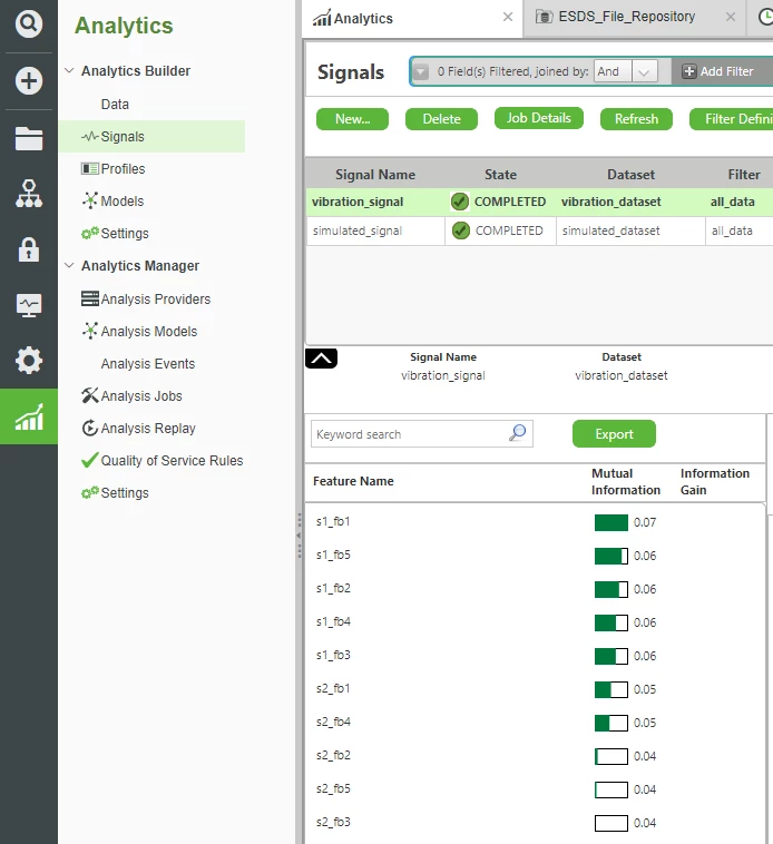
The results show that the five Frequency Bands for Sensor 1 are the most highly correlated with determining our goal of detecting a low grease condition.
For Sensor 2, only bands one and four seem to be related, while bands two, three, and five are hardly relevant at all.
This is a very different result than our earlier simulated data. Instead, it looks like it’s possible that the vibration-frequencies getting pickup up by our first sensor are explicitly more important.
Profiles
We’ll now re-run Profiles with our real-world dataset.
On the left, click Analytics Builder > Profiles.
Click New….
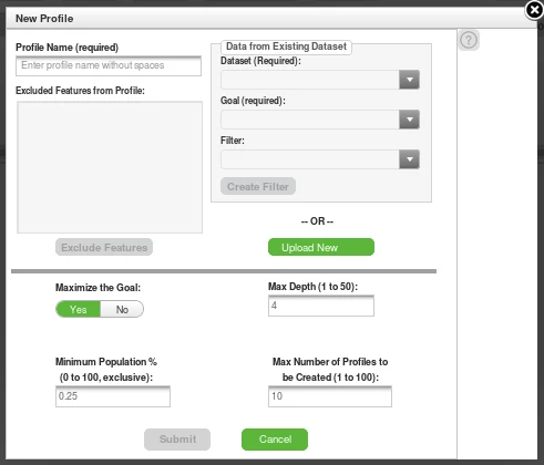
In the Profile Name field, enter vibration_profile.
In the Dataset field, select vibration_dataset.
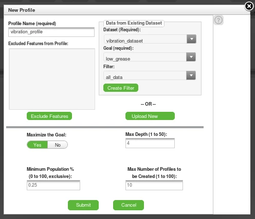
Click Submit.
- After ~30 seconds, the Signal State will change to COMPLETED.
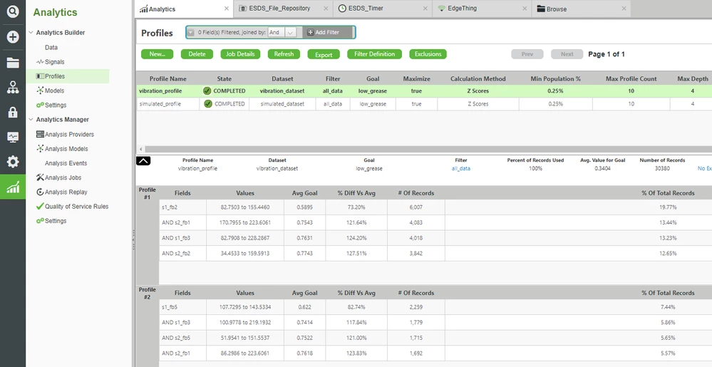
The results show several Profiles (combinations of data) that appear to be statistically significant.
Only the first few Profiles, however, have a significant percentage of the total number of records. The later Profiles can largely be ignored.
Of those first Profiles, both Frequency Bands from Sensor 1 and Sensor 2 appear.
But in combination with the result from Signals (where Sensor 1 was always more important), this could possibly indicate that Sensor 1 is still the most important overall.
In other words, since Sensor 1 is statistically significant both by itself and in combination (but Sensor 2 is only significant in combination with Sensor 1), then Sensor 2 may not be necessary.
Click here to view Part 3 of this guide.

