Create Your Application UI Guide Part 1
- Create Your Application Guide UI Part 1
- Overview
- Step 1: Create New Mashup
- Step 2: Mashup Builder Sections
- Step 3: Introducing Widgets
Create Your Application Guide UI Part 1
Overview
This project will introduce the ThingWorx Mashup Builder. Following the steps in this guide, you will learn how to use this tool to create a Graphical User Interface (GUI) for your IoT Application.
We will teach you how to rapidly create and update a Mashup, which is a custom visualization built to display data from devices according to your application's business and technical requirements.
NOTE: This guide's content aligns with ThingWorx 9.3. The estimated time to complete ALL 5 parts of this guide is 30 minutes.
Step 1: Create New Mashup
The Mashup Builder is a drag-and-drop environment with a What You See Is What You Get (WYSIWYG) interface. With the Mashup Builder you can quickly and easily create a visualization of your IoT data.
In this step, we'll explain various options to customize your application GUI.
- Click Browse > VISUALIZATION > Mashups.
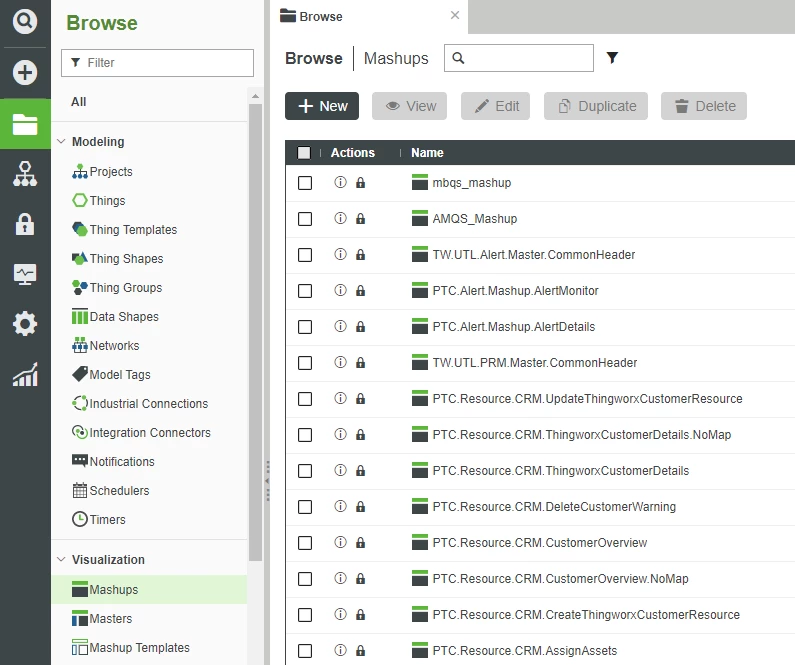
- Click + New.
- You are now on the New Mashup pop-up window.
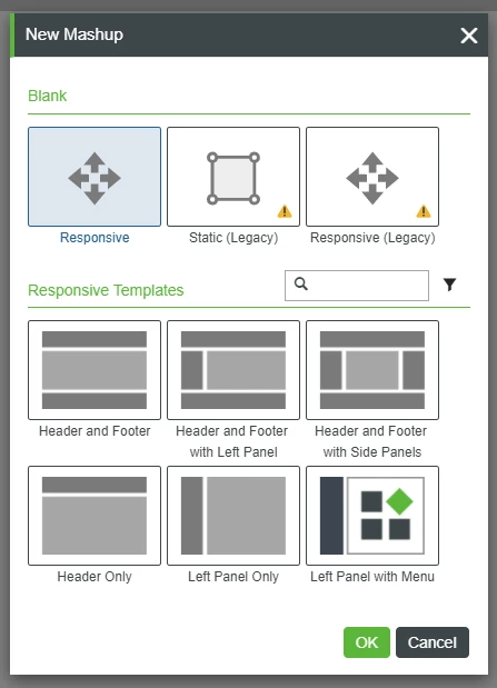
Layout Options
When creating your UI, you must choose whether you want a Responsive, Static, or Responsive (Advanced) Mashup, depending on the resolutions of the displays you want your application users to utilize when running your application.
Mashup Layout | Description | When to Use |
Responsive | Expands to the resolution of the display in an even more dynamic manner than the Responsive (Legacy) option. | Previously-labeled as Responsive (Advanced), this is now the default option with modifications to the Mashup Builder interface versus previous versions. For instance, divisions such as a header or footer are available with the Template options at the bottom of the pop-up. |
Static (Legacy) | Sized to the dimensions that you define. | Static Mashups are appropriate when your users have a standard device on which they’ll be utilizing your application, such as a smartphone or tablet. When displayed in a lower resolution you will see scroll bars, in a higher resolution there will be unused space around the Mashup. |
Responsive (Legacy) | Expands to the resolution of the display without leaving any unused space around the Mashup. | Responsive Mashups should be utilized when you anticipate that users will interface with your application through various-sized screens. Responsive Mashups should always be tested at various resolutions to ensure optimum display of your IoT data. |
- Keep the default of Responsive (with NO Responsive Templates chosen), and click OK in the pop-up window.
- In the Name field, enter appui_mashup.
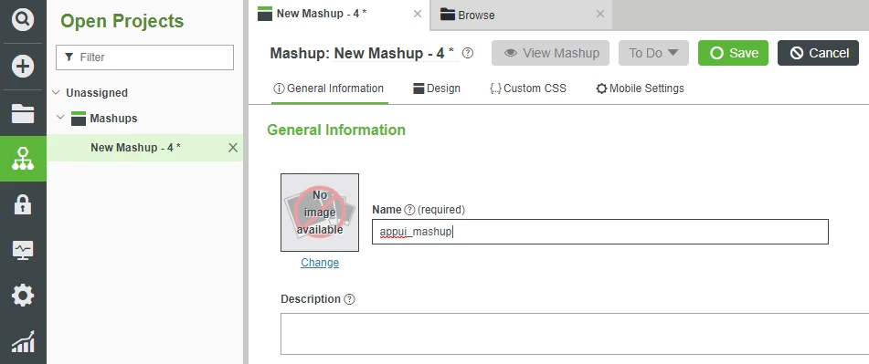
- If the Project is not already set, search for and select PTCDefaultProject.
- At the top, click Save.
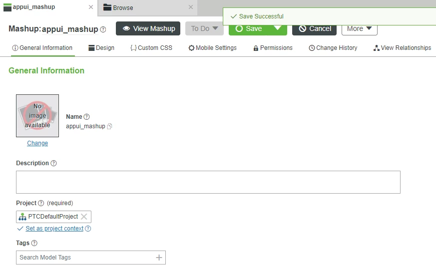
- At the top, click Design.
- This is the Mashup Builder user interface we will use for the remainder of this guide.
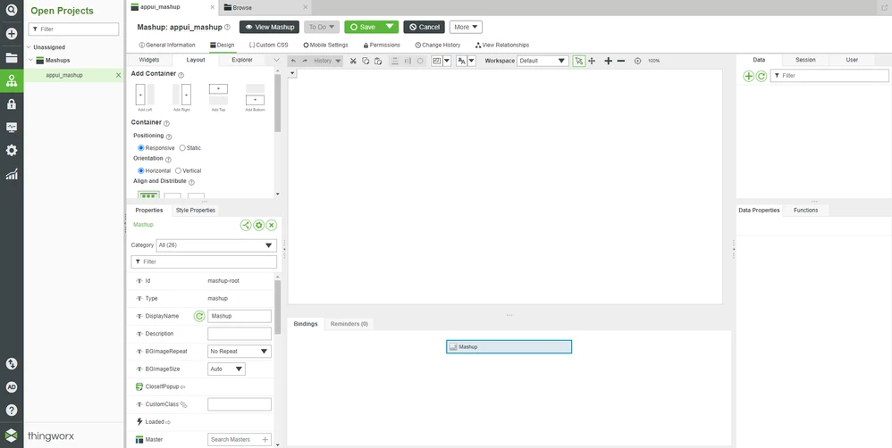
6. On the left, click the "left arrow" Collapse icon to cause the Composer Navigation to slide-out, revealing more room for the Mashup Builder interface.
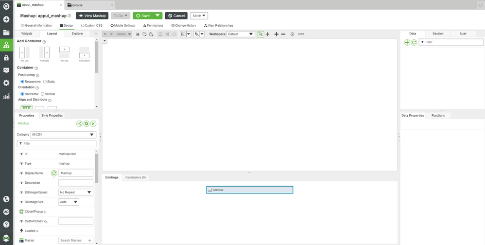
Step 2: Mashup Builder Sections
Now that you've launched the Mashup Builder, you'll need an understanding of the layout and configuration options.
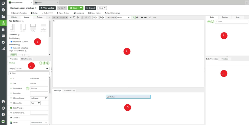
NOTE: Section 1 in the top-left has a drop-down arrow you can click to reveal additional sections if your screen resolution is too small to show all of Widgets, Layout, and Explorer. There is also the Mashups tab in Section 1, but it is not covered in this guide.
| Mashup Builder Section | Description |
1a | Widgets | Widgets provides a list of every graphical element within the platform. There are a wide variety of selections, from grids to graphs to text boxes to buttons. There is also a Filter Widgets field where you can enter the name of a particular Widget to sort the list. |
1b | Layout | Layout is used to divide your Mashup into logical sub-sections. |
1c | Explorer | Explorer allows you to reach any individual element of a Mashup. This can be helpful when multiple Widgets are overload on top of each other in the central Canvas window, making it difficult to click on them individually. |
2 | Canvas | This is an area into which you can drag-and-drop Widgets to your desired location to build your application UI. You can also drag-and-drop data onto the Widgets in the Canvas. |
3a | Data | Data is fundamental to any Mashup that wants to display ThingWorx IoT data, as it allows you to bind backend-data to particular Widgets. |
3b | Session | Session provides access to Session Parameters, which are similar to global variables that may be used across multiple Mashups, such as cookies or security information for a logged-in User. |
3c | User | User provides access to the User Extensions. User Extensions are the Properties of the logged-in User and can be used on the Client side and/or the Server side. |
4a | Properties | Properties displays the Properties for the selected Mashup or Widget. These Properties allow you to perform a variety of modifications to Widgets, such as setting its exact position. |
4b | Style Properties | Style Properties are a sub-set of Properties dealing with items such as changing color. |
5a | Bindings | As data connections are made to various Widgets, the Bindings window will show these links in an easy-to-understand 'arrow' format. For instance, if a button press causes a Thing’s Service to be called, then you’ll see a connection from the Button Widget’s *Clicked* Event over to the Thing’s Service. |
5b | Reminders | Reminders points out issues with your Mashup, such as unbound but required Properties, which often must be fixed before the Mashup can be saved. |
6a | Data Properties | Data Properties displays properties of the selected data element. This can be helpful, for instance, when you want something to be triggered only when something else has completed. In that scenario, you’d look for the ServiceInvokeCompleted Event in this bottom-right area. |
6b | Functions | Functions provides the ability to write custom business logic within the Mashup itself. |
Step 3: Introducing Widgets
The primary way in which you'll create the GUI for your IoT application is with Widgets.
Widgets are self-contained graphical elements that you can drag-and-drop onto the central Canvas area.
Once placed on the Canvas, you can:
- Modify Widget layout
- Resize Widgets
- Bind Data to Widgets
Combining several Widgets together will allow you to quickly and easily create a functional GUI for your IoT application.
Widget Name | Widget Example Picture | Description |
Button | 
| The Button Widget triggers an Event when it is clicked. Typically, this Event will be used to trigger a Service to either push or pull data from the platform’s backend. |
Checkbox | 
| The Checkbox Widget provides a simple box which can be either set or not-set. You primarily use a Checkbox when you’re setting or displaying Boolean data. |
Gauge | 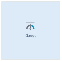
| The Gauge Widget provides a more “graphically interesting” way to display a numerical value. You can set the minimum and maximum values which a Gauge displays, or style a Gauge so that different areas are different colors. |
Label | 
| The Label Widget displays a non-user-interactable string within your Mashup. You can use this to create headings or descriptions for parts of your Mashup. |
Text Field | 
| The Text Field Widget is a small, one-line area into which you can either accept an input string from the User or display a string from the platform’s backend. |
Combining a few of the basic Widgets described above allows you to create a Mashup for your IoT application. However, without data being supplied to these Widgets from the platform's backend, they're just pretty graphics. In the next section, we will introduce a few of the Mashup Services that enable bidirectional data flow between your GUI and device data.
Click here to view Part 2 of this guide.

