Effective UI Implementation Part 2
- October 20, 2022
- 0 replies
- 815 views
Step 5: Collection Widget
A Collection widget is used to display information from a collection of Things. Similar to a Grid Widget, the Collection widget gives you complete control over how data is displayed by binding data to an embedded static Mashup.
In the first part of this step we will create a static Mashup with Parameters bound to its widgets. Next, we will configure a Collection widget to use the static Mashup we create. In the next step we will customize the Collection styling.
Create Static Mashup
- Click the Browse tab on the far left of Composer, in the Visualizations section, click Mashups .
- Click + New to create a Mashup.
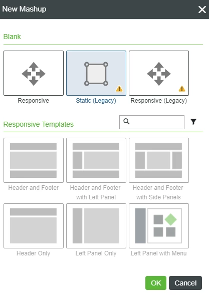
- Select Static Mashup, then click OK.
- Name your Mashup TractorListFormat
- If Project is not already set, click the + in the Project text box and select the PTCDefaultProject.
- Click Save.
- Click the Design tab
- If Project is not already set, click the + in the Project text box and select the PTCDefaultProject.
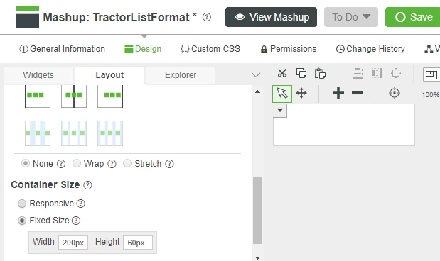
- In the Layout tab, under Container > Positioning, Click Static, then scroll to Container Size, and click Fixed Size
NOTE: A Static Mashup maintains fixed widget sizes and spacing, as opposed to a Responsive Mashup that will dynamically change widget sizes and spacing to use the available window area. - Click the Width property and set it to 200 and the Height property to 60
- In the lower left panel, click the Style tab and click the X to remove the default Style.
Click the + icon, then select DefaultImageBorderStyle to remove all styling.
NOTE: The default Mashup styling is removed so it will not override the sidebar and parent Mashup styling.Scroll to the Width property and set it to 200 and the Height property to 60
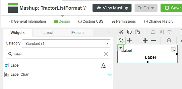
- Click the Widgets tab and type label in the filter text box.
- Drag and drop two Label Widgets onto the upper left of your static Mashup.
Add Parameters to Mashup
- Select the Explorer tab then select the top level Mashup
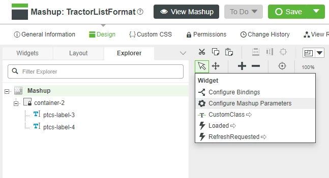
- Click Configure Mashup Parameters from the drop-down menu in the upper left of the Mashup canvas.
- Click the Add Parameter button.
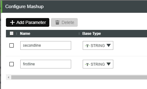
- Type firstLine in the Name field and select a Base Type of STRING.
- Click Add Parameter again and name this parameter secondLine also with a Base Type STRING.
- Click Done to return to Mashup Builder.
Bind Parameters to Widgets
- Click the drop-down in the upper left of the Mashup canvas, then select Configure Bindings
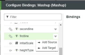
- Click firstLine from the Properties list on the left.
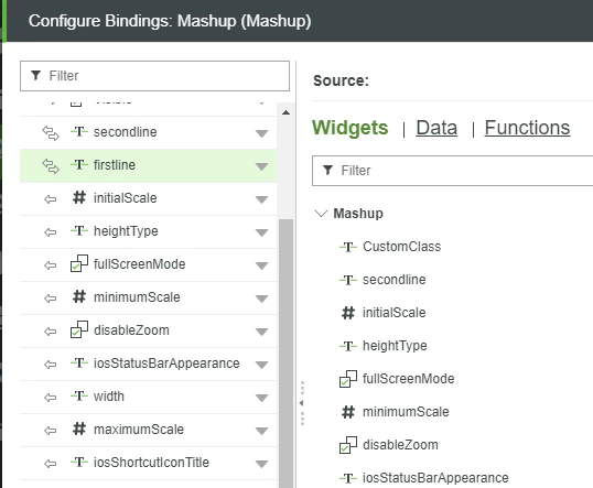
- Clicking the drop-down arrow and click Add Source to display the Mashup entities that can be bound to the Mashup parameter named firstLine.
- Select the checkbox next to the top LabelText property.
- Click Done to return to the Configure Bindings pop-up.
- Click secondLine, then Binding Targets, and select the checkbox next to the bottom Label Text property, then click Done
- Click Done to close Configure Bindings pop-up and return to Mashup builder.
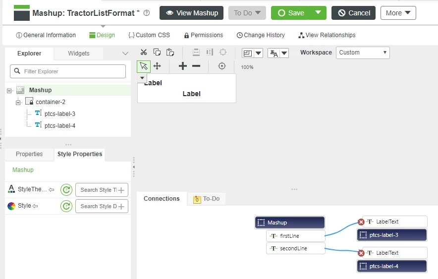
NOTE: The Mashup parameters and bindings are displayed in the Connections panel at the bottom. - Click Save before continuing to the next step.
Bind Data to Collection
- Return to the main Mashup then drag and drop a Collection widget onto the top area of the left side bar.
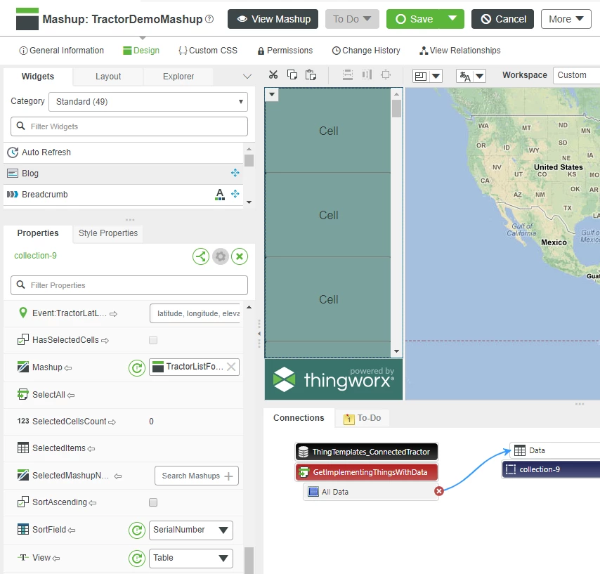
- In the Collection Properties panel, set the View property to Table
- Scroll to the Mashup property, click the wand icon and browse to the name of the static Mashup created above.
- Drag the All Data source from the data panel on the right onto the Collection widget, then click Data in the Select Binding Target pop-up.
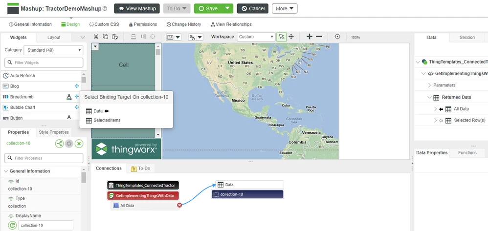
- Set UIDField property and SortField to SerialNumber.
- Drag the All Data source from the data panel on the right onto the Collection widget, then click Data in the Select Binding Target pop-up.
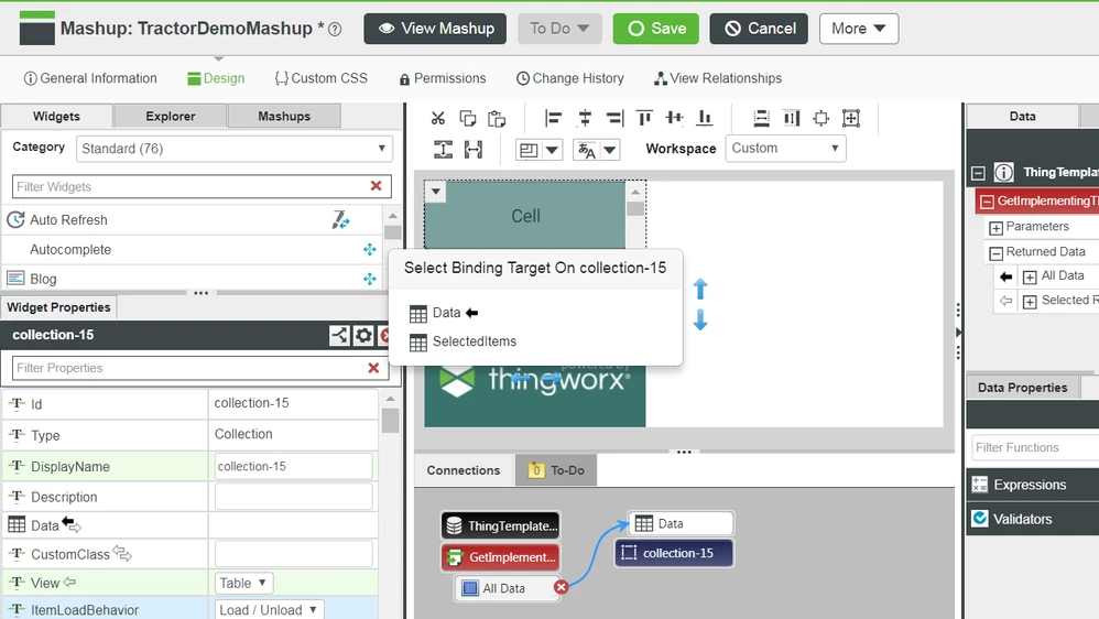
- In the Collection Properties panel, scroll to MashupPropertyBinding and click *Add
- Enter the text below, then click Done:
 {
 "SerialNumber": "firstLine",
 "ModelNumber": "secondLine"
 }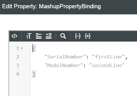
NOTE: This JSON property binds the SerialNumber and ModelNumber properties in the data source to the the firstLine and secondLine parameters in the embedded mashup
9. Save the Mashup and click View Mashup.
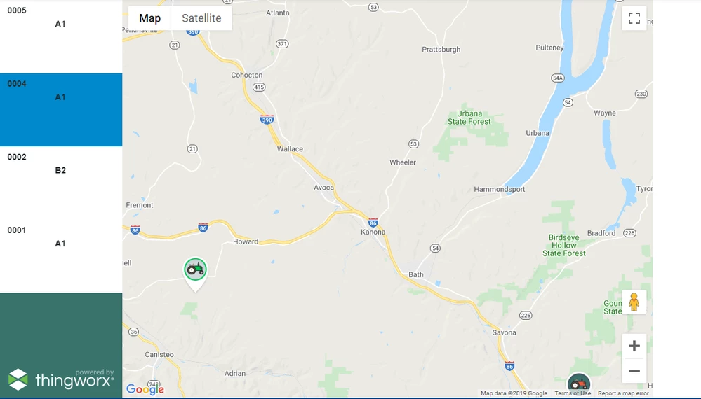
10. Test the Mashup and you will see the navigation panel on the left is showing data and is linked to the Google Map widget in the center.
Step 6: Customize Collection
The Collection uses default styling and no images. In this part of the exercise, we will replace the blue bar that indicates the selected row with a custom icon and modify the default styles so that the left panel's background color is shown.
Right-click on each of the images below to download and save them for use in the next step.


We will upload these images to create new Media entities and apply them to the Repeater widget.
- Select the Browse folder icon on the far left of Composer, in the Visualization section click Media
- Click the + New to create a new Media entity and enter a name for the un-selected tractor image.
- Click Change in the Image section, then browse to the saved image.
- Click Open, then Save.
- Repeat these steps to create a Media entity for a selected tractor
- Open the static TractorListFormat mashup that controls the Collection widget formating
- Click and drag an Image widget onto the mashup
- In the lower left panel, in the SourceURL property, click the wand icon to select the unselected tractor image.
- Change both the Width and Height properties to 50 pressing Tab after each entry to record them.
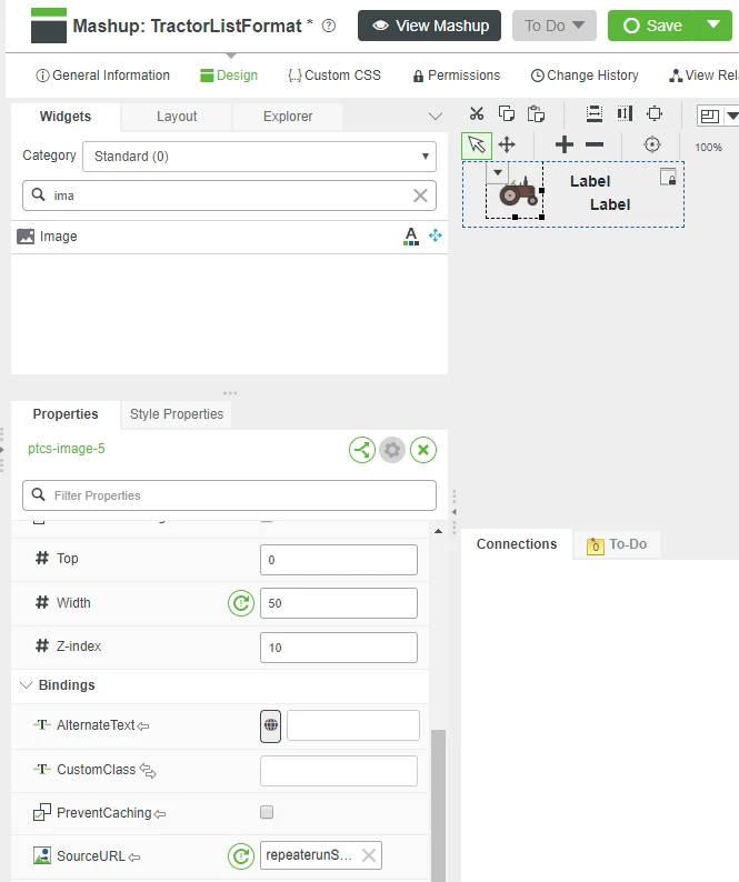
- Click the Explorer tab in the top left, click the top-most Mashup entity, then click the Style Properties tab
- Cick the X in the Style property and select DefaultImageBorderStyle to remove all styling, then click Save
- Click the More drop-down at the top of Composer and click Duplicate
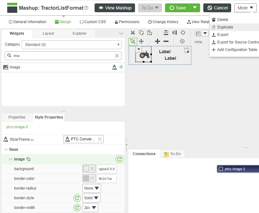
- Enter TractorListSelectFormat for the name and click Save then click the Design tab
- Click on the tractor image, then, the lower left, click the wand icon in the SourceURL property and select the selected tractor image and Click Save

- Open your original Mashup and click on the Collection widget in the Mashuo Builder canvas.
- Scroll to the SelectedMashupName Property and click the + to select TractorListSelecteFormat.
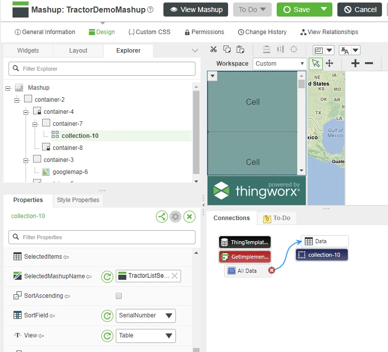
- Click Save for the Mashup, then View Mashup to see your Mashup with customized icons.
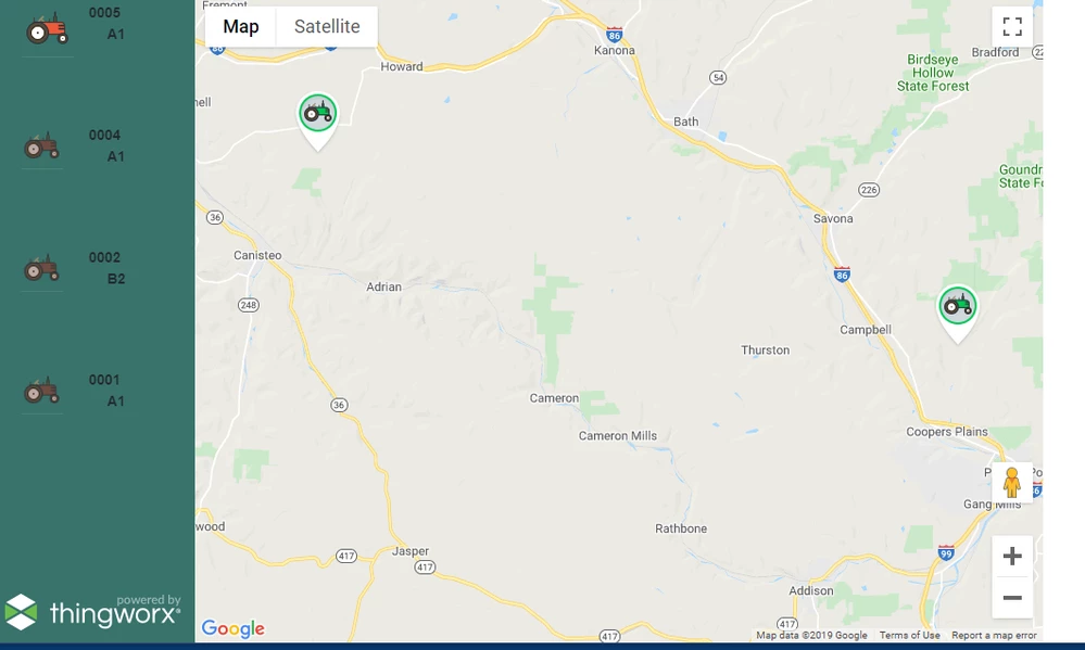
The default black text on green is a little hard to read. The steps below will change the text colors to make the data more readable.
- Open the TractorListSelectFormat Mashup then click on the top Label widget to change the color of the text.
- Click the Style Properties tab and expand Base and Label
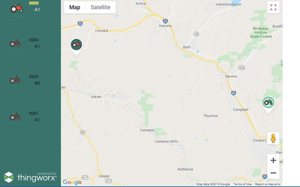
- In color property select yellow and select Bold in the font-weight property before clicking Save.
- Select the other Label widget and assign a light grey color for the color then save the embedded Mashup.
- Reload the runtime view of the Mashup to see the results.
Step 7: Detail Panel
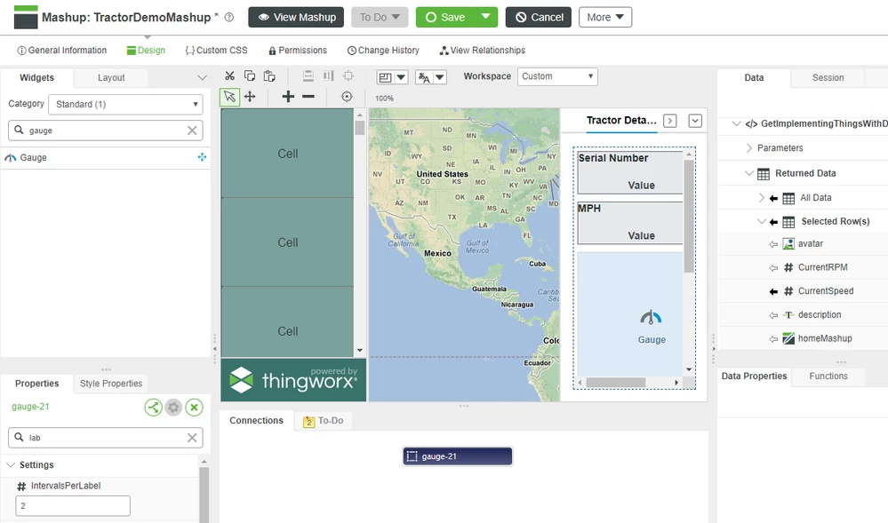
The right sidebar has a simple Image of a tractor along with product-specific information shown in Gauges and Value Displays.
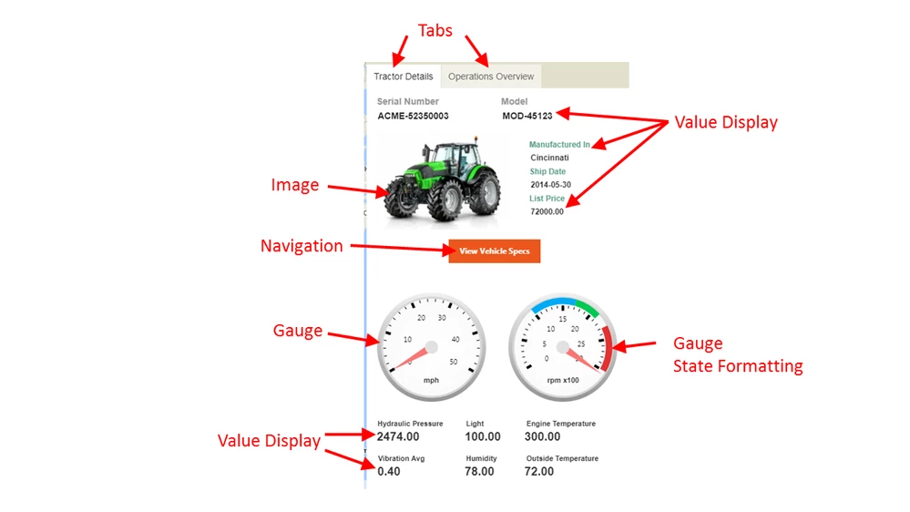
The right sidebar contains two tabs in a Tabs - Responsive widget. The tabs are used to selectively hide and display groups of functions and data. The orange button labeled "View Vehicle Specs" is a Navigation widget that opens a pop-up window with other detailed product information. The colored range indications on the right Gauge were created by configuring the gauges ValueFormatter property to use State Formatting.
Add Tab Widget
- Open the original, main Mashup and enter tab in the Widget panel search field.
- Drag and drop a Tabs widget onto the Right Sidebar.
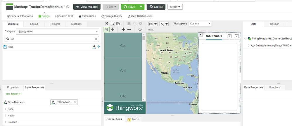
- Scroll to the Tab1Name property and enter Tractor Details.
NOTE: This guide only covers configuring one of the two tabs added to the Mashup. Using the skills you've practiced thus far, feel free to add additional information to the tabs on your Mashup. - Uncheck the RoundedCorners property.
- Click the Layout tab and click the radio button under Container > Orientation > Vertical
Add ValueDisplay Widgets
- Type value in the Widget search box then click and drag a Value Display Widget onto Tab 1.
- In the Property panel, scroll to the Label property and enter Serial Number
- In the Data panel, expand Selected Row(s) then drag the SerialNumber property onto the Value Display widget and click Data when the Select Binding Target pop-up is displayed.
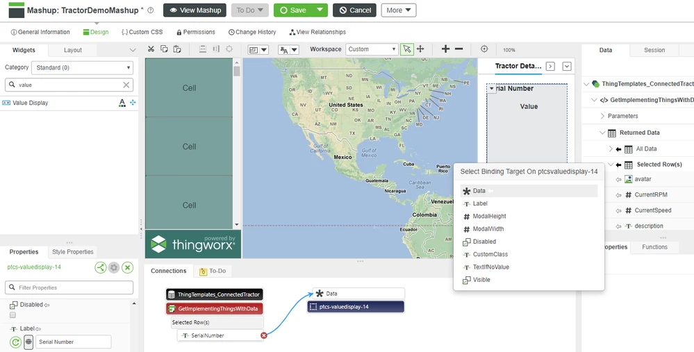
- Drag another Value Display Widget onto the tab widget below to the first one and enter Name for the Label property.
- Drag name from the Selected Row(s) onto the second Value Display and then click Data.
NOTE: Be sure to select data sources under Selected Row(s) so that data displayed will correspond to the tractor selected from either the map or the left side menu. - Save the Mashup then click View Mashup to see all three panels working together to show data.
Add Gauges
- Enter gauge in the Widget search box then click and drag a Gauge Widget onto Tab 1.
- In the Properties panel, enter 3000 for the MaxValue property and RPM in the Legend property.
- In the Data panel, expand Selected Row(s) then drag CurrentRPM onto the Gauge widget and click Data when the Select Binding Target pop-up is displayed.
- Drag another Gauge widget onto the canvas next to the first one and enter MPH for the Legend property.
- Drag CurrentSpeed from the Selected Row(s) onto the second Gauge, then click Data.
