- Community
- IoT & Connectivity
- IoT & Connectivity Tips
- Exploring UI Functions Part 2
- Subscribe to RSS Feed
- Mark as New
- Mark as Read
- Bookmark
- Subscribe
- Printer Friendly Page
- Notify Moderator
Exploring UI Functions Part 2
Step 3: Create Validation and Status
With our MyFunctionsMashup Mashup open, let's add a Validation. A Validation is similar to an Expression, except you have the added capability of triggering Events based on a True or False outcome of your validation. We will use the Validation to check and confirm the Text Field we created only has the values we added in our Functions. Let's also add two Status Message Functions that will show whether or not a user has added any text outside of what we want.
- Open the MyFunctionsMashup Mashup to the Design tab.
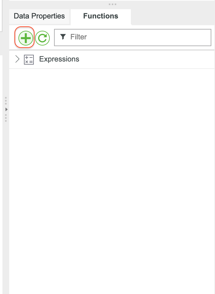
- Click the green + button in the Functions area.
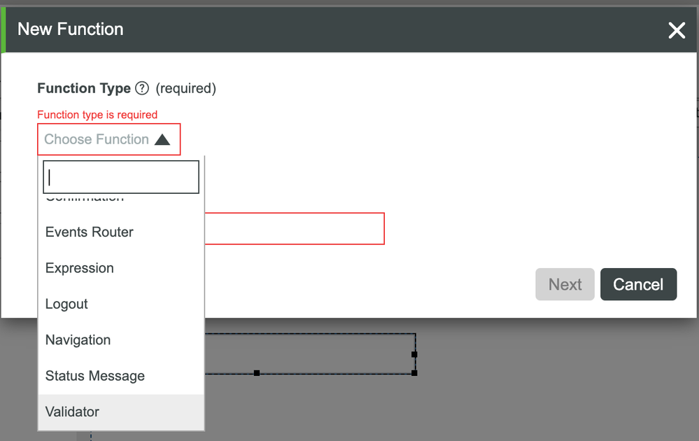
- In the New Function modal, select Validator.
- Set the Name to isDataClean.
- Click Next.
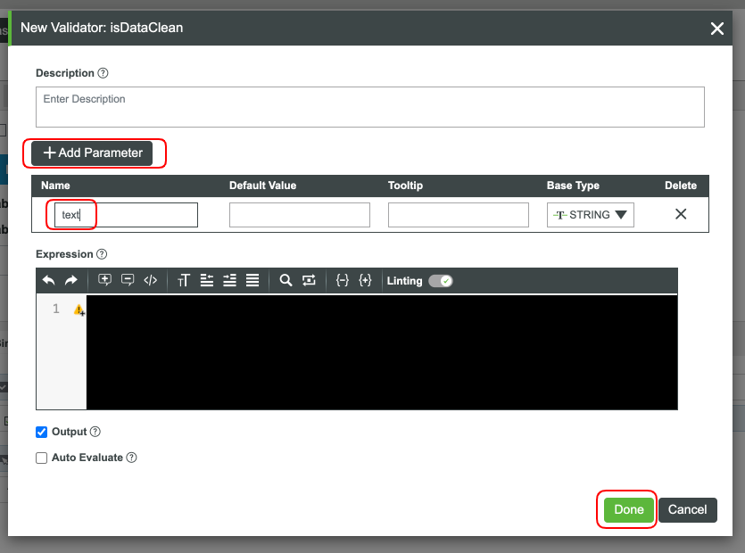
- Click Add Parameter.
- Set the Name to text and ensure the Base Type is STRING.
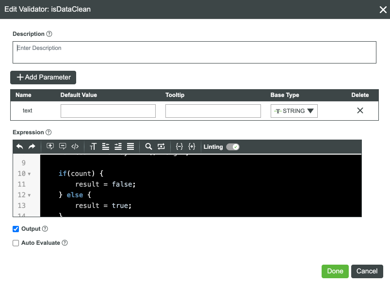
- Add the following code to the Expression are:
if(text === "NO") {
        result = true;
} else if(text === "YES") {
        result = true;
} else {
         let array = text.split("YES").join("");
         array = array.split(",").join("");
         let count = array.trim().length;

         if(count) {
              result = false;
         } else {
              result = true;
         }
}
9. Click Done.
We have our Validator in place, now we need our two Status Message Functions. Why two? You can setup one Status Message to perform the task, but for this case, we're keeping things simple.
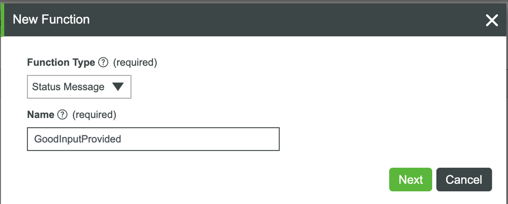
- Click the + button in the Functions area.
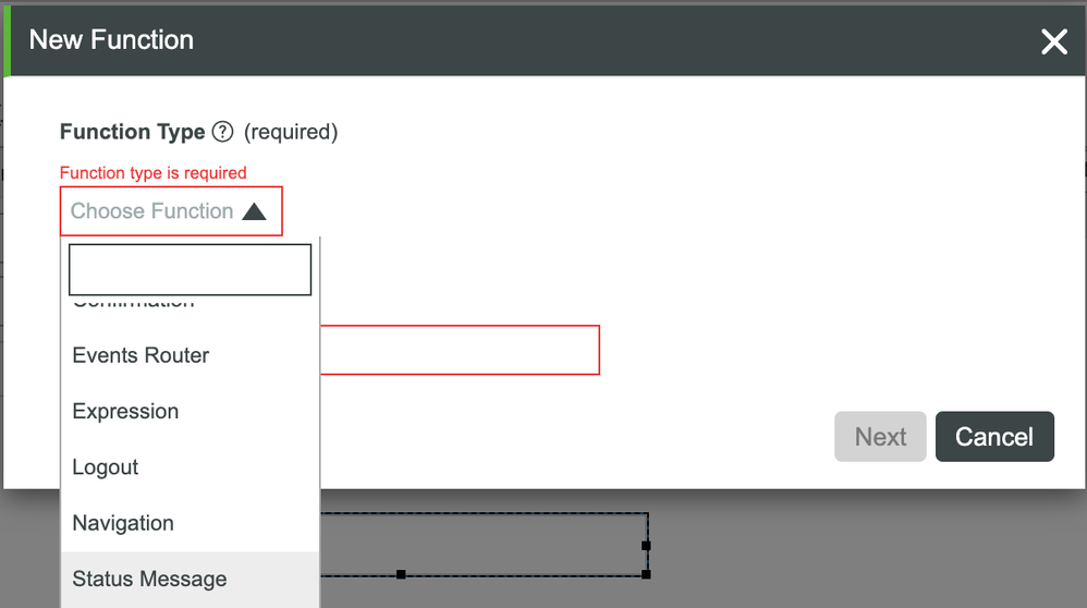
- Select Status Message in the dropdown.
- Set the Name to GoodInputProvided.
- Click Next.
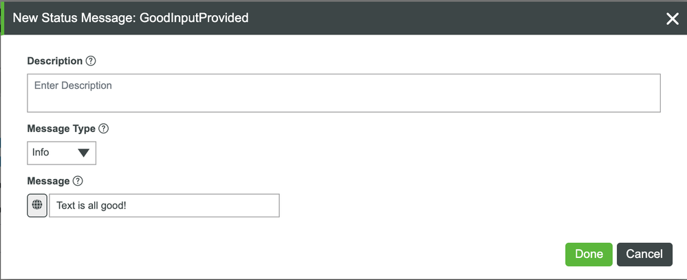
- Ensure Message Type is Info.
- In the Message field, enter Text is all good!.
- Click Done.
- Let's create another Status Message Function.
- Set the Name to BadnputProvided.
- Click Next.
- Change Message Type to Error.
- In the Message field, enter Text is BAD!.
- Click Done.
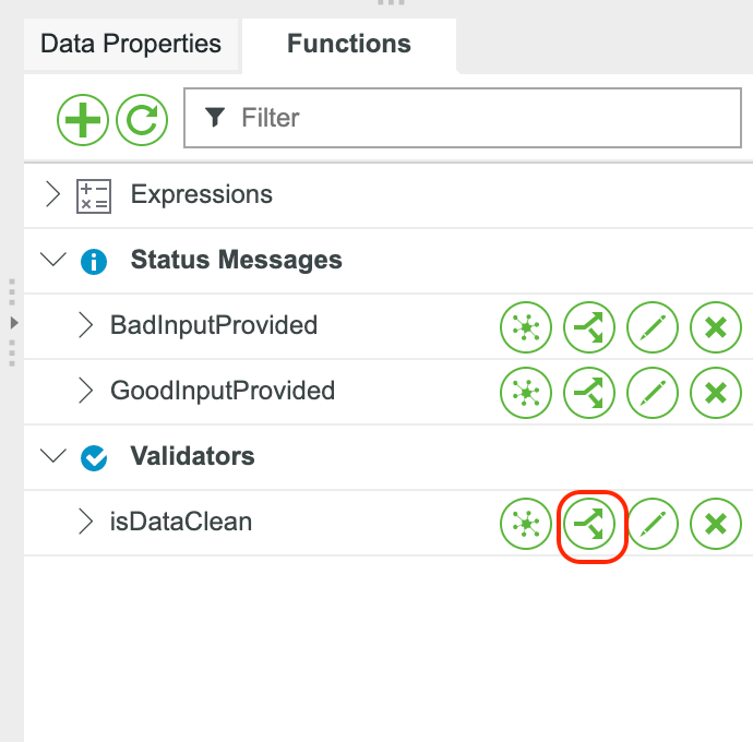
We now have two Status Message Functions and a Validator to help with checking our text data. Let's connect everything together. This time, let's use the Bind button.
- Expand the Validator section in the Functions tab.
- Click the Bind (arrows) button on the isDataClean Validator. This window will help us configure connections a bit easier.
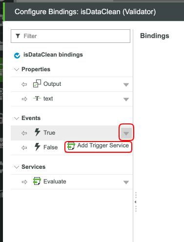
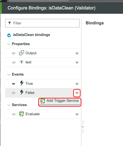
- Click the down arrow by the True Event.
- Click Add Trigger Service.
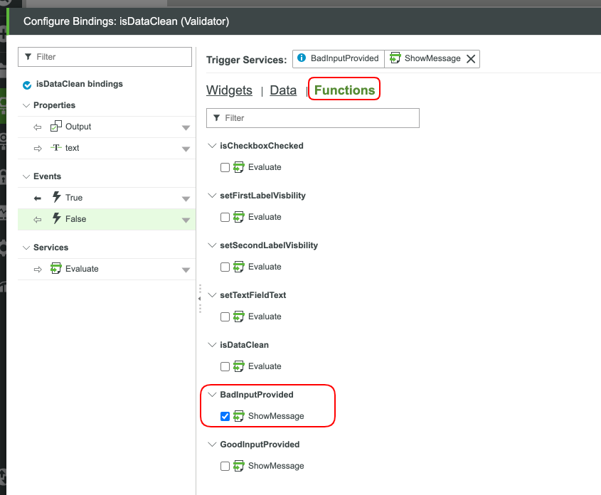
- Click Functions.
- Check the checkbox by GoodInputProvided.
- Click Next.
- Click the down arrow by the False Event.
- Click Add Trigger Service.
- Click Functions.
- Check the checkbox by BadInputProvided.
- Click Next.
- You should currently have the following setup:
Let's add in our connections to the Text Field and when we'll run this Validation.
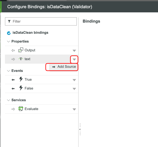
- Click the down arrow by the text Property.
- Click Add Source.
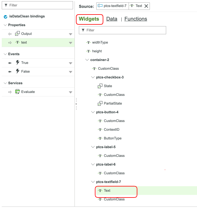
- With the Widgets tab selected, scroll down and select the Text Property of our Text Field.
- Click Next.
- Click the down arrow by Evaluate Service.
- Select Add Event Trigger.
- With the Widgets tab selected, scroll down and select the Clicked Property of our Button.
- Click Next.
- You should currently have the following setup:
- Click Done.
- Click Save and view your updated Mashup.
Your Validator is complete. You now have a way to tell when a user has inputed their own text into the text box. To try things out, add some crazy characters, hit the button, and see what happens. You might notice that you have your Expressions running at the same time as your Validator. Switch up the bindings to get it to run the way you want it to.
Step 4: Create Confirmation Modal
With our MyFunctionsMashup Mashup open, let's add a Confirmation Function. A Confirmation Function provides a quick modal that will give users a method to confirm actions or events before they take place. If you've ever almost deleted a production database (don't judge me!), then you know how handy a confirmation screen can be. Let's add a button that will trigger a confirmation as to whether we would like to run the Validator we created in the last section.
- Open the MyFunctionsMashup Mashup to the Design tab.
- Click the + button in the Functions panel.
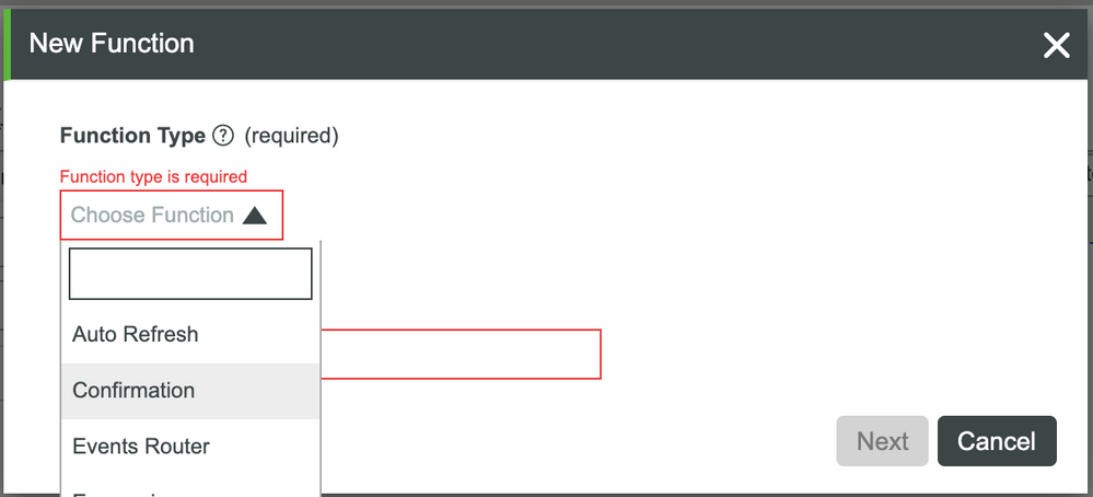
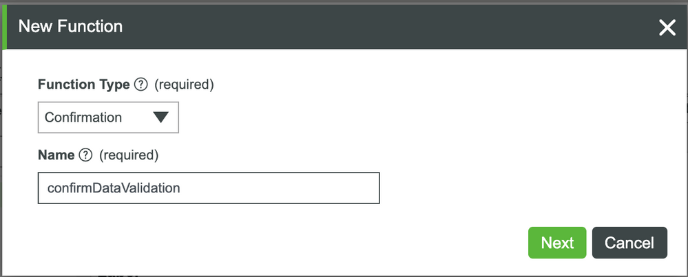
- Select Confirmation in the dropdown.
- Set the Name to confirmDataValidation.
- Click Next.
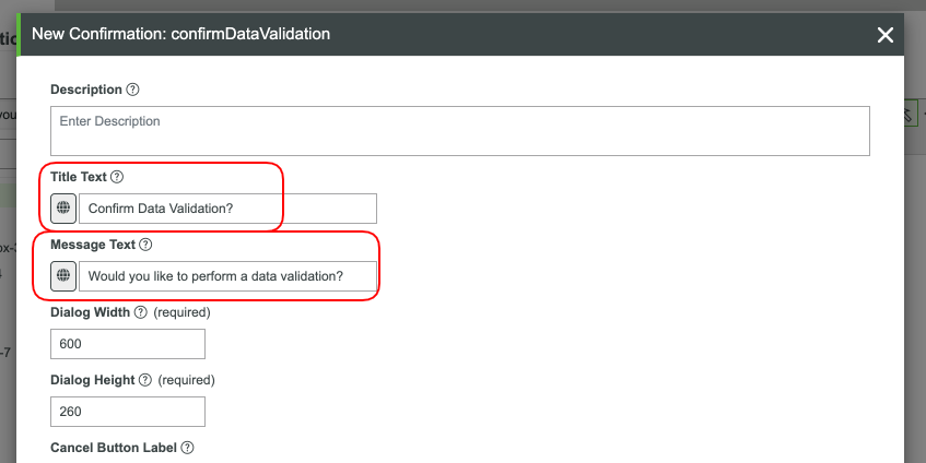
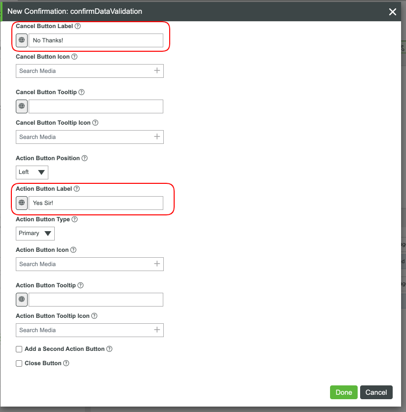
- Set the Title Text to Confirm Data Validation?.
- Set the Message Text to Would you like to perform a data validation?.
- Set the Cancel Button Label to No Thanks!.
- Scroll down and set the Action Button Label to Yes Sir!.
- Click Done.
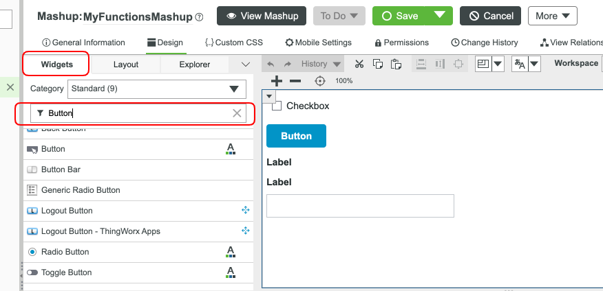
- Click the Widgets tab in the top left.
- Filter for and select a Button Widget.
- Drag and drop a Button Widget onto the Canvas.
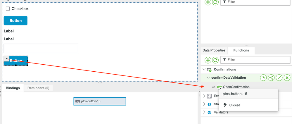
- With the new Button selected, click the down arrow that appears on the Button.
- Drag and drop the Clicked Event of the Button to the OpenConfirmation Service of our Confirmation Function.
We now have our Confirmation Function and a Button that will open the Confirmation when clicked. Let's add the final step by connecting the Confirmation to our Validation Function.
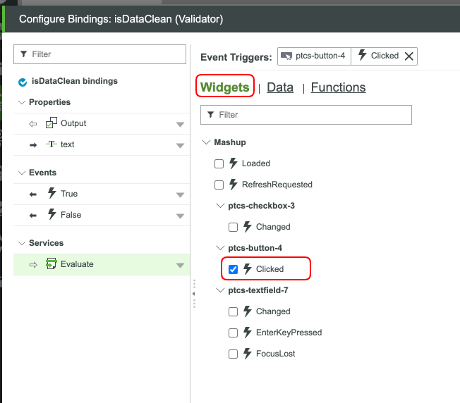
- Click the Bind (arrows) button for our isDataClean Validator.
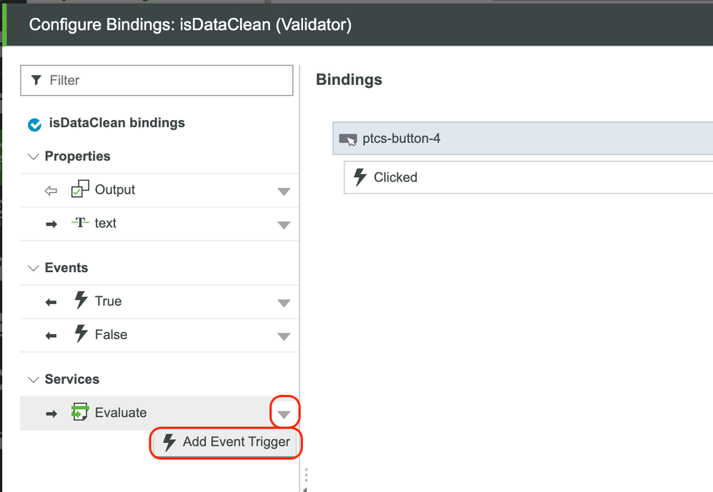
- Click the down arrow by the Evaluate Service.
- Select Add Event Trigger.
- Click the Functions tab.
- Select the ActionClick Event of our Confirmation Function.
- Click Next.
- Click Done.
- Click Save for our Mashup.
We now have a way to independently validate that the text in our text box does not contain random values added by the user. View the Mashup and test things out by clicking on the second button and adding some crazy characters to our text box.
Step 5: Create Navigation
Thus far, we have been sticking to one Mashup. Let's venture out a bit by showing a different Mashup. Inside of our MyFunctionsMashup Mashup, we will add a Navigation Function. This will allow us to go to or just show a different UI based on some kind of user input or event. For our example, when a user clicks No Thanks! in our Confirmation Function, let's send them to a different Mashup.
Follow the steps to create a Navigation Function, a destination Mashup, and tie the two together.
Create Destination Mashup
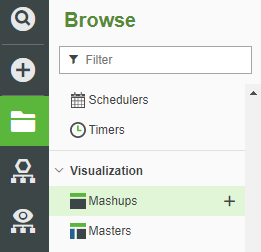
- Navigate to Browse > Visualization > Mashups.
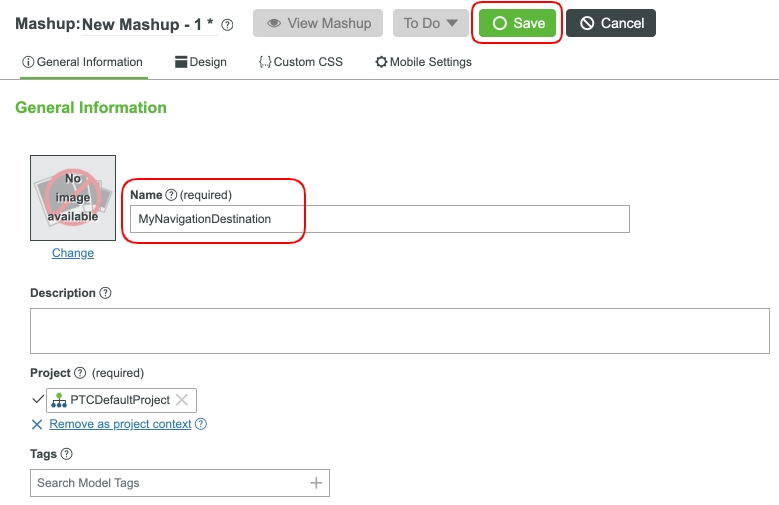
- Click + New.
- Keep the defaults and click OK.
- In the Name field, type MyNavigationDestination.
- Click Save.
- Click the Design tab at the top to open the Mashup canvas.
- Click the Widgets tab.
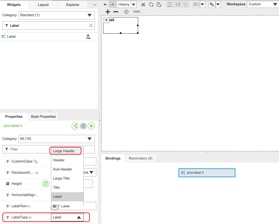
- Filter and search for the word Label.
- Drag and drop a Label Widget to the Mashup canvas. If you like, enlarge the Label sizing.
- In the Label Widget Properties section, scroll down to the LabelType Property.
- Click the dropdown and select Large Header.
- In the LabelText Property field, type MY DESTINATION UI SCREEN.
Click Save.
You have now created a simple UI that we will go to when we click our navigation button. Next, we'll tie together our navigation button and our freshly created Mashup.
Create Navigation Function
- Reopen the MyFunctionsMashup Mashup to the Design tab.
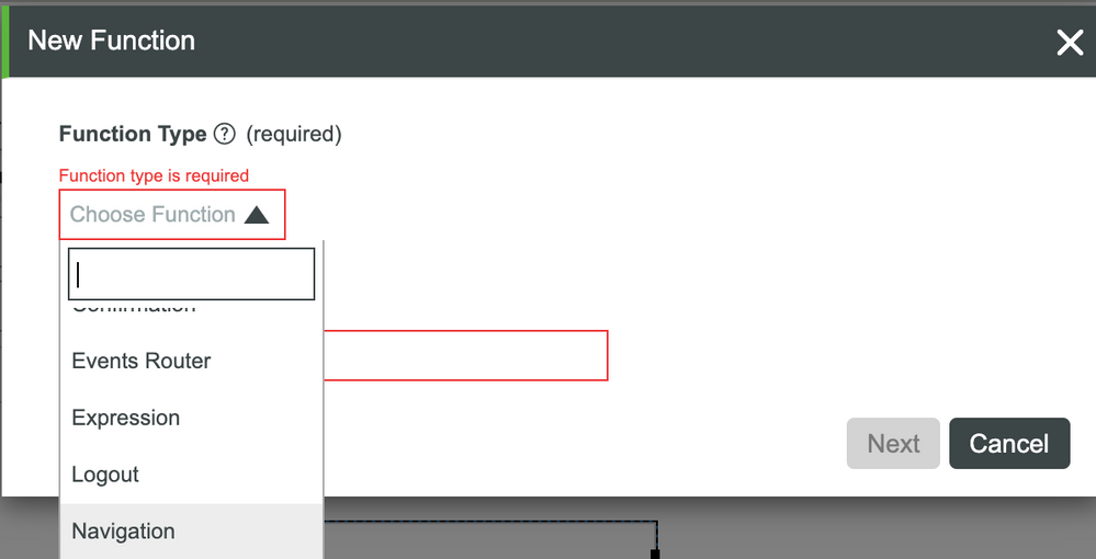
- Click the + button in the Functions panel.
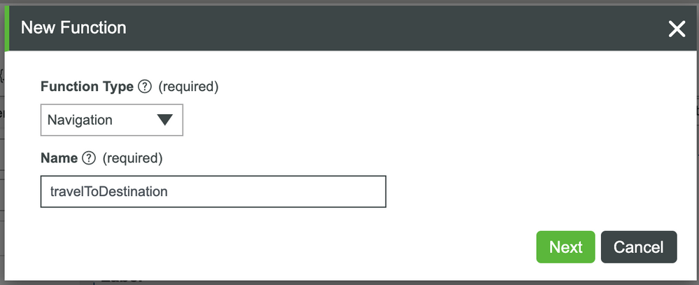
- Select Navigation in the dropdown.
- Set the Name to travelToDestination.
- Click Next.
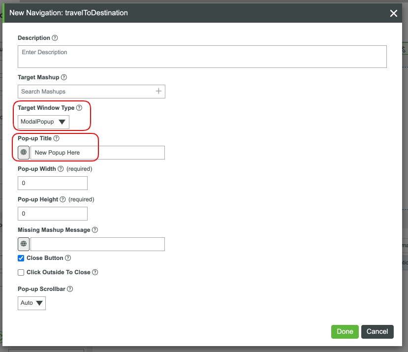
- Set the Target Window Type to ModalPopup.
- Set the Pop-up Title to New Popup Here.
- Set the Pop-up Width to 400.
- Set the Pop-up Height to 400.
- Click the + button at Target Mashup.
- Type MyNavigationDestination into the search bar.
- Select the MyNavigationDestination Mashup when it appears.
- Click Done.
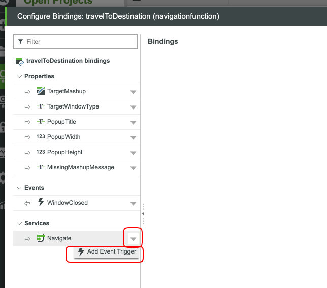
- Select the Bind (arrows) button for our new travelToDestination Navigation Function.
- Click the down arrow next to Navigate Service.
- Click Add Event Trigger.
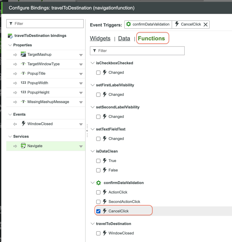
- Click the Functions tab.
- Select the CancelClick Event of our confirmDataValidation Confirmation Function.
- Click Done.
- Click Save for the Mashup.
We now have a modal that will appear after we click the No Thanks! button in our Confirmation Function. View the Mashup and try out what you've done by clicking the bottom button, then clicking No Thanks!
Click here to view Part 3 of this guide.

