- Community
- IoT & Connectivity
- IoT & Connectivity Tips
- How to use a custom color schema in Pie Charts
- Subscribe to RSS Feed
- Mark as New
- Mark as Read
- Bookmark
- Subscribe
- Printer Friendly Page
- Notify Moderator
How to use a custom color schema in Pie Charts
Disclaimer: This post does of course not express any political views.
Pie Chart Coloring
In ThingWorx Pie Charts use a default color schema based on the DefaultChartStyle Definitions.
These schemas are using fixed numbering and coloring systems, e.g. 1 is blue, 2 is green, 3 is red and so on. All Pie Charts will be rendered with these colors in the same order, no matter which data the chart is using. Visualization of data with the default colors might not necessarily help in creating an easy to read chart.
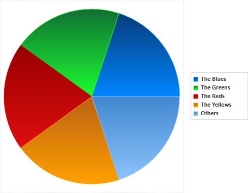
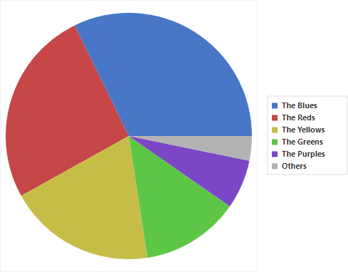
Just take a look at the following example with the default color schema. Let's just take political parties - as they are usually associated with a distinct color - to illustrate how the default color schema will fail depending on the data displayed.
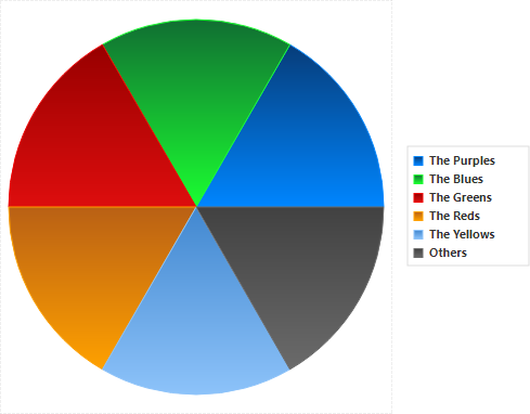
In the first example, just by sheer coincidence the colors are perfectly matching the parties. When introducing a new party to the pool suddenly the blues are rendered green and the yellows rendered light-blue etc. This can be quite confusing, especially on election night 😉
Custom Color Schema
PoliticalParties Thing
To test a custom color schema, we first need to create a new Thing:
PoliticalParties as a GenericThing
Add a dataset property with the following PoliticalParties DataShape.

Save the Thing and set the InfoTable to:
| Key | Value |
|---|---|
| The Purples | 20 |
| The Blues | 20 |
| The Greens | 20 |
| The Reds | 20 |
| The Yellows | 20 |
| Others | 20 |
Number values don't actually matter too much, as the Pie Chart will automatically distribute them according to their percentage.
PoliticalParties Mashup
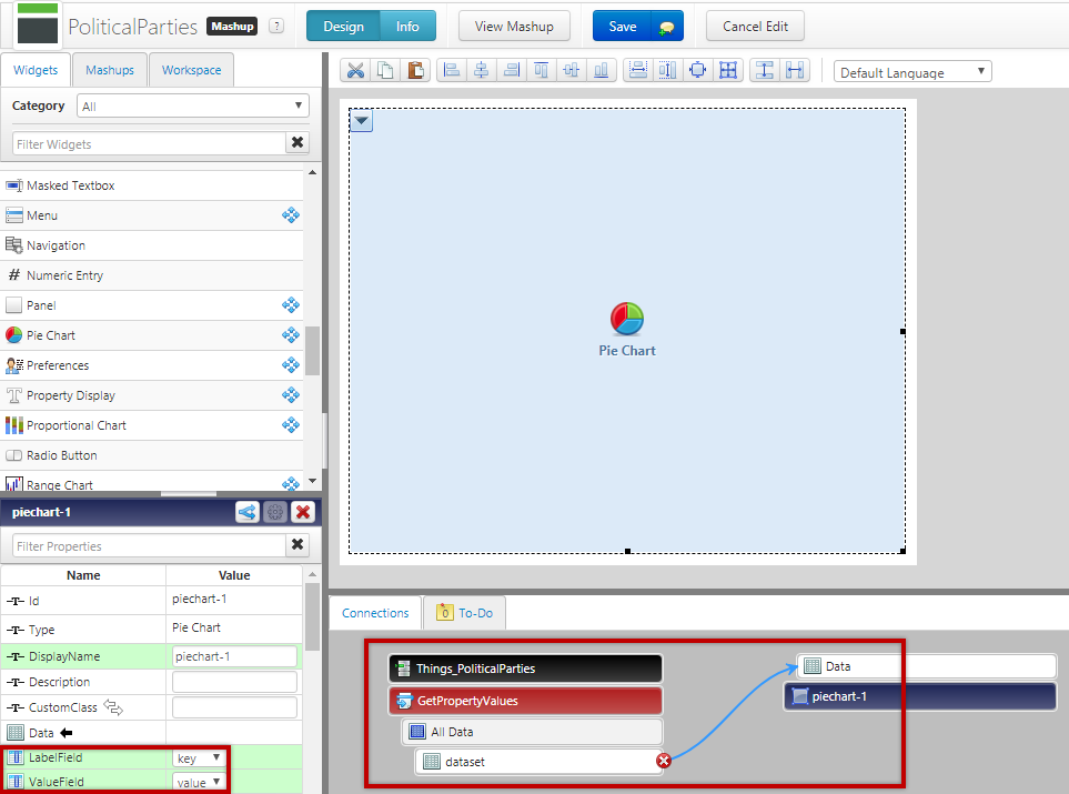
Create a new Mashup and add a PieChart to the canvas.
Bind the PoliticalParties > GetPropertyValues > dataset to the Data input of the Widget.
Ensure to set the LabelField to key and the ValueField to value for a correct mapping.
Save the Mashup and preview it.
It should show a non-matching color for each party listed in the InfoTable.
Custom Styles and States
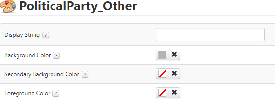
Create new custom Style Definitions for each political party.
As the Pie Chart is only using the Background Color other properties can stay on the default.
I chose to go with a more muted version of the colors to make the chart easier to look at.
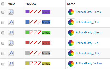
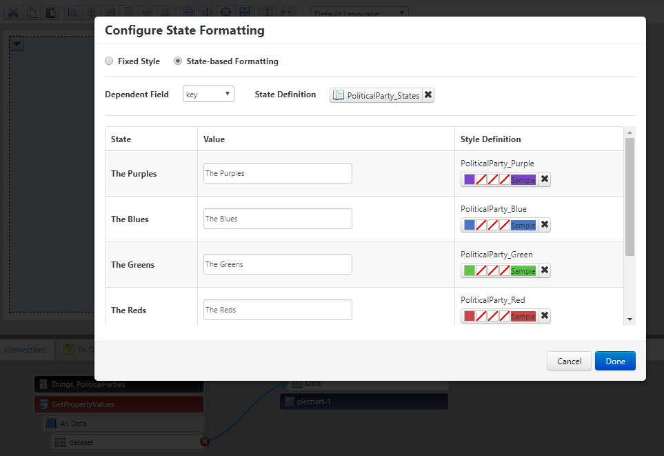
With the newly defined colors we can now generate a new State Definition as follows:

The States allow to evaluate the key-Strings in the Thing's InfoTable and assign a Style Definition depending on the actual value. In this definition we map a color schema based on the InfoTable's key-value to create a 1:1 mapping for the Strings.
This means, no matter where a certain party is positioned in the chart it will be tinted with its associated color.
Refining the Mashup
Back in the Mashup, select the PieChart.
In the ColorFormat property choose the newly created State Definition.
Save the Mashup and preview it.
With the States and Styles applies, colors are now displayed correctly.
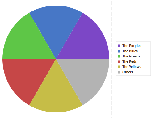
Even when changing positions and numbers in the original InfoTable of the PoliticalParties Thing, the chart now considers the mapping of Strings and still displays the colors correctly.

