- Community
- IoT & Connectivity
- IoT & Connectivity Tips
- The DPM User Experience
- Subscribe to RSS Feed
- Mark as New
- Mark as Read
- Bookmark
- Subscribe
- Printer Friendly Page
- Notify Moderator
The DPM User Experience
The DPM User Experience
Written by Tori Firewind, IoT EDC Team
As discussed in a previous post, DPM is a tool designed to be beneficial at all levels of a company, from the operators monitoring automated data on production events from the factory machines themselves, to the production supervisors who need to establish, task out, and track machine maintenance and improvement measures. DPM also engages the continuous improvement and plant leadership, by providing a standardized way to monitor performance that ultimately rolls up to the executive level. The end users of DPM are therefore diverse both in how they access DPM, and how they make use of its various features.

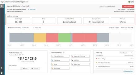
So, to demonstrate the influence of bandwidth and latency on the responsiveness of DPM, the Production Dashboard was loaded in the Google Chrome browser repeatedly under varying conditions. This dashboard is the webpage most operators and field users would access to log event information and production details (so it is widely used by end users). This provides a sort of benchmark of the DPM solution, something which indicates what can be expected and tells us a few things about how DPM should be deployed and configured.
Latency was introduced by hosting the servers involved in the test in different regions (all Azure cloud hosted servers, one in US East, one US West, and one in Japan East). Bandwidth was introduced using a tool on the PC with either no bandwidth or 4 megabits/second.
Browser caching was turned on and off as well, to simulate the difference between new and return users; new users would not have the webpage cached, so their load times are expected to be longer. Tomcat compression was also configured in half of the runs to demonstrate the importance of compression for optimal performance.
Each of these 24 scenarios was then tested 10 times from each location, and the actual data can be found in the attached benchmark document (a working solution benchmark, which is not designed to be referenced directly, as matters of infrastructure may influence the exact performance of the solution).

Key Takeaways
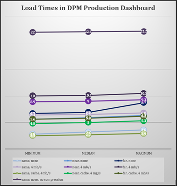
Latency and bandwidth impact DPM performance in exactly the way one would expect of a web application. While any DPM server can be accessed from any region, regions with more latency will experience delays proportional to the amount of latency. In the chart here, find the three regions represented three times by three different colors (different from the charts above):
- The three different shades of each color represent the different regions
- Green represents the optimal configuration settings (Tomcat compression enabled, caching turned on) for returning users with bandwidth limitations (i.e. mobile networks like 5G)
- Blue shows first-time page visitors with no bandwidth limitations
- Purple shows first-time visitors that do have bandwidth limitations
- The uncompressed first-time load for mobile users (those with bandwidth limitations imposed) within the same region is also given to demonstrate the importance of enabling Tomcat Compression (load times only get worse without compression the farther the region)
Notice how the green series has lower load times across the board than the blue one, meaning that return users even with bandwidth limitations have better performance across every region than new users. Also notice how the gap is larger between lighter colors and darker colors, where the darker the color, the farther the region from the DPM servers. This indicates that network latency has a more significant influence on performance versus bandwidth, with only longer running transactions like file uploads seeing a significant performance hit when on a network with bandwidth limitations. Find out how to enable tomcat compression and review the full solution benchmark in the document attached.


