cancel
Showing results for 
Search instead for 
Did you mean: 
cancel
Showing results for 
Search instead for 
Did you mean: 

Community Tip - Visit the PTCooler (the community lounge) to get to know your fellow community members and check out some of Dale's Friday Humor posts! X

New PTC Community Homepage Now Available!

Jaime_Lee
Community Manager

New PTC Community Homepage Now Available!

The PTC Community Team is excited to announce the launch of our new community homepage this week!  In addition to a complete brand alignment uplift, the PTC Community Team has been working with UX designers to improve readability and better meet accessibility recommendations.  The updates are shared below.

beforeafter.jpg


The PTC Community is primarily an online support community.  Most visitors come to the community looking for help with their existing PTC products and services.


In an effort to help new (or soon to be) community members know our community purpose, we've updated our tagline to  "Ask and learn from PTC and Industry Experts."  New members can easily search the community directly from the homepage and find their favorite content via the navigation menu. Our most popular content can also be accessed via the quick link tabs.
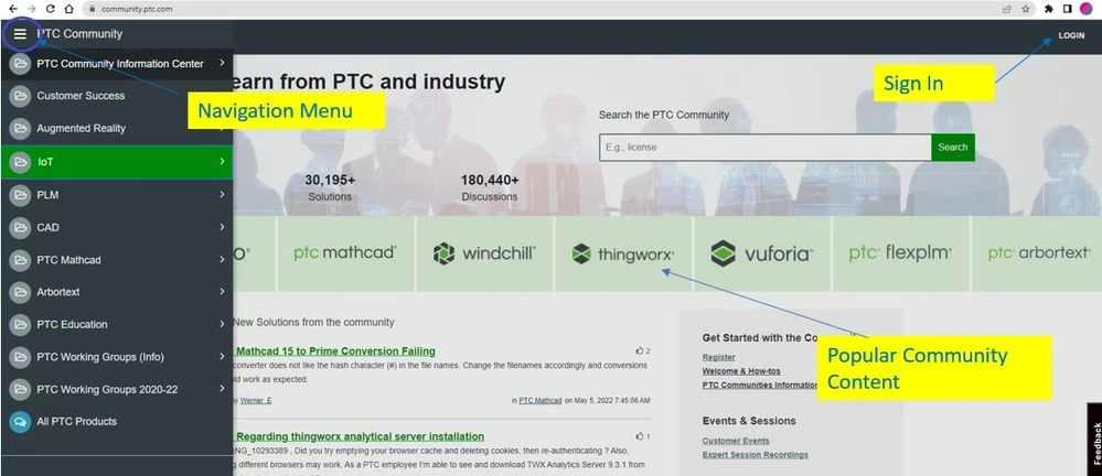
 

Navigation_Access.jpg


In order to engage on the community, registered members must be logged in.  (Hint:  You know you are logged in if your avatar is showing.  You should never have 224 unread messages.  This happens when your community manager is secondary admin on working groups! 🙂 Be sure to always check your private messages in case a community moderator or manager is trying to reach you!)


avatar.jpg


Members with standard (or regular) permissions will see their community stats. Members with elevated permissions will have a dashboard to access additional community functionality.


Below is a sample of a "regular" member who happens to have a PTC rank icon next to their username.
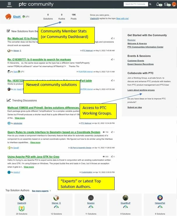


regularmemberscreen.jpg


In the footer of our new community landing page, you will find access to other PTC areas of interest and related communities. 


footer.jpg


Enjoy exploring the new community homepage.

before_after.jpg

9 REPLIES 9

All in all, I like the new design quite a bit.
However, I would have one criticism: The Vote button for ideas no longer makes it easy to see whether you have already voted for an idea or not - in my opinion, the button is a bit too dark by default.

Jaime_Lee
Community Manager
(To:DomenicLaritz)

Thank you @DomenicLaritzfor the feedback !  We have had other community members mention this as well.  @AndrewK is taking notes on all these suggestion for future iterations and updates.

AndrewK
Community Manager
(To:DomenicLaritz)

We had a similar complaint that the hover color on the vote button was almost as dark as the button for an idea already voted on. We removed the hover color. Is that any better or still confusing?

TomU
23-Emerald IV
(To:AndrewK)

It's still not blatantly obvious whether or not you've voted for an idea.  I find myself toggling it back and forth just to figure out what state it's currently in.  The colors need way more distinction between them, especially when viewing one idea at a time where there is nothing else to compare the current color against.

TomU
23-Emerald IV
(To:TomU)

Maybe the text should change depending on the state.  How is someone who is color blind going to be able to distinguish between the states?  Seems like maybe ideas that have already been voted on should have their text changed to 'unvote' (or something similar) to make it clear what action will be taken if clicked again.  Other sites/software use drop shadows to clearly communicate when something is in a 'pressed' state and when it's 'up'.  That might be an option too...

I don't want to seem too critical of the great work done to improve the usability of the site, including that for better accessibility for color-blind people, but the color used for the kudo is really too neutral.
It becomes difficult to understand if it has been put, or not, even for someone like me who has done it dozens of times.

Marco
StephenW
23-Emerald III
(To:AndrewK)

I would like to tag along with this also. You have to vote and read the number (obscured for emphasis) to see whether you voted or not.

Unless you investigate the color scheme, there is no other outward indicator.

StephenWilliams_0-1652199377925.png

StephenWilliams_1-1652199386931.png


kdirth
21-Topaz I
(To:AndrewK)

I agree that the Vote and Kudos buttons could be a lot better if it was obvious, just looking at it, if it was pressed or not.  I regularly hoover my mouse over vote buttons until I get the pop-up that tells me what pressing will do (give or remove).

kdirth_0-1652199968537.png


There is always more to learn in Creo.
Jaime_Lee
Community Manager
(To:kdirth)

Hi, @Marco_Tosin @TomU @StephenW @kdirth   I know @AndrewK has been looking at the vote button.  I will elevate your kudos button feedback as well.


We appreciate you taking the time to share with us.

Announcements

Top Tags