Community Tip - If community subscription notifications are filling up your inbox you can set up a daily digest and get all your notifications in a single email. X
Hi all,
I am using a line chart for representing a boolean graph, I am sending 00:00 hours as my start and end date. When I select the date from 1st Feb to 28th Feb, the last data shows 27/02/2023 22:59:18 UTC time, the condition is 1 (High signal) and went low at 27/02/2023 23:45:19 UTC, but this low signal is not shown on the graph. When I extend the date till 4th March, the same thing happens for the 4th March data and the continuation signal is formed for the 28th Feb data.
How can I get all the data points plotted on the graph?
Note: The maxItem is set to 50000!
Thank you,
Divya!
Solved! Go to Solution.
Hi Divya,
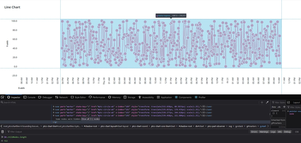
It's because the chart renders a max of only 512 markers or less depending on the area of render. If the area is smaller, it will render less points.
It's also the reason why the chart seems to be very well performing, because it just doesn't render all data, which is very bad for IoT data, since there might be only 1 point in 1000 that is the odd one out which the user needs to see, yet the chart might not show it.
We've also identified this problem, and this is the reason we built our own custom charts. But as a recommendation, I wouldn't put 50k points, I don't believe there are many charting libraries optimized for so much data.
Gabriel - IQNOX
Not sure if this is the issue but we run into this as well:
- If you select a date in the Datepicker, it will select it in the users timezone (e.g. 28th at 0AM in GMT+2)
- Mashup will convert this timestamp to UTC and send it to the backend. In this case the backend will receive the 27th at 10PM.
You can validate this by logging the received timestamps in your service or by checking the network tab of the browser (what it requested from backend).
We did not fix this but I found https://www.ptc.com/en/support/article/CS316250 which shows a possibility to get the users time offset, which you could additionaly pass to your service. The service will need to add the offset to the received timestamp (or you do it in the mashup before sending it to the backend)..
Hi Divya,
It's because the chart renders a max of only 512 markers or less depending on the area of render. If the area is smaller, it will render less points.
It's also the reason why the chart seems to be very well performing, because it just doesn't render all data, which is very bad for IoT data, since there might be only 1 point in 1000 that is the odd one out which the user needs to see, yet the chart might not show it.
We've also identified this problem, and this is the reason we built our own custom charts. But as a recommendation, I wouldn't put 50k points, I don't believe there are many charting libraries optimized for so much data.
Gabriel - IQNOX