Community Tip - Your Friends List is a way to easily have access to the community members that you interact with the most! X
- Community
- Creo+ and Creo Parametric
- 3D Part & Assembly Design
- CPUG - new Group / new Logo
- Subscribe to RSS Feed
- Mark Topic as New
- Mark Topic as Read
- Float this Topic for Current User
- Bookmark
- Subscribe
- Mute
- Printer Friendly Page
CPUG - new Group / new Logo
- Mark as New
- Bookmark
- Subscribe
- Mute
- Subscribe to RSS Feed
- Permalink
- Notify Moderator
CPUG - new Group / new Logo
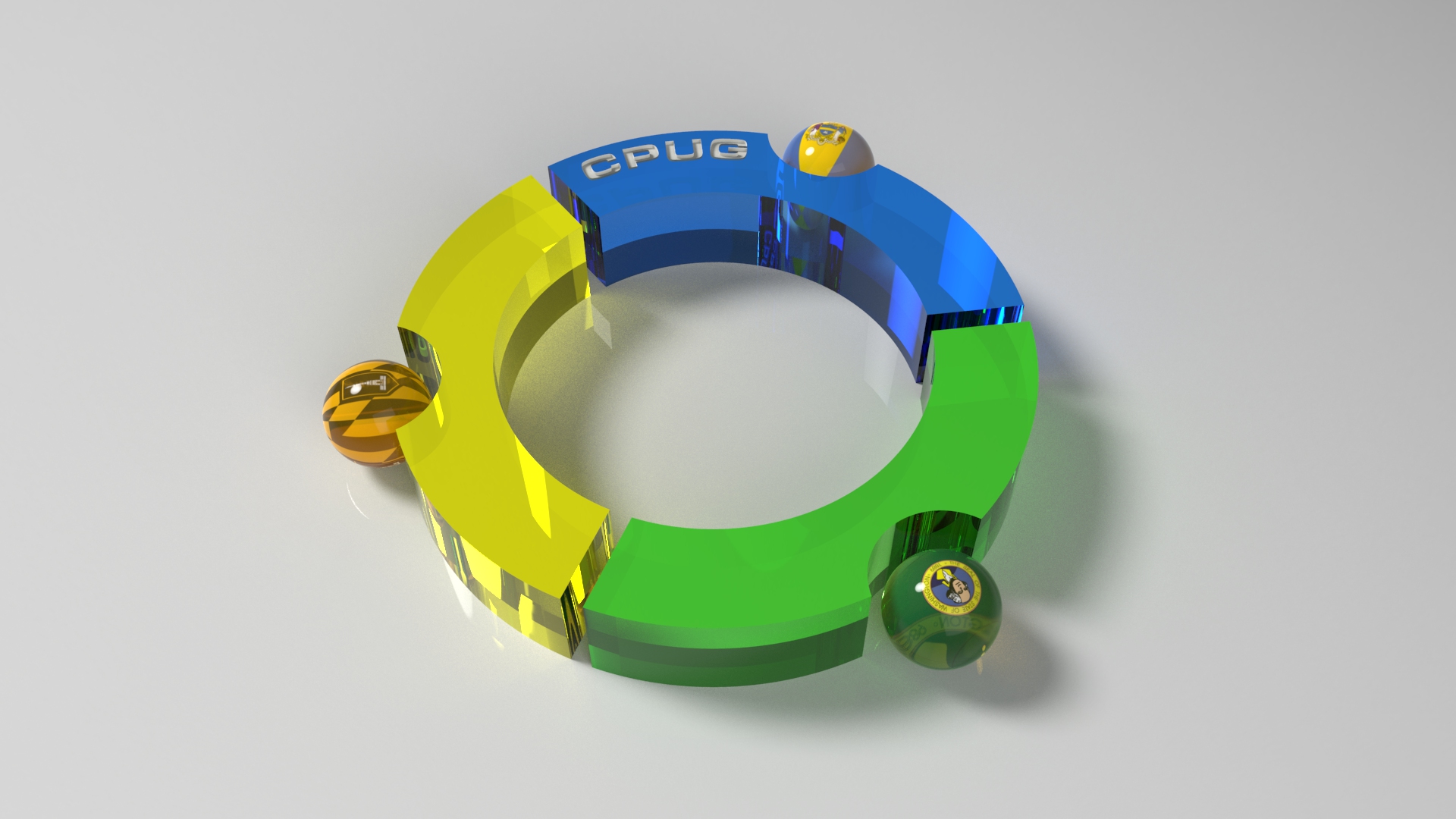
New CPUG group on Planet PTC Community and here is new CPUG logo ![]()
Note: If you're in the Baltimore/Washington/Philadelphia area, please consider joining our group. Follow the CPUG group on Planet PTC Community by selecting Join This Group from the panel on the right hand side of this page. Feel free to respond to the blog with questions or comments.


This thread is inactive and closed by the PTC Community Management Team. If you would like to provide a reply and re-open this thread, please notify the moderator and reference the thread. You may also use "Start a topic" button to ask a new question. Please be sure to include what version of the PTC product you are using so another community member knowledgeable about your version may be able to assist.
Vladimir Palffy
- Labels:
-
General
- Mark as New
- Bookmark
- Subscribe
- Mute
- Subscribe to RSS Feed
- Permalink
- Notify Moderator
Wow... again Vladimir you've done an awesome job. It took me quite awhile to really dig into this logo. I noticed the flags in the spheres but didn't recognize any but the Baltimore one. After a bit of Googling... I think I can finally appreciate the entire artwork.
Because I noted the Baltimore, Washington, and Philadelphia area, you used the flags for those cities in the spheres. But then you also used the primary color of the flag for the arc shaped pieces linking them all together. Very, very nice. There's one slight problem... the flag you used for Washington is actually for Washington State which is on the west coast. We'd actually need the flag for Washington DC which is red and white... thus the color scheme would change a bit. I still think it would be a beautiful logo in blue, yellow and red.
But let me back up a bit... we really want to convey a "regional" feel to CPUG. The group we're replacing actually covers Virginia, Washington DC, Maryland, Delaware, New Jersey, and most of southern Pennsylvania. That's a massive area. Of course we can't start out covering such a large space... but hopefully we can grow to encompass that region.
I really like the "segmented circle" idea. I also like the different colors. I almost feel like we should go for a 4-color segmented circle. But we run into a color problem. If we try for the four colors of Maryland (Yellow), DC (Red), Virginia (Blue), and Pennsylvania (also Blue) then we're stuck. Of course if we dump Virginia and add Delaware instead... that's ALSO Blue.
This is why I never have luck with logos... I'm always stuck on the details. How about this... could we go with a 4-segment circle, add Washington DC (remove Washington State), and try to use state flags for the spheres instead of the "city" flags? Although each city has a specific flag- most people have no idea what they look like. That's why it took me so long to figure out the inspiration for the images you created. If there are too many flags with Blue backgrounds, just pick another complimentary color to make it all work out.
One final note... could you take "CPUG" off the blue arc and somehow put it in the center of the circle (and make it larger)? If you'd like to keep the engraving (which I like), maybe you can engrave "Chesapeake" "Regional" "PTC Users" "Group" on the colored arcs. Or just "Chesapeake" "PTC" "Users" "Group". I don't know which would work out best...
See what I mean? I get very technical on the details. It's very hard to be artistic and technically accurate at the same time. ![]() Even if you never touched the image again, it's still an amazing piece of art I'd be proud to use as our logo.
Even if you never touched the image again, it's still an amazing piece of art I'd be proud to use as our logo.
Thank you again for all your hard work!
- Mark as New
- Bookmark
- Subscribe
- Mute
- Subscribe to RSS Feed
- Permalink
- Notify Moderator
Dear Brian
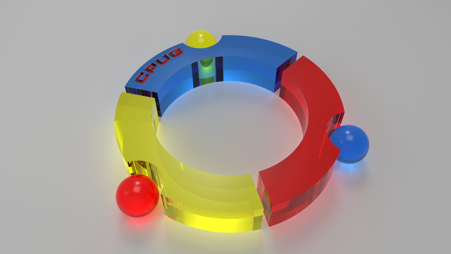
With logo I'd like to create some basic idea with flags - I have created new logo with red colored flag ( cpug logo-03_1920x1080.jpg😞

If you look on logo - you can see three people = it is main idea of this logo - Connection / Community ![]()
Vladimir
Vladimir Palffy


