- Community
- Creo+ and Creo Parametric
- 3D Part & Assembly Design
- Re: Modelcheck in Creo 5 feedback
- Subscribe to RSS Feed
- Mark Topic as New
- Mark Topic as Read
- Float this Topic for Current User
- Bookmark
- Subscribe
- Mute
- Printer Friendly Page
Modelcheck in Creo 5 feedback
- Mark as New
- Bookmark
- Subscribe
- Mute
- Subscribe to RSS Feed
- Permalink
- Notify Moderator
Modelcheck in Creo 5 feedback
I've been using Modelcheck in Creo 5 for a few months now, as I configure our setup from Creo 4 and prepare for training and migration. I would like to provide feedback:
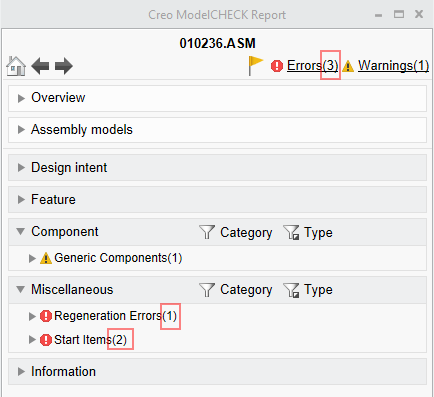
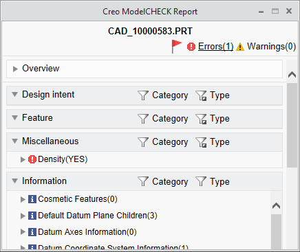
- The number on top, next to the Errors and Warnings, would seem to be a cumulative value of all of the numbers of errors and warnings within the subsections, due to the same way they are identified. For instance, in the below picture, if a user was expanding a random section, he would assume there is nothing in Design Intent and Feature as there are already three errors listed and 1 warning:
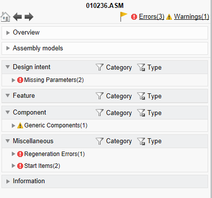
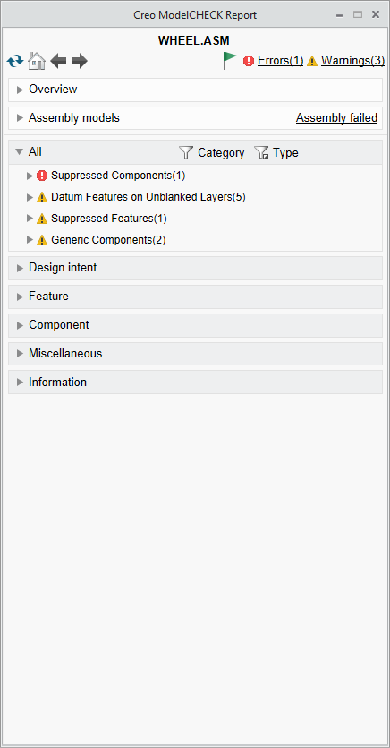
Rather, if we expand all sections, we see more errors:
Although I understand that the number on top is the check# and the number next to the checks are the quantity #, it is confusing since they are identified the same way - I'm not sure users care whether errors or warnings are identified as Design Intent, Feature, Component or Misc. Whatever the organization has identified as important will be an error and whatever they identified as not critical, will be a warning. I'm not sure how these categories help.
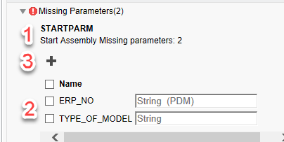
- When trying to fix an issue, it appears that the flow is also confusing. In a given check, the description is at the top(step 1), the field to specify the fix is at the button (step 2), and the button to fix it is in the middle (step 3). It would be equivalent to an online form where the submit button is at the top of the page instead of after the entry fields. Also, I'm not sure if the icons are 100% obvious to the action of the buttons.
This was probably done for a user who may not realize there is a way to fix an issue if the button is not visible from the beginning. I think a different way of showing the data will help with this. - In Creo 4, the default results for a Modelcheck regenerate showed the ALL tab which listed all errors and warnings. Here, not all categories are expanded from the beginning. This introduces a high risk of users missing the checks when they are trying to rush and get out a part by adding extra work for an improved tool. Users aren't a big fan of a tool which finds their mistakes to begin with. Having extra work to hunt for them is not going to go over well. Furthermore, now they can say they didn't see the checks when the report came up since it was buried. I can't even use a mapkey to show all checks since the commands are not mapkey sensitive. It goes without saying that the Overview and Information section should NOT be expanded by default. At this time, I am not sure if there is enough benefit to migrate to Creo 5 if this last issue does not get addressed before then.
@Mahesh_Sharma and @lwestbrook
- Labels:
-
General
- Mark as New
- Bookmark
- Subscribe
- Mute
- Subscribe to RSS Feed
- Permalink
- Notify Moderator
- Mark as New
- Bookmark
- Subscribe
- Mute
- Subscribe to RSS Feed
- Permalink
- Notify Moderator
I provided some of the same feed with the Creo 5 Sneak Peak - see my video from back in January 2018.
- Why are only some categories expanded by by default even though they have errors and warnings in them? I would suggest any category with errors/warning would be expanded by default. Or provide a count of errors/warning for each category? At the same time... It's a little confusing to have both a 'Missing Parameter' and 'Start Parameter' errors for 1 missing parameter. Not sure if this is why some categories are hidden by default but it has always been a little confusing for users.
- Thinking about it more... I probably agree with @jwagh... What's the value of the categories? The categories end up confusing people and wasting time collapsing menus and search. Option to turn off categories?
- Glad you took some of my feedback and added the error/warning icons at the top.

https://community.ptc.com/t5/video/gallerypage/video-id/Q1NGh4ZDE6ucAval57YyTFn-8oSSNNKT
- Mark as New
- Bookmark
- Subscribe
- Mute
- Subscribe to RSS Feed
- Permalink
- Notify Moderator
we really need, as a minimum, an option to expand all categories by default. Otherwise, I'm not sure we can move to Creo 5 without major pushback.
- Mark as New
- Bookmark
- Subscribe
- Mute
- Subscribe to RSS Feed
- Permalink
- Notify Moderator
I probably agree with the icons as well. The old "Add" and "Update" buttons were more obvious that ModelCheck could help users add missing info than + sign and a pencil. Not near as much of a problem as the categories though.
- Mark as New
- Bookmark
- Subscribe
- Mute
- Subscribe to RSS Feed
- Permalink
- Notify Moderator
Thanks for the feedback, gentlemen, and for your patience in awaiting a response. In order:
1. I agree with you: that's confusing. We're looking into ways to mitigate that confusion. Possibly reformatting how we display the numbers so that they aren't shown in the same way. Or perhaps having the top level numbers mean the same as the individual check numbers: the total number of errors and warnings found, rather than the total number of checks in which errors and warnings were found. Any preferences here?
2. I'm not sure I understand the concern here. The groups are there to better organize the checks, so users can more quickly find a certain check if needed, especially if there are a large number of errors or warnings. But perhaps you're saying that that's not all that useful? That being said, we are wanting to implement functionality to allow customers to customize the groupings in the report. Won't be in Creo 6.0, but maybe Creo 7.0. Thoughts?
3. I agree with you on this one as well. However, the reason that the buttons are above the list of features/parameters/layers/etc. is for situations in which that list is long, in which a user might not realize that there is an action that can be taken. From your perspectives, would having the buttons at the bottom of the list be an acceptable change?
4. A few thoughts on this one: (a) You may already know this, but clicking the top Errors or Warnings link will expand all of the groups in which Errors or Warnings are found. (b) Currently, only Design Intent gets expanded by default. I don't really like this. I'd rather have all groups with errors/warnings expanded by default. The only potential problem here is that in cases in which there are many errors/warnings, seeing all of them would require users to scroll. Personally, I think that's fine, but I'd love to validate that. Thoughts? (c) There's a hidden config that you can use to show all of the errors/warnings in an "All" category. They are still listed in their respective groups, which means that technically they are listed twice in the report. But you may still find it useful. (MC_REPORT_SHOW_ALL_TAB YN)
- Mark as New
- Bookmark
- Subscribe
- Mute
- Subscribe to RSS Feed
- Permalink
- Notify Moderator
Thanks for your response!
1. If you want to differentiate between checks and errors, I would actually spell it out next to the numbers. For example the top would saw "Errors (1 Checks)". And next to Geometry Check, it would say "Geometry Check (4 Issues)". I am not against getting rid of the Check count all together, since the issue count is more important. It is also a little more meaningful with the Windchill parameters. However, we just need to be careful for some of the checks that list more issues than necessary. If it is one issue, it should only be flagged as one. I'm going to submit a ticket for a scenario where it comes in as issues for one error when using mc_regen.mcr, in preparation for this.
2. Customizeable groups will be great! This way we can match the groups to our company checklist groups.
3. I understand. My concern is that it isn't even noticeable that some of these are buttons. I would update the GUI to make it obvious it is a button and replace the icon with the actual task name, or include the icon with the name, like every other button in Creo (by default). If you really want to revamp the GUI :(, after a check is expanded, the information should be split vertically. The issues on the left with a nice obvious big task button to the right. As you scroll through the list, the task buttons do not scroll as well.
4. Hidden config - AWESOME! It is now part of the company standard. Now we can push out Creo 5 when ready :). In order for a user to scroll, they would have to have upwards of 20 errors and warnings, which (I should imagine) is highly unlikely. Rather, a typical user would see a handful of issues and would like to see them at once. Getting users to run modelcheck was a long and tedious journey that we are still very much a part of. Having users press extra buttons to see mistakes they made is not something anyone would want to do. As it is, we have an advanced mapkey that does so much more than modelcheck, which they use; just so that our users save as much time as they can. Otherwise they won't use it.
Thanks again!
- Mark as New
- Bookmark
- Subscribe
- Mute
- Subscribe to RSS Feed
- Permalink
- Notify Moderator
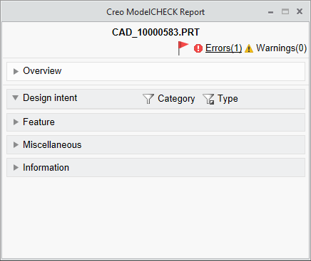
I am seeing that the ALL tab will not expand if it just has Warnings. Can you have the All tab always expand and when that happens, none of the other tabs expand? My case, there is 1 Warning of GLOBAL_INTF.
Update - this is only happening for Modelcheck interactive with ModelUpdate ON. Not the biggest deal. No updates happened for this case.
Thanks!
- Mark as New
- Bookmark
- Subscribe
- Mute
- Subscribe to RSS Feed
- Permalink
- Notify Moderator
When you run ModelUPDATE, the Update group is at the top, above All, correct? So what happens is that whatever is the top node of this "tree" will be expanded by default. So if you run ModelUPDATE, that will be Update. But if you just have the All category (no Update), that will be at the top and so will expand by default. I don't think it has to do with whether there are only Warnings in the All category, but let me know if that's not accurate.
- Mark as New
- Bookmark
- Subscribe
- Mute
- Subscribe to RSS Feed
- Permalink
- Notify Moderator
That would make sense. However, if there is nothing for the model to update, the group is not listed altogether (which is fine). In that case, nothing is expanded, not even ALL.
- Mark as New
- Bookmark
- Subscribe
- Mute
- Subscribe to RSS Feed
- Permalink
- Notify Moderator
@lwestbrook Thanks for the response as well!
- Maybe just don't show the 'Start Items' errors? In the example of the top of the post, they are really just duplicated of the 'Missing Parameters' errors. Users don't need to see the same thing twice. Then the total errors would match the errors displayed to users.
- If you're displaying more than 10-20 errors/warnings (lists long enough to consider justifying grouping)... your users are likely to revolt. Our main concern is the extra time/effort require to expand / collapse groups that are collapsed by default - this could result in missed errors/warnings, wasted time, and frustrate users. Even better than customizing the groups, would be the ability to have custom error messages! This would allow us to help users figure out what they need to fix and why. I wouldn't say no to customizing the groups if they stay around though - especially if there was custom headers for groups. The hidden config you mentioned in point 4 should hopefully solve things not being expanded by default.
- Thanks for the explanation - keeping the button at the top is fine and follow the Windchill Workspace logic for interacting with lists of objects. I agree with @jwagh... the main problem is that people don't realize the +/pencil icons are buttons where it was more obvious that the ADD/EDIT buttons were actually buttons. You could even keep the + sign but put the word ADD with a button box around it if desired.
- Thanks for letting us know about this config! Can you please make this config option not hidden? And show all by default? You'd get two votes from @jwagh and myself for this.
- Mark as New
- Bookmark
- Subscribe
- Mute
- Subscribe to RSS Feed
- Permalink
- Notify Moderator
Regarding expanding all of the errors/warnings by default instead of just the first group (disregarding the config to show the All category for now), would you want both errors and warnings to expand by default or just errors? If the latter, this would mean that a category with no errors would be collapsed by default even if it had several warnings. Thoughts?
Of course, we could make this user configurable, but I'd just as soon avoid yet another config option if there's a reasonable common behavior.
- Mark as New
- Bookmark
- Subscribe
- Mute
- Subscribe to RSS Feed
- Permalink
- Notify Moderator
I think it would be both error and warning (if no config is to be used). If it is important enough for the admins to put it as a warning, it should be shown. That is the current behavior anyway.
- Mark as New
- Bookmark
- Subscribe
- Mute
- Subscribe to RSS Feed
- Permalink
- Notify Moderator
I agree. Both. It's the current behavior and if the admin thought it was important enough to flag then, then it should be shown. There could always be a config option that could control this behavior.
- Mark as New
- Bookmark
- Subscribe
- Mute
- Subscribe to RSS Feed
- Permalink
- Notify Moderator
- Mark as New
- Bookmark
- Subscribe
- Mute
- Subscribe to RSS Feed
- Permalink
- Notify Moderator
Luke,
You mentioned MC_REPORT_SHOW_ALL_TAB as a hidden config option. Is this for the config.pro file or is it for a config file within the modchk structure?
Barry
- Mark as New
- Bookmark
- Subscribe
- Mute
- Subscribe to RSS Feed
- Permalink
- Notify Moderator
Within ModelCHECK
- Mark as New
- Bookmark
- Subscribe
- Mute
- Subscribe to RSS Feed
- Permalink
- Notify Moderator
In which file?
Within config_init ?
- Mark as New
- Bookmark
- Subscribe
- Mute
- Subscribe to RSS Feed
- Permalink
- Notify Moderator
You have to add it into config_init.mc as below:
MC_REPORT_SHOW_ALL_TAB YN Y Y Y Y
- Mark as New
- Bookmark
- Subscribe
- Mute
- Subscribe to RSS Feed
- Permalink
- Notify Moderator
Hi there,
thanks for the configuration option.
I tried it, but it did not work as expected.
This is the report after mc run:
And that is, what I expected:
Did I missed something?
- Mark as New
- Bookmark
- Subscribe
- Mute
- Subscribe to RSS Feed
- Permalink
- Notify Moderator
Hi Mat,
The only thing I can think of is that perhaps you need to close and re-open Creo in order for the config change to take effect. After I made the config change and then re-launched Creo, I see the following (which is not quite the same as what I think you were expecting. The config will not expand all categories by default but will instead add an "All" category that, if it's the first category, will be expanded.)
- Mark as New
- Bookmark
- Subscribe
- Mute
- Subscribe to RSS Feed
- Permalink
- Notify Moderator
@lwestbrook wrote:..The config will not expand all categories by default but will instead add an "All" category that, if it's the first category, will be expanded...
That's it! Thanks!
- Mark as New
- Bookmark
- Subscribe
- Mute
- Subscribe to RSS Feed
- Permalink
- Notify Moderator
@lwestbrook Any chance this option can work for RuleCheck as well? The default shows the Soft Checks are expanded by default, where the Hard Checks are not. I would argue that this should be reversed. In addition, there are a lot of enhancements I would like to make to Rule Check. Any chance there will be a push to make this more robust? (like adding groups, having allowing longer names, etc).
- Mark as New
- Bookmark
- Subscribe
- Mute
- Subscribe to RSS Feed
- Permalink
- Notify Moderator
There aren't any enhancements planned right now for RuleCHECK, but I'd like to get that list from you so I can see what we might be able to prioritize for a future release.
- Mark as New
- Bookmark
- Subscribe
- Mute
- Subscribe to RSS Feed
- Permalink
- Notify Moderator
You want it here or in an email?
- Mark as New
- Bookmark
- Subscribe
- Mute
- Subscribe to RSS Feed
- Permalink
- Notify Moderator
Email is good, though it would also be helpful to capture it in the product ideas forum.
- Mark as New
- Bookmark
- Subscribe
- Mute
- Subscribe to RSS Feed
- Permalink
- Notify Moderator
See the new rulecheck idea thread here: https://community.ptc.com/t5/Creo-Parametric-Ideas/Rulecheck-ideas/idi-p/627386#M12712
Thanks!
- Mark as New
- Bookmark
- Subscribe
- Mute
- Subscribe to RSS Feed
- Permalink
- Notify Moderator
Hi Luke,
There is a hidden config.pro option for creo4:
MODELCHECK_SHOW_NEW_REPORT_UI YES
that shows this new UI in creo4, my question: is it absolutely safe to implement in Creo4?
I mean, if it is safe, I hope it is, why is it a hidden option? thanks
- Mark as New
- Bookmark
- Subscribe
- Mute
- Subscribe to RSS Feed
- Permalink
- Notify Moderator
@Trebla Thanks for sharing! I didn't realize that the new ModelCheck menu was available in Creo 4 (which we're currently using). I also don't understand why several of these are hidden - like the MC_REPORT_SHOW_ALL_TAB in the config_init.mc file (which also works in Creo 4 M090 😀).
I'll be curious about @lwestbrook's response about if the new ModelCheck UI is 'ok' to use in Creo 4.
- Mark as New
- Bookmark
- Subscribe
- Mute
- Subscribe to RSS Feed
- Permalink
- Notify Moderator
This was done before I took over ModelCHECK (this is me trying to distance myself from any blame for the decision to keep the config hidden 😁), but essentially, Creo 5.0 is the earliest version in which the new UI is fully supported. It was backported to Creo 4.0 but isn't technically fully supported. So while it should generally function (and in that sense is 'ok' to use), there won't be any bug fixes for it in Creo 4.0. That's why it's hidden.
Luke Westbrook

