
Turn on suggestions
Auto-suggest helps you quickly narrow down your search results by suggesting possible matches as you type.
Showing results for
Please log in to access translation
Turn on suggestions
Auto-suggest helps you quickly narrow down your search results by suggesting possible matches as you type.
Showing results for
Community Tip - Have a PTC product question you need answered fast? Chances are someone has asked it before. Learn about the community search. X
- Community
- Creo+ and Creo Parametric
- 3D Part & Assembly Design
- Re: Vertical text creation?
Translate the entire conversation x
Please log in to access translation
Options
- Subscribe to RSS Feed
- Mark Topic as New
- Mark Topic as Read
- Float this Topic for Current User
- Bookmark
- Subscribe
- Mute
- Printer Friendly Page
Vertical text creation?
Jul 13, 2016
01:08 PM
- Mark as New
- Bookmark
- Subscribe
- Mute
- Subscribe to RSS Feed
- Permalink
- Notify Moderator
Please log in to access translation
Jul 13, 2016
01:08 PM
Vertical text creation?
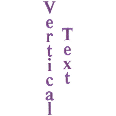
I need to create text on a surface. Simple enough, but the text needs to be like this:
V
E
R
T
I
C
A
L
I could create each letter individually, then align them and space them to make it look okay, but is there a more elegant solution? In short, is there a way to create a text string that is vertical but has the letters oriented in the "normal" way?
Also, oddly enough, if you use the ISOFONT, the capital "I" is not centered on the letter. The text geometry is offset a bit to the right side. Weird.
Solved! Go to Solution.
ACCEPTED SOLUTION
Accepted Solutions
Jul 14, 2016
10:06 AM
- Mark as New
- Bookmark
- Subscribe
- Mute
- Subscribe to RSS Feed
- Permalink
- Notify Moderator
Please log in to access translation
Jul 14, 2016
10:06 AM
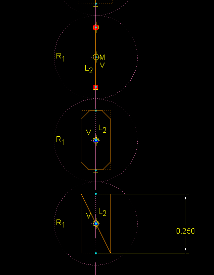
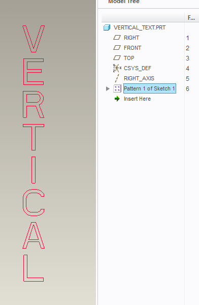
What I ended up doing to get the desired effect and ability to adjust things is the following:
(1) Sketch a centerline along which the letters will be aligned.
(2) Place a bunch of equal diameter construction circles along the centerline, one for each letter.
(3) Make each of the circles tangent to its adjacent neighbor.
(4) Create each letter of the expression as a separate text entity, with center and middle alignment. Make sure the size of each letter is defined as equal to the first letter, so you can change the size of all of them with one dimension change.
(5) Make each letter of text coincident with the center of a construction circle.
This way, I can play around with the diameter of the construction circles to adjust spacing of the letters, and it looks really nice. It's not very efficient, but gets the job done.
For the annoying "I" (capital "i") problem, I just put a vertical line in place of a letter as needed, and it looks great.
Attached is a picture of the a bit of the sketch for the feature.
22 REPLIES 22
Jul 14, 2016
08:35 AM
- Mark as New
- Bookmark
- Subscribe
- Mute
- Subscribe to RSS Feed
- Permalink
- Notify Moderator
Please log in to access translation
Jul 14, 2016
08:35 AM
That's never been possible at least up through Creo2. Not sure it 3 has that.
What I do is create them individually but not as individual features. This way you can lock height to one another but still move them individually to get the correct spacing and alignment.
Jul 14, 2016
08:48 AM
- Mark as New
- Bookmark
- Subscribe
- Mute
- Subscribe to RSS Feed
- Permalink
- Notify Moderator
Please log in to access translation
Jul 14, 2016
10:06 AM
- Mark as New
- Bookmark
- Subscribe
- Mute
- Subscribe to RSS Feed
- Permalink
- Notify Moderator
Please log in to access translation
Jul 14, 2016
10:06 AM
What I ended up doing to get the desired effect and ability to adjust things is the following:
(1) Sketch a centerline along which the letters will be aligned.
(2) Place a bunch of equal diameter construction circles along the centerline, one for each letter.
(3) Make each of the circles tangent to its adjacent neighbor.
(4) Create each letter of the expression as a separate text entity, with center and middle alignment. Make sure the size of each letter is defined as equal to the first letter, so you can change the size of all of them with one dimension change.
(5) Make each letter of text coincident with the center of a construction circle.
This way, I can play around with the diameter of the construction circles to adjust spacing of the letters, and it looks really nice. It's not very efficient, but gets the job done.
For the annoying "I" (capital "i") problem, I just put a vertical line in place of a letter as needed, and it looks great.
Attached is a picture of the a bit of the sketch for the feature.
Jul 14, 2016
10:15 AM
- Mark as New
- Bookmark
- Subscribe
- Mute
- Subscribe to RSS Feed
- Permalink
- Notify Moderator
Please log in to access translation
Jul 14, 2016
10:15 AM
More work than necessary, but effective.
Jul 15, 2016
06:31 AM
- Mark as New
- Bookmark
- Subscribe
- Mute
- Subscribe to RSS Feed
- Permalink
- Notify Moderator
Please log in to access translation
Jul 15, 2016
06:31 AM
How is it "more work than necessary"?
Jul 15, 2016
11:53 AM
- Mark as New
- Bookmark
- Subscribe
- Mute
- Subscribe to RSS Feed
- Permalink
- Notify Moderator
Please log in to access translation
Jul 15, 2016
11:53 AM
I stand corrected. Nice technique.
Sep 06, 2016
09:45 AM
- Mark as New
- Bookmark
- Subscribe
- Mute
- Subscribe to RSS Feed
- Permalink
- Notify Moderator
Please log in to access translation
Sep 06, 2016
09:45 AM
I can't believe that they're missing this basic text creation functionality in such an advanced software.
Sep 06, 2016
10:37 AM
- Mark as New
- Bookmark
- Subscribe
- Mute
- Subscribe to RSS Feed
- Permalink
- Notify Moderator
Please log in to access translation
Sep 06, 2016
10:37 AM
tongue in cheek reply--- That is your mistake, assuming this is 'advanced software'!
Sep 16, 2016
08:30 AM
- Mark as New
- Bookmark
- Subscribe
- Mute
- Subscribe to RSS Feed
- Permalink
- Notify Moderator
Please log in to access translation
Sep 16, 2016
08:30 AM
Ben, after all this time you're still a UG/NX guy at heart aren't you.
Sep 22, 2016
05:11 PM
- Mark as New
- Bookmark
- Subscribe
- Mute
- Subscribe to RSS Feed
- Permalink
- Notify Moderator
Please log in to access translation
Sep 22, 2016
05:11 PM
Kelley, I still have more years on UG/NX than PTC products and been using PTC since 2001 with a little break plus some doubled years when I supported both.
So yes, I guess I am!
Sep 22, 2016
04:34 PM
- Mark as New
- Bookmark
- Subscribe
- Mute
- Subscribe to RSS Feed
- Permalink
- Notify Moderator
Please log in to access translation
Sep 22, 2016
04:34 PM
Just to put things in perspective, what's being described is not a "vertical text". A vertical text is normal text rotated 90 degrees.
Sep 22, 2016
05:18 PM
- Mark as New
- Bookmark
- Subscribe
- Mute
- Subscribe to RSS Feed
- Permalink
- Notify Moderator
Please log in to access translation
Sep 22, 2016
05:18 PM
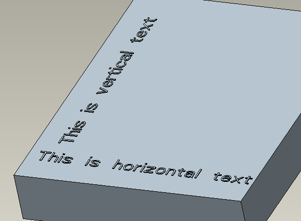
I disagree. What you show as 'vertical' text is horizontal text rotated to a vertical position. It is still readable like horizontal text.
This is Vertical Text!
Sep 23, 2016
07:49 AM
- Mark as New
- Bookmark
- Subscribe
- Mute
- Subscribe to RSS Feed
- Permalink
- Notify Moderator
Please log in to access translation
Sep 23, 2016
07:49 AM
Yeah, if you search on "vertical text" you get a lot of illustrations, many of which display just the very thing Ben shows. Besides, this is just semantics. I was perfectly clear in my initial inquiry as to what I was looking for.
Sep 26, 2016
03:35 PM
- Mark as New
- Bookmark
- Subscribe
- Mute
- Subscribe to RSS Feed
- Permalink
- Notify Moderator
Please log in to access translation
Sep 26, 2016
03:35 PM
This is a little hoaky because there are extra steps. But, you can create curves from a dxf or iges file. The step in creating the iges is to create a note in a drawing, probably A sized. Then, use the drag handles on the note to make the text vertical and save as an iges file. When creating the curve, use get data. Using the iges, it will come in as scalable, placeable text in the font used for the drawing text.
David Janes
Sep 26, 2016
04:52 PM
- Mark as New
- Bookmark
- Subscribe
- Mute
- Subscribe to RSS Feed
- Permalink
- Notify Moderator
Please log in to access translation
Sep 26, 2016
04:52 PM
I'm a little late to the party, but you could also control this with a parameter, some relations, and a pattern. Example attached.
Basically, you create a parameter for your text string. Then add a point to your sketch that you can use to increment a counter and use a relation inside of the sketch to define which character of the text string parameter to use. Pattern the sketch (you need to pattern the point "counter" dimension and the location dimension of the text). Finally, use a relation at the part level to tie the number of instances in the pattern to the length of your string (or manually keep them in sync). Probably easier to look at the example...
Sep 27, 2016
07:06 AM
- Mark as New
- Bookmark
- Subscribe
- Mute
- Subscribe to RSS Feed
- Permalink
- Notify Moderator
Please log in to access translation
Sep 27, 2016
07:06 AM
I like this because it puts all the work into the creation of the thing, up front, and makes it easy to modify the text string if the need arises. Presumably it would also work with a cosmetic groove, which I use to do engraving. I'd just have to pick a whole bunch of the features to do the engrave, but that's not unusual.
Sep 29, 2016
12:36 AM
- Mark as New
- Bookmark
- Subscribe
- Mute
- Subscribe to RSS Feed
- Permalink
- Notify Moderator
Please log in to access translation
Jan 21, 2019
11:46 AM
- Mark as New
- Bookmark
- Subscribe
- Mute
- Subscribe to RSS Feed
- Permalink
- Notify Moderator
Please log in to access translation
Jan 21, 2019
11:46 AM
I am not able to open your vertical text part, Its showing mw that it cannot be retrieved.
Jun 20, 2019
08:57 AM
- Mark as New
- Bookmark
- Subscribe
- Mute
- Subscribe to RSS Feed
- Permalink
- Notify Moderator
Please log in to access translation
Jun 20, 2019
08:57 AM
What version of Creo did you complete this in?
I am using Creo 3.0 and cannot replicate your actions. I can only get the sketch value to remain the same.
Jan 28, 2019
06:43 PM
- Mark as New
- Bookmark
- Subscribe
- Mute
- Subscribe to RSS Feed
- Permalink
- Notify Moderator
Please log in to access translation
Jan 28, 2019
06:43 PM
So, I'm gonna suggest something REALLY radical (but potentially extremely simple with the work dine up front):
Why not create a font where the characters are rotated either 90deg CW or 90deg CCW? I don't know how to do fonts, BUT it should be possible, if not easy. Then you can simply orient the text how you want, and manually type it in or use a parameter. No muss, no fuss, no bother.
Thoughts?
Sep 01, 2023
10:35 AM
- Mark as New
- Bookmark
- Subscribe
- Mute
- Subscribe to RSS Feed
- Permalink
- Notify Moderator
Please log in to access translation
Sep 01, 2023
10:35 AM
Did you ever try your "fonts"?
Sep 01, 2023
10:36 AM
- Mark as New
- Bookmark
- Subscribe
- Mute
- Subscribe to RSS Feed
- Permalink
- Notify Moderator
Please log in to access translation
Sep 01, 2023
10:36 AM
It has been several years, does anyone if Creo now has this capability?


