Add Style to Your UI with CSS Part 1
- October 17, 2022
- 0 replies
- 2742 views
- GUIDE CONCEPT
- Step 1: Custom CSS Benefits
- Step 2: Access Sample Files
- Step 3: Create CSS Rule Block
- Step 4: Apply Custom Class to Mashup
- Step 5: Apply Custom Class to Widget
- Step 6: Bind Custom Class
- Step 7: Use Media Queries
Modernize your Mashups with CSS to enhance the presentation of your application.
GUIDE CONCEPT
This project will introduce using CSS to create a customized, consistent look and feel for your IoT application.
Following the steps in this guide, you will create a custom CSS class definitions and bind these classes to Mashup features.
We will teach you how to present a professional-looking user interface and ensure consistency of style treatments within your application by implementing Cascading Style Sheets (CSS) in Mashups.
You'll learn how to
- Create custom CSS classes using the integrated CSS editor
- Bind CSS classes to a Mashup and to individual Widgets
- Use Media queries to dynamically apply styling
Step 1: Custom CSS Benefits
You now have more flexibility to customize your application’s UI and improve the user experience using industry-standard web techniques. You can implement CSS in ThingWorx to control the visualization of your Mashup.
Feature Benefit
| Text Treatments | Optimize text with shadow, color, font, and border |
| Responsive UI | Customize layout based on user actions and the data being displayed |
| Media Queries | Accommodate many screen sizes with flexboxes and other standard containers |
| Animations | Implement standard CSS key frames |
| Customizations | Modify application appearance without changing source Mashup |
| Linting | Expedite development with code auto-completion and design-time syntax warnings |
Step 2: Access Sample Files
We created sample entities you can use to complete the steps in this guide.
- Download the attached Mashups_CustomCssTutorialMashup.xml
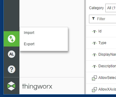
- From the Home page of Composer, click the Import/Export icon, then choose Import
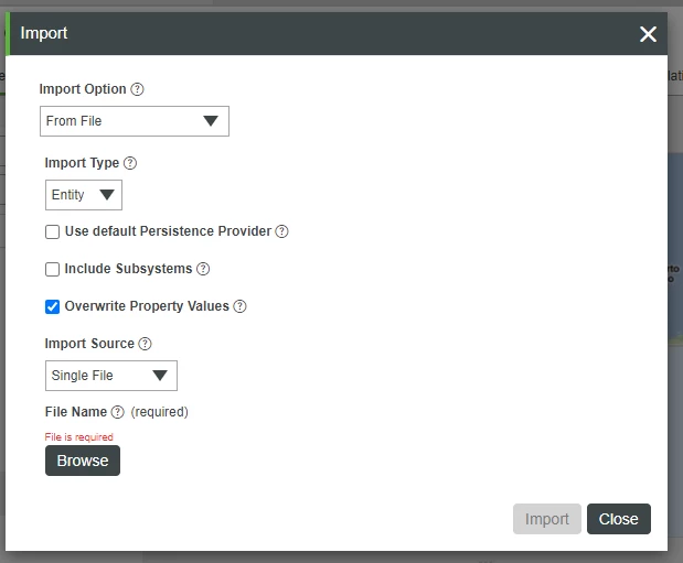
- Keep the default options and click Browse. Locate and select the CustomCssTutorialMashup.xml file you downloaded and extracted, click Open then Import.
- Click Close after the Import successful message is displayed.
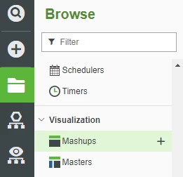
- Click the Browse tab in the left navigation panel, then click Mashups.
6. Select the CustomCssTutorialMashup.
7. Click View Mashup to view the Mashup.
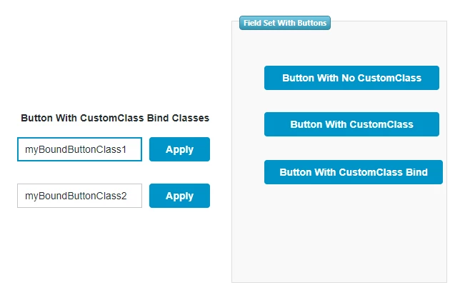
NOTE: This is a simple Mashup designed to demonstrate how the UI changes when CSS is applied.
Step 3: Create CSS Rule Block
In this step, you will use the built-in editor to create a custom CSS class that will be used in the next step to modify the appearance of three buttons grouped by the Fieldset Widget.
- Open the CustomCssTutorialMashup in Edit and Design view.
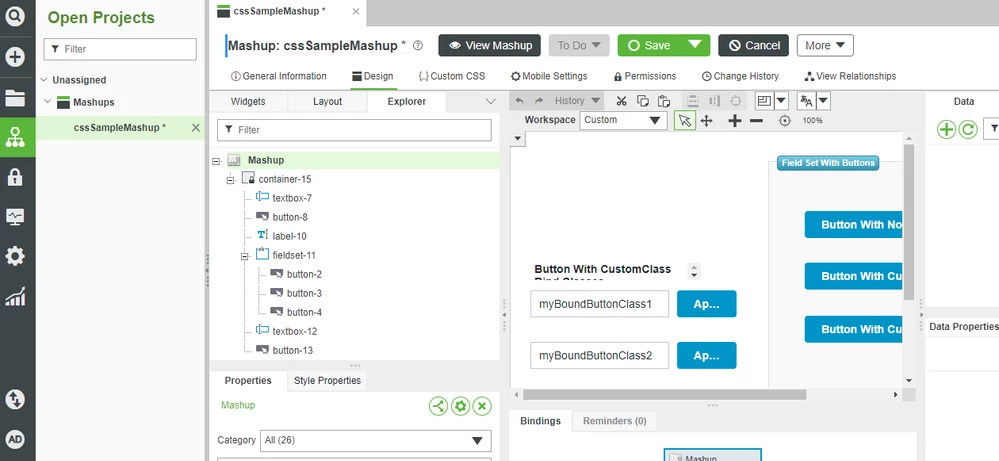
- Click Custom CSS.
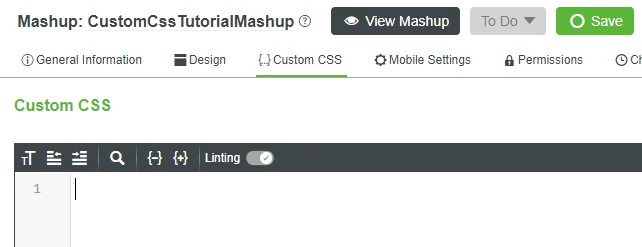
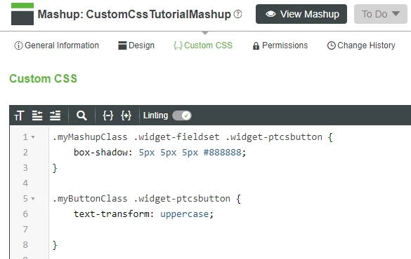
- Copy the CSS class below and paste it into the Custom CSS editor:
.myMashupClass .widget-fieldset .widget-ptcsbutton {
 box-shadow: 5px 5px 5px #888888;
}
NOTE: This class will create a shadow around all of the buttons that are in a Fieldset container only after it is bound to a Mashup,
4. Click Save.
Tips
Press Ctrl -> Space to use the Auto-complete feature and see code snippets, which can expedite your development time.
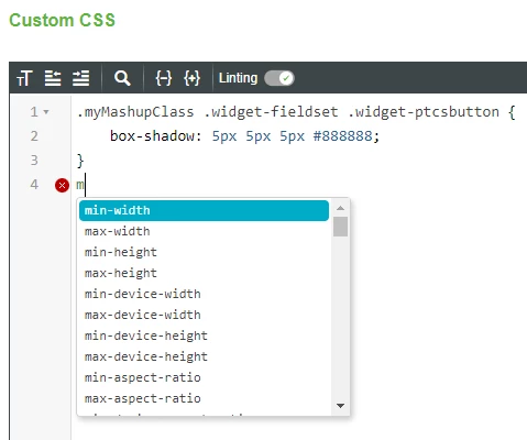
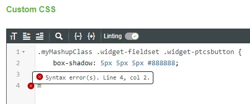
The Linting feature will warn you if there are errors in your code, so you can fix them at design time.
Step 4: Apply Custom Class to Mashup
In this step we will demonstrate how to modify the look and feel of a Mashup without changing the Mashup itself. The myMashupClass we just created chains two selectors: the widget-fieldset and the widget-button. Only Widgets that are in both selector categories will be modified.
- Click Design and select the Explorer tab, then select the top-level Mashup.
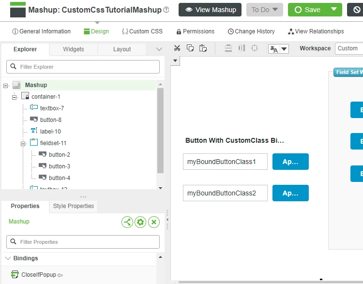
- In the property panel in the lower left, locate the CustomClass property and type myMashupClass as the value.
- Press Tab to save the value change.
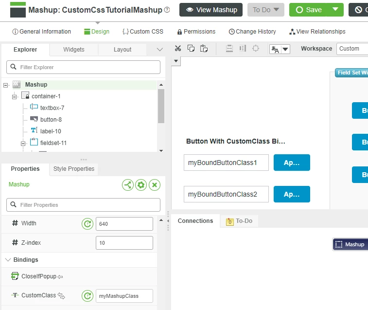
WARNING: You must press Tab after every property change in order for the new value to be saved.
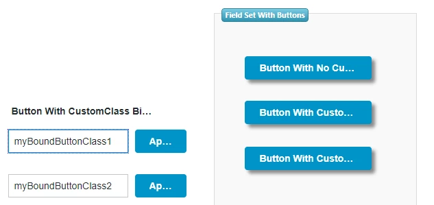
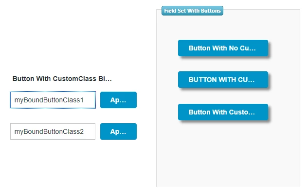
4. Click Save then View Mashup to see that the buttons in the Field Set have shadow borders.
Step 5: Apply Custom Class to Widget
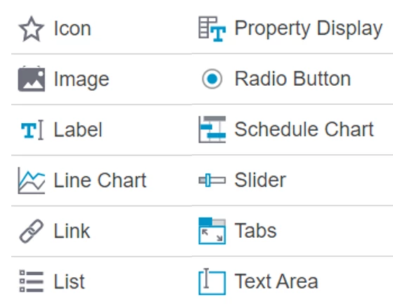
In addition to the Mashup level, you can apply style treatments directly to a Widget in your Mashup. In ThingWorx, the following Widgets have a CustomClass property you can modify:
For this example, we will make the text on one of the buttons all caps.
- In the CustomCssTutorialMashup, click Custom CSS.
Add the following css code:
.myButtonClass .widget-ptcsbutton {
 text-transform: uppercase;

}
- Return to the Design view, and In the Explorer tab, click the button-3.
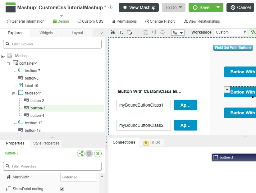
- In the Property panel, enter myMashupClass to the CustomClass field, then press tab
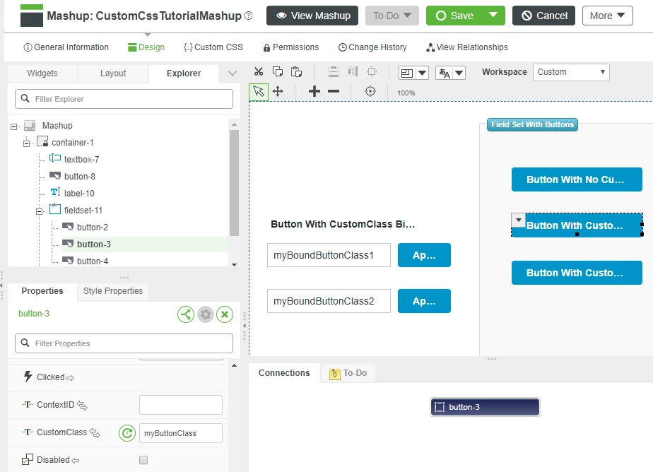
- Save then View Mashup the Mashup to see that the button text is now all caps.
Step 6: Bind Custom Class
The UI of a Mashup can be dynamically updated at runtime by binding the value of the CustomClass property to a dynamic data source such as:
- Services
- Mashup parameters
- Widgets (expression widgets for example)
In this portion of the guide, we will demonstrate modifying a Mashup in response to user actions:
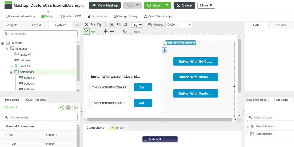
- Return to the Design view for the CustomCssTutorialMashup.
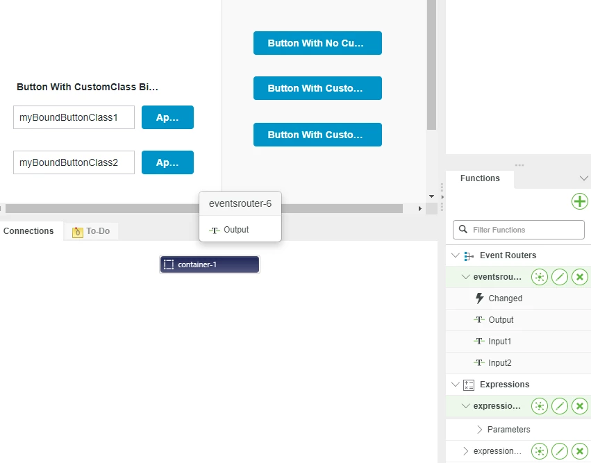
- In the Mashup Builder, click the Functions tab in the lower right, then expand Event Routers and expand eventsrouter-6
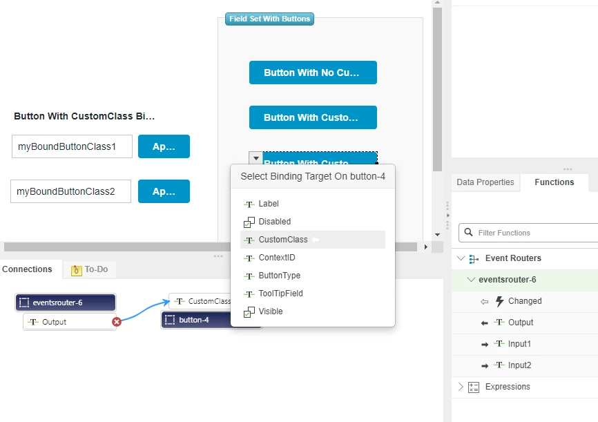
- Click Output property and drag it onto the bottom button of the group of three buttons.
- Select the CustomClass property from the pop-up to bind it to Button-4
- In Mashup Builder click Custom CSS tab.
- Add the following css code:
.myBoundButtonClass1 .widget-ptcsbutton {
 text-transform: lowercase;
}

.myBoundButtonClass2 .widget-ptcsbutton {
 text-transform: uppercase;
}
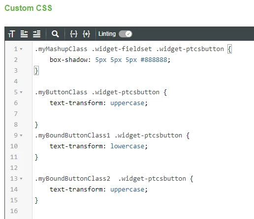
7. Click Save and then View Mashup.
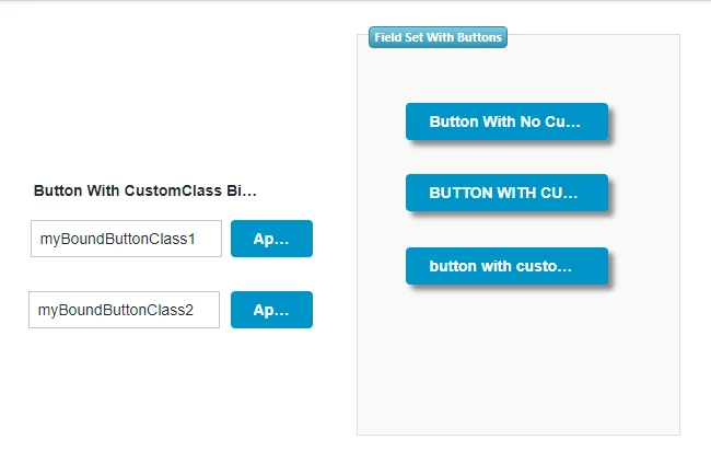
8. Click on each of the Apply buttons to see the results of a CSS class applied to in response to user actions.
Step 7: Use Media Queries
You can use Media queries to apply styling based on the characteristics of the device being used to access the application. For this example, we will use a CSS Class to hide three elements when the browser’s width is less than 600 pixels wide.
1. Open the CustomCssTutorialMashup in Edit and Design view, then click Custom CSS.
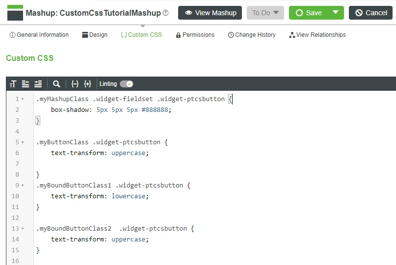
2. Copy the CSS class below and use the Custom CSS editor to add it to the top of the existing CSS, then click Save.
@media screen and (max-width: 1000px) {

 #root_ptcslabel-10-bounding-box {
 visibility: hidden;
 }

 #root_ptcstextfield-7-bounding-box{
 visibility: hidden;
 }

 #root_ptcstextfield-12-bounding-box {
 visibility: hidden;
 }
}
NOTE: The ID selector in your CSS must add root_ to the beginning, and -bounding-box to the end of the element’s ID shown in Mashup Builder.
3. Click View Mashup, then click and drag the edge of the browser window to reduce the width below 600 pixels.
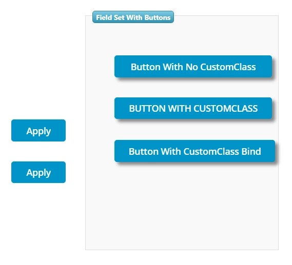
NOTE: The three Widgets selected in the media class added in the last step will disappear as soon as the browser is less than 600 pixels wide.
Click here to view Part 2 of this guide.

