Basic Mashup Widgets Guide Part 1
- July 26, 2022
- 0 replies
- 2553 views
Basic Mashup Widgets Guide Part 1
Overview
This project will introduce how to use some basic Widgets in a Mashup. Following the steps in this guide, you will create a Mashup that reacts to user input using a Button, Toggle Button, and Slider Widget. We will also teach you how to display data to users with the Grid Advanced, Gauge, and Property Display widgets. NOTE: This guide's content aligns with ThingWorx 9.3. The estimated time to complete ALL 3 parts of this guide is 60 minutes.
Step 1: Create Mashup
Build Mashup
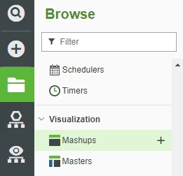
- Click the Browse folder icon on the top left of ThingWorx Composer.
- Select Mashups in the left-hand navigation, then click + New to create a new Mashup.
3. For Mashup Type select Responsive.
NOTE: A Responsive Mashup scales with a browser’s screen size. In the steps below we will create 5 containers, one for each widget, to organize how the widgets are presented.
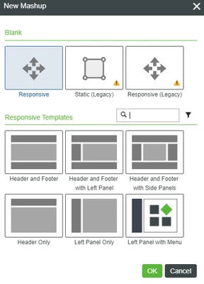
4. Click OK.
5. Enter a name for your Mashup.
6. If Project is not already set, click the + in the Project text box and select the PTCDefaultProject.
7. Click Save.
8. Select the Design tab to display Mashup Builder.
9. Select the Layout tab in the upper panel of the left dock.
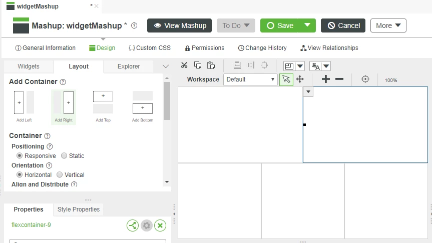
10. Click Add Bottom to split the Mashup canvas into two halves.
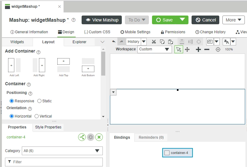
11. Click inside the bottom container to selected it, then click Add Left.
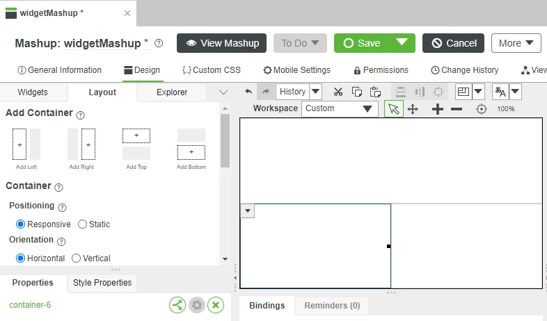
12. Click inside the bottom-right container to select it, then click Add Right.
13. Click inside the top container to select it, then click Add Right again. You should now have 5 containers in two rows, ready to have widgets added.
Step 2: Button
A button allows users to trigger an action, or stop and start long-running processes.
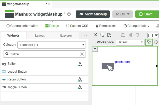
- Select the Widgets tab in the uppper panel of the left dock, then enter button inside the Filter field in the top-left.
- Drag-and-drop the Button widget onto the upper left container.
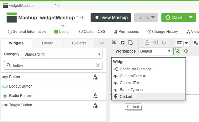
3. Click the drop-down arrow on the left side of the Button widget.
4. Click and drag the Clicked service shown in the drop-down onto a free area of the Mashup canvas.
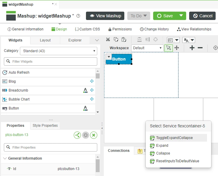
5. When the Select Service pop-up appears, Click the ResetInputsToDefaultValues service that is provided by the Container.
6. Click Save.
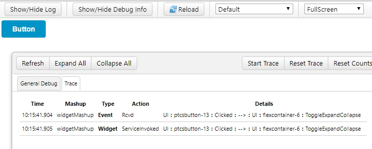
7. Click View Mashup then click Show/Hide Debug Info.
8. Click the Trace tab and click Start Trace.
9. Click the button you created in your Mashup then click Stop Trace to see the log of the Clicked event triggering the ResetInputsToDefaultValues service.
Many properties are available that give control over how a Button widget will be displayed. Many properties can be changed both statically when designing the Mashup, and dynamically in response to changes in property values.
Bindable
Name | Type | Default | Direction | Description |
ContextId | String | None | Input/Output | User-definable value that can be used by downstream triggered widgets |
Disabled | Boolean | False | Input | Widget is not usable and is displayed greyed-out if set to true |
Label | String | Button | Input | The text that appears on the button |
ToolTipField | String | None | Input | Text shown when user hovers over widget |
Visible | Boolean | True | Input | Widget is visible if set to true |
CustomClass | String | None | Input/Output | User-definable CSS class applied to top di of the button |
Static
Name | Type | Default | Direction |
DisplayName | String | auto-generated | Descriptor used for referring to widget in Composer and Mashup Builder |
Description | String | None | Description used for widget in user-facing interactions |
TabSequence | Number | 0 | Tab sequence index |
Height | Number | Autosize | Height of button |
Width | Number | Autosize | Width of button |
Z-index | Number | 10 | Controls widget placement on top or below other widgets |
Widget Events
Name | Description |
Clicked | Fired when user clicks button |
Click here to view Part 2 of this guide.

