Basic Mashup Widgets Guide Part 2
- July 26, 2022
- 0 replies
- 1387 views
Basic Mashup Widgets Guide Part 2
Step 3: Slider
A Slider allows your application users to interactively select a numeric value. When the user changes the position of the slider bar, an event is fired and the value property is changed.
- On the New Mashup tab, enter slider inside the Filter field in the top left.
- Drag-and-drop the Slider widget onto the top-right Container of your Mashup.
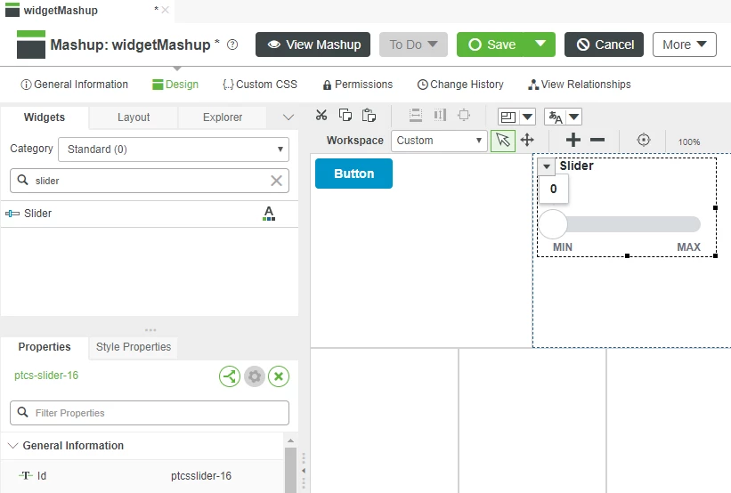
3. In the lower panel of the left dock, scroll to the Maximum property and change the value to 1000.
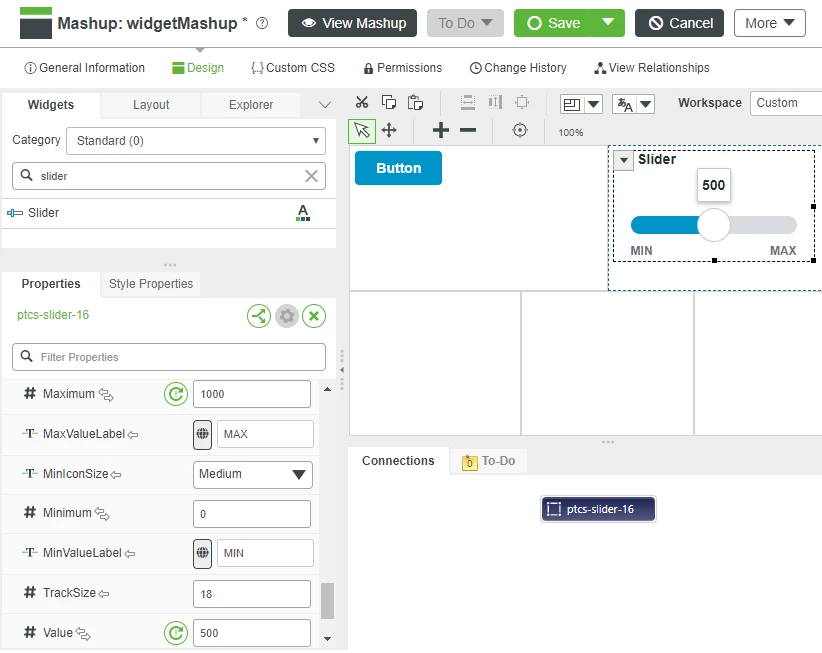
4. Change the Value property to 500 set the default position of the slider.
Add Value Display
To demonstrate the Slider functionality we will add a Value Display Widget within the same Container of your Mashup as the Slider and bind the slider widget output to the input of the Value Display.
1. In the Filter field where you entered slider, enter value.
2. Drag-and-drop a Value Display widget onto the same upper-right Container as the Slider widget.
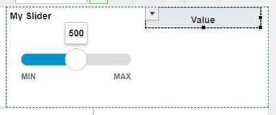
3. Click the drop-down arrow on the left side of the Slider widget.
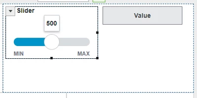
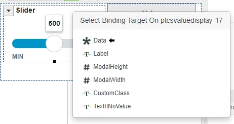
4. Click and drag the Value property listed in the Slider drop-down onto the Value Display widget.
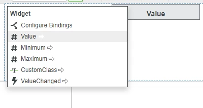
5. Click the Data property that is available from the Select Binding Target pop-up.
6. Click Save to save your Mashup.
7. Click View Mashup then adjust the slider to see the changing value shown in the Value Display widget.
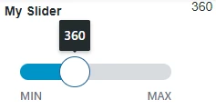
Many properties are available that give control over how a Slider widget will be displayed. Properties can be changed both statically when designing the Mashup, and dynamically in response to changes in property values.
Bindable
Name | Type | Default | Direction | Description |
Value | Number | 0 | Input/Output | Value defined by position of Slider that can be used by downstream widgets or services |
Minimum | Number | 0 | Input/Output | Value for left-most position of Slider, bottom-most position of Vertical Slider |
Maximum | Number | 100 | Input/Output | Value for right-most position of slider, top-most position of Vertical Slider |
HandleSize | Number | 34 | Input | Size in pixels of the slider handle |
Visible | Boolean | True | Input | Widget is visible if set to true |
StepSize | Number | 1 | Input | Smallest change in value when slider is moved |
Static
Name | Type | Default | Direction |
DisplayName | String | None | Name used for widget in user-facing interactions |
Description | String | None | Description used for widget in user-facing interactions |
HandleIcon | None/Circle/Split | Circle | Slider handle style |
SliderBar | Thick/Thin | Thick | Slider bar style |
SteppingMode | Boolean | False | When True, moves the slider by Step amount toward the click on the Slider bar |
TrackingMode | Boolean | False | When True, the slider generates events as it changes value. Use with caution, this mode generates many events rapidly. |
DisplayMinMaxLabels | Boolean | True | When enabled, displays the minimum and maximum values of the slider |
DisplayValueLabel | Boolean | True | When enabled, displays the value of the slider |
Widget Events
Name | Description |
ValueChanged | Fired when Slider Value changes |
Widget Services
Name | Description |
Increment | Increase value of Slider by Step amount |
Decrement | Decrease value of Slider by Step amount |
Step 4: Toggle Button
A Toggle Button widget is used when a Mashup user may select only one choice from two options.
- On the Widgets tab in the top-left, enter button in the Filter field.
- Drag-and-drop the Toggle Button widget onto the lower left container of the mashup.
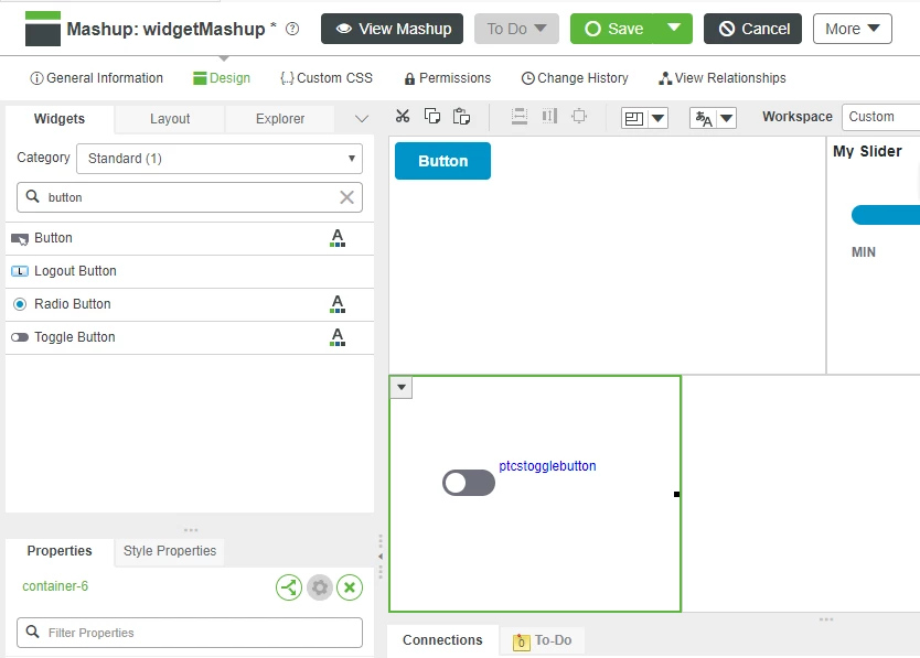
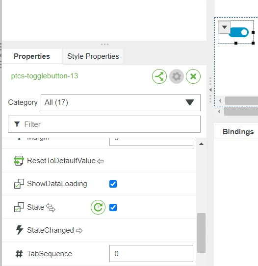
- Scroll to the State property in the lower panel of the left dock where Toggle Button widget properties are shown.
- Click the check box to set the default state to true.
Add Value Display
To demonstrate the toggle Button, we will add a Value Display Widget to the same Mashup container and bind the toggle Button State property to be shown by the Value Display.
- Drag-and-drop a Value Display Widget onto the same lower left container of the Mashup where the Toggle Button was placed.
- Click the drop-down arrow on the left side of the Toggle Button Widget.
- Click and drag the State property listed in the drop-down onto the Value Display Widget and a Select Binding Target pop-up will appear.
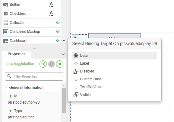
- Click the Data property that is available from the Value Display Widget.
- Click Save to save your Mashup so it can be tested.
- Click View Mashup then click the Toggle Button to see the value of the button shown in the Value Display Widget.

Other properties are available to provide control over how a Toggle Button Widget will be displayed. Properties can be changed both statically when designing the Mashup, and dynamically in response to changes in property values.
Bindable
Name | Type | Default | Direction | Description |
State | boolean | false | Input/Output | Value of toggle, can be used by downstream Widgets or Services |
Label | String | None | Input | Text that is displayed next to toggle button |
Visible | Boolean | True | Input | Widget is visible if set to true |
Static
Name | Type | Default | Description |
DisplayName | String | auto-generated | Name used to identify Widget in Mashup Builder |
Description | String | None | Description used for Widget in user-facing interactions |
Height | number | autosize | Sets the height of the widget in pixels |
LabelAlignment | Left/Right | Left | Where label is shown relative to toggle button |
Widget Events
Name | Description |
StateChanged | Fired when user clicks the button |
Click here to view Part 3 of this guide.

