- Community
- IoT & Connectivity
- IoT & Connectivity Tips
- Define Your UI Style Part 1
- Subscribe to RSS Feed
- Mark as New
- Mark as Read
- Bookmark
- Subscribe
- Printer Friendly Page
- Notify Moderator
Define Your UI Style Part 1
- Guide Concept
- Step 1: Completed Example
- Step 2: Create Style Definition
- Step 3: Customize Style Definitions
Convey information about IoT data effectively by customizing style definitions and implementing event-based logic
Guide Concept
This project will help you identify how you would like to create an experience for Users.
Following the steps in this guide, you will use color schemes to convey information quickly and effectively, for example to alert users of critical events. With ThingWorx Composer, you can implement Styles and States in your Mashups to enhance your user experience.
We will teach you how to create an affective IoT application experience that looks great and easy to navigate. How the UI is presented can influence users and their enjoyment of the application.
You'll learn how to
- Create a Style Definition
- Customize Style Definitions
- Create and implement State Definitions
- Implement event-based state changes
NOTE: This guide's content aligns with ThingWorx 9.3. The estimated time to complete this guide is 60 minutes
Step 1: Completed Example
Download the StylesAndStates.xml attached to this guide. Within this file, you will find Entities referenced in this lesson, including a finished application. Import and utilize this file to see a finished example and return to it as a reference if you become stuck during this guide and need some extra help or clarification.
Keep in mind, this download uses the exact names for entities used in this tutorial. If you would like to import this example and also create entities on your own, change the names of the entities you create.
Step 2: Create Style Definition
A Style Definition is a collection of HTML styling elements that can be applied to a Widget just as you would apply a CSS definition to an HTML tag. With Style Definitions, you can control the look and feel, such as colors, fonts, and color context of individual Widgets in your Mashup.
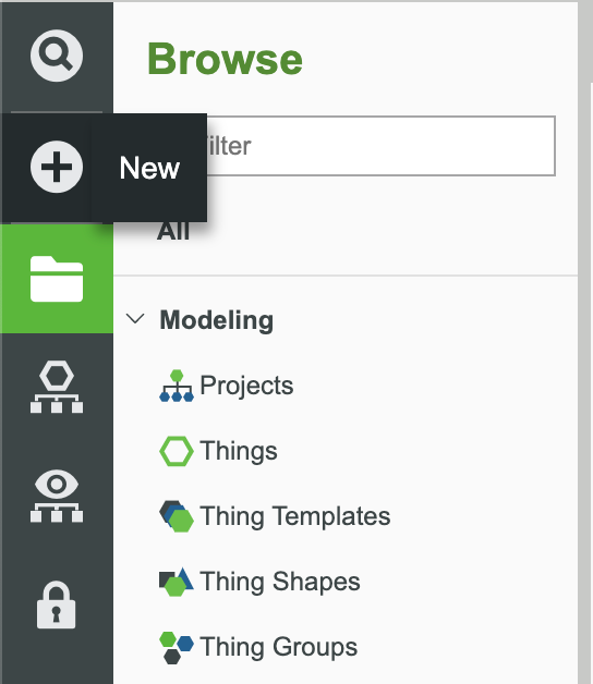
In the ThingWorx Composer, click the + New at the top of the screen.
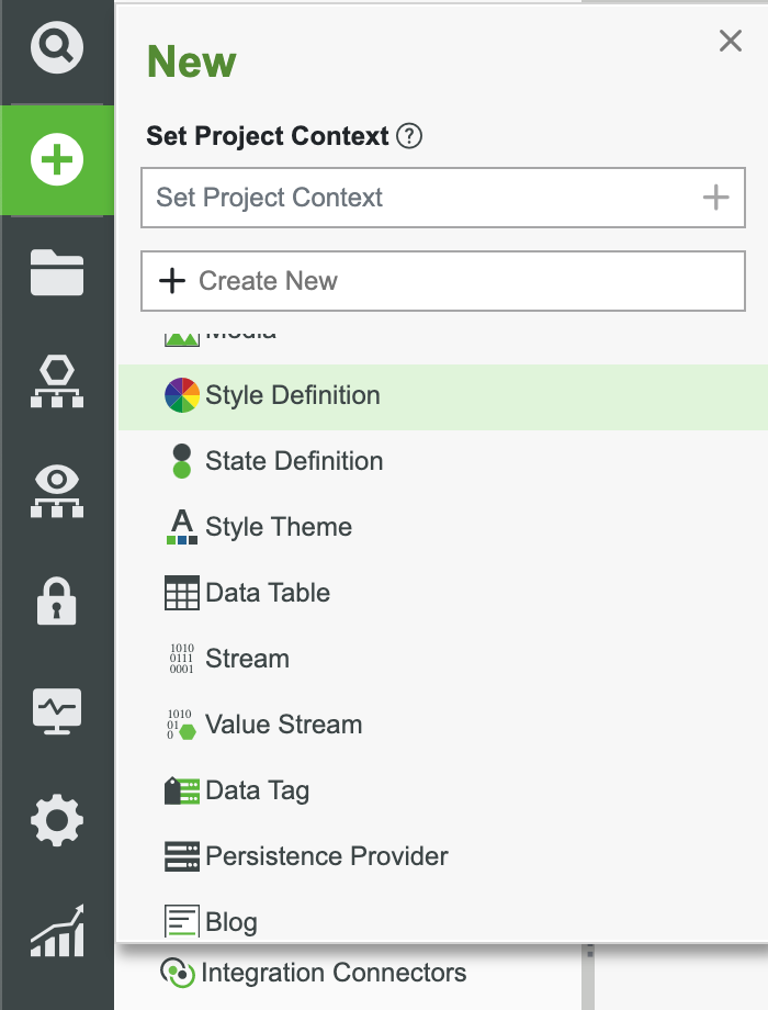
Select Style Definition in the dropdown.
Enter a name for the Style Definition, such as StyleDefinition.
Set the Project to an existing Project (ie, PTCDefaultProject).
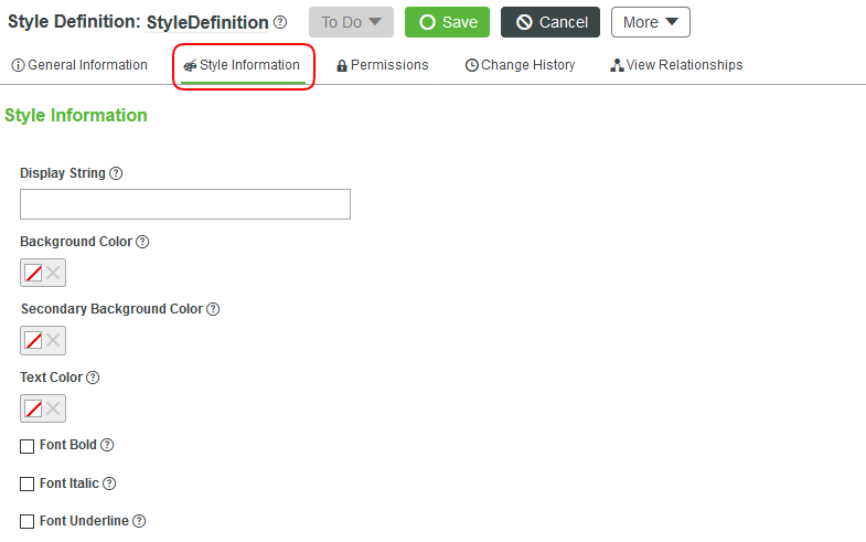
- Click Style Information.
The Style Information page shows the options for images, colors, lines, and display text. See the table below for information on what each field controls.
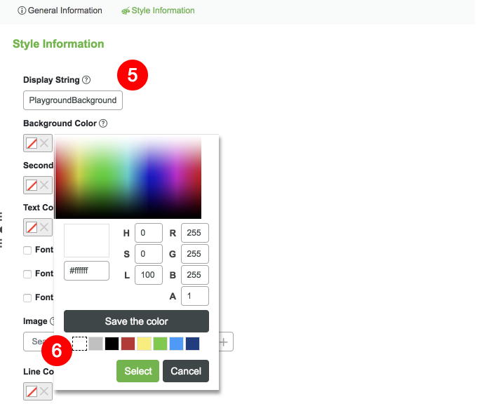
6. Type PlaygroundBackground in the Display String field.
NOTE: If you go back to the HelloWorldPlayground, clear the Mashup Style property, then search for StyleDefinition again, you will see the PlaygroundBackground descriptive text.
7. Select Background Color. A color pallet will appear. Select White and click Select.
8. Select Text Color. A color pallet will appear. Select Black and click Select.

9. Click Save.
You have now created your first Style Definition. To ensure a consistent user experience, we recommend creating a Style Definition that you can use throughout your application.
Option Description
| Display String | Descriptive string that can be displayed to indicate the current applied style definition |
| Background Color | Background for charts, buttons, panels, etc |
| Secondary Background Color | Meant for widgets that support gradients |
| Foreground Color | Used for foreground characteristics such as button text and label text |
| Font Bold | For text, whether the text should be bold or not |
| Font Italic | For text, whether the text should be italicized or not |
| Font Underline | For text, whether the text should be underlined or not |
| Image | Add images |
| Line Color | Pen styling in charts |
| Line Thickness | Pen styling in charts |
| Line Style | Generally refers to borders. ThingWorx provides the following options: Solid, Dashed, Dotted, None |
| Text Size | Choose a font size from 9-72px |
In the next part of this exercise, you’ll learn how to use Style Definitions to create an engaging experience for your application users.
Step 3: Customize Style Definitions
Open the HelloWorldPlayground Mashup in Composer, and click View Mashup.
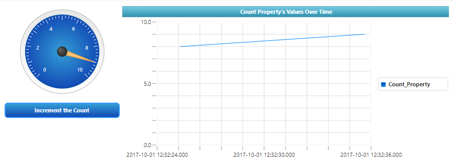
It shows a Button that sends an Event to a Gauge Widget, which then updates a Line Chart.
Modify Style Definition
In this part of the lesson, we'll make some changes to this Mashup. We will use Style Definitions to change the background of the Mashup, change the colors used in the Line Chart in order information stand out, and add color to the Gauge Widget.
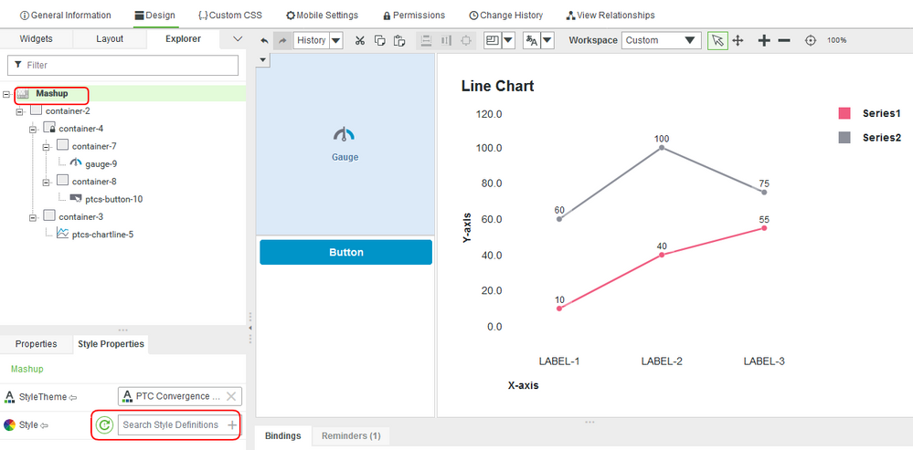
- In the Explorer tab, select the Mashup.
- Select the Style Properties tab, then click the X button to clear the Style Mashup Properties.
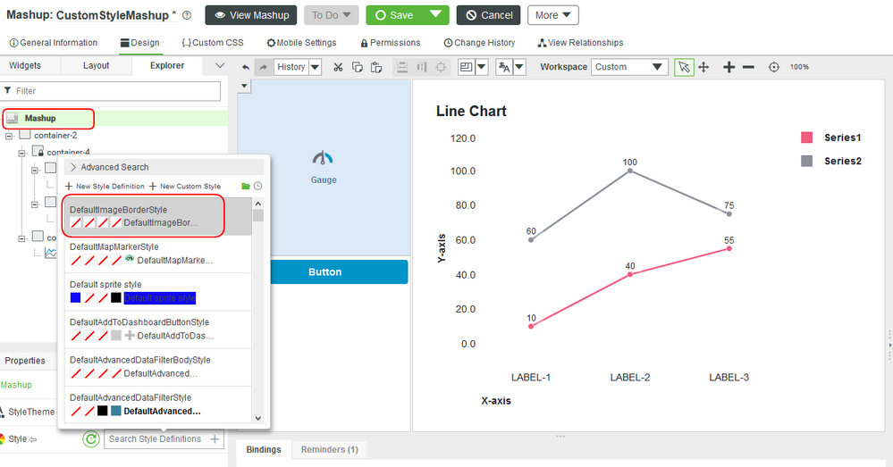
When editing a Mashup, you can either use a Style Definition Thing that you created earlier OR you can click the wand in a style property for a Mashup or Widget followed by clicking the + Custom button to create a one-time-use style.
3. With the Style Property clear, enter the Style Definition you created in the last section. Update the Background Color to #FF9082 to have the color pop in the Mashup.
4. Click Save and View Mashup to see the changes.
You have now updated the background for the HelloWorldPlayground. The style properties you define in the Style Definition will be consitent for any Mashup that references this Style Definition. Change the style around or create a custom style and see the changes in the Mashup. Below is what we'll be working to create. Get ideas of things you might want to see differently in your styling.
Customize Widget Style
ThingWorx provides a default Style Definition for many of its Widgets. Before editing the Style Definitions of a Widget, click the Style Definition property then click View. This enables you to see what the current values are and what you might want to change. If the changes are slight, create a copy of the original Style Definition and update the new version.
Until you are sure of the color schemes you would like to implement, use the default Style Definitions as a guide when creating your own versions.
Default Style Definitions
Next, we will update the colors and style of the Line Chart.
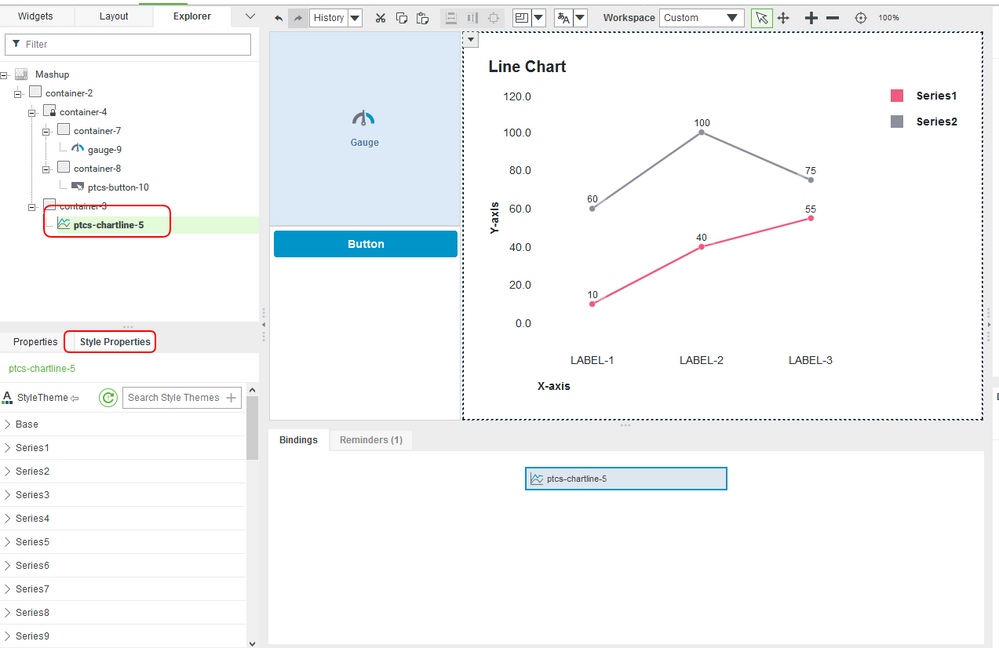
- Open the HelloWorldPlayground and select the Line Chart in the Workspace pane.
Click the Style Properties tab to see the chart styles section.
- Update the Legend->Color property to Blue.
Customize Chart Style Theme
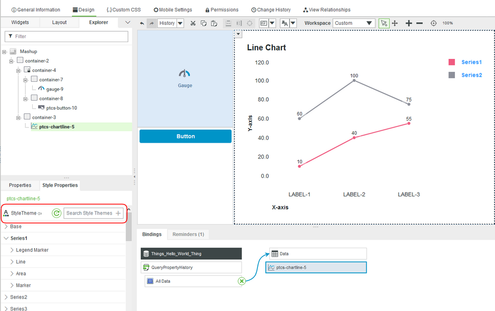
In this part of the lesson, we will update the Series1 and StyleTheme properties of the Line Chart. This is how you'll also set the colors for the chart titles.
The Series1 property will update the look and feel of the line for the count value being used. The Line Chart is a line graph, thus the only property you need to change is the Line Color property.
The StyleTheme property will update the background look of the Line Chart grid.
Clear the StyleTheme and click the + button to create a new theme.
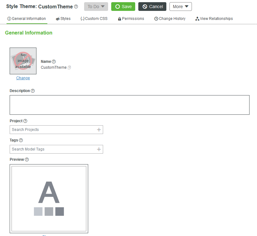
- Create a theme with the name CustomTheme.
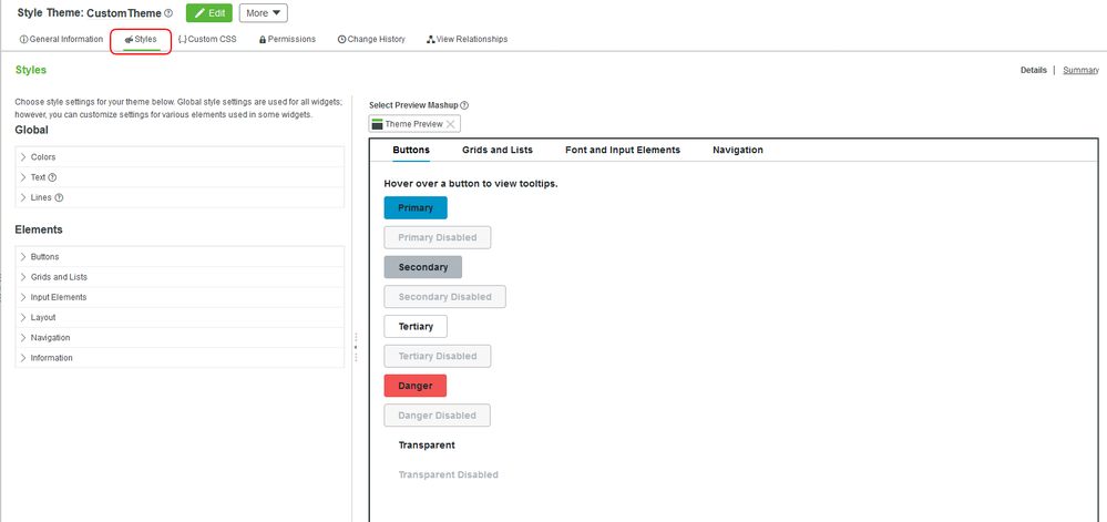
Click the Style tab and edit the feel of the items as you see fit.
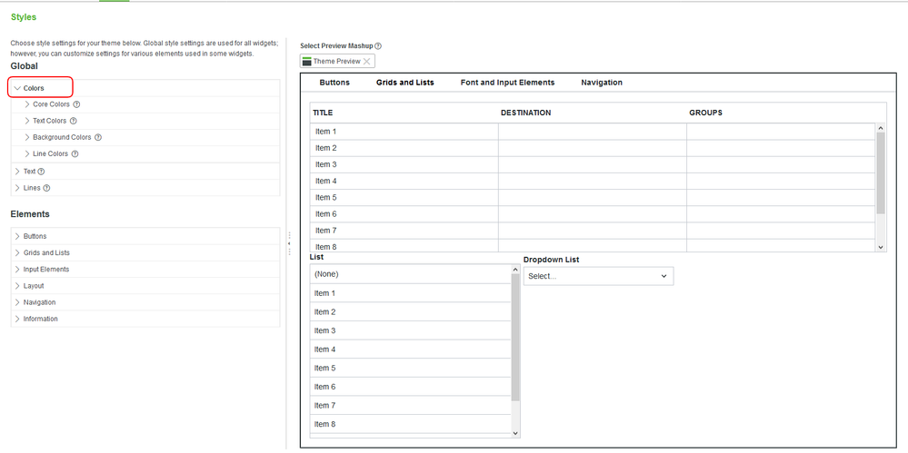
After open the Style Theme to be editable, click on colors. Here you'll see all the options and fields that you can make up your own color options and be as conservative as you like or as free as you like.
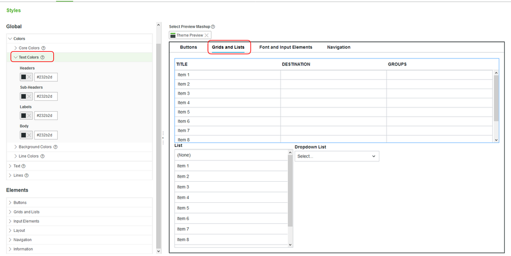
Click Text Colors, then click on the Grids and Lists tab on the right. This is where we will be shaping our colors for the chart. When you're done with this, update the Core Colors section to make your mashup pop even more.
- You may also notice a more focused method of updating grids and lists. In the below Elements section, you'll have a more focused experience for updated.
NOTE: As an extension, after completing the previous steps, try to use Style Definitions to customize the sections of the UI on your own.
Click here to view Part 2 of this guide.

