Effective UI Implementation Part 1
- October 20, 2022
- 0 replies
- 1217 views
Discover how ThingWorx Widgets can be implemented in a compelling Mashup design.
Guide Concept
This project will introduce how to create complex user interfaces that are built by combining simple Widgets and basic styling.
Following the steps in this guide, you will build a web application showing both geographic and table based information.
We will teach you how to create a professional user interface that effectively conveys information to users.
You'll learn how to
- Organize UI elements in a Mashup layout
- Use the Repeater widget effectively
- Use Styles to customize UI elements within a Mashup
NOTE: This guide's content aligns with ThingWorx 9.3. The estimated time to complete ALL parts of this guide is 60 minutes
Step 1: Top Level Layout
A Mashup like this does take some time to assemble, but is built by layering simple Widgets. In this guide, we will break down how this Mashup was created to give you a behind-the-scenes look and provide tips to use when developing your IoT application.
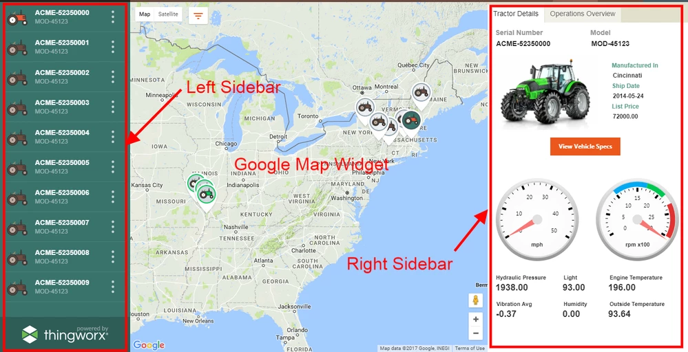
This professional-looking Mashup was created using only these Widgets:
- Layout with both left and right sidebars and a footer
- Tabs - Responsive
- Repeater
- Navigation
- Image
- Property Display
- Gauge
- Google Map
The first Widget placed on this Mashup canvas was a Layout widget with both a Left and a Right Sidebar defined. The center portion of the layout has only one GoogleMap widget. The tractor icons displayed on the map were created by uploading a .png to create a Media entity then specifying the image as a custom MarkerStyle in the GoogleMap widget. In the following steps you will duplicate this Mashup.
Step 2: Import Data
In this step we will download and them import both a Thing Template and the sample data that are used throughout the exercise.
- Download and save ConnectedTractors.xml which contains the Thing Template and example Things.
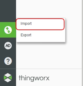
- In the lower left of Composer, click Import/Export, then Import.
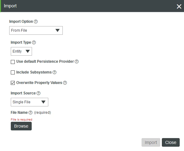
- In the Import From File pop-up, keep the defaults and click Browse.
- Navigate to the ConnectedTractors.xml file you previously downloaded.
- Select the Entities file, then click Open.
- Click Import in the bottom right of the pop up, then click Close after file is successfully imported.
Step 3: Map Mashup
Follow the steps in this part of the lesson to create a Mashup with an organized, structured layout.
Create Mashup
- Navigate to Browse > Visualization > Mashups.
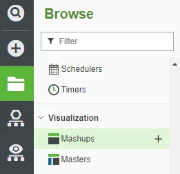
- Click + New.
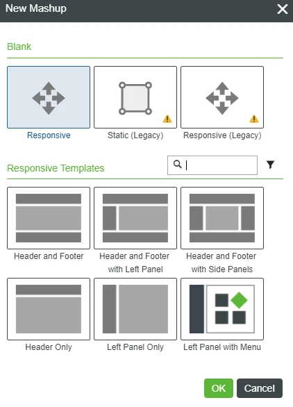
- Keep the defaults and click OK.
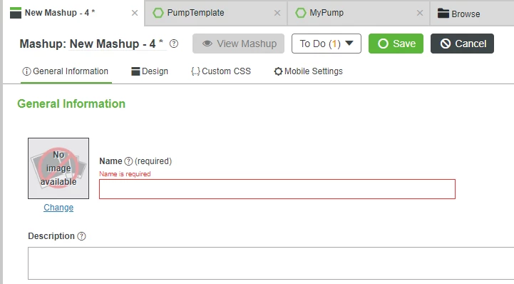
- In the Name field, type TractorDemoMashup.
- If Project is not already set, click the + in the Project text box and select the PTCDefaultProject.
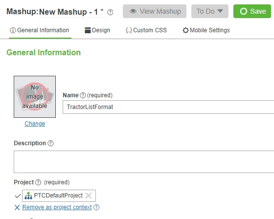
- Click Save
- Click the Design tab in the Mashup Information panel
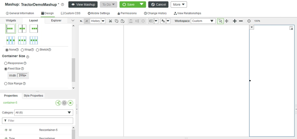
- Click the Layout tab, then click Add Left .
- Scroll down to Container Size, click Fixed Size then enter200 in the Width text box and press Tab to record your entry.
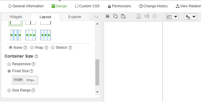
- Click on the right side of your Mashup to select the larger container.
- Click Add Right before again scrolling down to Container Size, click Fixed Size then enter200 in the Width text box and press Tab to record your entry.
NOTE: The next step uses the Google Map Widget which may need to be downloaded and imported from IQNOX.com. A Step-by-step guide for using Google Maps with ThingWorx is available.
12. Click the Widgets tab on the top left of the Widget panel, then enter map in the search box of the Widget panel.
13. Click and drag the Google Map Widget onto the center area of the canvas.
14. Click Save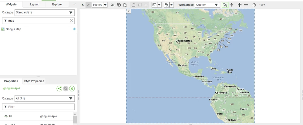
15. In the Data panel on the right click the + to add a data source for the Mashup.
16. Enter the name of the Template used to create the Things that will be shown on the Mashup. Click on the Template ConnectedTractor to use the sample data
17. Click the arrow to the right of GetImplementingThingsWithData, then click the Execute on Load check box before clicking Done.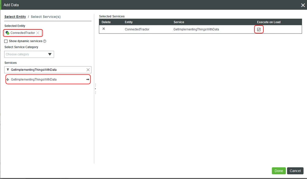
Setup Map Data
- In the Data panel on the right, if neccesary, expand the GetImplementingThingsWithData data source and then drag the All Data row onto the map widget.
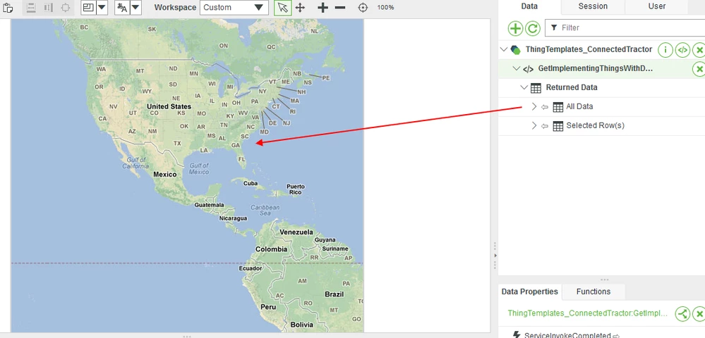
- Click Data in the Select Binding Target pop-up to connect the data source to the Data property of the Google Maps widget.
- In the Properties panel in the lower left, scroll to the LocationField property then select TractorLatLng
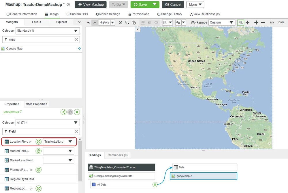
NOTE: The imported sample data provided for this lesson has a property named TractorLatLng that contains location information. Fields in the bound data with a type Location will be available in the drop down.
4. Click Save at the top of your Mashup. Click View Mashup to see the live map.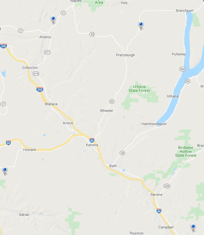
NOTE: The map uses the standard markers, click on one of the markers to see that the marker changes to indicate that it is selected.
Customize Map Markers
In this part of the lesson we will show how to use a custom image for the map markers.
Right-click on each of the images below to download and save them to use in the next step.


We will upload these images to create new Media entities and apply them to the Google Map widget.
- Click Browse > Visualization > Media.
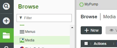
- Click + New.
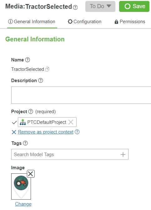
- In the Name field, type TractorSelected.
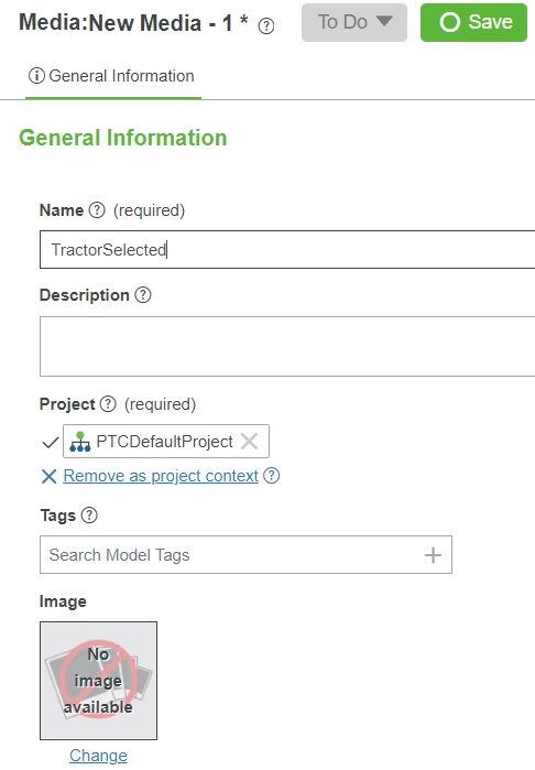
- If Project is not already set, click the + in the Project text box and select the PTCDefaultProject.
- Under Image, click Change.
- Navigate to and select the TractorSelected.png file you just downloaded.
- On the navigation pop-up, click Open to close the pop-up and confirm the image selection.
- At the top of Foundation, click Save.
- Repeat steps 1 through 8 for TracktorUnselected.
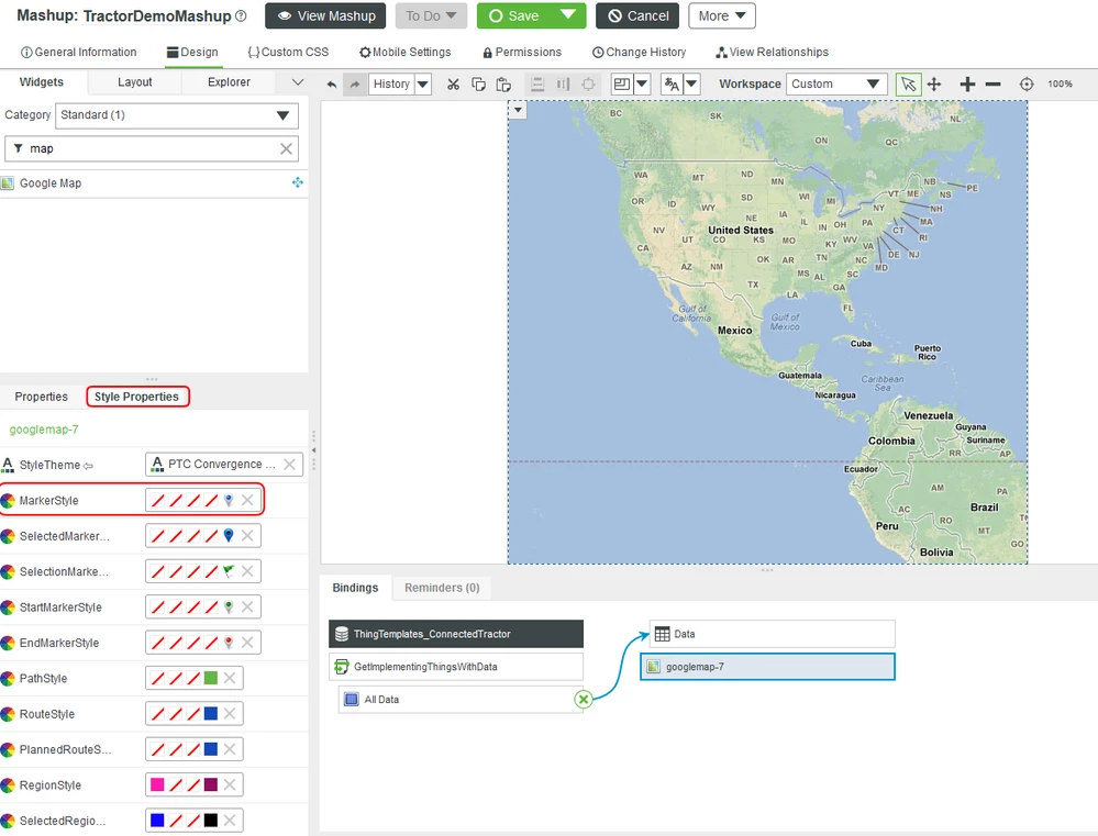
- Open your Mashup and click on the Google Map widget.
- Click on Style Properties tab in the lower left and scroll to the MarkerStyle Property and click on the Default map marker image, then click edit.
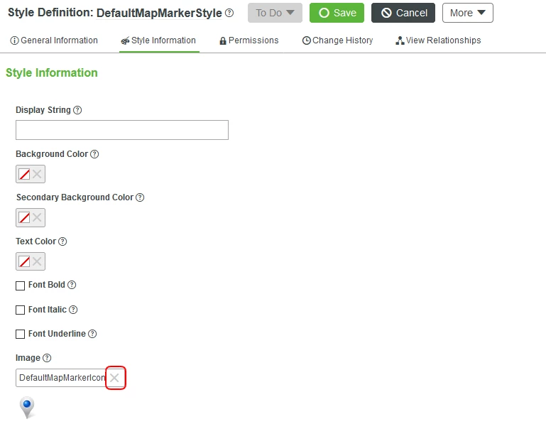
- Click Style Information in the left panel, then clear the default image by clicking the X next to Image.
- Click the + to select a new image then scroll to the Media entity you just created. In this case, the TractorUnselected media. Click Save.
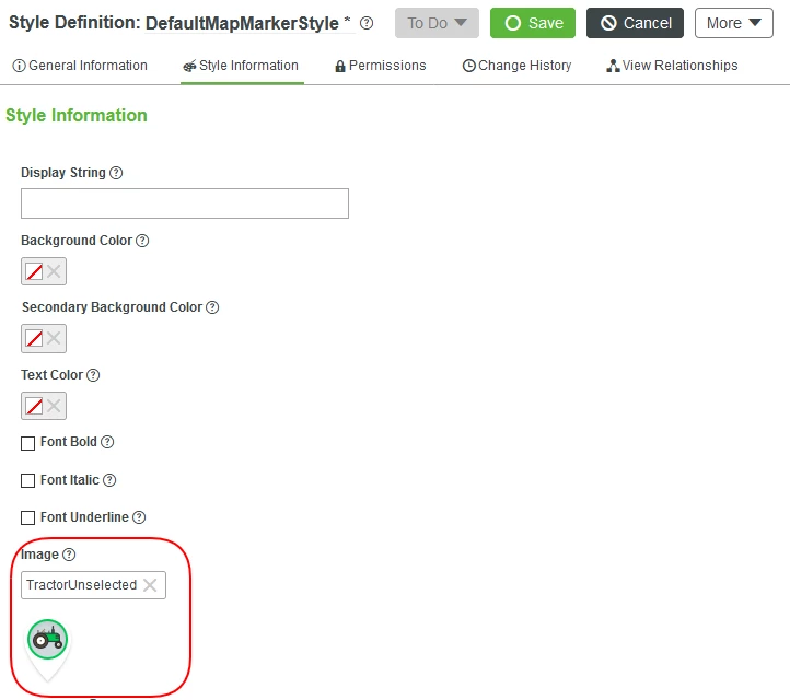
NOTE: The Google Map widget is packaged with default style entities. By editing these styles we will change the markers for all Mashups running on this ThingWorx server. In later steps we show how to create one time use Styles instead of modifying the default Styles.
14. Repeat steps 1 through 8 to create and assign the TractorSelected image for the SelectedMarkerStyle Property.
15. Click Save for the Mashup, then View Mashup to see the custom map icons.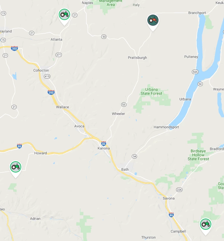
Step 4: Navigation Panel
The left sidebar defines the green background color in its style and contains just one Collection widget with custom embedded Mashups specified for both the Selected and the Unselected items. The logo at the bottom is an image defined in the Footer style.
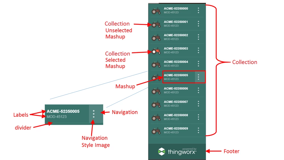
The Collection widget works by duplicating an embedded panel Mashup that controls the display of data from each entity in collection of entities.
Add Footer
- Select the left side container of your Mashup, then click the Layout tab
- Click Add Bottom and scroll down to Container Size, click Fixed Size then enter 60 in the Height text box and press Tab to record your entry.
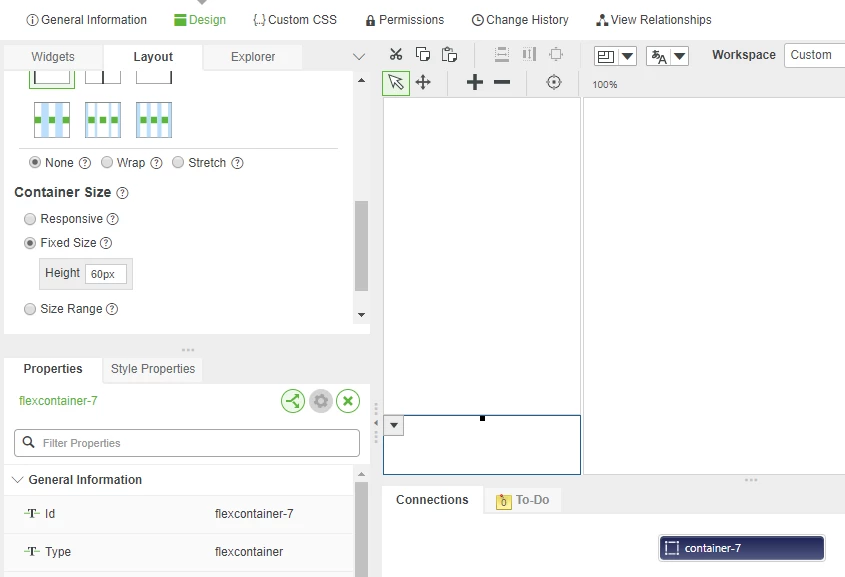
- Click Save.
Style Sidebar
Next, we are going to add a custom background color and image to the sidebar footer.
- Click the Explorer tab in the widget panel then select the top container for the left sidebar.
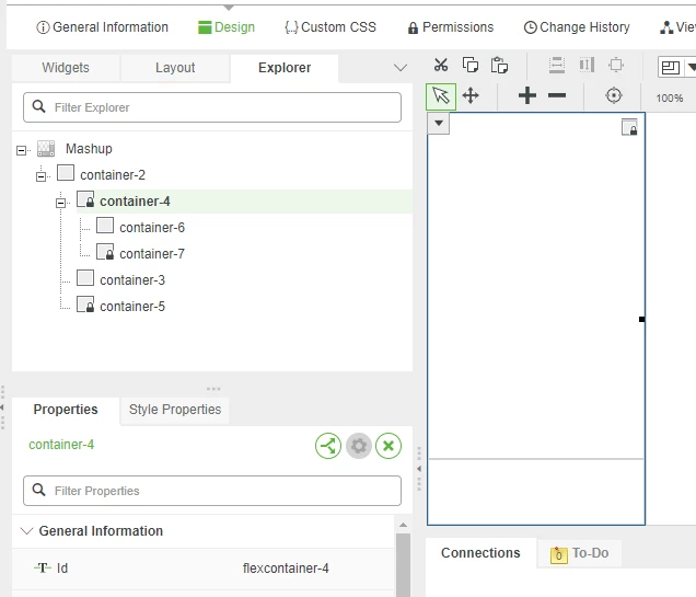
- Click the Style Properties tab in the lower left properties panel, then click to expand Base and flexcontainer.
- In the background tex box, enter #39736C for a dark green color, then press Tab.
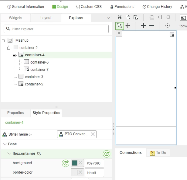
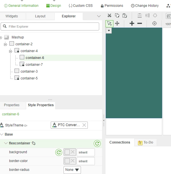
- Click the top left container, then, in the Style Properties tab, click to expand Base and flexcontainer.
- Click X in background property
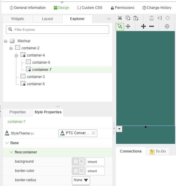
- Click the lower left container, and also click X to remove the background property.
- Right-click on the image below to download and save it for use when we add a footer in the next step.

- Create a Media entity as we did for the map markers by clicking the Browse folder icon, then click Media in the Visualization section.
- Click the + New to create a new Media entity.
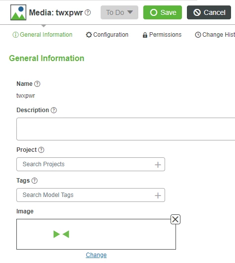
- Enter twxpwr in the Name field for the footer image.
- If Project is not already set, click the + in the Project text box and select the PTCDefaultProject.
- Click Change in the Image section, then browse to the image you saved.
- Click Open, then Save.
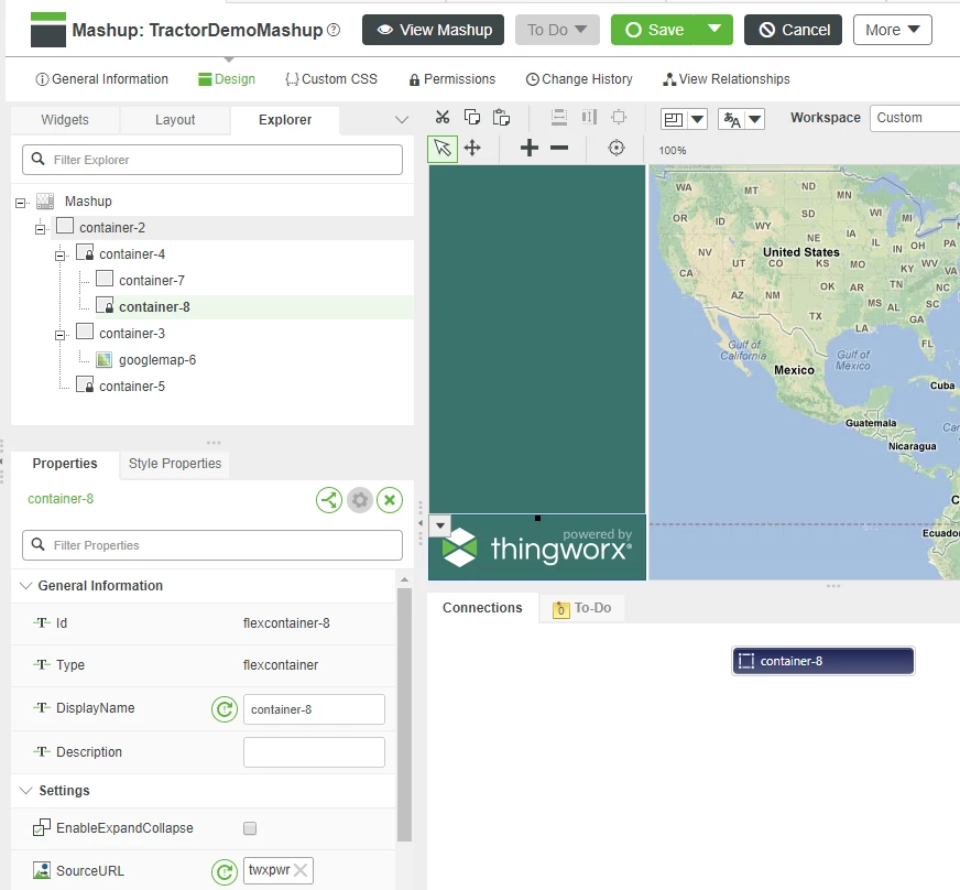
- Click in the lower-left footer container on your mashup, then click the Properties tab.
- Scroll to see the SourceURL property in the properties panel, then click the + to open the media selection window.
- Scroll to browse for the Media you just created.
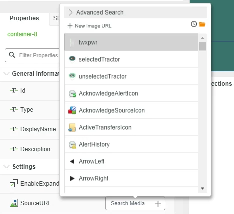
- Click the footer Media and then slick Save in Mashup Builder before continuing to the next step.
Click here to view Part 2 of this guide.

