Community Tip - You can Bookmark boards, posts or articles that you'd like to access again easily! X
- Subscribe to RSS Feed
- Mark as New
- Mark as Read
- Bookmark
- Subscribe
- Printer Friendly Page
- Notify Moderator
ThingWorx 9.0 Feature Highlight: What’s New in Composer and Mashup Builder?
Hello, IIoT Developers!
9.0 is out—let’s dive right into what’s new with Composer and Mashup Builder. (If you haven’t already checked out what’s new in 9.0 with active-active clustering, be sure to check out this tech tip.) We have a lot of new functionality that we can’t wait for you to start using, so without further ado, let’s begin!
Mashup Builder
In 9.0, we continue to make great advancements to our Mashup Builder and visualization toolset. We’re all about productive developers building the coolest IIoT apps!
Undo/Redo
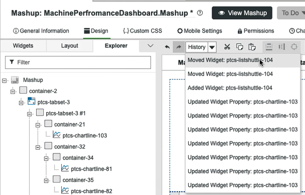
Ever spent a good half hour arranging a layout, making some data bindings, adding some styles, and once you view the Mashup, you decide you aren’t quite happy with your last few tweaks? The panic sets in when you forget exactly what you changed, and you don’t want to lose all of your edits. What is a developer to do? In older versions of ThingWorx, you might cancel without saving your edits or you might try to surgically get back to a good state. Either way, you were not a happy developer.
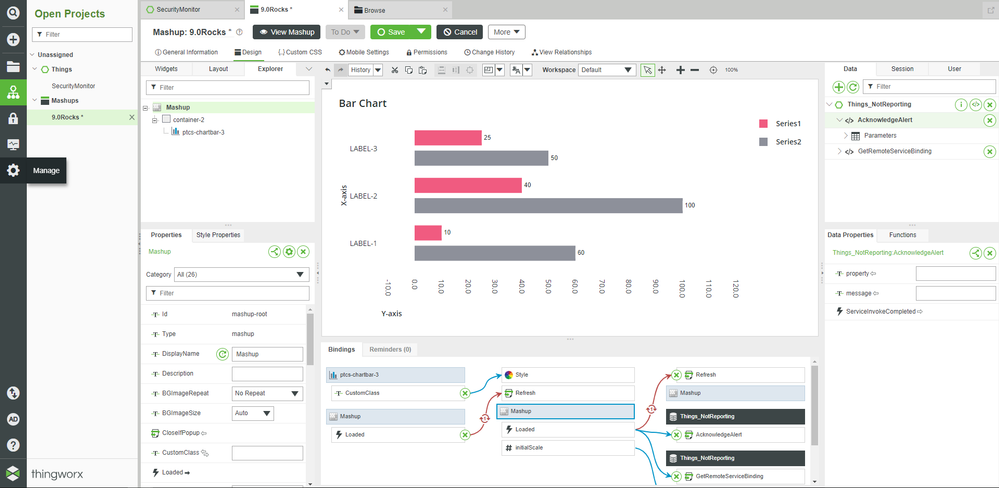
ThingWorx 9.0 will make you happy again. All actions in the Mashup are now tracked by an undo/redo buffer. Buttons are now available in the toolbar to help you revert actions. An action history drop-down is also available if you want to undo or redo a few jumps at once. Sometimes, it’s the little things!
Mobile Settings
For a few releases now, we’ve been upgrading our visualization toolset and examining ways we can be better for desktop and mobile experiences. It starts with our latest layout engine/editor introduced in 8.4 and with new Polymer-based, responsiveness “designed-in” web components introduced in 8.4, 8.5, and 9.0. For the more adventurous folks out there, you can also use Custom CSS to do media queries and influence your layouts based on the viewport settings. There are also custom resolutions and screen orientations available in the Mashup Builder toolbar itself so you can view your content in design mode with each of those targets in mind.
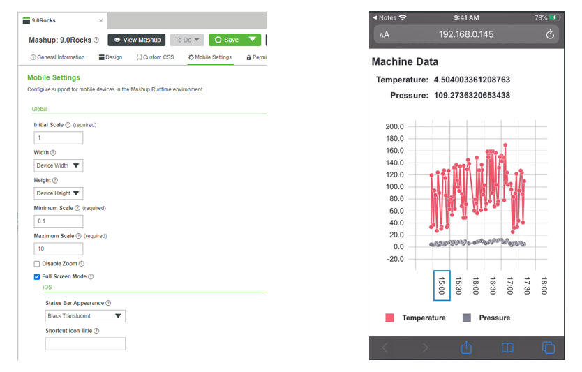
In 9.0, we now have introduced a new Mobile Settings configuration editor on the Mashup. This allows you to define for mobile browsers your scaling and width as well as your height and zoom settings. There are even iOS-specific settings for shortcuts and the status bar.
New Configure Bindings Dialog
The heart of any application is the data, and how it is leveraged in the UI. For Mashups, there many good ways to do that with our drag-and-drop functionality or our Bindings panel. But in 9.0, we have completely revamped the Configure Bindings Dialog. You’ll quickly notice when you open the new dialog that it has a more usable interface with more screen real estate to explore services, properties, sources and targets. There is now a good separation between the Widgets, Data and Function sources, which makes things easier to locate and build. You’ll also see, if you’ve made bindings already, the complete map of bindings for your context. New search enhancements and target bindings chip-based filters are also now added.

Another cool feature is that the bindings graph in the dialog will also show you any circular references you may have inadvertently created. If you can see in the diagram below, the red circle icon with a number 1 inside of it—this is almost always a bug, so we may as well tell you about it!

New Web Components
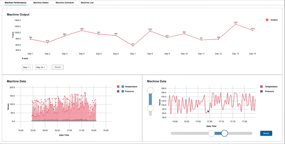
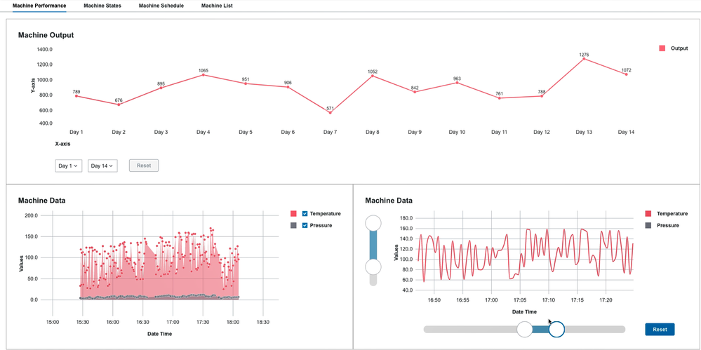
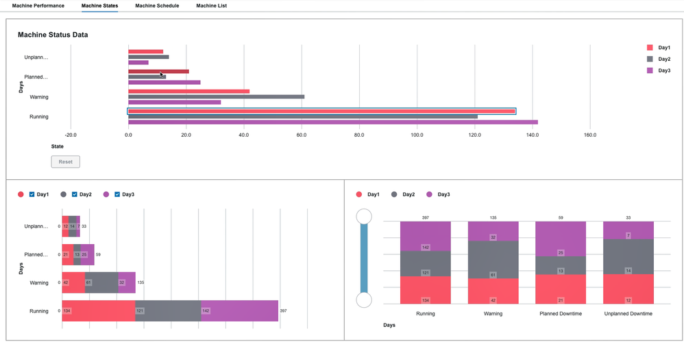
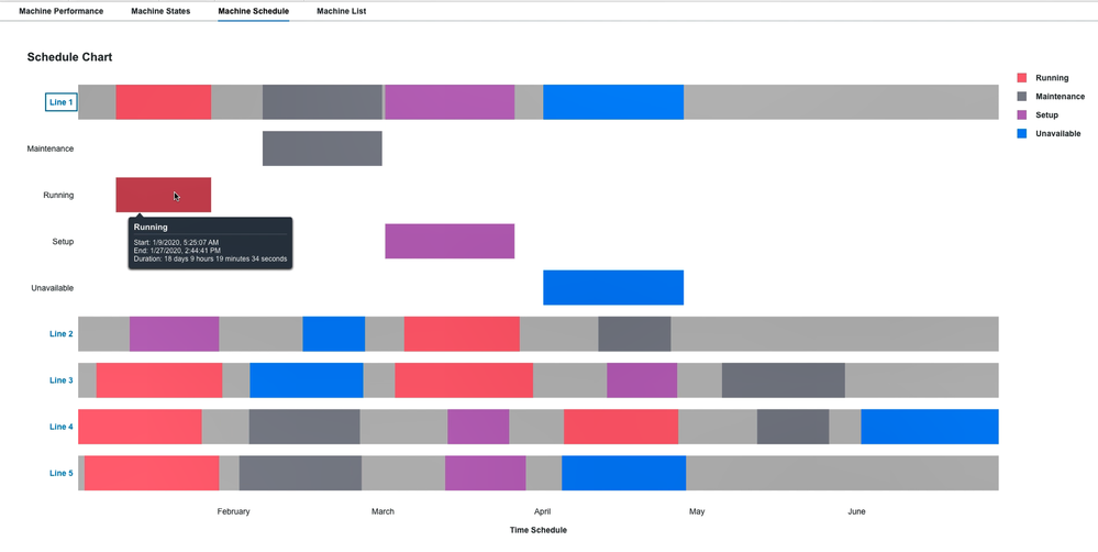
If you look at almost any IIoT application, you’re almost sure to see a chart. IIoT decisions are always centered around looking at telemetry and KPIs at specific moments of time, events, history, and future projections. ThingWorx has new charts in 9.0 for Line, Bar, and Schedule. They look sharp, they are powerful, and are a true upgrade over the former ThingWorx charts.
Here are some highlights. All are based on D3 framework and follow the PTC Design System. The Line chart also supports sub types of Run, Step, Area, Streamgraph and Scatter plot. The Bar chart also supports a column-based view. The Schedule chart is a great way to visualize downtime events, production orders, machine states, or device alarms. All charts feature responsive layout, advanced performance and data sampling, tooltips, multiple series support, multiple orientations for legends and axis labels, and plenty of styling and data configurations. They also all have great zooming capability for larger data sets including horizontal and vertical pan, drag/lasso zoom, interval controls, range zoom and zoom slider controls.
Other Coolness
The team was busy with these highlighted features, but there is so much more in 9.0! For Mashup, we also added:
- Improved tooltip and icon hover support for all web component-based widgets
- Accessibility improvements for keyboard navigation and focus
- New category filters for widget property configuration editors
- New data tools panel
- New context menu options
- New theming options for layout containers
Composer
For application development outside of the Mashup area, you’ll also notice some new changes in the Composer tool. One of our favorites is the new navigation panels. If you’ve been with ThingWorx for a few releases, you’ve seen many redesigns and updates to the Composer interface. We are constantly evaluating and testing this interface’s design with users to make it a highly productive and intuitive environment. You’ll now see much more horizontal real estate in the Composer because we’ve moved the top header bar into a new left-hand navigation. We’ve also improved the grid resizing in the entity and other list views in the interface to work better with larger result sets.
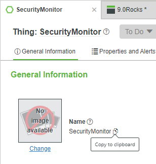
One more bonus feature to highlight! We now have quick copy buttons in common places in the interface where you might want to copy entity names or application keys. Just click and that text is in your clipboard. Very handy for searching or making bindings!
As you can see, plenty of awesome new features and upgrades in the ThingWorx 9.0 application development tools. We also have a brand-new visual SDK available in the 9.0 release so that you can make your own widgets with Polymer and import them into the Mashup Builder. Stay tuned for another Ask Kaya tech tip soon on the SDK.
Like what you see? Have a question? Drop us a line in the comments!
Stay Connected!
Kaya
- Mark as Read
- Mark as New
- Bookmark
- Permalink
- Notify Moderator
I was testing around with the new schedule chart widget and have some questions:
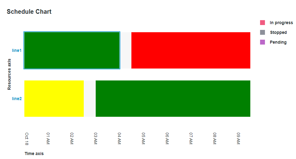
when I define a color for a resource in the data datatable it works for the graph but the legend uses the default color the event had without defining a color. Is this behaviour intended?
Also is there an option to disable the clickability/detail view of the resource? I can disable the schedule chart to achieve this but then i can't use the legend filter option.
- Mark as Read
- Mark as New
- Bookmark
- Permalink
- Notify Moderator
I have the same question about Schedule Chart legend - how to customize its colors?
Or should it take values from input data but it's not working properly?
In progress should be green, Stopped red and Pending yellow.
Best regards,
Jakub

