Community Tip - Have a PTC product question you need answered fast? Chances are someone has asked it before. Learn about the community search. X
- Community
- PTC Community Information Center
- PTC Community Feedback
- Re: Highlighted error off the screen - could not f...
- Float Topic for All Users
- Subscribe to RSS Feed
- Mark Topic as New
- Mark Topic as Read
- Float this Topic for Current User
- Bookmark
- Subscribe
- Mute
- Printer Friendly Page
Highlighted error off the screen - could not find it till the next day.
- Mark as New
- Bookmark
- Subscribe
- Mute
- Subscribe to RSS Feed
- Permalink
- Notify Moderator
Highlighted error off the screen - could not find it till the next day.
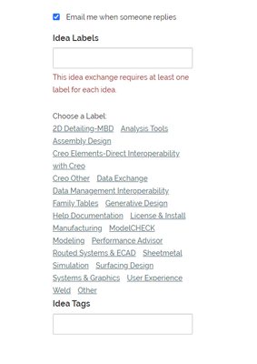
Recently posting an idea to the PTC Creo Ideas page and was getting an error stating to check the highlighted portion and fix..
What I didn't realized is that I had to scroll down quite a bit to find the errors on the bottom right of the
page below the screen window that I was filling out for the idea.
Not very intuitive that the "error" is off the screen and I have to scroll down to find it. It would be better if this error was visible or if you click on the error, it show you the "highlighted" error.
Thanks,
Dale
Solved! Go to Solution.
- Labels:
-
Structure
Accepted Solutions
- Mark as New
- Bookmark
- Subscribe
- Mute
- Subscribe to RSS Feed
- Permalink
- Notify Moderator
We published an update today moving the advisory message on the idea post page to the top of the page. Now the required labels section of the form will be clearly visible.
- Mark as New
- Bookmark
- Subscribe
- Mute
- Subscribe to RSS Feed
- Permalink
- Notify Moderator
I agree. On regular forums the label text box is near the top of the page and easy to see, but on the idea boards it is pushed down the page by the advisory message we are showing. We should probably relocate that message. I will talk it over with the team.
- Mark as New
- Bookmark
- Subscribe
- Mute
- Subscribe to RSS Feed
- Permalink
- Notify Moderator
We published an update today moving the advisory message on the idea post page to the top of the page. Now the required labels section of the form will be clearly visible.


