- Community
- ThingWorx
- ThingWorx Developers
- Re: Custom Widget with SubWidget
- Subscribe to RSS Feed
- Mark Topic as New
- Mark Topic as Read
- Float this Topic for Current User
- Bookmark
- Subscribe
- Mute
- Printer Friendly Page
Custom Widget with SubWidget
- Mark as New
- Bookmark
- Subscribe
- Mute
- Subscribe to RSS Feed
- Permalink
- Notify Moderator
Custom Widget with SubWidget
Hello Community,
we decided to use some more custom CSS in our UI and would like to leverate the bootstrap CSS.
For this purpose I am currently developing some Custom Widgets that should enhance our layouts
and look & feel.
The idea is to use the Bootstrap Card Class and make it an container widget, that by itself contains a
<div class="card">
  <div class="card-header">Header</div>
  <div class="card-body">
    <!-- Create Flex Container here -->
  </div>
</div>
The Code creates final HTML like this:
<div id="root_panelext-14-bounding-box" class="widget-bounding-box nonresponsive" style="top: 5px; left: 5px; width: 337px; height: 218px; z-index: 1510;">
    <div class="widget-content widget-panelext card text-white bg-secondary" id="root_panelext-14" style="width: 337px; height: 218px;">
        <div class="card-header"> Caption Test </div>
        <div class="card-body" sub-widget-container-id="panelext-14" sub-widget="1">
            <h5 class="card-title">Card Title</h5>
            <p class="card-text">Some quick example text to build on the card title and make up the bulk of the card content.</p>
        </div>
        <div id="root_flexcontainer-15-bounding-box" class="widget-bounding-box nonresponsive widget-flexcontainer-bounding-box no-flex-wrap flex-leaf-static" style="position: relative; z-index: 1510; flex: 1 1 auto;">
            <div class="widget-content widget-flexcontainer widget-container tw-flex-row"
                style="background: -webkit-linear-gradient(top, rgb(0, 96, 204) 0%, rgb(1, 61, 182) 100%); border-width: 1px; border-color: rgb(1, 52, 154); border-style: solid; flex-flow: row nowrap; align-items: flex-start; place-content: flex-start;"
                id="root_flexcontainer-15"></div>
        </div>
    </div>
</div>
So the bounding-box of the flexcontainer in added after the body-tag, not inside.
How can I tell a dynamic created widget which <div> to use?
Greetings
Andreas
- Mark as New
- Bookmark
- Subscribe
- Mute
- Subscribe to RSS Feed
- Permalink
- Notify Moderator
- Mark as New
- Bookmark
- Subscribe
- Mute
- Subscribe to RSS Feed
- Permalink
- Notify Moderator
Cool widget idea!
One thought, could you utilize the afterRender() function and jQuery to switch the parent element of that <div>?
Similar to the one of the suggestions on this post: https://stackoverflow.com/questions/2596833/how-to-move-child-element-from-one-parent-to-another-using-jquery
- Mark as New
- Bookmark
- Subscribe
- Mute
- Subscribe to RSS Feed
- Permalink
- Notify Moderator
Hi @nmilleson
thanks for the tip, but this is exactly what thingworx mashups system should do automatically and in fact it can!
I searched the complete mashup kernel and finally found the answer in the function
- The code first checks the parent widget for the runtime property "isContainerWithDeclarativeSpotsForSubWidgets".
- If propetry is false, it attaches the Widget to the contentElement (class="widget-content")
- If propery is true, it searches for child elements with sub-widget-container-id="[widget-Id]" sub-widget="[Nr of Subwidget]", and attaches it ...
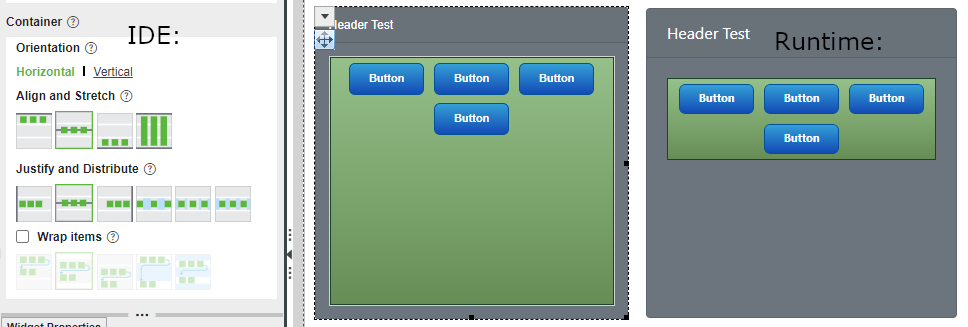
So the central code of my widget now looks like:
this.widgetProperties = function () {
    let properties = {};
    let result = {
        name: "bsCard",
        category: ['Common', 'Containers'],
        isContainer: true,
        isDraggable: true,
        supportsAutoResize: true,
        isContainerWithDeclarativeSpotsForSubWidgets: true,
        properties: properties,
    };
    return result;
};

this.afterCreate = function() {
    thisWidget.addWidget(this._createContainer(0), true);
};

this.renderHtml = function () {
    var html = "";
    html += '<div class="widget-content widget-bsCard card text-white bg-secondary">';
    html += '<div class="card-header"> Header Test </div>';
    html += '<div class="card-body" sub-widget-container-id="' + this.properties.Id + '" sub-widget="1">';
    html += '</div></div>';
    return html;
};

this._createContainer = function (tabNo) {
    var containerType = TW.IDE.isFlexLayout ? 'flexcontainer' : 'container';
    var containerDisplayName = (TW.IDE.isFlexLayout ? 'Responsive Tab' : 'Tab') + ' #' + (tabNo + 1);
    var widgetToAdd = TW.IDE.Widget.factory({ Type: containerType });
    var newId = TW.IDE.Workspace.Mashups.NewID(containerType);
    widgetToAdd.setProperty('Id', newId);
    widgetToAdd.setInternalProperty('DisplayName', containerDisplayName);
    widgetToAdd.setInternalProperty('ResponsiveLayout', true);
    widgetToAdd.setProperty('userCannotRemove', true);
    return widgetToAdd;
};
Also very important, as the runtimeProperties from IDE code are not forwarded to the runtime code:
TW.Runtime.Widgets.bsCard= function () {
    this.runtimeProperties = function () {
        return {
            isContainerWithDeclarativeSpotsForSubWidgets: true
        };
    };
    this.renderHtml = function () {
        var html = "";
        html += '<div class="widget-content widget-bsCard card text-white bg-secondary">';
        html += '<div class="card-header"> Header Test </div>';
        html += '<div class="card-body" sub-widget-container-id="' + this.properties.Id + '" sub-widget="1">';
        html += '</div></div>';
        return html;
    };
};


