Community Tip - Need to share some code when posting a question or reply? Make sure to use the "Insert code sample" menu option. Learn more! X
Hi, everyone.
I have a question when I trying to make a Thingworx smart city demo clone like this video and website
ThingWorx Industrial IoT Platform - Creating Smart Building Applications - PTC Demo Video Gallery | IoT start from 3:00 to 3:20 and SmartCitiesDataView .
And my question is how do I do like the video shows, how to interactive with the lights and rooms.
For example.
1.
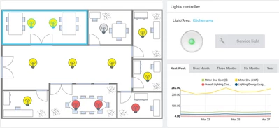
when I select the room and the Lights controller become green because all lights in this room are on, when I click the green button
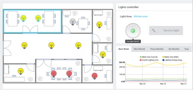
then the lights will turn of like this
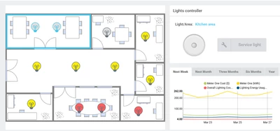
and the button turn to gray from green.
2.
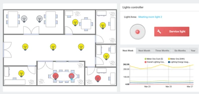
When I click the red light the Light controller will turn to red and the service light button turn to red.
Dose any one know how to achieve this goal? Please tell me how to do or some hits.
I know if use javascript and HTML, CSS to do this is not that hard even I can use frontend framework like React or Vue to do this, but in thingworx mashup I have no idea how to do this.
-------------------------------------------------------
And another question about Line chart. How do I customize my Line chart like this
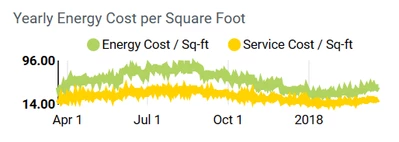
how to show X-axis and Y-axis value and auto scale like this I am try to do that but my result looks like this
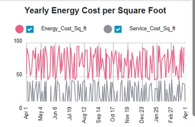
looks totally different, I want to know how to show Y-axis value only max and min, and show X-axis from Apr1 and the tick is 2 months and end at 2018 but the line still go through.
----------------------------------------------------------------------
Second question, when I click the legend filter
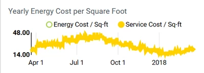
the chart will auto scale to max value 48 and min value 14. and how to let the legend mark have legend filter function, because when I enable legend filter it always have check box besides legend mark.
----------------------------------------------------------
Third question. How to achieve this
that this Line chart have bold min value and bold max value and normal 50 value as Y-axis tick. And like Line chart first question The X-axis tick is start from Apr1 and end at 2018 but the line didn't stop still go through.
I try to do this but the result is looks like
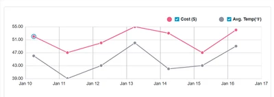
the line ends at Jan 16.
---------------------------------------------------------------
Those are my all question when I trying to do the SmartCitiesDataView web clone. and I crawled all the post on the forum, but I still can't find the answer. So I write this post to seek any help, if anyone know how to solve my question I will be very appreciate!
Solved! Go to Solution.
For your first question, this was probably done using SVG. You can highlight components there by assiging CSS classes to elements in SVG: Check this extension which also shows the lab example: https://github.com/ptc-iot-sharing/SvgViewerWidgetTWX
For the charts, you probably won't get pixel perfect same configuration, this the smart city demo is quite old and uses now deprecated widgets, while in your Thingworx installation probably/hopefully a 9.4/9.5, you will have the new versions of the widgets which have different options and configurations.
Thanks for the first question's answer I will try it.
And for chart question I am my Thingworx version is 9.4.1, but I tried all the configuration I still can't do auto scaling.
Like this picture.
My gray line is cut only show the top of it, and the whole line chart should looks like this
According to your reply is it not possible to look like the demo because of the new version Line chart widget?
Thanks again for your help!
The new version of the Widget is based off a different library (lit) than the older version (polymer). It is a re-write and some features are new, some are not and some are not supported (yet). So the configuration and behavior is different from the older widget. That's why I said you will probably not get the identical presentation with the new widget. It's a trial and error process (at least for me).
The lights can be done using State Based definitions, So you can assign values 1/0 to your lights that get toggled by the button pushed.
Based on that value, it will show one or the other icon.
For the charts you should be able to dynamically set the Min and Max of your Y-Axis from a service that returns those values.
Thanks for your reply! I will try to do this.
And do you know how do configure X-axis tick label? I want it looks like this.
Apr1, Jul1, Oct1, 2018 then go through the line don't stop at 2018.
Pretty sure there is a format involved or style for that label, as for why it goes Months Year and then nothing, I'm not sure, some sort of 'auto scale' decision I think