- Community
- ThingWorx
- ThingWorx Developers
- How to create Graphic to Analytics
- Subscribe to RSS Feed
- Mark Topic as New
- Mark Topic as Read
- Float this Topic for Current User
- Bookmark
- Subscribe
- Mute
- Printer Friendly Page
How to create Graphic to Analytics
- Mark as New
- Bookmark
- Subscribe
- Mute
- Subscribe to RSS Feed
- Permalink
- Notify Moderator
How to create Graphic to Analytics
Hi,
I am using this guide: https://developer.thingworx.com/en/resources/guides/statistical-monitoring-analytics/monitoring-introduction
My question is:
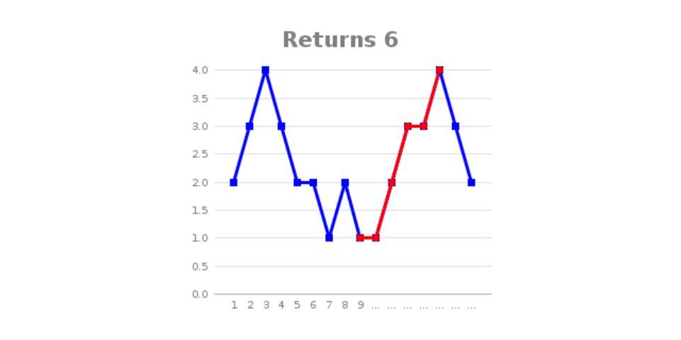
How to create a graphic to show the results in my mashup (like in the example below)
Solved! Go to Solution.
- Labels:
-
Analytics
-
Design
-
Mashup-Widget
-
TWX Dev Portal
- Tags:
- analytics
Accepted Solutions
- Mark as New
- Bookmark
- Subscribe
- Mute
- Subscribe to RSS Feed
- Permalink
- Notify Moderator
This guide gives step-by-step instructions for creating a mashup with several different charts:
https://developer.thingworx.com/en/resources/guides/display-data-charts
- Mark as New
- Bookmark
- Subscribe
- Mute
- Subscribe to RSS Feed
- Permalink
- Notify Moderator
fabriziogra,
Thank you for your post on the PTC Community.
Mashups are user created custom items as it pertains to ThingWorx Analytics.
We do provide sample Mashups for Anomaly Detection and the standard Modelling, Signals, Profiles, Scoring jobs as part of the offering.
If you desire to create your own mashups, I can refer you to the ThingWorx Platform HelpCenter - Mashup Builder page.
Please let me know if you have any additional questions.
Regards,
Neel
- Mark as New
- Bookmark
- Subscribe
- Mute
- Subscribe to RSS Feed
- Permalink
- Notify Moderator
This guide gives step-by-step instructions for creating a mashup with several different charts:
https://developer.thingworx.com/en/resources/guides/display-data-charts


