
Turn on suggestions
Auto-suggest helps you quickly narrow down your search results by suggesting possible matches as you type.
Showing results for
Please log in to access translation
Turn on suggestions
Auto-suggest helps you quickly narrow down your search results by suggesting possible matches as you type.
Showing results for
- Community
- ThingWorx
- ThingWorx Developers
- How to show x-axis fields in label chart diagonall...
Translate the entire conversation x
Please log in to access translation
Options
- Subscribe to RSS Feed
- Mark Topic as New
- Mark Topic as Read
- Float this Topic for Current User
- Bookmark
- Subscribe
- Mute
- Printer Friendly Page
How to show x-axis fields in label chart diagonally?
May 25, 2017
09:38 AM
- Mark as New
- Bookmark
- Subscribe
- Mute
- Subscribe to RSS Feed
- Permalink
- Notify Moderator
Please log in to access translation
May 25, 2017
09:38 AM
How to show x-axis fields in label chart diagonally?
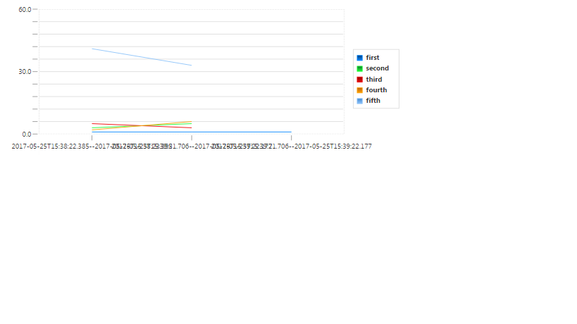
Hi,
I have label chart, the x-axis fields are very long string values, which is causing the fields to be overlapping with each other. Instead of showing x axis fields in a straightline, i want to show it in diagonal or something which makes x axis fields to be clearly visible. Actual and Expected images are shown below. Can anyone help me on this?
Actual
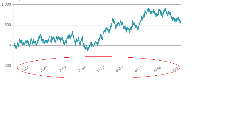
Expected:
Labels:
- Labels:
-
Extensions
0 REPLIES 0


