- Community
- ThingWorx
- ThingWorx Developers
- Label Chart Formatting.
- Subscribe to RSS Feed
- Mark Topic as New
- Mark Topic as Read
- Float this Topic for Current User
- Bookmark
- Subscribe
- Mute
- Printer Friendly Page
Label Chart Formatting.
- Mark as New
- Bookmark
- Subscribe
- Mute
- Subscribe to RSS Feed
- Permalink
- Notify Moderator
Label Chart Formatting.
Hi,
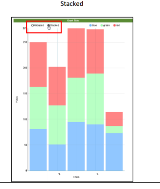
I have a label chart displaying power consumption (y axis) against each month (x axis) . Y axis range is 0 to 100 units. I have a state formatting, if the value of power is less than 50 then its green, if its less than 80 then yellow else red. The formating applies to full bar based on the value, is it possible to segregate the bar coloring into different types ? like sample below,

Solved! Go to Solution.
- Labels:
-
Mashup-Widget
Accepted Solutions
- Mark as New
- Bookmark
- Subscribe
- Mute
- Subscribe to RSS Feed
- Permalink
- Notify Moderator
Dinesh, as you noted the State-based formatting will apply to the entire bar and not sections. You would need to create a custom widget of sorts to render as shown in your picture.
- Mark as New
- Bookmark
- Subscribe
- Mute
- Subscribe to RSS Feed
- Permalink
- Notify Moderator
Dinesh, as you noted the State-based formatting will apply to the entire bar and not sections. You would need to create a custom widget of sorts to render as shown in your picture.
- Mark as New
- Bookmark
- Subscribe
- Mute
- Subscribe to RSS Feed
- Permalink
- Notify Moderator
Aanjan, Thanks for the reply. I was able to use the 'Custom Chart Widget' from Marketplace and use the stacked view .


