Community Tip - If community subscription notifications are filling up your inbox you can set up a daily digest and get all your notifications in a single email. X
- Community
- Creo+ and Creo Parametric
- 3D Part & Assembly Design
- Arial on pdfs from worker looks bold when zoomed o...
- Subscribe to RSS Feed
- Mark Topic as New
- Mark Topic as Read
- Float this Topic for Current User
- Bookmark
- Subscribe
- Mute
- Printer Friendly Page
Arial on pdfs from worker looks bold when zoomed out.
- Mark as New
- Bookmark
- Subscribe
- Mute
- Subscribe to RSS Feed
- Permalink
- Notify Moderator
Arial on pdfs from worker looks bold when zoomed out.
Dear all,
we have bumped into strange issue, or possibly we're doing something wrong.
We have a Windchill product in which we use client's configs including fonts, in their case Arial.
Suddenly some drawings started using different font which caused text overspilling its respective table cells.
Anyway, during investigation we learned that for some reason we were missing Arial in the default Creo folder on worker machine (../common/text/fonts) and in the config.pro there was no other folder specified (pro_config_dir commented out).
We copied over the Arial font to the folder, and drawings started using the font all right, BUT it's displayed in a very strange way.
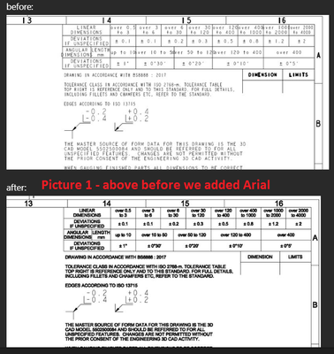
Attaching an image to illustrate it (picture 1) - the "futher" you are the more the font looks as if it's bold.
And it even prtins out this way on a paper.
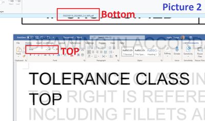
But when I zoomed in typed fragment of text in Word and overlayed one with another (picture 2), it looks all right.
Arial bold should be proportionally different from plain Arial, but these are identical.
How come the more we zoom away the more bold it looks? Is there some settings in the config.pro / *.dtl file that affects this?
I must apologize, but I am not very experienced with this, so any clue will be appreciated.
Best regards,
Daniel
- Labels:
-
2D Drawing
- Mark as New
- Bookmark
- Subscribe
- Mute
- Subscribe to RSS Feed
- Permalink
- Notify Moderator
@DanielHalfar wrote:
Dear all,
we have bumped into strange issue, or possibly we're doing something wrong.We have a Windchill product in which we use client's configs including fonts, in their case Arial.
Suddenly some drawings started using different font which caused text overspilling its respective table cells.Anyway, during investigation we learned that for some reason we were missing Arial in the default Creo folder on worker machine (../common/text/fonts) and in the config.pro there was no other folder specified (pro_config_dir commented out).
We copied over the Arial font to the folder, and drawings started using the font all right, BUT it's displayed in a very strange way.
Attaching an image to illustrate it (picture 1) - the "futher" you are the more the font looks as if it's bold.
And it even prtins out this way on a paper.
But when I zoomed in typed fragment of text in Word and overlayed one with another (picture 2), it looks all right.
Arial bold should be proportionally different from plain Arial, but these are identical.How come the more we zoom away the more bold it looks? Is there some settings in the config.pro / *.dtl file that affects this?
I must apologize, but I am not very experienced with this, so any clue will be appreciated.
Best regards,
Daniel
Hi,
I guess that Stroke All Fonts option is set during printing. In this case Creo applies pen width (set in pentable file) to every character outline. Because of this text is displayed as bold.
Martin Hanák
- Mark as New
- Bookmark
- Subscribe
- Mute
- Subscribe to RSS Feed
- Permalink
- Notify Moderator
Hello Martin,
thanks a lot for a quick response and my apologies for late response, wanted to do a couple of tests first.
Anyway it seems you were right. When I open a drawing in Creo and in the PDF Export Settings I select "Stroke All fonts" instead of "Use TrueType Fonts" the resulting drawing really suffers from the same "bold" problem, while with "Use TrueType Fonts" selected it doesn't.
The problem is I am not sure how to make worker (Creo 6) to do it the same way.
If I understand correctly this should be driven by intf2d_out_pdf_stroke_text_font "feature" in the config.pro file.
I tried to set it to none as well as non_ttf on the worker (it was set to ALL originally) but no change.
What am I doing wrong, please?
Also have to mention (to make it even more complicated) that a product which suffers from this is in Creo 4 where the feature was different (I believe intf2d_out_stroke_text) and we use client config.pro while the worker use our own config.pro, but I checked them both and in the client one there is no this feature set and on the worker it's set to all (but as mentioned I tried to both other values with no effect).
Thnaks a lot in advance.
Best regards,
Dan Halfar
- Mark as New
- Bookmark
- Subscribe
- Mute
- Subscribe to RSS Feed
- Permalink
- Notify Moderator
- Mark as New
- Bookmark
- Subscribe
- Mute
- Subscribe to RSS Feed
- Permalink
- Notify Moderator
Hi Martin,
thanks a lot for the link.
Just reading through it. 🙂
Dan Halfar
- Mark as New
- Bookmark
- Subscribe
- Mute
- Subscribe to RSS Feed
- Permalink
- Notify Moderator
You need assistance in resolving a font/printing issue. There is a lot to unpack and first and foremost separate the wheat from the chaff.
Is this attributed to Windchill or does the behavior happens without it?
In order to make sure of that, save the drawing to your hard drive and see if the issue happens there.
Looking forward to your confirmation.
- Mark as New
- Bookmark
- Subscribe
- Mute
- Subscribe to RSS Feed
- Permalink
- Notify Moderator
Hello Remy,
my apologies also to you.
As mentioned above it must be in the PDF export settings, so when the drawing is opened even from Windchill and exported manually the problem is not there.
Only need to learn how to drive the settings on the worker.
Thank you to you too and also any clue from you will be appreciated.
Best regards,
Dan Halfar
- Mark as New
- Bookmark
- Subscribe
- Mute
- Subscribe to RSS Feed
- Permalink
- Notify Moderator
Your top picture is using 'line fonts' and your bottom picture is using 'TrueType fonts'. Line fonts in Creo look the same no matter how far you're zoomed in or out. Essentially the line is a certain number of pixels wide and it stays that width regardless of zoom. On the other hand, TrueType fonts have a pre-defined width to them and scale as you zoom in and out. Because of their thickness, TrueType fonts will always look 'bold' compared to the line fonts. I agree that there is less distinction between normal and bold TrueType fonts in Creo. The users will eventually get used to the thicker TrueType fonts after a while. It helps to switch everything in Creo to using TrueType fonts and avoid having a mix.
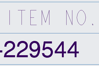
Notice how the width of the line font does not change with zoom:
- Mark as New
- Bookmark
- Subscribe
- Mute
- Subscribe to RSS Feed
- Permalink
- Notify Moderator
A couple quick comments on stroking fonts.
- Stroke none will convert all line fonts to Creo's built-in TrueType font, and also output any TrueType fonts that exist.
- Stroke all will draw all fonts as lines and dots. No TrueType fonts will listed in the output.
- Stroke non-ttf will draw all line fonts and lines and dots, but still output any TrueType fonts that exist natively.
None of these options will change TrueType fonts back to line fonts. Any TrueType fonts present in the drawing are going to be exported 'thick', the only question is 'how' - either with the native TrueType font embedded in the file or redrawn as lines and dots.
- Mark as New
- Bookmark
- Subscribe
- Mute
- Subscribe to RSS Feed
- Permalink
- Notify Moderator
...and thanks for this too. I can see I didn't understand the values correctly. 🙂
Regards,
Dan
- Mark as New
- Bookmark
- Subscribe
- Mute
- Subscribe to RSS Feed
- Permalink
- Notify Moderator
Hi TomU,
thanks a lot for the explanation and finding right words for me. 🙂
So what you say is that the line font's thickness is absolute - wide / thick XY pixel(s) no matter how "far" from a text you are, correct?
While TrueType font's thickness should be relative. But that's the thing - it looks as if the thickness of the text written in TTF is also absolute, which make lines look thicker (but in fackt of still the same width) in comparison to a letter(s) size when zoomed out if it makes sense.
Best regards,
Daniel Halfar
- Mark as New
- Bookmark
- Subscribe
- Mute
- Subscribe to RSS Feed
- Permalink
- Notify Moderator
@DanielHalfar wrote:
So what you say is that the line font's thickness is absolute - wide / thick XY pixel(s) no matter how "far" from a text you are, correct?
Graphically, on the screen, yes. Non-bold line fonts will maintain their width regardless of how far you zoom in or out.
If you make a line font bold, Creo will add some fixed width to it. This does scale, just like TrueType fonts.
Keep in mind that line fonts can have thickness applied to them by the pen table when printing or exporting. It is entirely possible to adjust the pen table settings so that line fonts and TrueType fonts will end up having very similar widths after output.
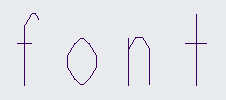
Also keep in mind that Creo will fall back it its default font if the font originally used is not available. In your case, the drawing was apparently created with Arial but your system didn't have it so Creo reverted back to 'font' (or whatever your default font is.)

