
Turn on suggestions
Auto-suggest helps you quickly narrow down your search results by suggesting possible matches as you type.
Showing results for
Please log in to access translation
Turn on suggestions
Auto-suggest helps you quickly narrow down your search results by suggesting possible matches as you type.
Showing results for
Community Tip - Visit the PTCooler (the community lounge) to get to know your fellow community members and check out some of Dale's Friday Humor posts! X
- Community
- Creo+ and Creo Parametric
- 3D Part & Assembly Design
- Tips for text
Translate the entire conversation x
Please log in to access translation
Options
- Subscribe to RSS Feed
- Mark Topic as New
- Mark Topic as Read
- Float this Topic for Current User
- Bookmark
- Subscribe
- Mute
- Printer Friendly Page
Tips for text
Apr 04, 2012
08:26 AM
- Mark as New
- Bookmark
- Subscribe
- Mute
- Subscribe to RSS Feed
- Permalink
- Notify Moderator
Please log in to access translation
Apr 04, 2012
08:26 AM
Tips for text
Here's an open discussion for text and notes in Creo and Pro-engineer.
Add tips and tricks that you know and ask questions that would be a good addition to this topic.
If you know of any previous threads that will compliment this topic please provide us the link.
131 REPLIES 131
Jul 11, 2014
12:03 PM
- Mark as New
- Bookmark
- Subscribe
- Mute
- Subscribe to RSS Feed
- Permalink
- Notify Moderator
Please log in to access translation
Jul 11, 2014
12:03 PM
Matthew,
at the bottom of http://www.ptc.com/cs/help/creo_hc/creo20_hc/index.jspx?id=The_Text_Style_Dialog_Box&action=show page you can find information that it is possible to:
Change the color of the note text by clicking Color and selecting the required color from the Color palette.
I think that this means that the color is set for the whole note (not for individual words). I suggest you to discuss the problem with PTC support.
Martin Hanak
Martin Hanák
Jul 11, 2014
02:37 AM
- Mark as New
- Bookmark
- Subscribe
- Mute
- Subscribe to RSS Feed
- Permalink
- Notify Moderator
Please log in to access translation
Jul 11, 2014
02:37 AM
I have raised an SPR for the issue..i do not have maintenace now..so cannot view what is hapenning..this is not a problem in creo 2 only..it has been there for a long time..
May 21, 2014
01:53 AM
- Mark as New
- Bookmark
- Subscribe
- Mute
- Subscribe to RSS Feed
- Permalink
- Notify Moderator
Please log in to access translation
May 21, 2014
01:53 AM
hello...
how to increase the gap in between underline and the text.......mine is coming too close......
May 21, 2014
02:29 PM
- Mark as New
- Bookmark
- Subscribe
- Mute
- Subscribe to RSS Feed
- Permalink
- Notify Moderator
Please log in to access translation
May 21, 2014
02:29 PM
Welcome to the forum Sujit.
I suspect this is built into the font. You can try and see if the true type fonts are better than the native fonts.
Jun 08, 2014
11:37 PM
- Mark as New
- Bookmark
- Subscribe
- Mute
- Subscribe to RSS Feed
- Permalink
- Notify Moderator
Please log in to access translation
Jun 08, 2014
11:37 PM
Thanx
Jun 16, 2014
02:30 AM
- Mark as New
- Bookmark
- Subscribe
- Mute
- Subscribe to RSS Feed
- Permalink
- Notify Moderator
Please log in to access translation
Jun 16, 2014
02:30 AM
HEY GUYS PLZZ HELP ME TO WRITE THE NOTE IN BELOW METHOD WITH BOX
Jun 16, 2014
05:06 AM
- Mark as New
- Bookmark
- Subscribe
- Mute
- Subscribe to RSS Feed
- Permalink
- Notify Moderator
Please log in to access translation
Jun 16, 2014
05:06 AM
Gaurav,
I just tested the following tip:
To Enclose Notes in Text Boxes
To enclose words or characters in a box, type "@[" before and "@]" after the text.
Unfortunatelly it does not work correctly on multiline note  .
.
.I guess you have to sketch bounding rectangle manually in Drawing mode.
Martin Hanak
Martin Hanák
Jun 16, 2014
05:35 AM
- Mark as New
- Bookmark
- Subscribe
- Mute
- Subscribe to RSS Feed
- Permalink
- Notify Moderator
Please log in to access translation
Jun 16, 2014
05:35 AM
Thanks Martin,
It helped a lot.
If you get something more about it plz do write.
Jun 16, 2014
08:02 AM
- Mark as New
- Bookmark
- Subscribe
- Mute
- Subscribe to RSS Feed
- Permalink
- Notify Moderator
Please log in to access translation
Jun 16, 2014
08:02 AM
I would do it using a table. Go to the table tab then TABLE, select 1X1 and then place it on the drawing. You can then double click the table (or right click properties) and add your text.
Jun 16, 2014
09:03 AM
- Mark as New
- Bookmark
- Subscribe
- Mute
- Subscribe to RSS Feed
- Permalink
- Notify Moderator
Please log in to access translation
Jun 16, 2014
09:03 AM
Nice one !
Simple but efficient.
Jul 09, 2014
05:27 PM
- Mark as New
- Bookmark
- Subscribe
- Mute
- Subscribe to RSS Feed
- Permalink
- Notify Moderator
Please log in to access translation
Jul 09, 2014
05:27 PM
Is there a way to have a true type font be still be able to adjust the font thickness and the width factor?
For some reason these text options on the dwg only work if it is NOT a true type font.
"When you reward an activity, you get more of it!"
Jul 09, 2014
05:32 PM
- Mark as New
- Bookmark
- Subscribe
- Mute
- Subscribe to RSS Feed
- Permalink
- Notify Moderator
Please log in to access translation
Jul 09, 2014
05:32 PM
true type fonts don't work that way. Thickness, which is only assigned to the screen, is based on "curves" and TT fonts don't have those. Same as width (aspect ratio)... TT fonts have this built into their definition so it cannot do that either.
What PTC really needs to do is gray out those cells when a TT font is specified to there would be no question rather than have one assume these values are set.
Let's see what the new Creo 3.0 overhaul of annotation has to offer.
Jul 10, 2014
08:20 PM
- Mark as New
- Bookmark
- Subscribe
- Mute
- Subscribe to RSS Feed
- Permalink
- Notify Moderator
Please log in to access translation
Jul 10, 2014
08:20 PM
If TTFs don't work that way, then how can it be done in any other application such as MS Office,etc (even this website can do it!).
Rather than graying out the features shouldn't PTC just figure out how to utilize whatever is built into the ttf definition, like every other program in the world seems able to do? If all these other programs can do it, it seems like it should not be that complicated for Creo to do likewise. I don't particularly care if the exact thickness/boldness of text can be controlled, but having the ability to bold it at all is required to help separate heading from body text.
It would be really nice if this is one of the issues that PTC addressed in Creo3
"When you reward an activity, you get more of it!"
Jul 10, 2014
08:46 PM
- Mark as New
- Bookmark
- Subscribe
- Mute
- Subscribe to RSS Feed
- Permalink
- Notify Moderator
Please log in to access translation
Jul 10, 2014
08:46 PM
Do you know anything about Windows NT? The 1st level emulation in Creo (all Pro|E) has something to do with that. And therefore, the next level of emulation is anything "Windooze Like". I am happy that we can easily add TTF into Creo, but handling them is certainly not like Windows.
Windows buries a lot of that "magic" in the application UI's. It knows how to group several windows features under a single name, although it is managed with several files. Even the width manipulation of fonts in Windows is a graphics trick. That is why many applications make a real mess of exported texts into other applications although it is improving but certainly not solved.
I too am looking forward to what Creo 3.0 did with the WYSIWYG implementation.
Jul 11, 2014
07:28 PM
- Mark as New
- Bookmark
- Subscribe
- Mute
- Subscribe to RSS Feed
- Permalink
- Notify Moderator
Please log in to access translation
Jul 11, 2014
07:28 PM
Antonius, I do not understand the point you are trying to make with the correllation with Windows NT. I am ont familiar with anything regarding the background of Win NT. Could you explain this further? Thanks.
"When you reward an activity, you get more of it!"
Jul 11, 2014
08:09 PM
- Mark as New
- Bookmark
- Subscribe
- Mute
- Subscribe to RSS Feed
- Permalink
- Notify Moderator
Please log in to access translation
Jul 11, 2014
08:09 PM
There use to be an operating system called UNIX where everything storage was treated the same; disks, memory, cache... which is where Pro|E spawned from. Then there was Windows NT which tried to emulate UNIX code (roughly speaking... -v-e-r-y- roughly!) so things could be ported. Today, there are remnants of NT in windows code but new development is not grandfathered in. So even when applications appear to moving forward, those who have not rewritten their kernal to be completely Windooze compliant cannot make use of the Windows background "gadgets".
I know this is a very crude way to spell this out but if you can rise to the 50,000 feet from where this is written, you might get a hint of the history.
Jul 11, 2014
11:21 PM
- Mark as New
- Bookmark
- Subscribe
- Mute
- Subscribe to RSS Feed
- Permalink
- Notify Moderator
Please log in to access translation
Jul 11, 2014
11:21 PM
Windows NT was the product of the systems architect of Digital Equipment Corp VMS (Virtual Memory System)
http://windowsitpro.com/windows-client/windows-nt-and-vms-rest-story
A big problem for PTC, and all other CAD developers at the time, was that each UNIX variant had it's own graphics and GUI development tools, so PTC appears to have created their own version that used the lowest common denominator of those that were available** Even if PTC had started with Win-NT it would not solve the problem of TTFs for PTC because the underlying OS doesn't provide the sort of conversion PTC needs.
I do wonder if things would have been better if Display Postscript, which found a home on NeXT, had been available earlier. https://en.wikipedia.org/wiki/Display_PostScript At least the printed and screen versions of graphics could have been identical.
**Also see MOTIF, X11, and CDE. Remember at the time there was no UI standard beyond a command line and terminal emulator and each company was trying to put their own face on their own UNIX variant. Good times.
Jul 18, 2014
11:46 AM
- Mark as New
- Bookmark
- Subscribe
- Mute
- Subscribe to RSS Feed
- Permalink
- Notify Moderator
Please log in to access translation
Jul 18, 2014
11:46 AM
Antonius and David, thanks for the explanations. It sounds like a very interesting problem. If Creo3 does indead have WYSIWYG, then it sounds like some of this may have been addressed. We are downloading Creo3 just to see what issues have been addressed, and which still need addressign (or reporting).
"When you reward an activity, you get more of it!"
Aug 04, 2014
02:54 PM
- Mark as New
- Bookmark
- Subscribe
- Mute
- Subscribe to RSS Feed
- Permalink
- Notify Moderator
Please log in to access translation
Aug 04, 2014
02:54 PM
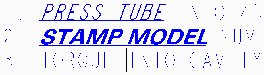
Just tried Creo3 and it seems that they solved this font issue. Whether it is the default font (non-True Type), or a TT font, I can bold, underline and italisize with the use of CTRL B, U, or I.
As an example, the first 2 words that are bolded font in #1 is the default font where I used CTRL B,U, and I, Number 2 is a TT font where I did the same.
"When you reward an activity, you get more of it!"
Aug 04, 2014
03:18 PM
- Mark as New
- Bookmark
- Subscribe
- Mute
- Subscribe to RSS Feed
- Permalink
- Notify Moderator
Please log in to access translation
Aug 04, 2014
03:18 PM
I am looking forward to exploring the new font UI.
Jul 10, 2014
11:15 PM
- Mark as New
- Bookmark
- Subscribe
- Mute
- Subscribe to RSS Feed
- Permalink
- Notify Moderator
Please log in to access translation
Jul 10, 2014
11:15 PM
It's not as easy as it looks.
True Type Fonts are programs that are run to generate an image of characters they represent. In Windows, a built-in facility converts the underlying (usually) vector outlines into bit-map images for display on screen. This easy inclusion in other document processing software does not translate to vector output in PTC drawings. One might think rendering a vector font to a vector drawing is easy, but duplicating the tweaks that others use in interpreting those programs isn't.
In many cases there are separate programs for normal, bold, italic, and bold italic. Since they are programs, their execution can be modified; some programs create false bold or italics by making on-the-fly rendering changes. Most programs depend on the host OS to do the processing, so they don't have to each reinvent the technology and so the results are uniform.
The better bet is to find the actual bold//italic/bold-italic definitions and use those.
Typically the TTF definitions are of precise outlines that are then filled. There is no 'thickness' as there is in stroked fonts, like 'font' that is included by PTC. For other characteristics, the font author will make sure the font doesn't block up using hints.
See https://en.wikipedia.org/wiki/TrueType scroll to the "Hinting language" for information on programming.
Also, http://www.microsoft.com/typography/default.mspx
Also, http://scripts.sil.org/cms/scripts/page.php?site_id=nrsi&id=iws-chapter08
Jul 11, 2014
04:35 AM
- Mark as New
- Bookmark
- Subscribe
- Mute
- Subscribe to RSS Feed
- Permalink
- Notify Moderator
Please log in to access translation
Jul 11, 2014
04:35 AM
Lawrence,
Creo Parametric is able to use the definition of the font saved in specific file with ttf extension, only.
For example, in Windows 7 if I copy the following 4 files from C:\Windows\Fonts directory to C:\PTC\Creo2_M070\Creo 2.0\Common Files\M070\text\fonts directory, then I can use 4 variants of Arial font in Creo drawing. This means I have the same functionality as in MS Office suite.
---
arial.ttf ... Arial
arialbd.ttf ... Arial Bold
arialbi.ttf ... Arial Bold Italic
ariali.ttf ... Arial Italic
---
Of course, Creo is not able to tweak Arial font - MS Office has such functionality.
Martin Hanak
Martin Hanák
Jul 11, 2014
09:47 AM
- Mark as New
- Bookmark
- Subscribe
- Mute
- Subscribe to RSS Feed
- Permalink
- Notify Moderator
Please log in to access translation
Jul 11, 2014
09:47 AM
Why not just point your font dir to the windows font library.
pro_font_dir C:\WINDOWS\Fonts
Jul 11, 2014
10:56 AM
- Mark as New
- Bookmark
- Subscribe
- Mute
- Subscribe to RSS Feed
- Permalink
- Notify Moderator
Please log in to access translation
Jul 11, 2014
10:56 AM
This is good solution in case that you can see all Windows fonts in Creo drawing.
Martin Hanak
Martin Hanák
Jul 11, 2014
11:25 AM
- Mark as New
- Bookmark
- Subscribe
- Mute
- Subscribe to RSS Feed
- Permalink
- Notify Moderator
Please log in to access translation
Jul 11, 2014
11:25 AM
Creo builds certain index files to include the special character symbols. Windows has a lot of fonts and this could slow the process. This is especially true for font horders like myself.
Good point on the alternative face -presentations-, Martin. The only font I added was Swiss721 since it mimics Helvetica nicely. I think there are 12 variations in my font folder.
Jul 11, 2014
03:04 PM
- Mark as New
- Bookmark
- Subscribe
- Mute
- Subscribe to RSS Feed
- Permalink
- Notify Moderator
Please log in to access translation
Jul 11, 2014
03:04 PM
I looked into the True type font and the open type font more since my last posting. I have also done a fair amount of experimenting with different fonts within Creo2. Making sure to use a TTF or OTF that has bold and italic is a decent work around, however, all Creo would need is to have a ticker for bold and another italic that would essentially switch between text definitions (e.g. Arial to Arial Bold, etc), which seems to be how MSOffice (and most other programs use). This would allow the user to to still control the default font with a detail settting option while being able to maintain the bold (yet again while switching between different text styles).
It would be really nice if this is one of the issues that PTC addressed in Creo3 with their supposed overhauled annotations. Ticker boxes for bold and italic, just like it has for underline...
Do you think this would still be extremely challanging?
"When you reward an activity, you get more of it!"
Jul 11, 2014
04:58 PM
- Mark as New
- Bookmark
- Subscribe
- Mute
- Subscribe to RSS Feed
- Permalink
- Notify Moderator
Please log in to access translation
Jul 11, 2014
04:58 PM
I think it would be just as well to list the variants of the base font as well as a flag indicating if their definition can be embedded with the document. Underline doesn't change the font outlines, so that's an easy thing to implement.
Arial has nine variations. Of the fonts I have installed, about fifty percent have no variations, including the Wingdings series. MS Office doesn't need to switch between the font variants. I'm pretty sure** it just sets flags, the base font and size and color and the OS creates a bitmap and some metrics about how big the bitmap is. There isn't anything the Office application does that depends on the variants, so it's not so complicated.
To support vector outputs, PTC needs to duplicate all the work that MS and Adobe already did on font rendering, but to convert the TTF definition language into PTC managed entities. PTC's done some of it, but to handle the cases where Bold or Italic are requested and not part of the font definition is going to be additional effort, especially since the result won't match what other companies produce.
**This is the Windows OS description of the Font and Text API at http://msdn.microsoft.com/en-us/library/dd144824%28v=vs.85%29.aspx From there: "When necessary, the system synthesizes a font by changing the character bitmaps. To synthesize a character in a bold font, the system draws the character twice: at the starting point, and again one pixel to the right of the starting point. To synthesize a character in an italic font, the system draws two rows of pixels at the bottom of the character cell, moves the starting point one pixel to the right, draws the next two rows, and continues until the character has been drawn. By shifting pixels, each character appears to be sheared to the right. The amount of shear is a function of the height of the character."
Jul 11, 2014
07:35 PM
- Mark as New
- Bookmark
- Subscribe
- Mute
- Subscribe to RSS Feed
- Permalink
- Notify Moderator
Please log in to access translation
Jul 11, 2014
07:35 PM
Thank you for all those who have provided links with further details on how fonts work, with your explanations and comments.
Although it has become obvious that people here, who know a lot more than I on the subject, have explained and backed up that fixing this issue is a lot more challanging than my initial question suggested, I do hope that PTC figures it out with Creo3, or a later version as it would make working with TTFs and OTFs a lot easier.
(I still hope for ticker options!  )
)
"When you reward an activity, you get more of it!"
Sep 19, 2014
11:27 AM
- Mark as New
- Bookmark
- Subscribe
- Mute
- Subscribe to RSS Feed
- Permalink
- Notify Moderator
Please log in to access translation
Sep 19, 2014
11:27 AM
Hello,
I am inserting a symbol into a drawing. This is a significant symbol (pentagon) with a number inside of it to be used for quality purposes. I would like to know a way to insert the symbol on a certain layer so I can show and hide it, also to have each instance increase by one number sequentially.
What is the best way to accomplis this?
Sep 19, 2014
12:19 PM
- Mark as New
- Bookmark
- Subscribe
- Mute
- Subscribe to RSS Feed
- Permalink
- Notify Moderator
Please log in to access translation
Sep 19, 2014
12:19 PM
Dan,
That sounds like a good use of layers.
If you already have the layer you want the symbol(s) on, you can right click on it and select Activate before you add the symbols. That way whatever you create while it is activated will go on that layer. Then deactivate when done.
If you already added the symbols to the dwg, then just open that layer properties and add them manually. If it is the only symbol you could probably use the find/search tool to add them all at once or use the filter selection tool to grab many at once.
Make sure to write back and let use know how it works for you.
"When you reward an activity, you get more of it!"


