Basic Mashup Widgets Guide Part 3
- July 26, 2022
- 0 replies
- 2083 views
Basic Mashup Widgets Guide Part 3
Step 5: Gauge
A Gauge is best for displaying a quickly readable approximate value.
- Select the Widgets tab in the uppper panel of the left dock, then enter gauge inside the Filter field in the top left.
- Drag-and-drop the Gauge widget onto the bottom-center container.
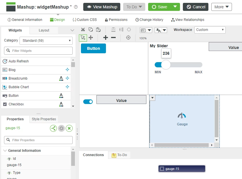
- We will now bind the Slider to the Gauge. Click the Slider Widget in the top-right Container.
- Click the drop-down arrow on the left side of the Slider widget.
- Click and drag the Value property listed in the Slider drop-down onto the Gauge widget.
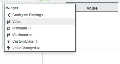
- Click the # Data property that is available from the Select Binding Target pop-up.
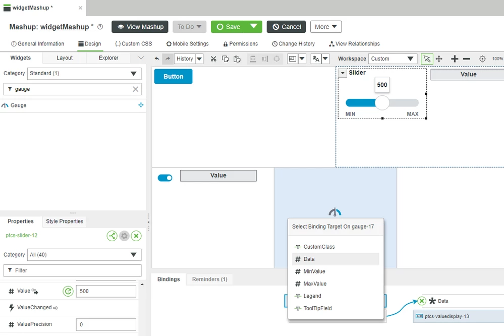
- Click Save to save your Mashup.
- Click View Mashup then adjust the slider to the left to see the changing value shown on the widget.
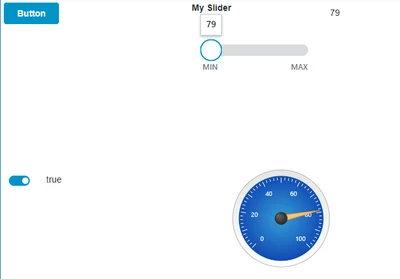
Many properties are available that give control over how the Gauge widget will be displayed. Many properties can be changed both statically when designing the mashup, and dynamically in response to changes in property values.
Bindable
Name | Type | Default | Direction | Description |
Data | Number | None | Input | Value displayed by gauge indicator |
MinValue | Number | 0 | Input | Value used for lowest gauge display |
MaxValue | Number | 100 | Input | Value used for highest gauge display |
Legend | String | None | Input | Text Shown under Gauge |
ToolTipField | String | None | Input | Text shown when mouse hovers over gauge |
Visible | Boolean | True | Input | Widget is visible if set to true |
Static
Name | Type | Default | Description |
DisplayName | String | None | Name used for widget in user-facing interactions |
Description | String | None | Description used for widget in user-facing interactions |
MinorTicks | Number | 4 | Number of minor ticks per interval |
TickLength | Number | 8 | Tick mark length |
MinorTickLength | Number | 4 | Minor tick length |
ValueDisplayMode | None/Top/Bottom/Inside | None | Location on gauge where numeric value is shown. |
LabelDigits | Number | 3 | Number of digits for label display |
LabelDecimals | Number | 0 | Number of decimals for label display |
ValueDigits | Number | 3 | Number of digits for value display |
ValueDecimals | Number | 0 | Number of decimals for value display |
LegendDisplayMode | None/Top/Bottom | None | Location on gauge where Legend is displayed |
ReferenceAngle | Number | 225 | Angle that controls the gauge orientation (degrees) |
Aperture | Number | 270 | Angle that controls the gauge size (degrees) |
NeedleDiameter | Number | 10 | Diameter of the gauge needle (pixels) |
CenterDiameter | Number | 20 | Diameter of the gauge center (pixels) |
GaugeBorder | Number | 20 | Width of the outside gauge border (pixels) |
Step 6: Grid Advanced
A Grid Advanced widget is used to display data to a mashup user in a table
- Select the Widgets tab in the uppper panel of the left dock, then enter grid inside the Filter field in the top-left.
- Drag-and-drop the Grid Advanced widget onto the top-left container on your Mashup that already has the Button Widget.
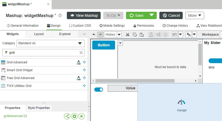
Add Data Source
Before you can customize the Grid display, you must first bind an Infotable to the Grid's Data property. In this example we will use the QueryImplementingThingsWithData Service to bind a group of Things created with the same Template.
We have created a file with sample entities for this exercise.
- Download the attached demoTractors.xml.
- Click Import/Export in the lower left of Composer, then select Import
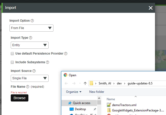
- Click From File in the drop down, then Browse.
- Browse to the demoTractors.xml file and click Open.
- Click Import, then Close after entities are successfully imported.
- Click the green + button in the Data tab on the right side of the Mashup Builder window.
- In the Select Entity panel click Thing Templates from the drop down.
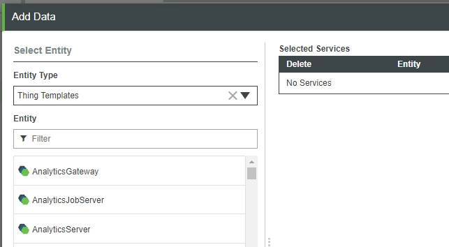
- Scroll through the available Thing Templates and select the Connected Tractors Template that was imported.
- Enter query into the filter text box then click the arrow to the right of QueryImplementingThingsWithData.
- Click the Execute on Load check box, this option will execute the QueryImplementingThingsWithData Service when the Mashup is loaded.
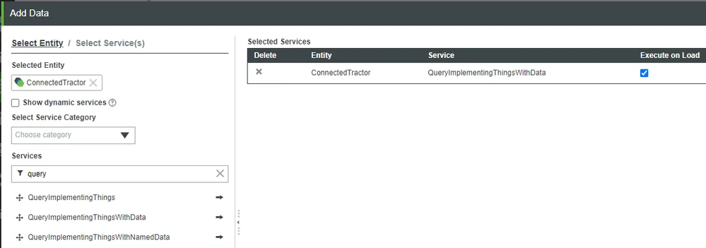
- Click Done.
- Click the arrow icon to expand QueryImplementingThingsWithDate, and Returned Data.
- Click and drag All Data onto the Grid widget.
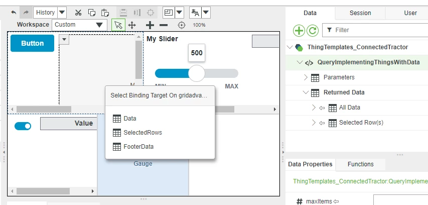
- Click Data in the Select Binding Target pop-up.
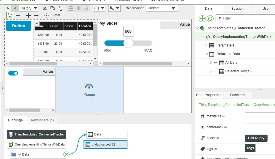
NOTE: The Grid widget now shows Property names in the column headers.
15. Click the drop down in the upper left of the Grid widget, then click Configure Grid Columns to show the Configure Grid Columns pop-up.
16. Uncheck the check box next to the property names in the left-hand panel that you don't want shown in the Grid.
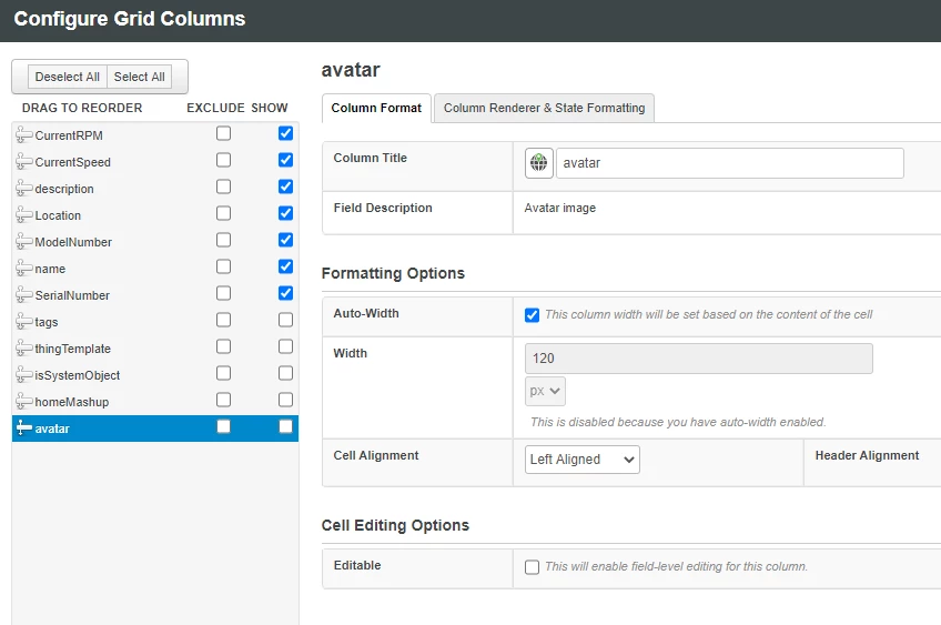
NOTE: You can drag and drop the property names to change the display order. You can customize Column names and formatting by making changes in this window.
17. Click Done when you are satisfied with the column formatting options.
18. Click Save to save your Mashup.
19. Click View Mashup.
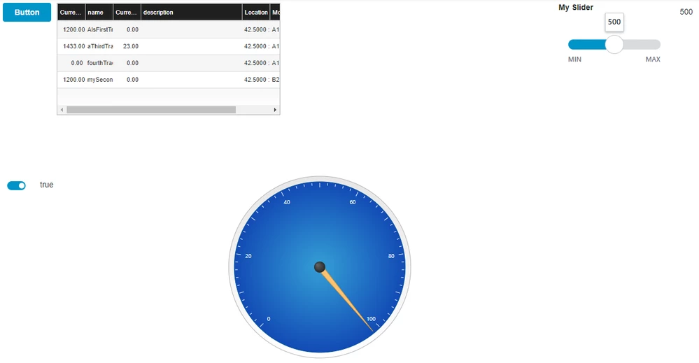
In addition to properties that give control over how a Grid widget will be displayed, the scroll position of a Grid can be read in the CurrentScrollTop property and can be set with the ScrollTop property.
Bindable
Name | Type | Default | Direction | Description |
Data | Infotable | None | Input | The data that is displayed in the Grid |
EditedTable | Infotable | None | Output | The data that is in the Grid after a user edit |
CurrentScrollTop | Number | 0 | Output | How far down (in pixels from the top of the full data list) the Grid is currently scrolled |
ScrollTop | Number | 0 | Input | How far down (in pixels from the top of the full data list) the Grid will be scrolled. |
Visible | boolean | true | Input | Widget is visible if set to true |
Static
Name | Type | Default | Description |
DisplayName | String | None | Name used for widget in user facing interactions |
Description | String | None | Description used for widget in user facing interactions |
RowFormat | StateDefinition | None | Specify a State Formatter to control display of the data in each grid row |
AlignHeader | Boolean | False | When enabled, align column headers with their data |
MultiSelect | Boolean | False | allow multiple items to be selected |
IsEditable | Boolean | False | Allow grid value editing in Configure Grid Columns pop-up |
AutoSelectFirstRow | Boolean | False | Automatically select the first row upon initial loading of data. |
CellTextWrapping | Boolean | False | Enable or disable text wrapping within the grid cells. |
TabSequence | Number | 0 | Tab sequence index |
Widget Events
Name | Description |
DoubleClicked | Fired when user double clicks on the grid |
Step 7: Next Steps
Congratulations on completing the guide!
The next guide in the Customize UI and Display Options to Deploy Applications learning path is Define Your UI Style.
If you have questions, issues, or need additional information, refer to:
Resource | Link |
Experience | |
Community | |
Support | |
Support | |
Support | |
Support |

