- Community
- IoT & Connectivity
- IoT & Connectivity Tips
- Exploring Dynamic Grids and Trees Part 2
- Subscribe to RSS Feed
- Mark as New
- Mark as Read
- Bookmark
- Subscribe
- Printer Friendly Page
- Notify Moderator
Exploring Dynamic Grids and Trees Part 2
Step 3: Create A Tree Grid
With our MyFunctionsMashup Mashup open, let's add a Validation. A Validation is similar to an Expression, except you have the added capability of triggering Events based on a True or False outcome of your validation. We will use the Validation to check and confirm the Text Field we created only has the values we added in our Functions. Let's also add two Status Message Functions that will show whether or not a user has added any text outside of what we want.
- Open the MyFunctionsMashup Mashup to the Design tab.
- Click the green + button in the Functions area.
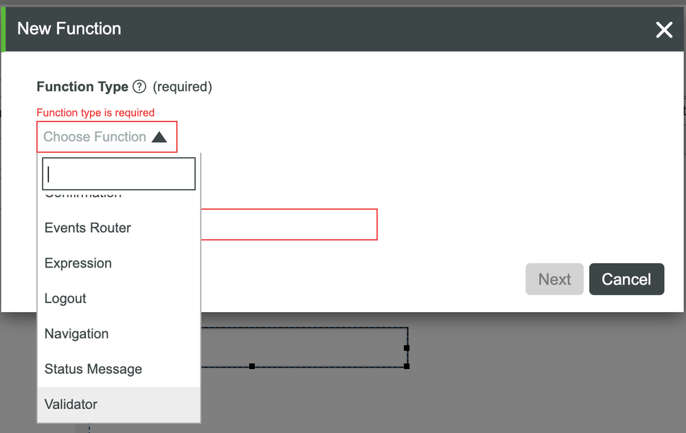
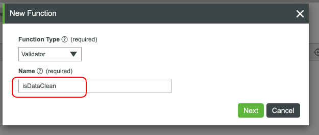
- In the New Function modal, select Validator.
- Set the Name to isDataClean.
- Click Next.
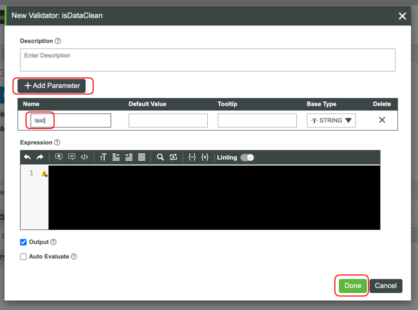
- Click Add Parameter.
- Set the Name to text and ensure the Base Type is STRING.
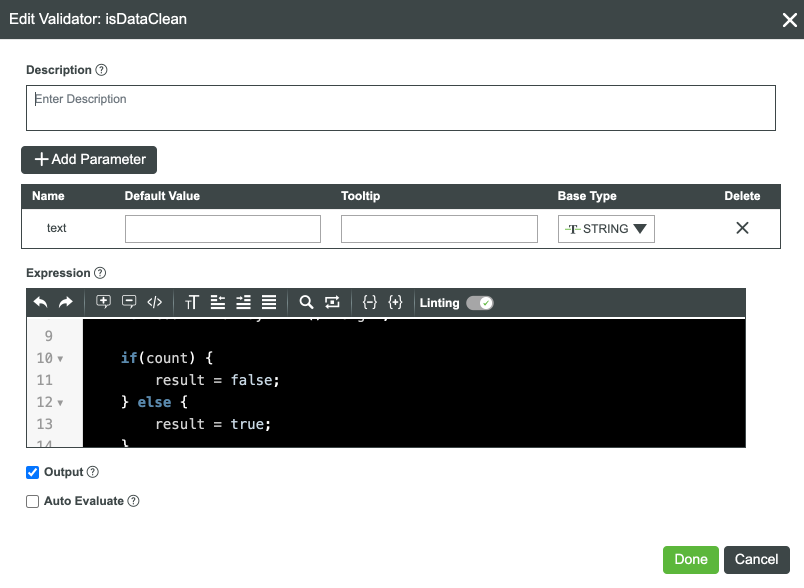
- Add the following code to the Expression are:
if(text === "NO") {
        result = true;
} else if(text === "YES") {
        result = true;
} else {
         let array = text.split("YES").join("");
         array = array.split(",").join("");
         let count = array.trim().length;

         if(count) {
              result = false;
         } else {
              result = true;
         }
}
9. Click Done.
We have our Validator in place, now we need our two Status Message Functions. Why two? You can setup one Status Message to perform the task, but for this case, we're keeping things simple.
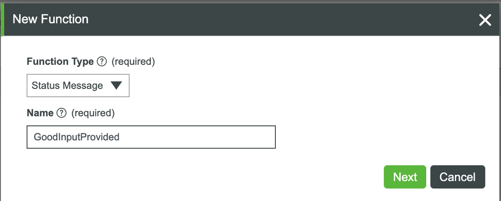
- Click the + button in the Functions area.
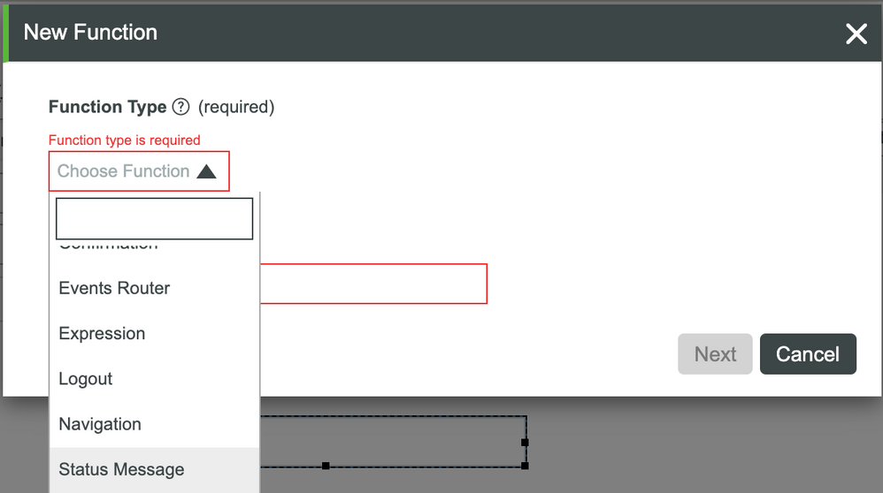
- Select Status Message in the dropdown.
- Set the Name to GoodInputProvided.
- Click Next.
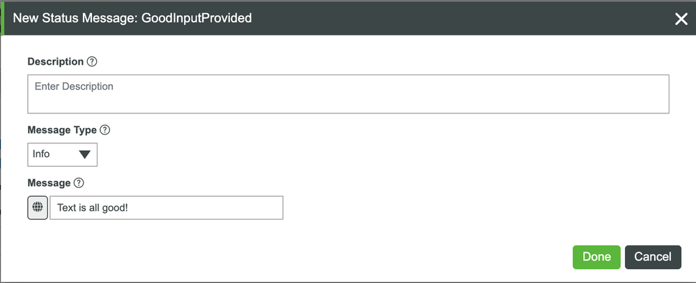
- Ensure Message Type is Info.
- In the Message field, enter Text is all good!.
- Click Done.
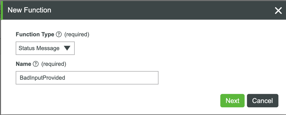
- Let's create another Status Message Function.
- Set the Name to BadnputProvided.
- Click Next.
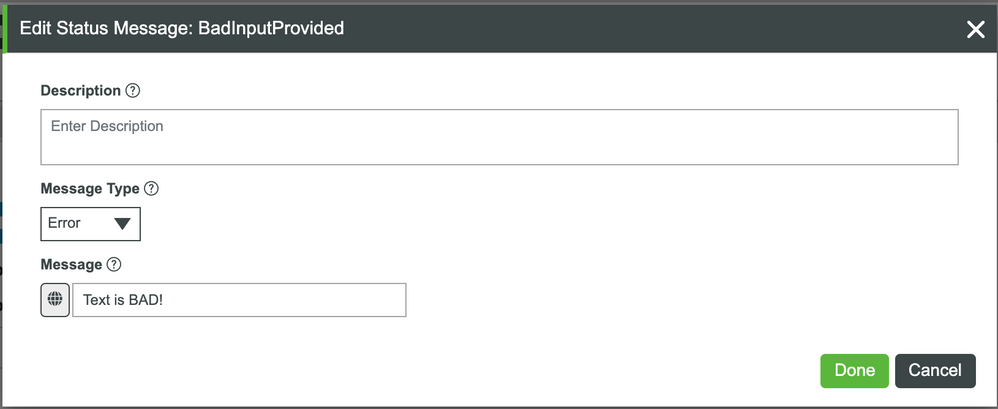
- Change Message Type to Error.
- In the Message field, enter Text is BAD!.
- Click Done.
We now have two Status Message Functions and a Validator to help with checking our text data. Let's connect everything together. This time, let's use the Bind button.
- Expand the Validator section in the Functions tab.
- Click the Bind (arrows) button on the isDataClean Validator. This window will help us configure connections a bit easier.
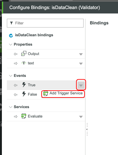
- Click the down arrow by the True Event.
- Click Add Trigger Service.
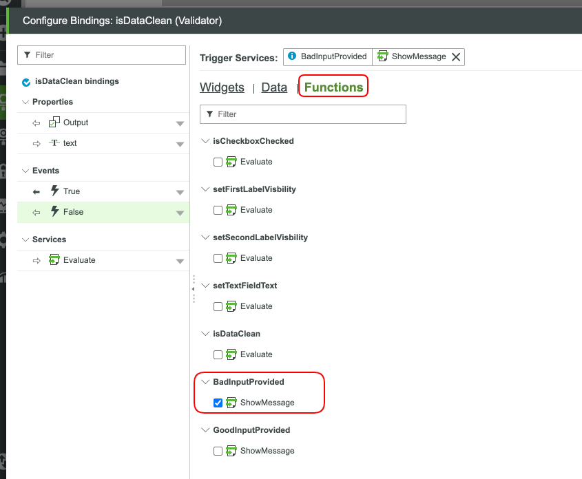
- Click Functions.
- Check the checkbox by GoodInputProvided.
- Click Next.
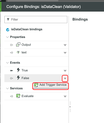
- Click the down arrow by the False Event.
- Click Add Trigger Service.
- Click Functions.
- Check the checkbox by BadInputProvided.
- Click Next.
- You should currently have the following setup:
Let's add in our connections to the Text Field and when we'll run this Validation.
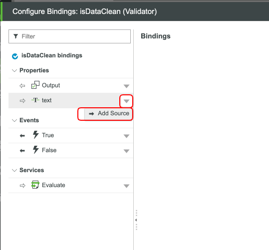
- Click the down arrow by the text Property.
- Click Add Source.
- With the Widgets tab selected, scroll down and select the Text Property of our Text Field.
- Click Next.
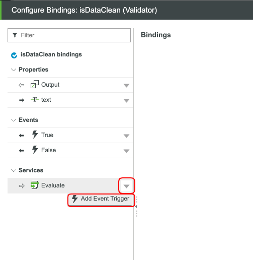
- Click the down arrow by Evaluate Service.
- Select Add Event Trigger.
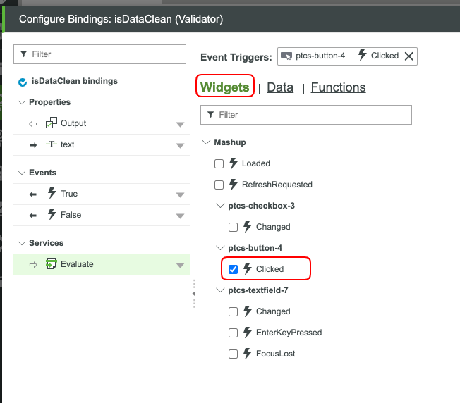
- With the Widgets tab selected, scroll down and select the Clicked Property of our Button.
- Click Next.
- You should currently have the following setup:
- Click Done.
- Click Save and view your updated Mashup.
Your Validator is complete. You now have a way to tell when a user has inputed their own text into the text box. To try things out, add some crazy characters, hit the button, and see what happens. You might notice that you have your Expressions running at the same time as your Validator. Switch up the bindings to get it to run the way you want it to.
Step 4: Next Steps
Congratulations! You've successfully completed the Explore UI Functions guide, and learned best practices for building a complex Mashup that navigations, multiple data inputs, confirmations, and all working together effectively for an enhanced user experience.
Learn More
We recommend the following resources to continue your learning experience:
Capability Guide
| Experience | Object-Oriented UI Design Tips |
Additional Resources
If you have questions, issues, or need additional information, refer to:
Resource Link
| Community | Developer Community Forum |
| Support | Mashup Builder Support Help Center |


