How to Display Data in Charts Guide Part 3
- July 27, 2022
- 0 replies
- 1773 views
How to Display Data in Charts Guide Part 3
Step 6: Configure Charts
You now have a test Thing that has an Info Table Property and Time Series Property with values appropriate for display in various Chart Widgets, as well as a Mashup with those charts inside.
However, in order for the Widget to display data, you need to bind it to the data source.
Bring Data into the Mashup
- Select the Data tab in the top-right section of Composer.

- Click the green + button under Data.
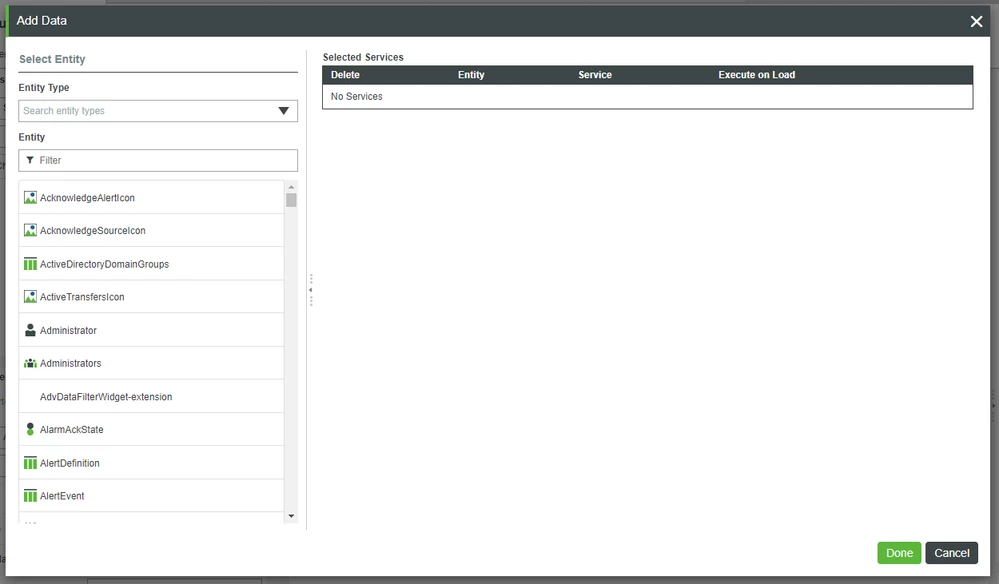
- In the Entity Filter field, search for and select DDCThing.
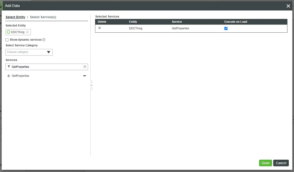
- In the Services Filter field, type GetProperties.
- Click the right-arrow beside GetProperties
- The GetProperties Service will now appear on the right under Selected Services.
Check the Execute on Load box under Selected Services.
- This will cause the GetProperties Service to execute as soon as the Mashup is loaded.
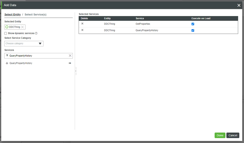
6. In the Services Filter field, type QueryPropertyHistory.
7. Click the right-arrow beside QueryPropertyHistory.
8. Check the Execute on Load box under Selected Services.
9. Click Done to close the Add Data pop-up window.
Drag-and-Drop Data Bindings
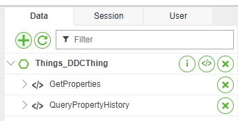
- Under the Data tab, expand the Things_DDCThing > GetProperties service.
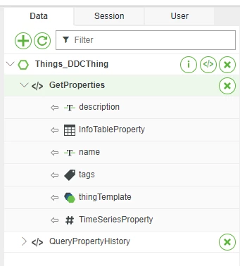
- Drag GetProperties > InfoTableProperty to the Pie Chart Widget in the top-left section of the Canvas.
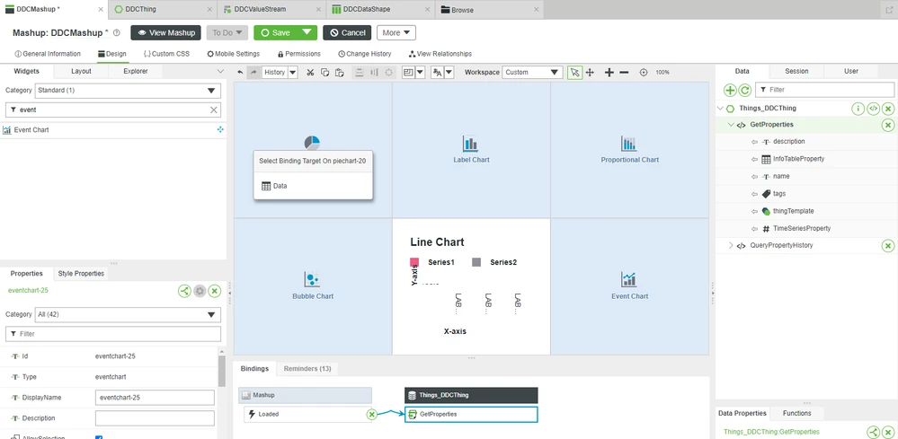
3. On the Select Binding Target pop-up, select Data.
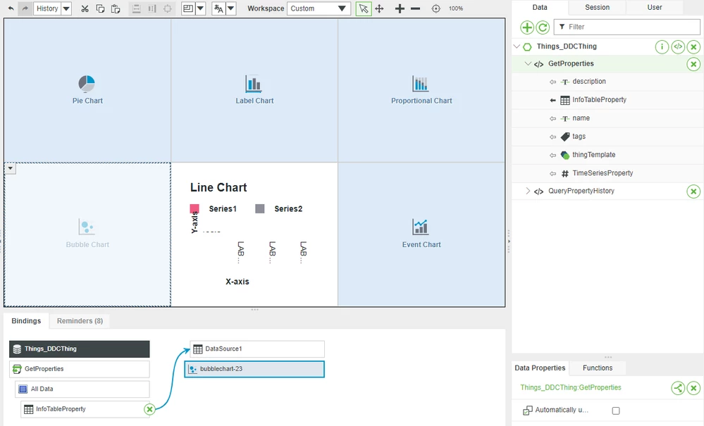
4. Repeat steps 2-3 for the Label, Proportional, and Bubble charts.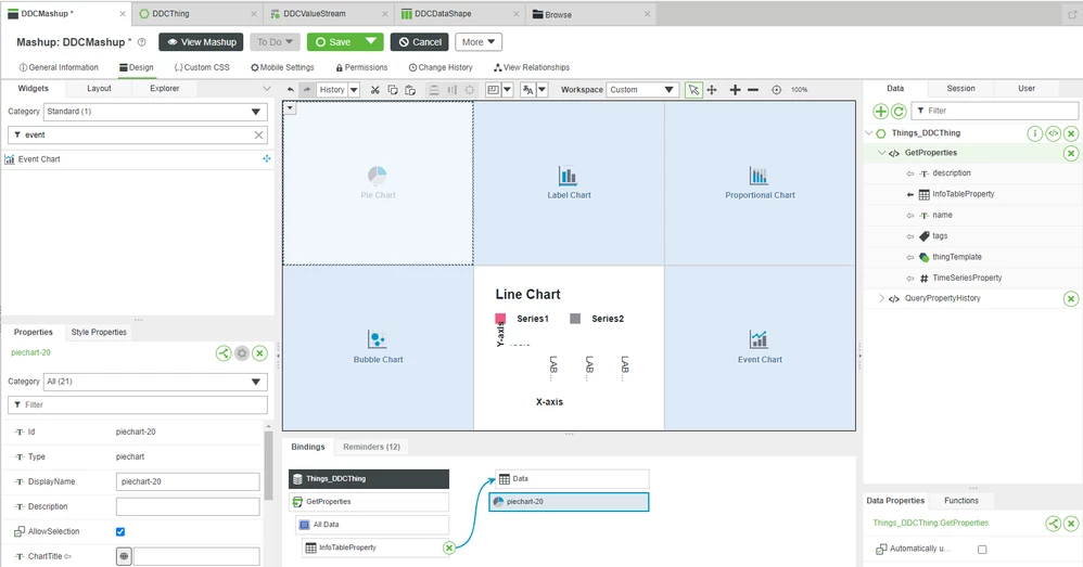
- Note that the Bubble chart will be bound to DataSource1 rather than Data.
5. Drag-and-drop QueryPropertyHistory > Returned Data > All Data to the Line Chart Widget in the bottom-middle section of the Canvas.
6. On the Select Binding Target pop-up, select Data.
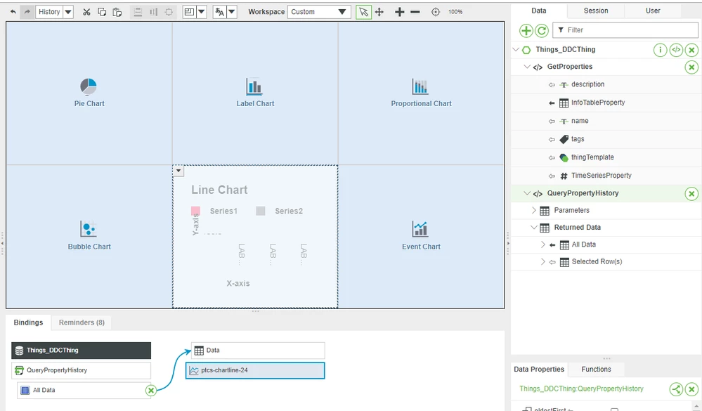
7. Repeat steps 5-6 for the Event Chart in the bottom-right of the Canvas.
Configure Chart Properties
- Click the Pie Chart in the top-left of the Canvas to select it.
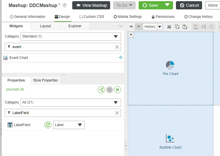
- In the bottom-left section of Composer, showing the Properties of the Pie Chart, type LabelField in the Filter Properties field.
- For the LabelField drop-down, select Label.
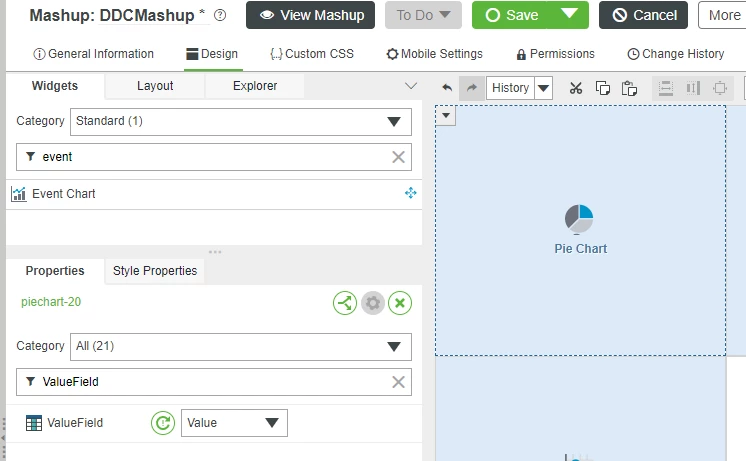
- In the Filter Properties window, type ValueField.
- In the ValueField drop-down, select Value.
- Repeat steps 1-5 for each of the other charts, making the following Widget Property changes:
Chart | Property | Setting |
Label | XAxisField | XAxis |
Label | DataField1 | Data |
Proportional | XAxisField | XAxis |
Proportional | DataField 1 | ASensor |
Proportional | DataField 2 | BSensor |
Proportional | DataField 3 | CSensor |
Bubble | XAxisField1 | XValue |
Bubble | YAxisField1 | YValue |
Bubble | BubbleValueField1 | BubbleValue |
Line | XAxisField | timestamp |
Event | XAxisField | timestamp |
Event | LabelField | TimeSeriesProperty |
7. At the top, click Save.
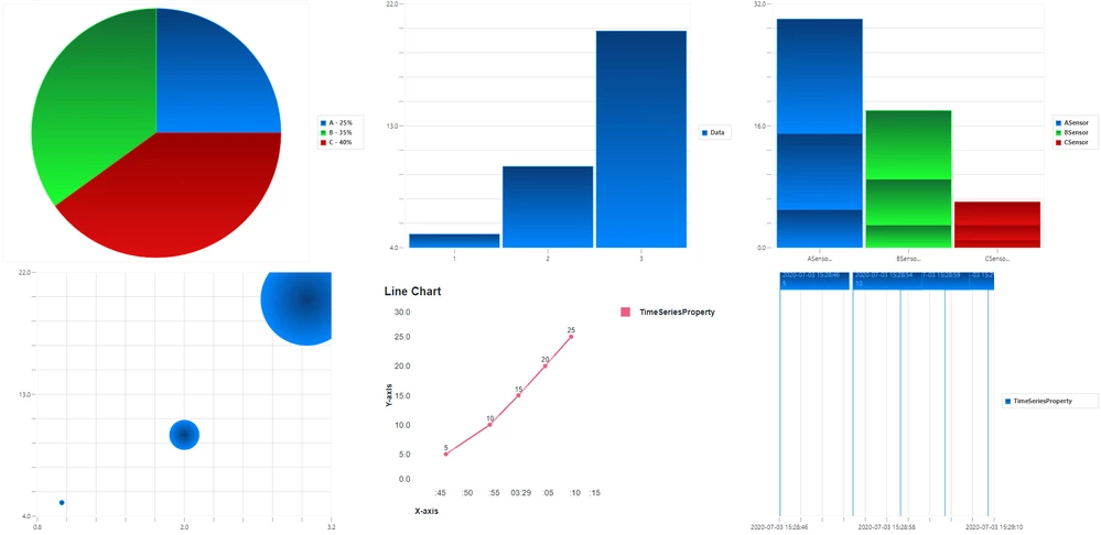
8. Click View Mashup.
Step 7: Next Steps
Congratulations! In this guide, you learned how to:
- Create a Data Shape to format an Info Table
- Create a Value Stream to record Property Value changes
- Create a Thing with an Info Table Property and a Time Series Property
- Create a Mashup with various Chart Widgets
- Link your Thing's Properties to the Chart Widgets
This is the last guide in the Customize UI and Display Options to Deploy Applications learning path.
Additional Resources
If you have questions, issues, or need additional information, refer to:
Resource | Link |
Community | |
Support |

