Community Tip - You can subscribe to a forum, label or individual post and receive email notifications when someone posts a new topic or reply. Learn more! X
- Subscribe to RSS Feed
- Mark Topic as New
- Mark Topic as Read
- Float this Topic for Current User
- Bookmark
- Subscribe
- Mute
- Printer Friendly Page
GRAPHING HELP
- Mark as New
- Bookmark
- Subscribe
- Mute
- Subscribe to RSS Feed
- Permalink
- Notify Moderator
- Labels:
-
Mathcad Usage
Accepted Solutions
- Mark as New
- Bookmark
- Subscribe
- Mute
- Subscribe to RSS Feed
- Permalink
- Notify Moderator
- Mark as New
- Bookmark
- Subscribe
- Mute
- Subscribe to RSS Feed
- Permalink
- Notify Moderator
Select plot-type's 4th one
- Mark as New
- Bookmark
- Subscribe
- Mute
- Subscribe to RSS Feed
- Permalink
- Notify Moderator
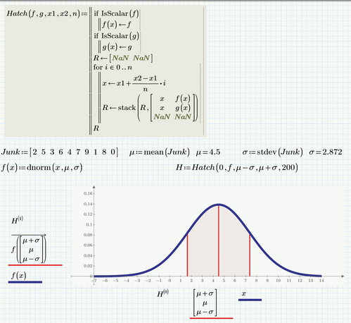
Additionally to using the stem plot as suggested by ttokoro, you may also consider adding some kind of shading/hatch:
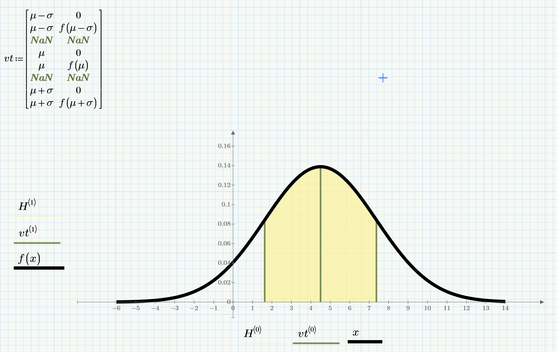
Instead of using the stemplot you may also create a matrix with the points you want to be connected and plot the appropriate columns. This is more versatile especially when some day not every vertical line should end at the x-axis. Furthermore using this method I had less problems placing the shade underneath the vertical lines.
- Mark as New
- Bookmark
- Subscribe
- Mute
- Subscribe to RSS Feed
- Permalink
- Notify Moderator
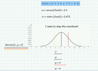
Maybe you have to explain what you mean with 'overshoot'...
If you mean you want the red and yellow bars to stop their top at the black bell-curve, then you have to change the expressions for these traces, e.g. like ttokoro did.
You now have x running from at least -6 to 14. The red trace covers all dnorm(x,mu,sigma) values along the vertical over that range of x, that is from near zero, to mu. The horizontal range of the red trace is determined by mu+sigma, that is a single value. Thus you get a vertical bar from near zero to mu, at x=mu+sigma. Likewise for the yellow trace, except that it is set at x=mu-sigma.
Ttokoro used a different expression for the red trace: only a single point is defined: dnorm(mu+sigma, mu, sigma), that is, instead of ranging from at least -6 to 14, the first parameter to the dnorm function is limited to just: mu+sigma. So the red trace is determined by just a single point; to get a vertical bar, the stem type of trace is used.
Hope this helps.
Success!
Luc
- Mark as New
- Bookmark
- Subscribe
- Mute
- Subscribe to RSS Feed
- Permalink
- Notify Moderator
I can work with what ttokoro did.
[image: image.png]
Thanks Luc.


