Community Tip - New to the community? Learn how to post a question and get help from PTC and industry experts! X
- Subscribe to RSS Feed
- Mark Topic as New
- Mark Topic as Read
- Float this Topic for Current User
- Bookmark
- Subscribe
- Mute
- Printer Friendly Page
Interpolation between points in Mathcad Prime 3.0
- Mark as New
- Bookmark
- Subscribe
- Mute
- Subscribe to RSS Feed
- Permalink
- Notify Moderator
Interpolation between points in Mathcad Prime 3.0
Hello all,
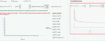
I have datapoints, expressed in a x-vector and a y-vector.
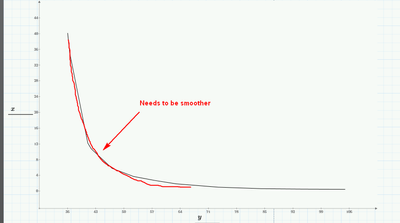
Just by plotting x and y the points are already pretty smooth. The gradient between the first x-points is very big, so I would like to smooth the curve even more. How do I do it the best way? Interpolation between points is the answer, but how to I do it in mathcad?
I attached a mathcad prime 3.0 sheet where I try to do some tests, but without success so far.
The graph in the screenshot is already pretty accurate, but thats because I have enough datapoints.
In a worst case, where I cannot obtain enough datapoints, I would need some kind of interpolation...
The optimum would be even to reconstruct a function out datapoints. Is this possible?
I could do further analysis by having a function f(x)
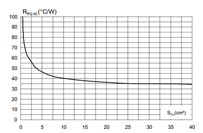
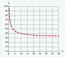
The datapoints were obtained from this graph for thermal resistance over a copper area:
Best regards!
Solved! Go to Solution.
Accepted Solutions
- Mark as New
- Bookmark
- Subscribe
- Mute
- Subscribe to RSS Feed
- Permalink
- Notify Moderator
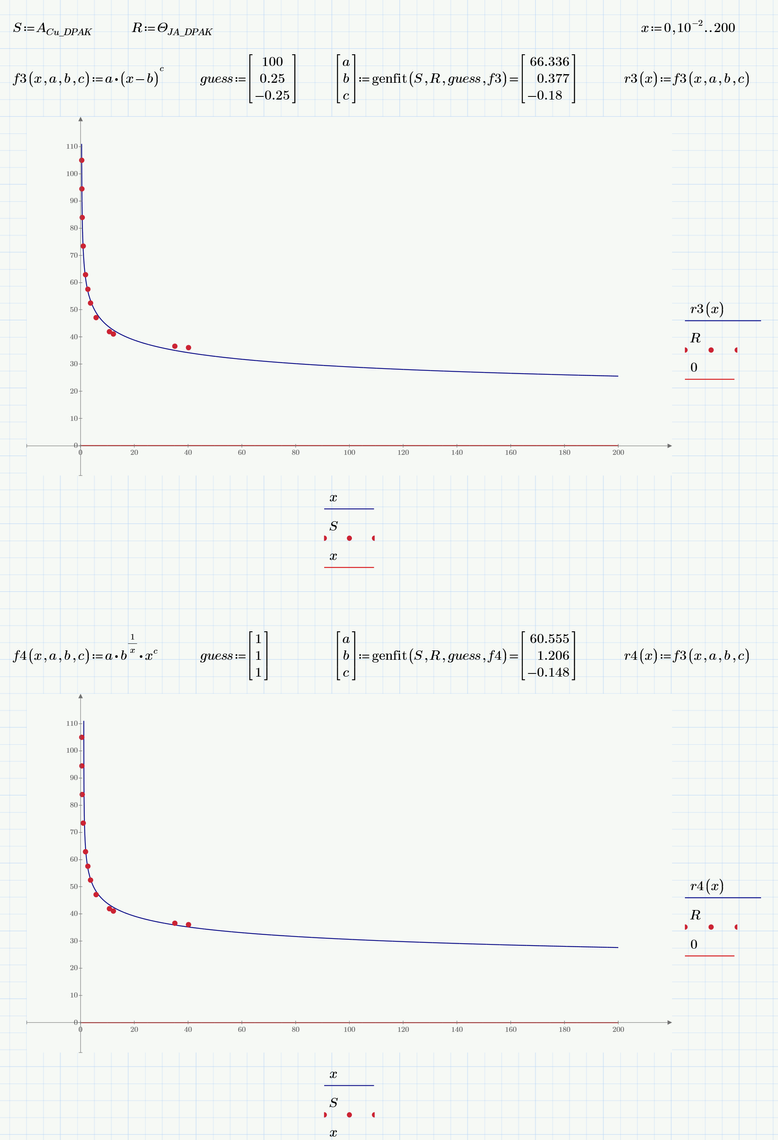
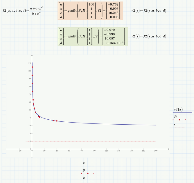
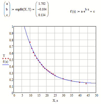
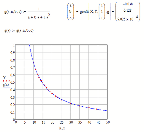
Here are two other models.
Both have the x-axis as horizontal asymptote and use just three parameters.
For playing around with different models I suggest you download the trial/evaluation version of "CurveExpert Professional". You can testdrive it (for I think 30 days) in full mode and then it falls back to a very useful mode with limited functionality which is always good enough for trying different fits for a given data set. CurveExpert will try to fit about a hundred predefined function models to your data and you may also define your own models. It sorts them for best fit and most of the times finds good guess values to come to a fitting result itself. In Prime you have to play around with the guesses yourself to get genfit do its job. Needless to say - the models above were found using CurveExpert Pro.
- Mark as New
- Bookmark
- Subscribe
- Mute
- Subscribe to RSS Feed
- Permalink
- Notify Moderator
The sheet you attached does not have much value without the data!
I guess that what you are looking for is not interpolation but rather some kind of regression.
Maybe some type of hyperbola or a more elaborate rational function type.
You may try "genfit" after you have settled for a specific type of regression function type.
Of course it would help if you know the type of function you can expect.
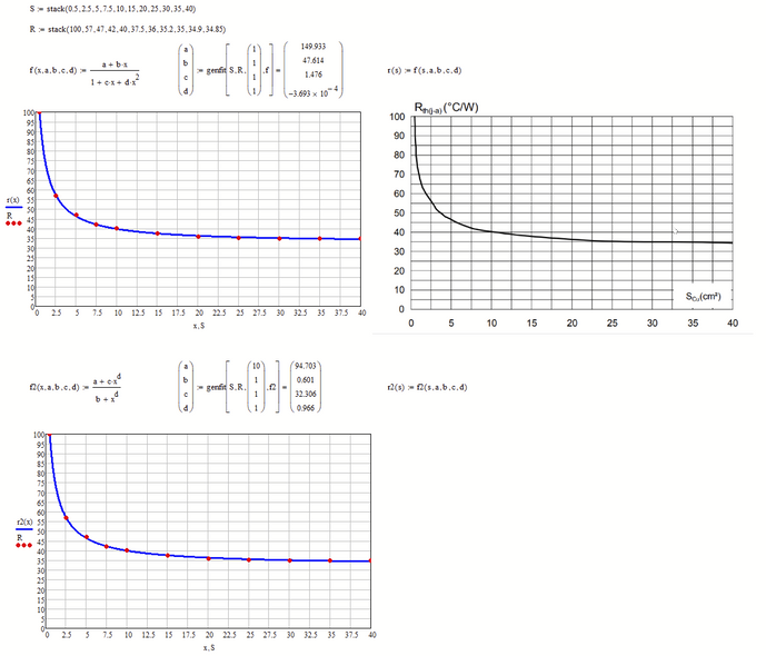
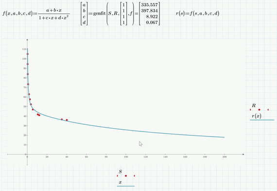
Here is a quick try using some few data optically sampled from the picture you provided.
For my convenience, I implemented it in MC 15, but it should work the same way in Prime.
- Mark as New
- Bookmark
- Subscribe
- Mute
- Subscribe to RSS Feed
- Permalink
- Notify Moderator
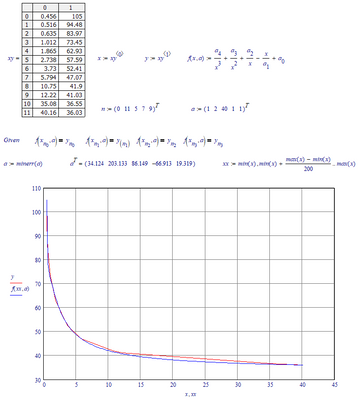
Here is my 10 ct:
(I grabbed the data from the two vectors on the first page of your file, and assigned that to x and y, exported them using WRITEPRN and then imported it into Mathcad 11)
Success!
Luc
- Mark as New
- Bookmark
- Subscribe
- Mute
- Subscribe to RSS Feed
- Permalink
- Notify Moderator
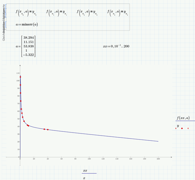
Ok, I had to redigitize the graph since (as Werner pointed out) you didn't send your data.
Attached is a Prime Express file and a pdf of it.
I would expect that a log/log plot would present a straight line; it doesn't (perhaps an artifact of digitization.) At any rate, a second order polynomial fit of the log of X and Y provides a reasonable curve.
(The method of getting there is due to having only Express, so polyfit needs to be invented.)
- Mark as New
- Bookmark
- Subscribe
- Mute
- Subscribe to RSS Feed
- Permalink
- Notify Moderator
Dear Luc, Werner and Fred,
very impressive overall 😮
I tried your solutions and attached the sheet here.
Also I included a screenshot from the original Data, but its the same as my both x- and y-arrays...
The Solution from Luc and Werner may have an issue in prime 3.0, or maybe I did something wrong? Please check. I would like to make your solutions work for me!
The solution from Fred works good within some conditions. The x-axis represents the copper area (for thermal cooling) and values bigger than 30-40 (cm^2) are practial. So within this this x-intervall the function is very good!
I played a little bit and increased the maximum x-axis until the function began to rise again (gradient rises again) and thats wrong. Anyway, for practical values its super fine 🙂
Best regards
- Mark as New
- Bookmark
- Subscribe
- Mute
- Subscribe to RSS Feed
- Permalink
- Notify Moderator
You will have to provide the data if you want us to examine your file.
As there seems to be only 12 x- and y-values, you should better simply include them in the sheet rather than providing the Excel table:
Open your sheet and somewhere at the top after importing the data from Excel evaluate the two variables containing the data, copy the result matrix (Ctrl-C) and assign it the very same variable.
If for example the vector of x-values is called JADPAK, you would type JADPAK= and will see a matrix to the right of the equal sign. Mark it and copy it using Ctrl-C. Then Type JADPAK:= and press Ctrl-V to insert the matrix.
Now your data is embedded in the sheet and we don't need the Excel file.
- Mark as New
- Bookmark
- Subscribe
- Mute
- Subscribe to RSS Feed
- Permalink
- Notify Moderator
I just noticed that you evaluated the two vectors anyway and as we can see the last result when we open a Prime sheet, I can copy the data myself and assign it to the variables.
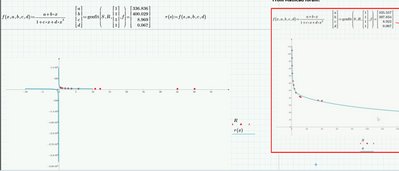
I don't know what happened in your attempt to duplicate my first approach. But when I deleted the region "r(s):=f(s,a,b,c,d)" and retyped it from scratch, things worked OK. So you may give that a try. Maybe the reason is Primes infamous autolabel "feature" - don't know.
Here is what I see after a changed the limits on the axis accordingly:
If x approaches infinity, r(x) appraoches zero - so the x-axis is the horizontal asymptote.
In my second appoach I realize that the new algorithm in Prime seems to be even more sensitive with respect to the guess values that the one on Mathcad. You found out about that yourself.
After changing the axis limits I guess this is the better fit of the two.
The graph approaches the value of c (approx. 10) if x goes to infinity.
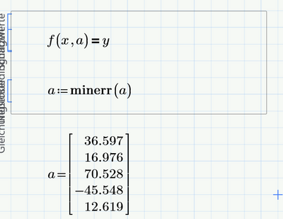
According you attempt to duplicate Luc's contribution:
1) You must put the constraints and the minerr command into a solve block
2) You must use vector indices! The ones you get by pressing [
When Luc writes xn1, both the n and also the 1 are vector indices!
This graph approaches minus infinity when x goes to infinity
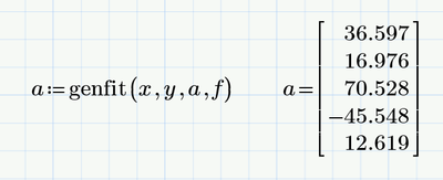
You may consider an easier approach without using the vector n , like
or you also can use "genfit" to do the job:
The values are a little bit different because in Lucs original approach only five data points (specified by the vector n) where considered, but now all 12 data points are taken in account.
- Mark as New
- Bookmark
- Subscribe
- Mute
- Subscribe to RSS Feed
- Permalink
- Notify Moderator
Here are two other models.
Both have the x-axis as horizontal asymptote and use just three parameters.
For playing around with different models I suggest you download the trial/evaluation version of "CurveExpert Professional". You can testdrive it (for I think 30 days) in full mode and then it falls back to a very useful mode with limited functionality which is always good enough for trying different fits for a given data set. CurveExpert will try to fit about a hundred predefined function models to your data and you may also define your own models. It sorts them for best fit and most of the times finds good guess values to come to a fitting result itself. In Prime you have to play around with the guesses yourself to get genfit do its job. Needless to say - the models above were found using CurveExpert Pro.
- Mark as New
- Bookmark
- Subscribe
- Mute
- Subscribe to RSS Feed
- Permalink
- Notify Moderator
Thank you very much Werner,
this is a great help - from all of you guys. Thank you for the hint with "CurveExpert Pro". I was wondering how you obtain these functions.
I attached my current sheet - please have look!
Basically it works, I can obtain plots, BUT:
- I have different results for my genfit function, although I used the exakt copy of your mathcad definitions.
I documented everything in my attached sheet, please expand the mathcad sheet so you can see the screenshots on the "hidden" right side.
- One of your solutions shows a completly different graph than the desired function... , please see "solution 2"
- In some cases I have to scale the y-axis properly, please see "solution 3", "solution 5"
Best regards
- Tags:
- nk you
- Mark as New
- Bookmark
- Subscribe
- Mute
- Subscribe to RSS Feed
- Permalink
- Notify Moderator
I mean this for "solution 2"
and this for "solution 3" and "solution 5"
- Mark as New
- Bookmark
- Subscribe
- Mute
- Subscribe to RSS Feed
- Permalink
- Notify Moderator
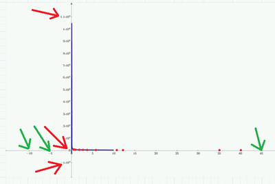
To change plot scales, you can select and change the first, the second and the last value along each of the axes.
See the picture above, The red arrows point to the y-axis parameters, the green are for the x-axis.
Zoomed in on the bottom y-value.
If you change the bottom y-value to 0, and the second one (which is now 0) to 20, and the top one to 200, you get an axis from 0 to 200 with ticks every 20.
It is great to see how intuitive this was designed...
Success!
Luc
- Mark as New
- Bookmark
- Subscribe
- Mute
- Subscribe to RSS Feed
- Permalink
- Notify Moderator
Is this graph scaling or editing only a Prime 3.0 thing? Is it differently in Prime 6.0 (should be the last version, right?) ?
I have already faced other problems in mathcad prime with the symbolic math engine and with the missing grid lines. For the grid lines I saw proposals here in the forum, but you have to program for this - means it is far from intuitive
Best regards
- Mark as New
- Bookmark
- Subscribe
- Mute
- Subscribe to RSS Feed
- Permalink
- Notify Moderator
I opened your file in Prime 3.1, and created the picture from there. I don't recollect it being different in other versions of Prime. What PTC has added in Prime 5 is a different (third party) plotting facility that has its own quirks. It's not available in Prime 3, obviously, but you don't miss a thing, other than grid-lines maybe. The new plotting feature has a less-than-desirable operation w.r.t. units...
Did you succeed in changing the scales now?
Luc
- Mark as New
- Bookmark
- Subscribe
- Mute
- Subscribe to RSS Feed
- Permalink
- Notify Moderator
Luc already pointed out the problem - Primes autoscale usually does not do a good job and you will have to manually tweak the axis values. This is what I was talking about when I wrote about "changing the axis limits".
You can change the first, second and last value on each axis. And yes, its absolutely unintuitive and can take quite a while and may be very demanding to catch those tiny values with the mouse. A shame for a company like PTC to deliver such a crap.
Furthermore I usually used the so called quickplot feature. By this its meant that you can plot a functon f(x) over x without defining x. Prime will automatically chose what it thinks is an appropriate step width and ... it will always chose the range from -10 to +10 for x. Thats the reason you may see the curve stop at x=10. As soon as you manually set the upper limit for the x-axis to a different value, the quickplot will adapt itself accordingly.
An alternative to the quickplot is to define the x-values as a range. This may give you a better and more intuitive control. Its also a good idea to name this variable differently and thats the reason Fred used xx as variable name for the range and consequently did not plot f(x) over x but rather f(xx) over xx.
- Mark as New
- Bookmark
- Subscribe
- Mute
- Subscribe to RSS Feed
- Permalink
- Notify Moderator
Okay perfect, the scaling worked, yes.
I collect enough solutions, I have the hint with "CurveExpert Professional" and I understand the principe with the genfit function.
Thanks for your support, the topic can be closed 👍
Best regards
- Tags:
- ay
- Mark as New
- Bookmark
- Subscribe
- Mute
- Subscribe to RSS Feed
- Permalink
- Notify Moderator
It's your job to close it...
Luc
- Mark as New
- Bookmark
- Subscribe
- Mute
- Subscribe to RSS Feed
- Permalink
- Notify Moderator
B splines are often useful. While they can get you into trouble, they're often a quick way to take a lot of data and get a quick interpolation function (provided you stay within mathcad, can't really export it). See the ptc help example here:
4.0 and pdf attached
- Mark as New
- Bookmark
- Subscribe
- Mute
- Subscribe to RSS Feed
- Permalink
- Notify Moderator
Thank you DJF,
this also works !
Best regards
- Mark as New
- Bookmark
- Subscribe
- Mute
- Subscribe to RSS Feed
- Permalink
- Notify Moderator
Hello all,
could you please help again to interpolate smoothly the following datapoints?
X-Axis Y-Axis
| 10 | 0,76 |
| 11 | 0,66875 |
| 12 | 0,60625 |
| 13 | 0,56 |
| 14 | 0,519 |
| 15 | 0,4875 |
| 16 | 0,456 |
| 17 | 0,42 |
| 18 | 0,39 |
| 19 | 0,36875 |
| 20 | 0,348 |
| 21 | 0,328 |
| 22 | 0,312 |
| 23 | 0,29375 |
| 24 | 0,28125 |
| 25 | 0,263 |
| 30 | 0,2125 |
| 35 | 0,1815 |
| 40 | 0,15625 |
| 44 | 0,1375 |
Best regards
- Mark as New
- Bookmark
- Subscribe
- Mute
- Subscribe to RSS Feed
- Permalink
- Notify Moderator
@xyz123 wrote:
Hello all,
could you please help again to interpolate smoothly the following datapoints?
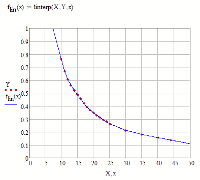
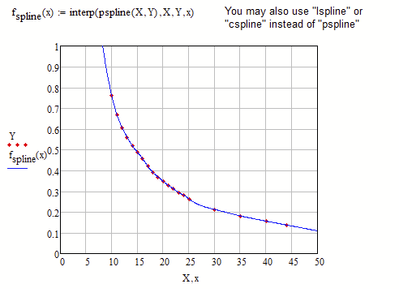
That depends on how you would define "smooth interpolation" and what you would need the interpolation function for. For many cases a simple linear interpolation like the one shown in the next picture would suffice and be as good and suitable as any spline interpolation.
It may also be that you are looking for a regression function. If thats the case it would help to know more about the data, what process it stems from and what kind of function its assumed to be underlying.
Here are two different examples for a regression and you always may fit your own function type to the data using Mathcads genfit function as shown in the last example.

