Community Tip - Have a PTC product question you need answered fast? Chances are someone has asked it before. Learn about the community search. X
- Subscribe to RSS Feed
- Mark Topic as New
- Mark Topic as Read
- Float this Topic for Current User
- Bookmark
- Subscribe
- Mute
- Printer Friendly Page
Mathcad 15 3D graph surface contour challenge
- Mark as New
- Bookmark
- Subscribe
- Mute
- Subscribe to RSS Feed
- Permalink
- Notify Moderator
Mathcad 15 3D graph surface contour challenge
I wish to map calculation results in a 2D matrix onto the surface of a hemisphere to produce a "heart map" showing the magnitide (colour) and orientation of the maxima and minima in the dataset. The matrix data are the result of calculation of stresses on a plane for a grid that has been incremented by 15 degrees in the polar and azimuthal directions. I can generate a hemisphere with the appropriate 15 degree grid but do not know how to map my data to this grid. Can it be done? Any assistance would be appreciated.
Cheers
Ross
Solved! Go to Solution.
- Labels:
-
Mathcad Usage
Accepted Solutions
- Mark as New
- Bookmark
- Subscribe
- Mute
- Subscribe to RSS Feed
- Permalink
- Notify Moderator
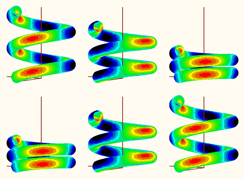
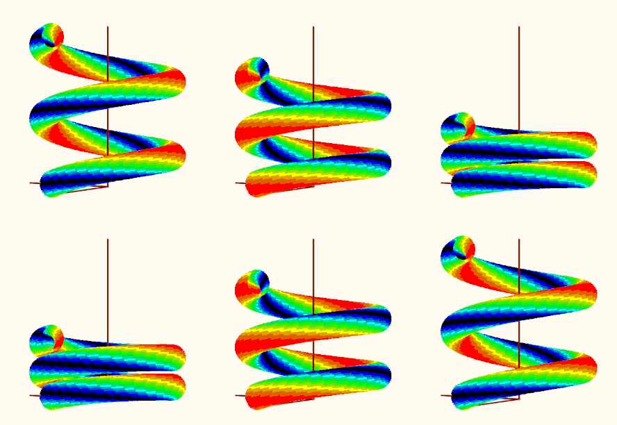
Your question reminded me of an old thread in which a user was also interested in a special coloring of a 3D plot of a helix using a given function. Back then, I 'solved' it in such a way that I realized the coloring by plotting many individual points in the desired colors. A separate plot would have to be set up and formatted for all points of the same color. Quite laborious, which is why I limited myself to just 16 colors. The thread and the files created back then are still available here, if you are interested:
Re: Solid Helix with Surface Color defined by Inde... - PTC Community
I guess using this method could also help creating the 3D sphere you are looking for but it may be quite some work to do.
- Mark as New
- Bookmark
- Subscribe
- Mute
- Subscribe to RSS Feed
- Permalink
- Notify Moderator
I can't think of an easy way to color the sphere according to a stress function.
Her some general thoughts:
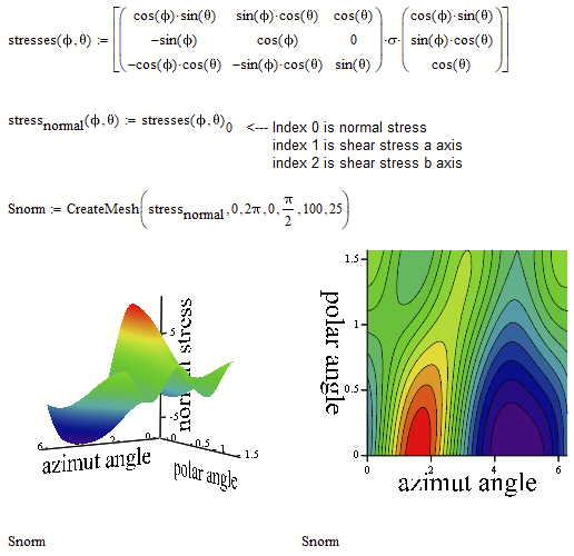
Your plots of the stresses (plots of X, Y and Z) lack of correct axis labels. These labels simply are the indices of the matrix and not the azimut and polar angle values.
Here is a way to create these plots with correct axis labels. I also use a functional approach:
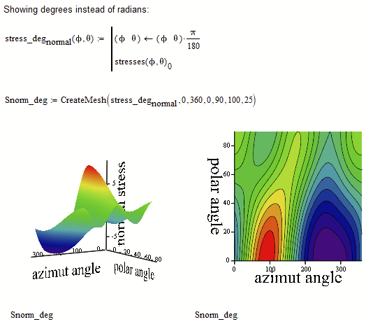
In case you'd rather would like to see the axis scaled in degree, you could do it that way:
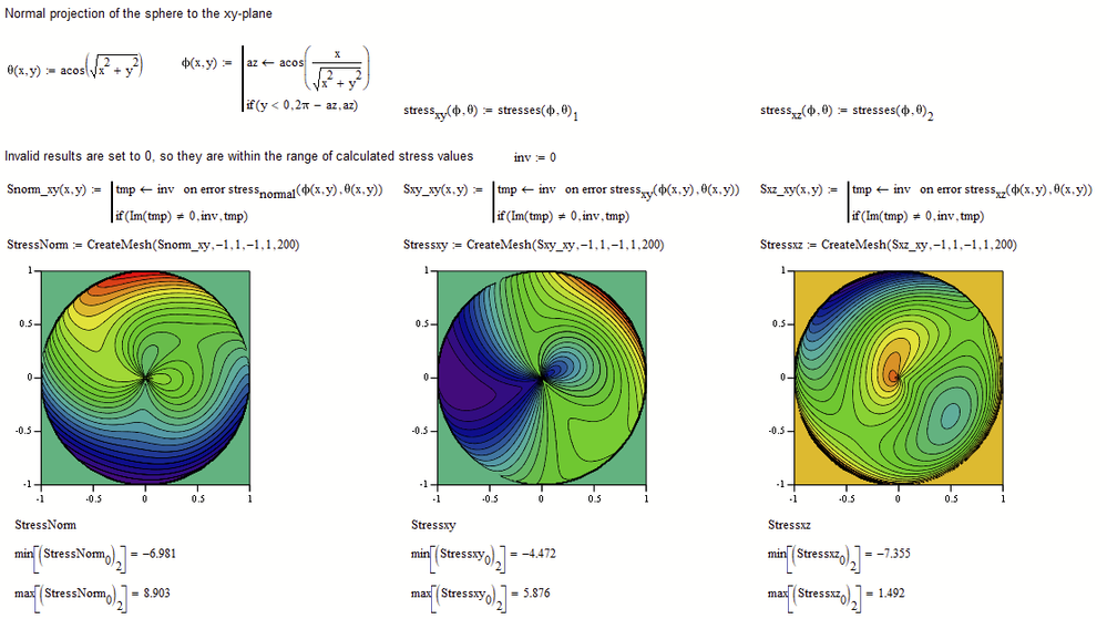
I now mapped the the angle values to their appropriate xy-values. What you get is not the 3D plot you were asking for but at least its normal projection to the xy-plane.
Mathcads 3D plots (on contrary to its 2D plots) does not accept/ignore Nan's or imaginary values but rather refuses to plot . So I had to replace the values for these points (points outside of the circle) by a number and I had chosen -10 as this seems to be lower than all regular stresses calculated. The value should not be set too low as its considered by the color map of the contour plot and you get less colors for the area inside the circle. You also may play around with the number of contour line (tab "Special" in the 3-D Plot Format menu)
Because min and max stress values differ in the three plots, same color does not mean same stress.
We may add a legend for each plot for a visualization which color corresponds to which stress amount. Its a simple contour plot itself which can be formatted to your needs:
- Mark as New
- Bookmark
- Subscribe
- Mute
- Subscribe to RSS Feed
- Permalink
- Notify Moderator
Your question reminded me of an old thread in which a user was also interested in a special coloring of a 3D plot of a helix using a given function. Back then, I 'solved' it in such a way that I realized the coloring by plotting many individual points in the desired colors. A separate plot would have to be set up and formatted for all points of the same color. Quite laborious, which is why I limited myself to just 16 colors. The thread and the files created back then are still available here, if you are interested:
Re: Solid Helix with Surface Color defined by Inde... - PTC Community
I guess using this method could also help creating the 3D sphere you are looking for but it may be quite some work to do.
- Mark as New
- Bookmark
- Subscribe
- Mute
- Subscribe to RSS Feed
- Permalink
- Notify Moderator
OK, I couldn't resist and adapted the method from the old worksheet to the new task. Since the plot region with the 18 individual plots could be taken over from there (including the colors used there), the work was limited to the "makePoints" function, which calculates a series of points on the sphere with their stress values and then sorts the points into one of 16 matrices depending on the stress value.
So here are your spheres ...
Remark: I notice that the colors are modified (fades/pale, to the worse) when I insert a picture here in the forum. Not sure why. had not noticed that in former times ...
Mathcad 15 worksheet attached
- Mark as New
- Bookmark
- Subscribe
- Mute
- Subscribe to RSS Feed
- Permalink
- Notify Moderator
Werner,
After your fantastic graphics effort I decided to push on to identify the critical plane using a method known as the Maximum Variance Method. If you are happy to assist further, I would appreciate assistance with:
I need to:
- Calculate Var(τq(t) for each angle
- Create a matrix with columns [θ ϕ α Var(τq(t)]
- Search and locate Max Var(τq(t)
- Report Max Var(τq(t)
- Plot Var(τq(t) on sphere using Makepoints to visualise the location of max shear stress
I can calculate Var(τq(t) but i am having trouble assembling the [θ ϕ α Var(τq(t)] data into a matrix form that can be used with your MakePoints plot routine to show the maximun location.
I would appreciate assistance if you have the time.
Regards,
Ross
- Mark as New
- Bookmark
- Subscribe
- Mute
- Subscribe to RSS Feed
- Permalink
- Notify Moderator
Your Excel file with the data is missing
- Mark as New
- Bookmark
- Subscribe
- Mute
- Subscribe to RSS Feed
- Permalink
- Notify Moderator
Werner,
Thats what we call a "seniors moment"!
File attached with thanks
Ross
- Mark as New
- Bookmark
- Subscribe
- Mute
- Subscribe to RSS Feed
- Permalink
- Notify Moderator
Werner,
I hope you have not been offended by my comment regarding a "seniors moment".
It was a comment directed at myself (its a common saying in Australia) for being forgetful in my old age at not including the excel file and certainly not intended to be disrespectful or make any reference to yourself. My apologies if this is how it was received.
Regards,
Ross
- Mark as New
- Bookmark
- Subscribe
- Mute
- Subscribe to RSS Feed
- Permalink
- Notify Moderator
Don't worry, I've already understood that correctly.
However, I had only just noticed the subsequent posting with the data. I won't be able to deal with it for at least another week.
- Mark as New
- Bookmark
- Subscribe
- Mute
- Subscribe to RSS Feed
- Permalink
- Notify Moderator
Werner,
No problem. Thank you for your continued interest.
- Mark as New
- Bookmark
- Subscribe
- Mute
- Subscribe to RSS Feed
- Permalink
- Notify Moderator
I am not sure what exactly you want to plot - your variable Var.rq is a 13x13 matrix with more than 50% zero values!?
To plot a point we need its three cartesian coordinates and probably one additional value to decide in which of the 16 color zones is belongs to. Or do you want to add some special points (maybe in black) to the already existing plots?
- Mark as New
- Bookmark
- Subscribe
- Mute
- Subscribe to RSS Feed
- Permalink
- Notify Moderator
Werner,
I have updated the Program to include:
- a revised input data file to include bending data for 2 strain gauge bridges at 0 degrees (1-3) and 90 degrees (2-4)
- Selected the bending signal with the highest RMS level
- Reduced the number of data points of the excel file as a demo
- Included Poisson effects so now have strains at Sigma y
- Note I would expect the Var.rq output to include a lot of zeros as the input data is for surface stresses and hence all tensor elements with "z components" will be zero.
The program is calculating Var.rq at increments of 15 degrees cycling through 3 angle orientations, theta, phi and alpha as referenced to the global x,y,z cartesian system defined in the diagram above. So we should have 4 parameters (theta, phi, alpha and Var.rq).
The goal is to:
- locate the maximum value of Var.rq
- Plot the values of Var.rq on the surface of the sphere
- List the combination of angles (theta, phi, alpha) at which the maxima occurs.
- This is deemed to be the most damaging pnae (Critical Plane)
Once I have located the maximum value of Var.rq and its orientation, this will be the critical plane and then I can perfrom a cycle count of the data at this transformed stress history and then determine fatigue damage.
The ouput from my program does not look correct as we need a 3D set of angles that are associated with each value of Var.rq.
I have attached the updated Excel file and the Mathcad sheet.
Your assistance is appreciated.
Regards Ross
- Mark as New
- Bookmark
- Subscribe
- Mute
- Subscribe to RSS Feed
- Permalink
- Notify Moderator
Sorry I guess I am loss which is probably due to the fact that I only try to look at the math and the usage of Mathcad and have no idea about what your application is actually about. What would be needed from a math point of view is:
A function to calculate the cartesian coordinates based in the various angles which seem to be involved and then a function which calculates the value for each point which determines which of the 16 color sections it should fall in.
I don't see how this would correlate to the (N+1) x (M+1) matrix (13x^3 in your sheet) you calculate in the sheet.
- Mark as New
- Bookmark
- Subscribe
- Mute
- Subscribe to RSS Feed
- Permalink
- Notify Moderator
Werner,
After the excitement of seeing your routine to map the stress data onto a sphere, I was a little over zealous in my venture into identifying the Critical Plane. The algorithm I am seeking to copy is searching for a plane that is oriented by theta and phi angles to the reference cartesian coordinate system. Within this plane there is a vector Var(tauq(t)) which is oriented an angle alpha from an axis "a". The idea is to calculate Var(tauq(t)) whilst cycling through these three angles and then identify the combination of angles that gives a maximum Var(tauq( )). The critical plane is determined by the values of theta and phi. Within this Critical Plane there will be a maximum of the Var(tauq(t)) vector at one of the angles alpha.
So I need to know the three angles that give the maximum Var(tauq(t)), but for visualisation purposes I only need the angles of the plane in order to plot the results on the sphere (i.e. "alpha" is not required for the plot - having thought about it if alpha were to be used this would require 4 dimensions!). The two objectives are:
- Find the combination of angles theta, phi & alpha at which Var(tauq(t)) is a maximum.
- Sort the results for theta, phi and the maximum value of Var(tauq(t)) for all/any of the alpha angles at each theta/phi combination.
Please note my nested loop at the bottom of the sheet has errors as the output is not giving a matrix for all theta, phi, alpha, Var(tauq(t)) results.
My apologies if I have confused you.
Let me know if you need futher clarification.
Regards,
Ross
- Mark as New
- Bookmark
- Subscribe
- Mute
- Subscribe to RSS Feed
- Permalink
- Notify Moderator
The problem possible stems from the fact that I have no idea what exactly you are calculating - I am just looking at the pure math involved.
For further clarification (haven't looked at the new sheet yet): The goal is to just plot one single point on a sphere? The one for which a calculation based on the angles determining the position plus an angle alpha not visible in the plot give a maximum value?
For every position (determined by theta and phi) alpha is varied and the maximum value "Var" calculated from these three angles should be saved.
So at the end we have a table with three or four columns: theta, phi, "Var" and maybe also alpha?
I guess that the three angles should be varied in the the range of 0 to 180 resp. 360 degree in small steps (you chose 15° just for demonstration?)
Does your sheet provide a single function with the three angles as input which calculates "Var" as its output? Which one is it?
If the aforementioned table is created, how would it be used to create which kind of plot?
- Mark as New
- Bookmark
- Subscribe
- Mute
- Subscribe to RSS Feed
- Permalink
- Notify Moderator
OK, I had a second look at the sheet.
Your program for Var.rq did not return the desired result because Mathcad does not support 3-dimensional arrays (array with three indices). So you can't create a 13 x 13 x 13 array as you tried to do. But you could created nested matrices, e.g. a 13 x 1 vector whose elements are 13 x 13 matrices or, maybe better in your case, a 13 x 13 matrix (corresponding to the phi and theta values) whose elements are 13 x 1 vectors, containing the Var values for the 13 alpha angles.
But as you are only interested in the maximum Var value, I would not bother keeping all of them. And it also seems that you do not need to keep the value of alpha which is responsible for the max Var value because it will not show up in the plot anyway.
So here two suggestions for making tables containing only the maximum Var values for each position phi, theta.
The function I was looking for seems to be:
Table1 is a 2-dimensional array, where the rows correspond to the value of phi and the columns to the theta-values. The entries in the table are the maximum Var values for each position.
For plotting purposes a simple table might be more appropriate, simply four columns
What would be the next step?
Larger values for M, N and K=O and then assign the various points one of 16 colors depending on the Var value?.
Are you sure that ALL three angles should run from 0 to 2 pi (360 degree)?
I think that theta should be running just from 0 to pi/2 (90 degree) which should cover the full upper half of the sphere anyway.
EDIT: I could not resist to try the plot. I did not make use of any of the tables mentioned before but rather tried to make use of the already existing "makPoints()" function. Here is what I get when I try to plot the data. Is the result reasonable?
EDIT2: Guess its not reasonable because the creation of vector "d" is erroneous (and I used it unchanged in my function "VarFun()". See my follow up posting for a corrected version.
MC15 file attached
- Mark as New
- Bookmark
- Subscribe
- Mute
- Subscribe to RSS Feed
- Permalink
- Notify Moderator
I just noticed that you had a severe typo in the creation of vector d. In the fourth line the parenthesis were placed at wrong positions.
And when I compare with the picture you provided, the leading minus in the last line should not be there as well.
I had used the wrong d throughout - the curse of copy and paste 😉
Using the corrected variant, the plot looks like this:
Mathcad 15 sheet attached.
- Mark as New
- Bookmark
- Subscribe
- Mute
- Subscribe to RSS Feed
- Permalink
- Notify Moderator
Werner,
You have come up with the goods yet again! Also picked up my errors in defining the input equations. The 3D graphic looks very plausible and is visually impressive.
I need some time to check the result is what should be expected.
Thanks so much for your efforts. It is greatly appreciated.
Cheers
Ross

