Community Tip - Did you get an answer that solved your problem? Please mark it as an Accepted Solution so others with the same problem can find the answer easily. X
- Community
- PTC Community Information Center
- PTC Community Feedback
- Re: PTC help pages and support articles badly view...
- Float Topic for All Users
- Subscribe to RSS Feed
- Mark Topic as New
- Mark Topic as Read
- Float this Topic for Current User
- Bookmark
- Subscribe
- Mute
- Printer Friendly Page
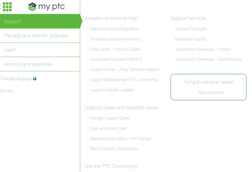
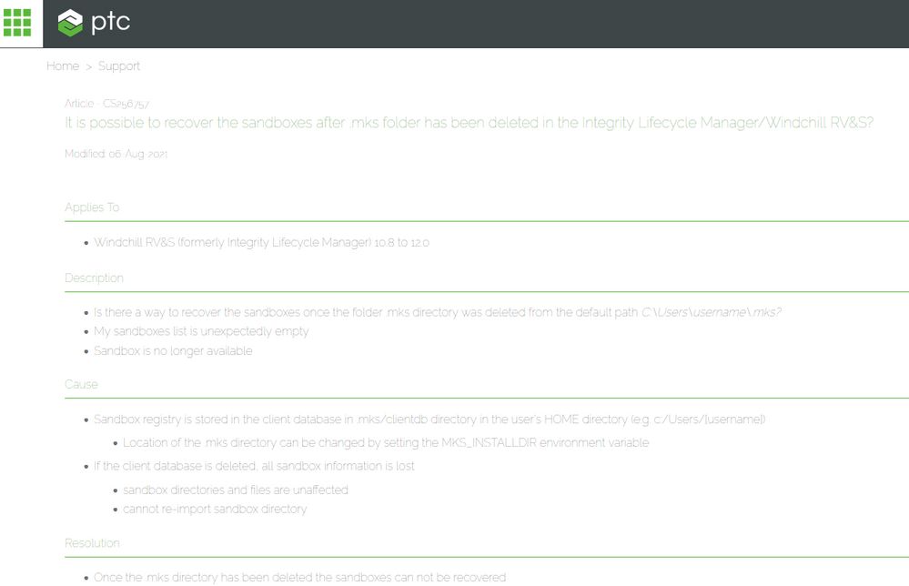
PTC help pages and support articles badly viewable under Firefox (low contrast)
- Mark as New
- Bookmark
- Subscribe
- Mute
- Subscribe to RSS Feed
- Permalink
- Notify Moderator
PTC help pages and support articles badly viewable under Firefox (low contrast)
Hi,
the PTC help pages and support articles are badly viewable under Firefox (low contrast).
They are fine in Chrome.
Any ideas on how to change this?
Solved! Go to Solution.
Accepted Solutions
- Mark as New
- Bookmark
- Subscribe
- Mute
- Subscribe to RSS Feed
- Permalink
- Notify Moderator
Hi @ssaul, thanks for testing further, and sorry to hear this is still present for you (and some others). To stay in sync with you, I updated to Firefox 95.0 (64-Bit) but articles and the top left navigation still render in the correct colours for me.
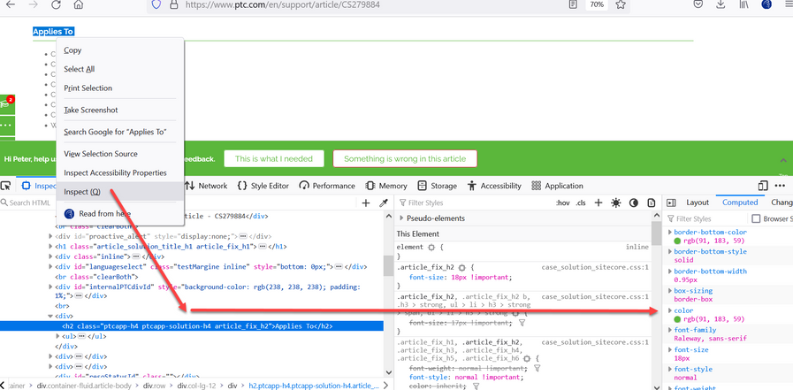
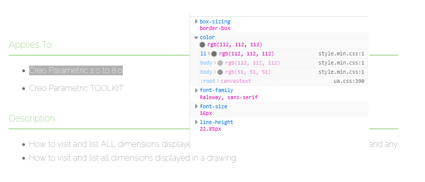
Could you share what you see when you "Inspect" a field on an article. In the screenshot below, you can see I highlighted "Applies To" and see the CSS and details of fonts and colours under the "Computed" tab:
RGB value should read (91, 183, 59). If it's reading this information correctly from our side, then we need to focus on browser config. If the information it's reading is not the same as above, then we need to understand where / how that's being intercepted and changed.
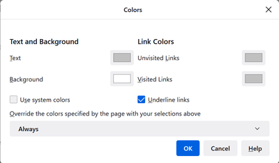
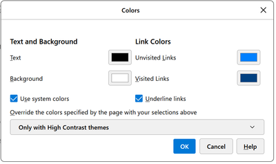
I was able to reproduce the problem only by accessing about:preferences#content and updating the colours as shown below:
Default settings for these are something like:
Could you please compare / experiment with the settings here? If nothing else, overriding with your own preferred colours for text, and visited / unvisited links should provide a workaround while we figure out the root cause.
Many thanks, and best regards,
Peter.
- Mark as New
- Bookmark
- Subscribe
- Mute
- Subscribe to RSS Feed
- Permalink
- Notify Moderator
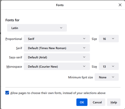
Hi @ssaul , I also use Firefox as my main browser (build 94.0.2) and don't see this issue. Did you check # Settings # General # Language and Appearance, and ensure "Allow pages to use their own fonts.. " is checked. That way, you will be pulling the CSS from our site:
I'd also recommend clearing the cache and restarting, if this doesn't work first time.
Thanks,
Peter.
- Mark as New
- Bookmark
- Subscribe
- Mute
- Subscribe to RSS Feed
- Permalink
- Notify Moderator
Hi @PeterCase,
"Allow pages to use their own fonts.. " is checked here.
I also cleared the cache, disabled extensions and restarted - still the same (low contrast text).
- Mark as New
- Bookmark
- Subscribe
- Mute
- Subscribe to RSS Feed
- Permalink
- Notify Moderator
I have the same issue in Firefox (version 95.0, x64).
- Mark as New
- Bookmark
- Subscribe
- Mute
- Subscribe to RSS Feed
- Permalink
- Notify Moderator
Good to see that I'm not the only one with this problem.
What can we do to help you reproduce this?
- Mark as New
- Bookmark
- Subscribe
- Mute
- Subscribe to RSS Feed
- Permalink
- Notify Moderator
Hi @ssaul, thanks for testing further, and sorry to hear this is still present for you (and some others). To stay in sync with you, I updated to Firefox 95.0 (64-Bit) but articles and the top left navigation still render in the correct colours for me.
Could you share what you see when you "Inspect" a field on an article. In the screenshot below, you can see I highlighted "Applies To" and see the CSS and details of fonts and colours under the "Computed" tab:
RGB value should read (91, 183, 59). If it's reading this information correctly from our side, then we need to focus on browser config. If the information it's reading is not the same as above, then we need to understand where / how that's being intercepted and changed.
I was able to reproduce the problem only by accessing about:preferences#content and updating the colours as shown below:
Default settings for these are something like:
Could you please compare / experiment with the settings here? If nothing else, overriding with your own preferred colours for text, and visited / unvisited links should provide a workaround while we figure out the root cause.
Many thanks, and best regards,
Peter.
- Mark as New
- Bookmark
- Subscribe
- Mute
- Subscribe to RSS Feed
- Permalink
- Notify Moderator
Hi @PeterCase,
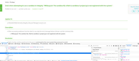
hmmm, is there something changed? Now articles also show correctly here:
I would like to inspect other articles, but actually always get "something went wrong" when searching.
So I will retry the next day(s) and get back to you.
- Mark as New
- Bookmark
- Subscribe
- Mute
- Subscribe to RSS Feed
- Permalink
- Notify Moderator
Hi Peter,
And what RGB settings do you have for the font under "Applies To"?
- Mark as New
- Bookmark
- Subscribe
- Mute
- Subscribe to RSS Feed
- Permalink
- Notify Moderator
Hi @PeterCase , now I inspected a page:
"Applies To" RGB value reads (91, 183, 59).
The settings for the font below "Applies To" are (112, 112, 112).
But here the contrast is okay at the moment, so the settings should also be okay.

