Community Tip - If community subscription notifications are filling up your inbox you can set up a daily digest and get all your notifications in a single email. X
- Subscribe to RSS Feed
- Mark Topic as New
- Mark Topic as Read
- Float this Topic for Current User
- Bookmark
- Subscribe
- Mute
- Printer Friendly Page
Overlaying a contour plot with an x-y plot
- Mark as New
- Bookmark
- Subscribe
- Mute
- Subscribe to RSS Feed
- Permalink
- Notify Moderator
Overlaying a contour plot with an x-y plot
This is a follow-up question to a recent Mathcad 15 solution provided by Werner_E. I manipulated some control parameters and "converted" your "rainbow-effect" surface plot of a two-variable function into a nice-looking "contour" plot [see attached file]. How can I overlay it with an x-y plot of a parabola [shown in the second attached file] so that the vertex of this curve coincides with the contour plot [x, y] = [0, 0] and opens to the right [i.e., in the y direction]?
Solved! Go to Solution.
- Labels:
-
Mathcad Usage
- Tags:
- plot overlay
- Werner_E
Accepted Solutions
- Mark as New
- Bookmark
- Subscribe
- Mute
- Subscribe to RSS Feed
- Permalink
- Notify Moderator
Its funny but now we are back to where you started from - Prime 😉
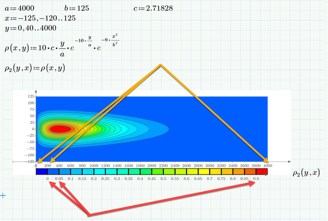
Unfortunately Mathcad 15 does not offer a way out of the box to add a legend to a contour plot. This is one of the few improvements in Prime. On the other hand, in Prime you have not much control over the colors used (in Mathcad you can provide your own color map) but can just chose among a handful. Also I don't think that you can add your parabola in the Prime plot.
Anyway, for whatever it may be worth - here is what Prime can do for you. You may also notice that on contrary to a surface plot you are able to stretch the contour plot (isolines plot) the way you demanded. I added the arrows to show which values you can change directly in the plot to have more control over the number of isolines, etc. basically the first, second and last value in every scale.
I used the Prime file you posted in your initial thread. I would prefer the approach with "CreateMesh" but in this file I didn't change your approach with the range variables and of course they work OK, too.
Of course its possible to add a legend in Mathcad, too, but you have to create it yourself. Basically you add a second contour plot of a simple plane and have to take care to use the same color map and the same max and min z-values in both plots.
The need for a legend in contour plots resulted in a lot of questions for them in this forum quite a while ago. I attach one of my answer files (could't find the thread it stems from) with a possible solution.
- Mark as New
- Bookmark
- Subscribe
- Mute
- Subscribe to RSS Feed
- Permalink
- Notify Moderator
Success!
Luc
- Mark as New
- Bookmark
- Subscribe
- Mute
- Subscribe to RSS Feed
- Permalink
- Notify Moderator
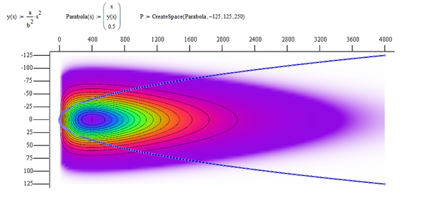
One possible way is to turn the parabola into a 3D parametric curve, use "CreateSpace" and add it as an additional plot, which you have to format as "Data points"/"Scatter Plot". You can decide to omit the dots and just draw line segments. The distance between the dots can be controlled by the last argument of "CreateSpace".
It was necessary to give the curve some "height" (here 0.5) to avoid the curve being covered up partially by the surface plot. Another way to cope with this could be to add some degree of transparency to the surface plot.
- Mark as New
- Bookmark
- Subscribe
- Mute
- Subscribe to RSS Feed
- Permalink
- Notify Moderator
The MC15 sheet is now attached.
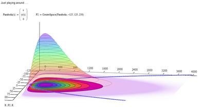
I also played around with transparency and added a true contour plot as a ground base.
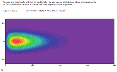
If you would like to use the built in contour plot only, you have to change the arguments of the function to achieve the same plot as yours because we have not other way to change the axis orientation in the contour plot.
- Mark as New
- Bookmark
- Subscribe
- Mute
- Subscribe to RSS Feed
- Permalink
- Notify Moderator
Fantastic! Stripped-down contour plots with and without the parabola overlay will work out perfectly [see attached Word file].
One more question: Is it possible to generate a multi-colored "bar" similar to that used by weather forecasters to illustrate temperature variation on a map [example shown in the second attached file] to match the variation of z(x,y) between its calculated values of 0 to 1.0?
- Mark as New
- Bookmark
- Subscribe
- Mute
- Subscribe to RSS Feed
- Permalink
- Notify Moderator
Its funny but now we are back to where you started from - Prime 😉
Unfortunately Mathcad 15 does not offer a way out of the box to add a legend to a contour plot. This is one of the few improvements in Prime. On the other hand, in Prime you have not much control over the colors used (in Mathcad you can provide your own color map) but can just chose among a handful. Also I don't think that you can add your parabola in the Prime plot.
Anyway, for whatever it may be worth - here is what Prime can do for you. You may also notice that on contrary to a surface plot you are able to stretch the contour plot (isolines plot) the way you demanded. I added the arrows to show which values you can change directly in the plot to have more control over the number of isolines, etc. basically the first, second and last value in every scale.
I used the Prime file you posted in your initial thread. I would prefer the approach with "CreateMesh" but in this file I didn't change your approach with the range variables and of course they work OK, too.
Of course its possible to add a legend in Mathcad, too, but you have to create it yourself. Basically you add a second contour plot of a simple plane and have to take care to use the same color map and the same max and min z-values in both plots.
The need for a legend in contour plots resulted in a lot of questions for them in this forum quite a while ago. I attach one of my answer files (could't find the thread it stems from) with a possible solution.
- Mark as New
- Bookmark
- Subscribe
- Mute
- Subscribe to RSS Feed
- Permalink
- Notify Moderator
I wound up taking screen shots of your contour/surface plots and color bar, added a number range between 0 and 1, adjusted the aspect ratios and sizes, and pasted these objects into PowerPoint slides [attached]. It turned out very nice. Thank you for all your help!
- Tags:
- plot overlay
- Werner_E
- Mark as New
- Bookmark
- Subscribe
- Mute
- Subscribe to RSS Feed
- Permalink
- Notify Moderator


