- Community
- ThingWorx
- ThingWorx Developers
- Re: Bar chart and negative values
- Subscribe to RSS Feed
- Mark Topic as New
- Mark Topic as Read
- Float this Topic for Current User
- Bookmark
- Subscribe
- Mute
- Printer Friendly Page
Bar chart and negative values
- Mark as New
- Bookmark
- Subscribe
- Mute
- Subscribe to RSS Feed
- Permalink
- Notify Moderator
Bar chart and negative values
Hello!
This is my first post since I am new to Thingworx. So please excuse any "easy" questions:-)
I am doing a mashup where I want to display values from an energy meter. But the values can also be negative due to solar panel production. I want to use a bar chart for this, but it seems like the bar chart only can draw from the bottom up? I want it to draw from the centerline (eg zero) and up/down dependant of the value. That is what the area and line does. Is there any configuration I have missed?
Best regards
Ulf
- Labels:
-
Mashup-Widget
- Mark as New
- Bookmark
- Subscribe
- Mute
- Subscribe to RSS Feed
- Permalink
- Notify Moderator
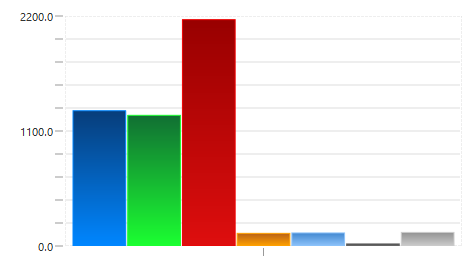
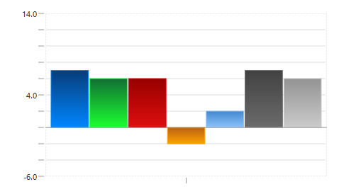
The label chart will display negative values if they are passed in the data. I've not changed the settings for the y axis and it scales the graph (adding negative Y as needed) to show data that it needs to display. The screen shots below show the same graph with varing quantities for the items displayed.
- Mark as New
- Bookmark
- Subscribe
- Mute
- Subscribe to RSS Feed
- Permalink
- Notify Moderator
Hello and thanks!
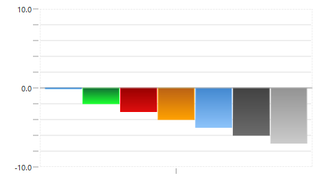
Strange. Can it be because I had only 0 and negative values when I tested? When tested today where I have some positive values, I get the same correct behavior as you. I did a new test with only 0 and negative, and I get the following result:
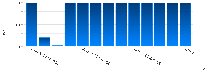
As you can see it draws from the lowest value and up:-)
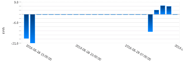
And here the same chart with some positive values and some negative...
- Mark as New
- Bookmark
- Subscribe
- Mute
- Subscribe to RSS Feed
- Permalink
- Notify Moderator
looks like a bug to me!
If you have a good idea of the possible max and min values you can 'fix' the issue by turning off Auto scaling on the y-axis and then putting in the max and min values (looks like these can also be driven by data bindings so you could write a service to give you max and minimum)
If you did write such a service you would want your maximum to be >= 1 otherwise the bars would rise from the bottom still.
Good luck
- Mark as New
- Bookmark
- Subscribe
- Mute
- Subscribe to RSS Feed
- Permalink
- Notify Moderator
Thank's for the info. And it do look like a bug. I will evaluate if I can write an efficient max/min service (without needing to loop the data several times).
I will try to get PTC to create a ticket for this.


