cancel
Showing results for 
Search instead for 
Did you mean: 
cancel
Showing results for 
Search instead for 
Did you mean: 

Community Tip - Did you get an answer that solved your problem? Please mark it as an Accepted Solution so others with the same problem can find the answer easily. X

How to prevent Custom widget resizing from Mashup Builder?

pjbiocco
8-Gravel

How to prevent Custom widget resizing from Mashup Builder?

Hello! Currently I'm working on a custom widget that is supposed to take up the full width of the mashup it's contained in, but add certain amounts of scrolling. Unfortunately, default CSS values seems to have come into conflict. There are two parts that caused concern, one which is now solved.

I can get the desired visual results I want by editting the CSS the page directly post render on the web browser. The two divs below both need to have a css tag of width:100% to be functional. To do so on the parent was relatively easy using jquery's parent function on the name of my widget "widget-costestimatetile" in the afterRender function. However, when trying to set the css of "widget-costestimatetile" directly, as shown in the image below, a static width is appended, overriding this. I've used the step-through function in firefox debugging to confirm my suspicion that this was being over-written after the afterRender function was executed.

Upon further investigation we realized that this number is based on the width of the widget as sized in the mashup-builder. I assume that I may be able to fix this by using updateProperty, but this seems like a very inelegant solution. What would be a more proper way of preventing mashup-builder resizing?


pjbiocco_0-1667257453425.png


1 ACCEPTED SOLUTION

Accepted Solutions

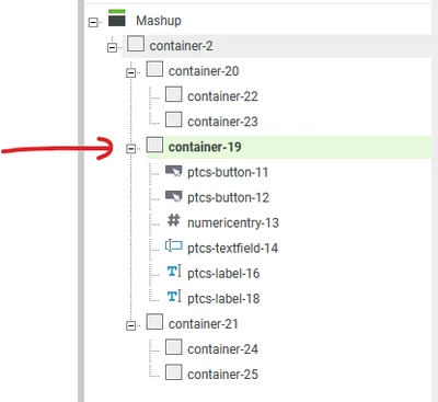
The containers are the default placeholders in the mashup, so if you would want to have 100% usage of the width of the page, you need to have a container placed in the root structure, that has nothing on the left/right of it. This would be container 19 here (and opposite, containers 22, 23, 24 and 25 will never be able to go full page width because they have components on their left or right - and you can't and should not override this behavior, as widgets should not get out of their container)

VladimirRosu_0-1669711143849.png


View solution in original post

10 REPLIES 10

Hi @pjbiocco,

First, happy to see a fellow widget coder!

  1. You say that your desire is that the widget should take the full width of the mashup it's contained in, but then you say "add certain amount of scrolling". I assume you refer to the fact you want to have internal scrolling. Based on what you said, I believe you also mean that you only want the width to be 100%, and have at the same time a specific height, right? Could you confirm if what I assume here is correct?
  2. Typically when we code a responsive widget (which enlarges fully based on its container), that will have both width and height set to 100%. It would be the task of the container it is placed in to enlarge itself. So, in your case I would code the widget with width and height 100% (in the renderHTML function), and just place it - alone -  in a horizontal container that stretches from left to the right of the page. The widget is responsive if you specify in the IDE.js widget properties one of these fields (don't remember which one exactly, but they trigger the display of the "responsive" icon in Mashup Builder)
     'isResizable': true,
     'supportsAutoResize': true,​


I think that what I wrote above should point in the right direction, but I'm not entirely certain, so please don't hesitate to let me know if that worked.

I also don't believe relying on post-render events would be the right choice (page could flicker after loaded etc).

Hey. I've realized that my post was quite unclear. I wrote it when I was very tired, haha. Looking back, scrolling isn't quite the correct word. A better way to describe it is that I'm attempting to support resizing. Your solution did fix the need to rely on post render specifically for the outer div, but the second div still is giving me trouble. Let me add some more details.

Below I'm adding some images that describes the issue. On certain screen widths, I want the column to be two column, but on smaller sizes, I want it to be one column. This effect is something I've already written off of Thingworx, and have been able to recreate via firefox debugger.

Intended effect.

pjbiocco_0-1667312926381.png

pjbiocco_1-1667313041176.png

Current issue: White space on right side. On smaller window, the snap no longer happens. This is caused by the 2nd divs fixed width

pjbiocco_2-1667313372169.png

pjbiocco_3-1667313511404.png


@pjbiocco ,

Thank you for providing this detail.

Now it is my turn to act as the devil's advocate and ask why exactly you've written off ThingWorx

I'm curious about this because I managed to obtain this effect with a classic Collection widget in 9.3.4

You will note the cells do not expand to fit all the available screen size, that's because the FlowLayoutGravity is set to Center. If you set it to Expand they will expand according to their space (of course obeying the MashupWidth you set)


@VladimirRosu 
I have had a consistent issues with performance when it comes to Collection widgets unfortunately, and so to fix such, I have written widgets to effectively replace the collection widget. Even in your video, I see visible lag on resize, and you only have a handful of objects. When you are expected to have 20-50, then resizing slows to a crawl. In experimentation, I've put 40 collection mashups on one page to see what would happen. This by itself caused resize times to creep up to the 2 minute mark, which for my purposes is effectively non-functional. Given we've had scenarios where we may have need for 50-100 of these tiles in different, flexible formats.

When working with my method, resizes are instant, and the UI remains performative to my expectations, hence the widget.

@pjbiocco 

In the video I made the resize executes after I remove my finger from the mouse, I would guess in a range lower than 0.5 seconds. I do not consider this resize time as something dramatic. I also tested with 40 cells on screen and the resize time was <2 seconds. I am not sure what exactly you have in those cells, but remember if you have expressions that execute on each cell context this time will vary to more.

The widget will not resize during the resize action itself, but I guess that is not your aim.

I believe the core issue here is that you are trying to make sure that if the user starts the browser in a smaller window size, when he resizes the screen he won't need to wait a lot of time to redraw, correct? Or you're maybe adding a row, which would cause the collection to redraw?

Did you look at gadgets and dashboards? It looks like that feature might be a better fit based on what I read here.

@VladimirRosu 
It's hard to say exactly what caused the performance issues, especially since the testing that I did was months ago. Additionally, the expectations aren't really something I've set. This is what my supervisor has set. I've used my method to get resize on 100+ cells down to milliseconds given my method, and we are looking to achieve that level of scale. Given that I've set this standard with this widget, they want to continue on that standard.

In short, the idea was to have 2 columns but drop to 1 column if the screen resolution was too small just in case the site was viewed within a tablet or phone application. At this point, I've been advised to go back to fixed-width partitions which functions better, so for now, this issue no longer needs to be solved,

However, for future reference this would still be helpful. I've struggled to make 'full-screen-width' widgets multiple times due to the mashup builder adding unwanted CSS in regards to the width of the widget and have been looking for a way to override this functionality. As I've said, I get exactly what I want when I edit the webpage directly using debugging tools by undoing some of the styling thingworx applies. However, I can't seem to influence that styling causing this pre-afterRender() execution. This has directly impacted other widgets I've tried to write and had to scrap as a result. That is why I'm looking for a fix.

Gotcha. Did you use a container that spans left and right to the page? (as wrapper for your widget). That will control the width of the widget (info from my second reply I think)

I apologize for not getting back to this sooner, but we have moved on to a different design to compensate, and I don't particularly remember how containers were.

The containers are the default placeholders in the mashup, so if you would want to have 100% usage of the width of the page, you need to have a container placed in the root structure, that has nothing on the left/right of it. This would be container 19 here (and opposite, containers 22, 23, 24 and 25 will never be able to go full page width because they have components on their left or right - and you can't and should not override this behavior, as widgets should not get out of their container)

VladimirRosu_0-1669711143849.png


Gotcha, thanks!

Top Tags