- Community
- ThingWorx
- ThingWorx Developers
- Remove Extra Spaces and Rest Layer in Line Chart
- Subscribe to RSS Feed
- Mark Topic as New
- Mark Topic as Read
- Float this Topic for Current User
- Bookmark
- Subscribe
- Mute
- Printer Friendly Page
Remove Extra Spaces and Rest Layer in Line Chart
- Mark as New
- Bookmark
- Subscribe
- Mute
- Subscribe to RSS Feed
- Permalink
- Notify Moderator
Remove Extra Spaces and Rest Layer in Line Chart
Hi,
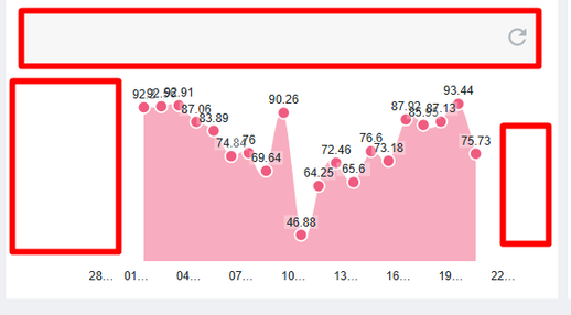
I was working on the Line Chart. I don't see many options to remove the extra padding and space in the LineChart and the Reset Area in the Line Chart.
ChartType: Area Chart
Thingworx version: 9.3.6
Thanks,
+91 8099838001 | shashi@psptechhub.com,
PSPTechHub || World of PTC Thingworx || LinkedIn
Solved! Go to Solution.
- Labels:
-
Coding
-
Design
-
Mashup-Widget
Accepted Solutions
- Mark as New
- Bookmark
- Subscribe
- Mute
- Subscribe to RSS Feed
- Permalink
- Notify Moderator
Hello.
So, the Padding is not due to CSS. When the X-axis is in the Timestamp format, extra dates are shown on the Left and Right sides of the Chart, but there is no value for them; those dates are auto-generated by the Chart, which is the reason for the space.
To avoid this, I have bound the X-AxisMinmumValues and X-AxisMaximumValues with the Max Date and Min Date from the Data given to the Chart.
If Someone needs the code to get the Max and Min from the Data of the Chart, below is the code for it:
let result = Resources["InfoTableFunctions"].CreateInfoTableFromDataShape({
    infoTableName: "InfoTable",
    dataShapeName: "FSR.MaxMinDates.DS"
});

if(InfoTable && InfoTable.length)
{
   InfoTable.Sort({ name: "Timestamp", ascending: false });
   let minTimeStamp = InfoTable.rows[InfoTable.length - 1].Timestamp;
   let maxTimeStamp = InfoTable.rows[0].Timestamp;

    result.AddRow({
        MaxTimeStamp: maxTimeStamp, // DATETIME
        MinTimeStamp: minTimeStamp // DATETIME
    });
}
I am unsure how I removed exactly the Reset button from the Chart. There should be a property that I changed by mistake, and it disappeared.
Thanks a lot, @Velkumar, for putting in the effort and sharing the CSS with me; I appreciate it.
Thanks,
+91 8099838001 | shashi@psptechhub.com,
PSPTechHub || World of PTC Thingworx || LinkedIn
- Mark as New
- Bookmark
- Subscribe
- Mute
- Subscribe to RSS Feed
- Permalink
- Notify Moderator
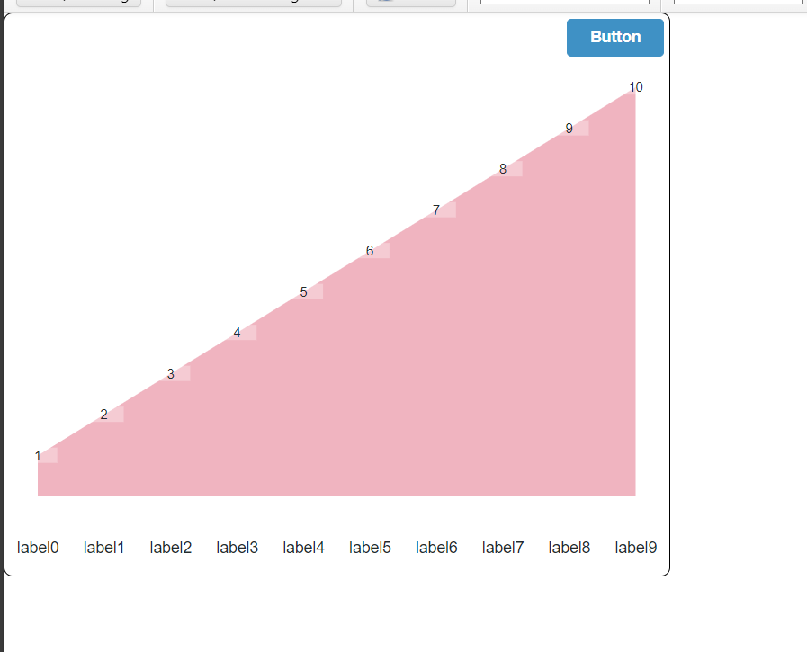
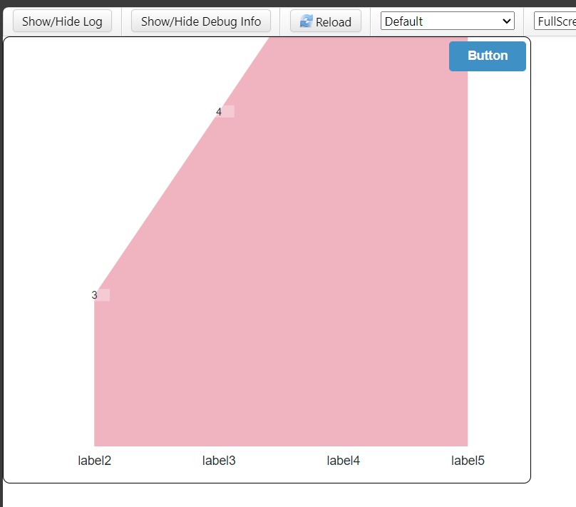
You can use the below CSS to remove extra padding and hide the default reset button
.myclass ptcs-chart-line::part(chart-layout){
    padding : 0px;
}

.myclass ptcs-chart-line::part(zoom-xaxis){
    height : 0px;
    padding : 0px;
}
To place a reset button over the line chart, create a layout top of the line chart container and make it an overlay container.
/VR
- Mark as New
- Bookmark
- Subscribe
- Mute
- Subscribe to RSS Feed
- Permalink
- Notify Moderator
Hello.
So, the Padding is not due to CSS. When the X-axis is in the Timestamp format, extra dates are shown on the Left and Right sides of the Chart, but there is no value for them; those dates are auto-generated by the Chart, which is the reason for the space.
To avoid this, I have bound the X-AxisMinmumValues and X-AxisMaximumValues with the Max Date and Min Date from the Data given to the Chart.
If Someone needs the code to get the Max and Min from the Data of the Chart, below is the code for it:
let result = Resources["InfoTableFunctions"].CreateInfoTableFromDataShape({
    infoTableName: "InfoTable",
    dataShapeName: "FSR.MaxMinDates.DS"
});

if(InfoTable && InfoTable.length)
{
   InfoTable.Sort({ name: "Timestamp", ascending: false });
   let minTimeStamp = InfoTable.rows[InfoTable.length - 1].Timestamp;
   let maxTimeStamp = InfoTable.rows[0].Timestamp;

    result.AddRow({
        MaxTimeStamp: maxTimeStamp, // DATETIME
        MinTimeStamp: minTimeStamp // DATETIME
    });
}
I am unsure how I removed exactly the Reset button from the Chart. There should be a property that I changed by mistake, and it disappeared.
Thanks a lot, @Velkumar, for putting in the effort and sharing the CSS with me; I appreciate it.
Thanks,
+91 8099838001 | shashi@psptechhub.com,
PSPTechHub || World of PTC Thingworx || LinkedIn


