- Community
- ThingWorx
- ThingWorx Developers
- Re: Stacked Label Chart with secondary y axis as L...
- Subscribe to RSS Feed
- Mark Topic as New
- Mark Topic as Read
- Float this Topic for Current User
- Bookmark
- Subscribe
- Mute
- Printer Friendly Page
Stacked Label Chart with secondary y axis as Line
- Mark as New
- Bookmark
- Subscribe
- Mute
- Subscribe to RSS Feed
- Permalink
- Notify Moderator
Stacked Label Chart with secondary y axis as Line
Hy!
I searched a long time for this and couldn't find an answer that suits me. So I will try and make my own topic about it.
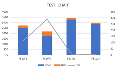
I have data that is showing me on different Items different counts of good, bad and TU2. I would like to have in one chart the items on the x-axis then the good and the bad on the primary y axis stacked and overall the TU2 on the secondary y-axis not stacked at all. Now I tried a lot. It is working with the secondary y axis when it is not stacked, but as soon as I click stack series it also sets my secondary y axis on the bottom just as a thin line and doesn't show me the secondary y axis at all. Now as a sample of what I want to achieve I made an example in Excel.
Is there a way to also achieve this in Thingworx?
BTW I am using Thingworx 9.3 for this project I am working on.
Solved! Go to Solution.
Accepted Solutions
- Mark as New
- Bookmark
- Subscribe
- Mute
- Subscribe to RSS Feed
- Permalink
- Notify Moderator
Hi @MS_9497713.
We are able to confirm the issue you reported. However, since you are using a legacy widget, no further bug fixes or updates are planned unless they are security related. In a future release of ThingWorx, we are including the combo widget that may provide the functionality you need.
Regards.
--Sharon
- Mark as New
- Bookmark
- Subscribe
- Mute
- Subscribe to RSS Feed
- Permalink
- Notify Moderator


