- Community
- ThingWorx
- ThingWorx Developers
- Re: Unable to get straight line parallel to Y axis...
- Subscribe to RSS Feed
- Mark Topic as New
- Mark Topic as Read
- Float this Topic for Current User
- Bookmark
- Subscribe
- Mute
- Printer Friendly Page
Unable to get straight line parallel to Y axis on line chart?
- Mark as New
- Bookmark
- Subscribe
- Mute
- Subscribe to RSS Feed
- Permalink
- Notify Moderator
Unable to get straight line parallel to Y axis on line chart?
Dear Team,
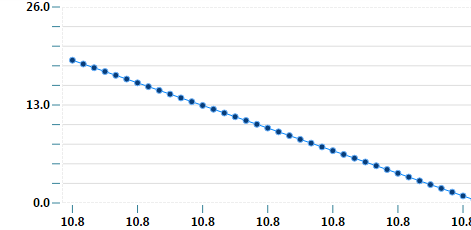
How to get straight line parallel to Y axis on line chart?
My data points. Flow as X axis , Efficiency as Y axis .

My chart is showing

Here x axis has same value i.e. 10.8 against y axis
But instead of x axis starting from 0.0 it is starting 10.8 .
- Mark as New
- Bookmark
- Subscribe
- Mute
- Subscribe to RSS Feed
- Permalink
- Notify Moderator
This label chart in which I am using line chart
- Mark as New
- Bookmark
- Subscribe
- Mute
- Subscribe to RSS Feed
- Permalink
- Notify Moderator
I don't think it will render as you expect with label chart...
Did you tried XY Chart?
- Mark as New
- Bookmark
- Subscribe
- Mute
- Subscribe to RSS Feed
- Permalink
- Notify Moderator
In xy chart it is showing as require. But I need to show in line chart.
- Mark as New
- Bookmark
- Subscribe
- Mute
- Subscribe to RSS Feed
- Permalink
- Notify Moderator
Thanks Carles,
My requirement is as shown in below figure. I am showing line chart . On curve peak point need to draw line to x axis which is parallel to Y axis. such thing newd to show in line chart

- Mark as New
- Bookmark
- Subscribe
- Mute
- Subscribe to RSS Feed
- Permalink
- Notify Moderator
Can you add up fake data points to increase X Axis ( minimum =0 and maximum= 20 for instance ) ?
- Mark as New
- Bookmark
- Subscribe
- Mute
- Subscribe to RSS Feed
- Permalink
- Notify Moderator
You can set it on a separate series and also set it ( the fake ones ) to Marker only.
- Mark as New
- Bookmark
- Subscribe
- Mute
- Subscribe to RSS Feed
- Permalink
- Notify Moderator
Thanks Carles,
In XY chart it is showing properly as shown below,

But when I am implementing in line chart and selecting as marker it is showing as below.Here problem with x axis.

- Mark as New
- Bookmark
- Subscribe
- Mute
- Subscribe to RSS Feed
- Permalink
- Notify Moderator
Why X axis is not showing as per expectationsin marker( in label chart).
- Mark as New
- Bookmark
- Subscribe
- Mute
- Subscribe to RSS Feed
- Permalink
- Notify Moderator
But XY can be only line without markers also.
- Mark as New
- Bookmark
- Subscribe
- Mute
- Subscribe to RSS Feed
- Permalink
- Notify Moderator
Hi Carles,
My questions is why x axis is not showing properly in line chart. But same thing properly showing in XY chart.
Is anything wrong?
- Mark as New
- Bookmark
- Subscribe
- Mute
- Subscribe to RSS Feed
- Permalink
- Notify Moderator
I don't know exactly your configuration, but yes TW it's sometimes tricky with the Charts.
- Mark as New
- Bookmark
- Subscribe
- Mute
- Subscribe to RSS Feed
- Permalink
- Notify Moderator
I am very glad, if you send me some example in line chart as shown in diagram.
- Mark as New
- Bookmark
- Subscribe
- Mute
- Subscribe to RSS Feed
- Permalink
- Notify Moderator
I can't man, getting the right result it's your job, and as said can be tricky and also you may end up with not the exact solution, but the best approximation and you will have to decide what you accept as approximation.
- Mark as New
- Bookmark
- Subscribe
- Mute
- Subscribe to RSS Feed
- Permalink
- Notify Moderator
Thanks Carles
- Mark as New
- Bookmark
- Subscribe
- Mute
- Subscribe to RSS Feed
- Permalink
- Notify Moderator
this is exactly the same issue I'm facing. in order to create the vertical line, I have to create a "large set of " fake data and insert the real data point in the middle. But at the end, it will show up as a narrow triangle.
so far, this is the workaround I'm using. Mean/Nominal/USL/LSL in this chart should be a vertical line.
I'm considering to create a widget to support this when I have bandwidth.


