cancel
Showing results for 
Search instead for 
Did you mean: 
cancel
Showing results for 
Search instead for 
Did you mean: 

Community Tip - New to the community? Learn how to post a question and get help from PTC and industry experts! X

dynamic button size in Mashups

drieder
16-Pearl

dynamic button size in Mashups

Hello everyone,


I would like to have buttons always resized to their container size (note: I will use these mashups on Smartphone and Desktop PCs)

For that I had the following in Mind:
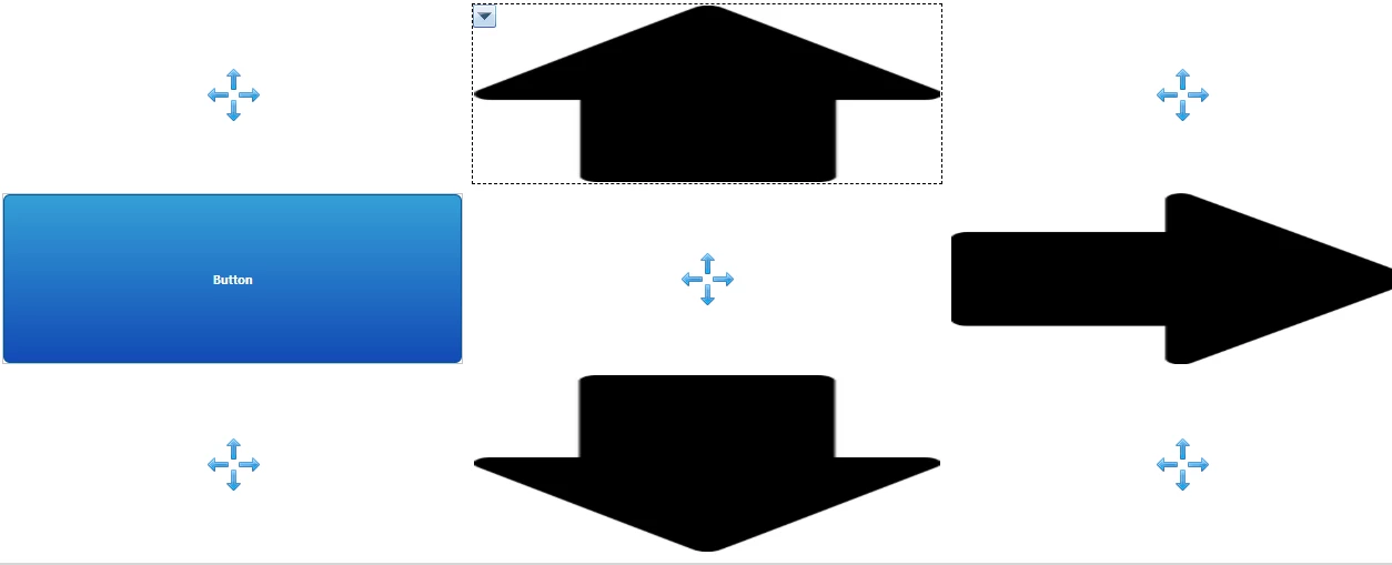
designTime.png

Basically I want the Button be the arrows. The arrows here are Image Widgets which dont need an extra panel and can be placed directly on a responsive panel. The button on the other hand needs a panel.


So even though I have selected "Expand to Container" for the button, the result looks like this:
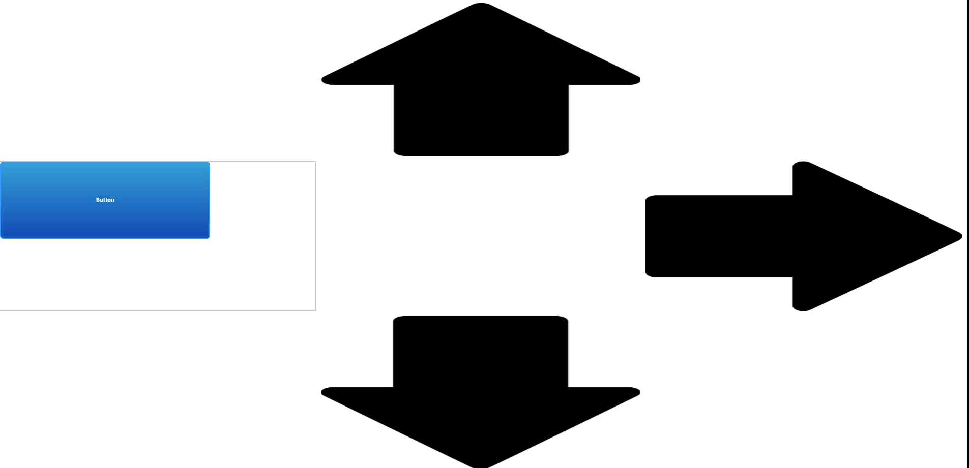
runTime.png

The button just resized to Container size during designTime and kept the size eventhough the container size changed. The image Widgets look exactly like I want to but are missing the button functionality.


Is there a way to have the button being dynamically resized accordingly to its container size? Otherwise feel free to make other suggestions how to achiev the functionality with this layout.


Best Regards,

Dominik

ACCEPTED SOLUTION

Accepted Solutions
vxavier
14-Alexandrite
(To:drieder)

Hi Dominik,


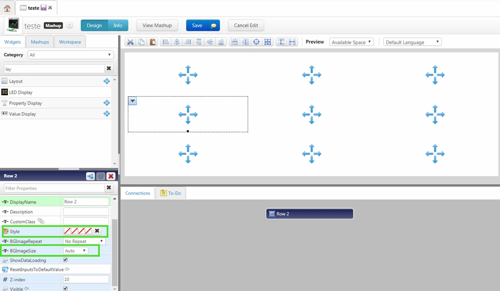
My suggest for this is, put the images as the background for layout. Divide your layout to be organized the way you want to and, in each box, put a background image in the Style property and set  BGImageSize property to contain. Then you use the value display(because it is responsive also) with invisible Style to apply the clicked event.


image2.png


Hope it works for you,


Thanks,
Vinícius Xavier.

View solution in original post

6 REPLIES 6

Hello Sir,


If a clickable Arrow image which can work as a Button is what you want, you can use the ValueDisplay widget directly.

1. It is responsive, so it can change based on your container size

2. It can show Images, either an Arrow image or a Button image

3, It has the clicked event, which helps it work exactly like a Button 

drieder
16-Pearl
(To:zyuan1)

Hello @zyuan1,


thank you for your reply, I just tried this out. My result looks like this:

valueDisplay.png

The left arrow uses the value display. The problem is, the image does not scale to the container size like in the other arrows.


I setted the image scaling to width. When setted to height or none the arrow is not visible at all. Any suggestions on that?


Best Regards,

Dominik

The Image or ValueDisplay widget in ThingWorx is based on Pixel image rather than vector image, and I forgot about that.  I tried to upload vector image ending with .svg, .cgm and .idr, but they don't work.


I can't make the Arrow image grow as big, but you can make it appear in the center when size changed, will it work for you?

vxavier
14-Alexandrite
(To:drieder)

Hi Dominik,


My suggest for this is, put the images as the background for layout. Divide your layout to be organized the way you want to and, in each box, put a background image in the Style property and set  BGImageSize property to contain. Then you use the value display(because it is responsive also) with invisible Style to apply the clicked event.


image2.png


Hope it works for you,


Thanks,
Vinícius Xavier.

Hello Xavier,


thank you, this just works great! There is one little thing which would make it perfect. As you can see here


Screenshot (40).png

the images are aligned in center. To have a more compact symetrical view for every layout resolution, I would like to align the top arrow at the bottom, the bottom at the top, the right one left and the left one right. 


Its probably not possible since I didn't see any alignment options for the layout. Anyway if you know anything please let me know.


Best Regards,

Dominik

vxavier
14-Alexandrite
(To:drieder)

Hi Dominik,


You can still work with layouts. For example, to the top look more in bottom you can divide the top layout in 2 rows and adjust the sizes of layouts to it stay the way you want. For exemple: Divide in two rows and set the top row 30%.


You can also manage the space between the layouts.


Cheers, 

Vinícius.

Announcements


Top Tags